The data set that I chose to work with was the Trans-Atlantic Slave data set. During the course of looking over the data for quite some time, I began to think of the possibility of highlighting historical events and relating these events to the data set to see if some pattern or relation could be illustrated. In order to accomplish this, I turned to the platform Palladio platform to aid me in this endeavor.
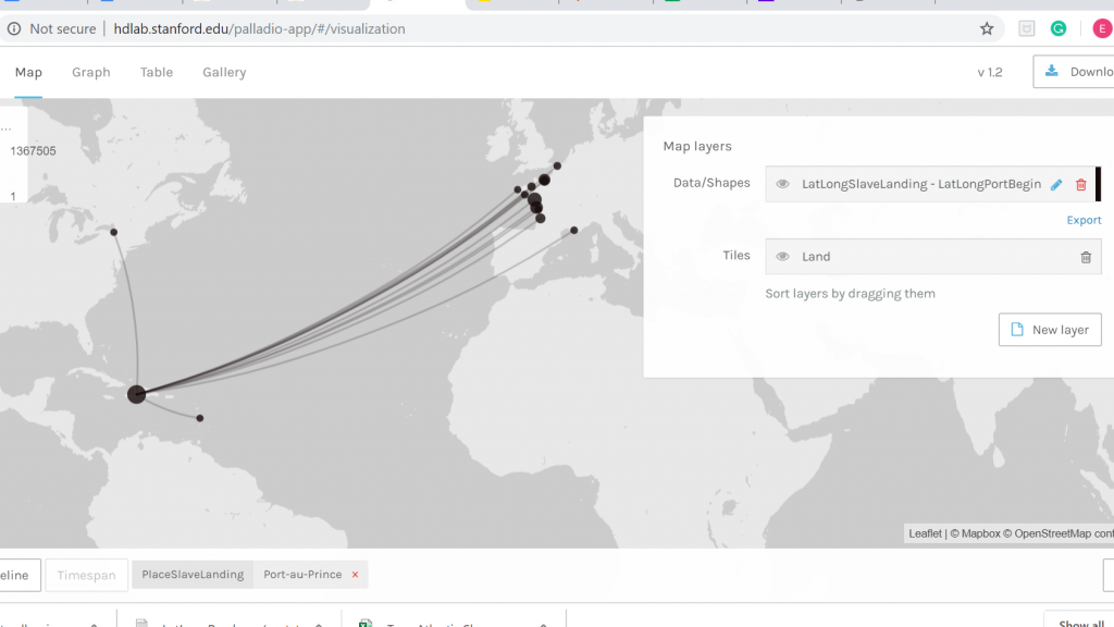
The first order of business in working with Palladio and the Trans-Atlantic data set was trying to make sense of all the functions, filters, facets, and dimensions. However, with some tinkering, I was able to produce the image above. What this map illustrates is all the Trans-Atlantic slave voyages from the initial port of vessel departure to the port where the slaves were destined to disembark along with the year of the various voyages. As one might observe all the vessels begin their voyage in European ports, the majority of them being French ports and at the end of the links from Europe, the vast majority arrive in the Carribean. Using the Facet features I was able to choose a port of disembarkation which is Port-au-Prince, Hispaniola. Thinking about the historical context of the time period in which these voyages were taking place I was able to come to the realization that this visualization was represenitive of the French colonial period of Hispaniola.
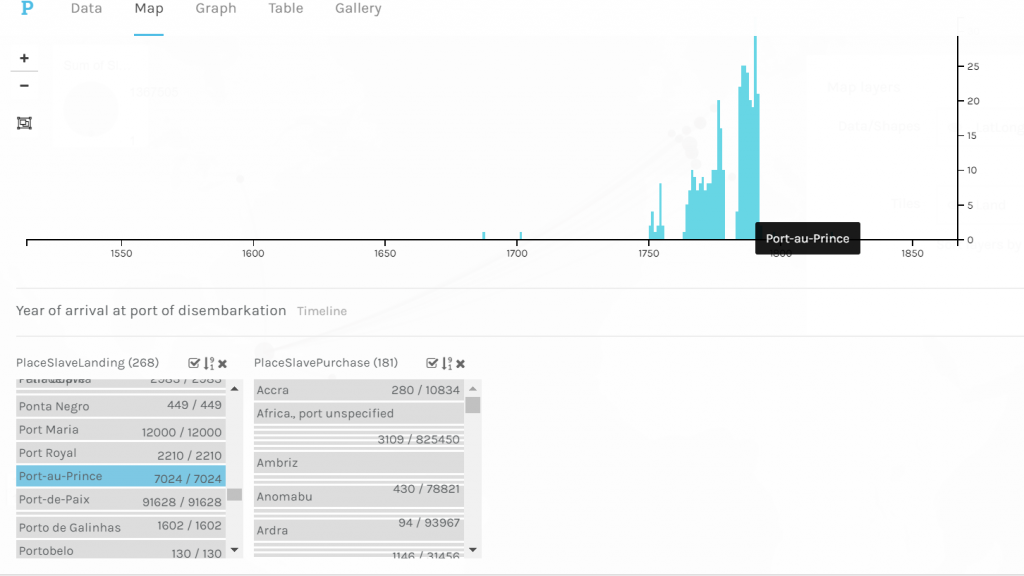
Once I established that I wanted to examine Trans-Atlantic slave voyages from the starting point of the voyage to where the slaves were to disembark upon arrival in Port-au-Prince the thought of showing a timeline that illustrated the number of voyages to Port-au-Prince during the French colonial period came to mind. What this timeline shows is the number of voyages over time to Port-au-Prince in their perspective years. As one might observe in the timeline there is a significant increase in the number of voyages in the mid to late 18th century. Upon completing historical research I was able to deduce that this was the time period in which colonial French Hispaniola was at its height. Thus, meaning that there was high demand from French plantation owners on Hispaniola for enslaved labor to tend to the plantations. However, it significantly drops at the very end of the 18th century which makes historical sense due to the fact that the Haitian slave revolts began during 1791 and continued until Haitian independence in 1804.
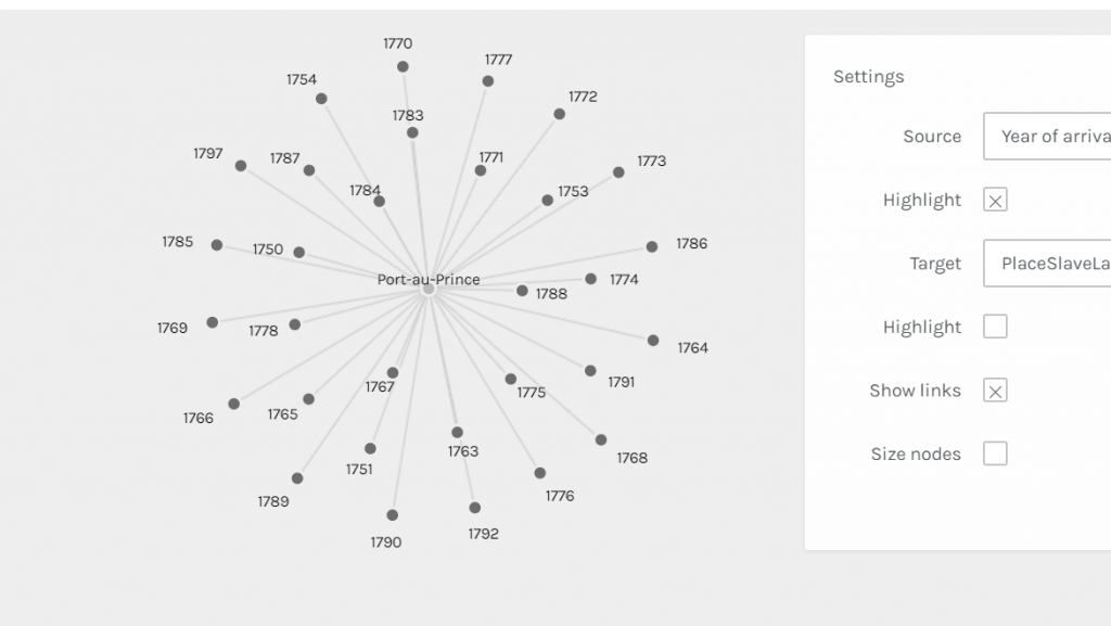
This image is of a graph that I was able to create in Palladio that illustrates individually the specific years that Trans-Atlantic slave voyages were arriving in Port-au-Prince. It takes the first image of the timeline previously discussed to a close-up-view where one can individually see each year. And as one might observe the last year chronologically is 1792 which again seems to make historical sense since the Haitian slave revolts began in the year of 1791. The notion of taking data, in this case, the Trans-Atlantic slave dataset, set a step further is touched upon by Drucker when she states, “The dataset is already an extraction from a corpus, text, or aesthetic work and a remediation. The image is another level of translation, further removed from the original act of creating capta” (Drucker). The representations produced by Palladio provide the opportunity to explore the history of French Hispaniola in a more in-depth manner, removed from the original data set.
Not only this, but the timeline from Timeline JS adds historical context to the data visualization created in Palladio. I was only able to create a short timeline that highlights key points in the history of Haiti, however, it allows the onlooker to get a sense of what is going on in the world during the time period of colonial French Hispaniola. And even, perhaps, think more broadly on the topic of the Trans-Atlantic slave trade.
