Categories
Assignment 3

Assignment 3

For the third assignment, I chose to look at the Trans-Atlantic Slave Data to see if I could play around with the visualizations, hoping that I would find connections that I would be able to write about. 

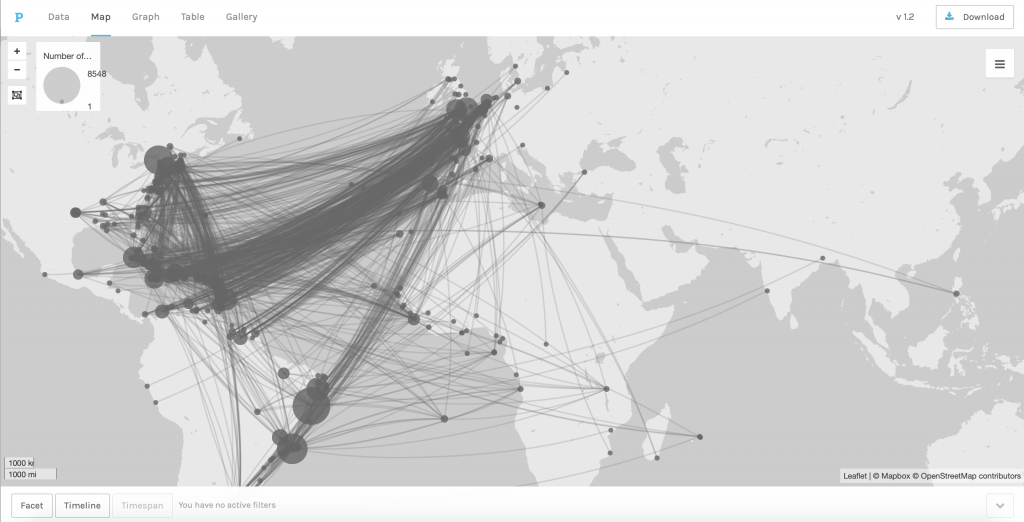
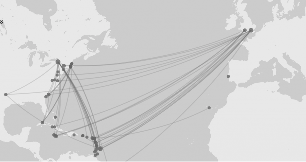
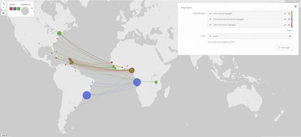
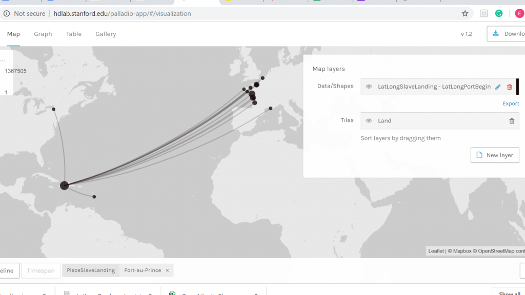
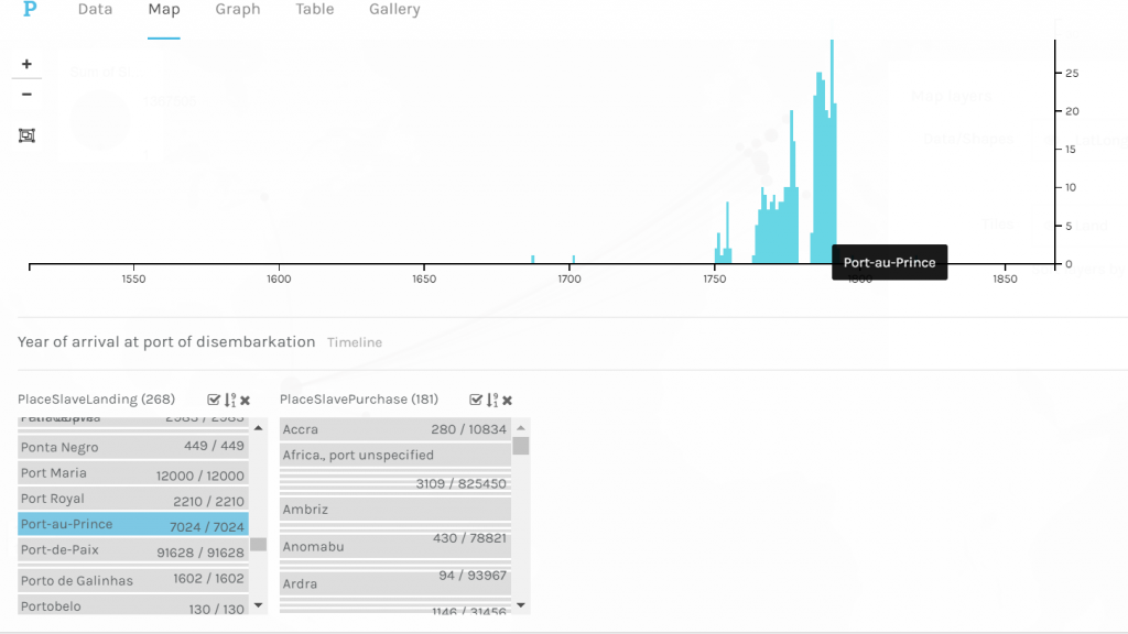
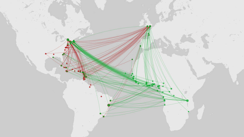
For my first visualization, I wanted to see connections of the places that the enslaved people were sent. This involved setting two visual layers on the map, one layer representing where slaves were bought and where their journeys began, and the other representing where their journeys began to where they disembarked. To achieve this, I had to select three variables – the places that the enslaved people were bought, where they had embarked on their journey and where they had disembarked. There was still a lot of data to interpret for the set of all voyages taken, so I narrowed it down more to the voyages of the top three named ships. The resulting visualization was interesting, and I interpreted it to infer that a lot of slaves whose final destination was South America were transported to the East Coast before going to South America, as opposed to having a direct voyage there.

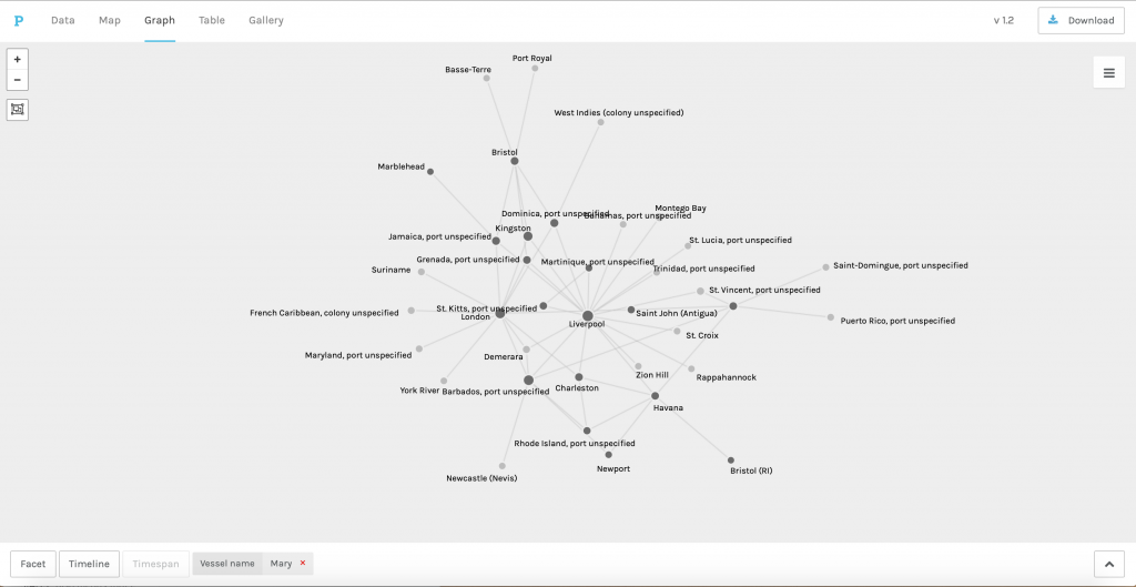
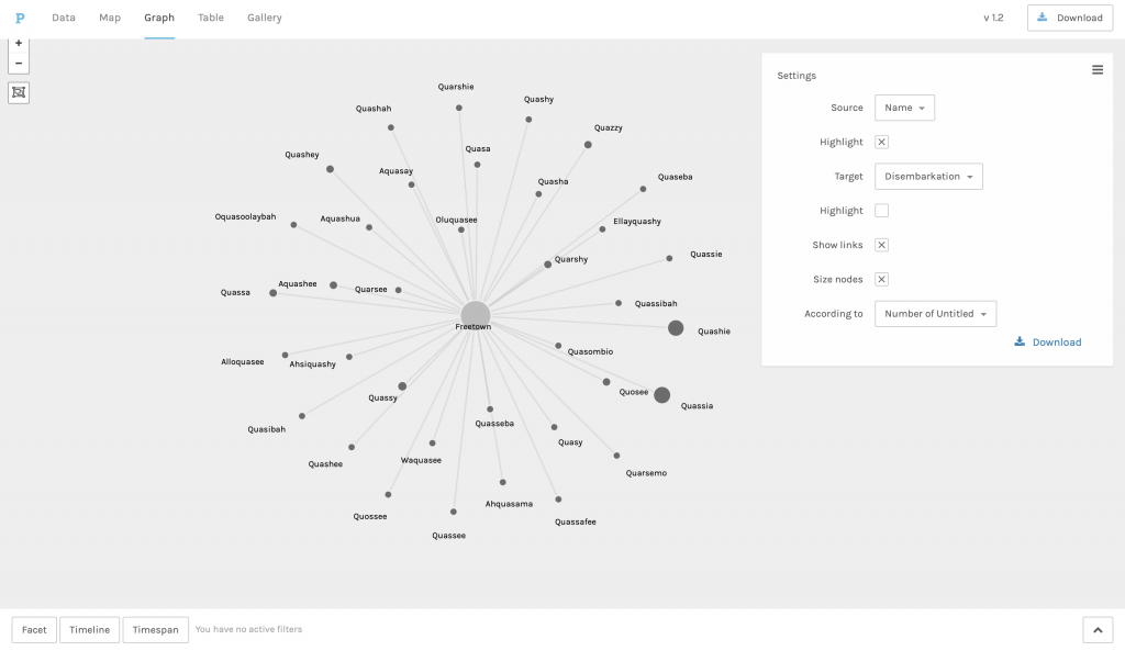
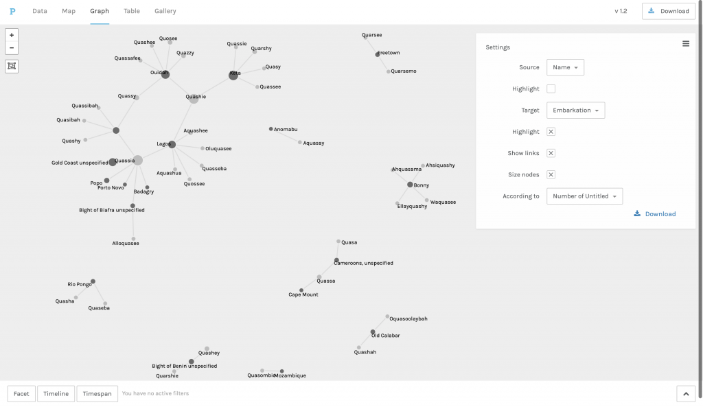
I also wanted to look for links between the three ships that I had filtered for the data. This time, I wanted to see how many ports they had in common with each other and see if there was any correlation between them. I pulled up the ships and the ports that they were associated with on the graph to see if there were multiple common ports between them. To further polarize the view, I set the names of the ships to anchor in a triangular fashion, as shown below. We can see that while Nancy and Mary had the most number of ports in common, there was much less correlation between them and the NS da ConceiCao Antonio e Almas. 

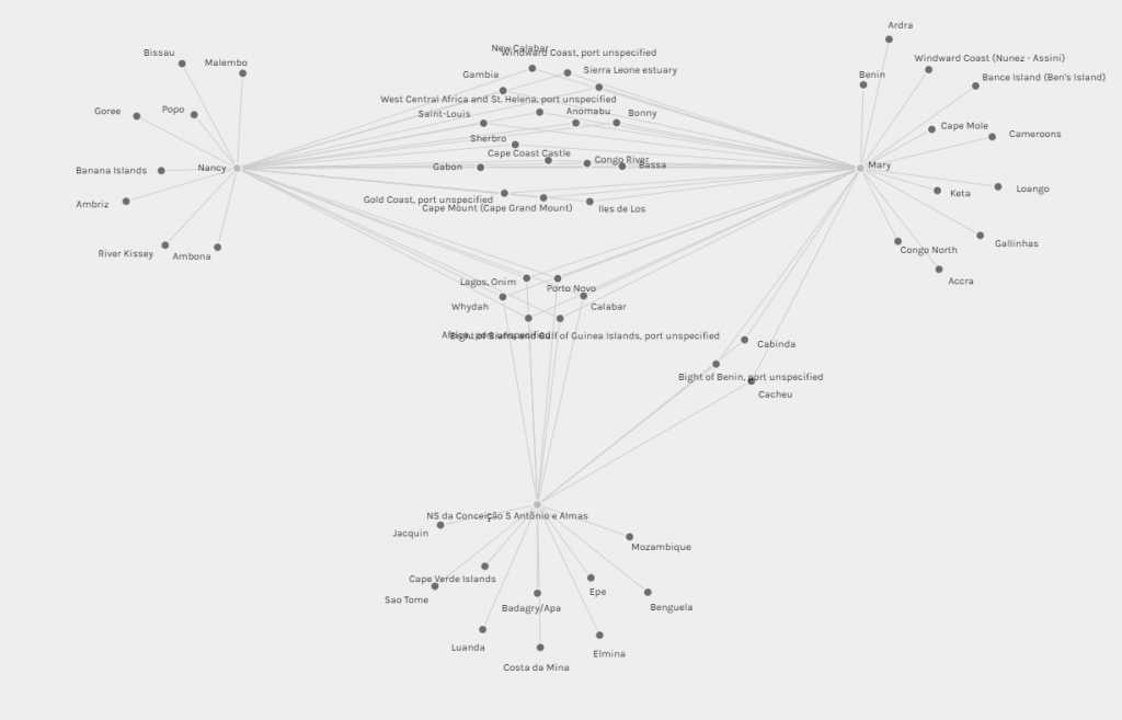
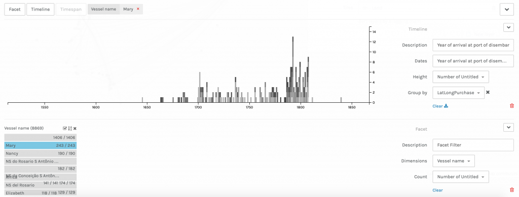
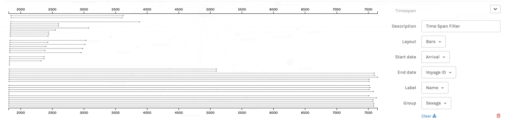
The results, in the context of the service period and origins of the ships, make sense, as Mary and Nancy were affiliated with the United Kingdom and were launched within twenty years of each other, Nancy having been launched in 1789 and Mary in 1806. The NS da ConceiCao Antonio e Almas was launched much earlier, with records indicating that it was in service from 1691 to 1782 (ShipIndex). Another possible explanation is that the countries that owned the ships respected each other’s trade routes and did not infringe on each other’s paths. The timeline JS view below shows how much overlap there was between the three ships and how they may have influenced each other.

These results that I have shown here display data that has been filtered and represented in a different way than it was given to me, which was on an excel sheet. By selectively using parts of this data and making a visualization out of it, I am effectively skewing the dataset to my own ends and drawing new conclusions on data that I already have. By using timelines, I added more meaning to the years that the ships were active, graphically improving their meaning to suit my narrative. I think that this makes me what Johanna Drucker describes a ‘knowledge generator.’

Categories
Assignment 3

Assignment #3

This visualization illustrates the many voyages taken during the Trans-Atlantic slave trade.

I used the data in the Trans-Atlantic Slave Database to map the numerous voyages taken across the world in Palladio. The first visualization shows the 8548 recorded voyages and plots each one of them using the LatLong of the original port and the LatLong of the location where the slaves landed. I was able to get a general idea of popular ports because of the size of the bubbles on the map, but I found the visualization to be a bit overwhelming. I decided to focus in on a specific vessel, the Mary, because it was the ship with the most recorded number of voyages.

When I was able to filter it down just to the Mary, I got a better understanding of the locations that the ship went. I found the “graph” feature in Palladio extremely useful in helping me see the most visited ports. I used the highlight feature to differentiate the ports of origin from the port that the slaves landed at. I became particularly interested in Liverpool, not only because it was one of the ports that many of the voyages originated at, but it also had the most number of connections with different ports. From the lines connecting the nodes in the visualization and the spatial layout of this particular visualization, I was able to infer that Liverpool served as a hub in the Trans-Atlantic slave trade. I continued to explore the Mary in Palladio.

The “timeline” feature on Palladio was really beneficial for me to see when the Mary took its first recorded voyage, its last recorded voyage, and the most number of voyages. The height of the bars on the timeline shows me the number of recorded voyages each year. I was particularly interested in the years right before 1800 because there was a huge surge in the number of voyages it went on and the year 1807 because there was a dramatic stop in the number of voyages following that year.

Palladio allowed me to be what Johanna Drucker refers to as a “knowledge generator.” I was able to take a large set of data and filter it to display the results I wanted and answer the questions I had. I was able to narrow in on a specific vessel and see where it went and when it went to these locations. The platform allowed me to manipulate the data that I had to produce the answers I needed. I then was able to relate what I learned about the Mary to what was going on in society at the time. Through Palladio, I learned that Liverpool, specifically in the years right before and after 1800, had an extremely important role in the Trans-Atlantic slave trade. However, I wanted to learn more about this, so I did contextual research on the port in Liverpool around the beginning of the nineteenth century and was able to discover more. 

I discovered that Liverpool was a location that many slave voyages occurred from. The port was in a prime location because it had easy access to a network of rivers. It is estimated that “Liverpool ships transported half of the 3 million Africans carried across the Atlantic by British slavers” (International Slavery Museum). This helps to explain the significance of Liverpool as it relates to the Mary. The immediate end to the Mary’s voyages can be explained by the fact that the United Kingdom passed a bill abolishing slave trade in 1807 (The National Archives). Timeline.js allowed me to build on my findings on the Mary, which I discovered in Palladio, and relate them to the overall Trans-Atlantic slave trade in an interactive and educating manner.

Categories
Assignment 3

Assignment 3 Ryder Nance

For my first visualization, I utilized Palladio and the transatlantic slave voyage database to map the paths of the 3 most active ship captains. Achieving this result required quite a bit of plumbing, as I had to do a great bit of manipulation to make the same rows and columns appear as 3 separate layers on the map. Another challenge was the many duplicate names that I discovered. When I initially sorted by captain name, I found that one of the most common names is William Williams, with 25 trips. However, upon closer inspection, this individual made trips starting in 1725 and ending in 1808. Given the life expectancy of people in that time, especially those at sea, this seemed suspect. I looked closely at the dates and determined that there were effectively three ~10-year ranges for William Williams, suggesting that there were actually 3 captains sharing that name. To fix this I went through the list and broke up all of the names that seemed to have duplicates, and then picked the top 3 names after duplicates were separated.

Voyages of the 3 most active captains of slave voyages. Location data is inferred from location name. 

The three different colors represent the 3 captains that are mapped and the size of the dots represents the number of times that they landed at the port. The trips are mapped with the starting location being the place of slave purchase and the ending location being the place of slave landing. This visualization did not provide much insight into the data, as I did not see any trends that warranted further investigation. So after this, I moved on. I included it because I thought it was intriguing. 

Deaths between 1907 and 1927, with the dots sized according to the average life expectancy of the location of the center of the dot. Data is sample data from Palladio.
Deaths between 1961 and 1981, with the dots sized according to the average life expectancy of the location of the center of the dot. Data is sample data from Palladio.
 A look at the overall average for all of the locations in the dataset, through all years, with the dots sized according to the average life expectancy of the location of the center of the dot.  Data is the sample data from Palladio.

For the second visualization, I mapped the average lifespan of people based on their location, utilizing the sample database inside of Palladio. The dots are sized based on the average lifespan and centered on the respective location. The timeline at the bottom was used to isolate different time periods for comparison. This visualization also required quite a bit of data plumbing, as Palladio only allows the sizing of dots based on the sum of a count, not the average. To get around this, I had to use excel to calculate the partial average so that when Palladio summed it up, the average was accurate. Once the visualization was set up, I noticed a few patterns. I took two different images from different 20-year periods. Between those two periods was a noticeable difference in the size of the dots, indicating that as the years progressed the average lifespan increased. I looked into some of the possible reasons why this could have occurred and discovered multiple major accomplishments in the medical world that could have affected the lifespan of people. Many of these advancements were made by American physicians and scientists, which may explain why the dots in the US are slightly large on average than in Europe (with the exception of some of the larger cities in Europe).  In order to take a closer look at this, I created a timeline in Timline.js. 

The timeline shows some of the medical advancements that could account for the difference in lifespan.

Drucker’s principal argument is that visualizations are all misrepresentations or “reifications” of information, that are passed off as verbatim presentations. The layer of abstraction and methodology of said abstraction performed by the author or artist is not always shown. I believe this is true. Often the viewer or reader is given a visualization that could be interpreted as truth or fact. The design information that would lead the reader to see and consider the bias of the designer is often omitted or hidden, thereby obfuscating important information. For example with the first visualization that I created, there was a tie for 3rd most active captain. I chose at “random” between the two. Additionally, the latlong data that was used for all of the locations came from a plugin for google drive. Some of the information is inaccurate. At the bottom of the diagram I chose to indicate that I had done this, but I easily could have. If that were the case, a viewer would not know that I manually went into the data and changed locations labeled London from a location in the US to London England. While this is most likely correct, a viewer does not know that I went in and changed that. While I don’t believe I introduced any bias by doing this, I have a western knowledge of geography, which could affect how I fixed the data. 

Categories
Assignment 3

Assignment #3

The data set that I chose to work with was the Trans-Atlantic Slave data set. During the course of looking over the data for quite some time, I began to think of the possibility of highlighting historical events and relating these events to the data set to see if some pattern or relation could be illustrated. In order to accomplish this, I turned to the platform Palladio platform to aid me in this endeavor.

Palladio Map Feature

The first order of business in working with Palladio and the Trans-Atlantic data set was trying to make sense of all the functions, filters, facets, and dimensions. However, with some tinkering, I was able to produce the image above. What this map illustrates is all the Trans-Atlantic slave voyages from the initial port of vessel departure to the port where the slaves were destined to disembark along with the year of the various voyages. As one might observe all the vessels begin their voyage in European ports, the majority of them being French ports and at the end of the links from Europe, the vast majority arrive in the Carribean. Using the Facet features I was able to choose a port of disembarkation which is Port-au-Prince, Hispaniola. Thinking about the historical context of the time period in which these voyages were taking place I was able to come to the realization that this visualization was represenitive of the French colonial period of Hispaniola.

Number of Voyages to Port-au-Prince During French Colonial Period

Once I established that I wanted to examine Trans-Atlantic slave voyages from the starting point of the voyage to where the slaves were to disembark upon arrival in Port-au-Prince the thought of showing a timeline that illustrated the number of voyages to Port-au-Prince during the French colonial period came to mind. What this timeline shows is the number of voyages over time to Port-au-Prince in their perspective years. As one might observe in the timeline there is a significant increase in the number of voyages in the mid to late 18th century. Upon completing historical research I was able to deduce that this was the time period in which colonial French Hispaniola was at its height. Thus, meaning that there was high demand from French plantation owners on Hispaniola for enslaved labor to tend to the plantations. However, it significantly drops at the very end of the 18th century which makes historical sense due to the fact that the Haitian slave revolts began during 1791 and continued until Haitian independence in 1804.

Years of Voyages to Port-au-Prince

This image is of a graph that I was able to create in Palladio that illustrates individually the specific years that Trans-Atlantic slave voyages were arriving in Port-au-Prince. It takes the first image of the timeline previously discussed to a close-up-view where one can individually see each year. And as one might observe the last year chronologically is 1792 which again seems to make historical sense since the Haitian slave revolts began in the year of 1791. The notion of taking data, in this case, the Trans-Atlantic slave dataset, set a step further is touched upon by Drucker when she states, “The dataset is already an extraction from a corpus, text, or aesthetic work and a remediation. The image is another level of translation, further removed from the original act of creating capta” (Drucker). The representations produced by Palladio provide the opportunity to explore the history of French Hispaniola in a more in-depth manner, removed from the original data set.

Not only this, but the timeline from Timeline JS adds historical context to the data visualization created in Palladio. I was only able to create a short timeline that highlights key points in the history of Haiti, however, it allows the onlooker to get a sense of what is going on in the world during the time period of colonial French Hispaniola. And even, perhaps, think more broadly on the topic of the Trans-Atlantic slave trade.

Categories
Assignment 3

Assignment 3

I began with the African names database in Palladio to examine the network of a particular name, Quashie, along with versions of that name, including different spellings and “qua” sounds to see how the name developed through time. I am interested in exploring data related to what my final project may include and Kei Miller’s “Quashie’s Verse” is a poem I imagine using as a data source. Only having an idea of what the name signifies in the Jamaican context, seeing it appear in the database sparked my interest in understanding how the name developed during the period of enslavement.

My first attempt at mapping these relations, using name and disembarkation. I also use the ‘size nodes’ option highlighting the names to demonstrate the frequency of each iteration of Quashie.

The graph function in Palladio supports the visualization of the relations between Quashie and iterations of the name through time, using embarkation and disembarkation as those temporal boundaries. In order to make these relationships legible I did some data plumbing, extracting the names that have a phonetic similarity to Quashie before loading it to Palladio. The hidden pattern then emerged from the larger database, all the iterations of Quashie, some spelled Quashee, Quarshy, Quarsee Quashy, to name a few. Others seemed to be derived from Quashie, like Aquasay and Ahquasama, or feminine versions of the presumably masculine name. 

The timeline and timespan features reveal new knowledge, notably the frequency in the documentation of the name Quasia, and then that of Quashie from 1810-1850. The network graph, timeline and timespan allow for multidimensional interaction between visualizations of the data. For example, the Time span filter to group the names by sex, demonstrating that some names were attributed to both men and women. 

Timeline filter (grouped by name with arrival date as the measure)
Time span filter (grouped by sexage)

Furthermore, by reorganizing the data in the network using embarkation in contrast with disembarkation, two significantly different visuals are produced. The aesthetics of the latter implies wholeness or unity among the names with Freetown in the center, while the broken or truncated system produced by the former evokes a diverse relationship, highlighting the heterogeneity of the ‘origins’ of the names. They are not unified or homogenous, despite the similarities among names many came from different places. The image created depends on what the user prioritizes.

A visualization of the same names but representing their relations with embarkation, highlighting the locations instead of the names.

Thinking of these visualizations as art fosters an interesting connection with the visual or concrete poem that inspired this exploration. The idea of critically reading or examining the digital links Tanya Clement’s work with Johanna Drucker’s. In terms of Clement I did a kind of distant reading using the ‘find and replace’ tool in Excel to locate “qua” names and then doing a sort of close reading by examining the words that the program identifies to see if they fit my criteria for phonetic similarity – producing a differential reading. While Drucker’s argument about giving attention to and questioning the tools that digital humanists use, prompting an investigation into the (mis)representations produced by any visualization is made clearer not only by my extraction of the data, but also what I choose to highlight to make an argument.

In an effort to contextualize the visualizations I began with an article from David DeCamp titled “African Day-Names in Jamaica” (1967). He discusses the chronology of male and female African day-names, where “An infant born on Sunday would be named if a male, Quashé, if a female Quasheba, and so on, each sex receiving a name proper and peculiar to each day of the week according to the following table” (140). Gosse’s use of the tabular format recalls Drucker and her discussion of the mechanisms of the columnar form and its complex readings (the starting point for the Palladio and the Timeline JS visualizations). One reading I offer is that by beginning with Sunday and ending with Saturday Gosse adopts or reifies a particular conception of time – that it has a direction. It may even present a hierarchization of the names, despite Drucker’s claim that “grid forms do not express a hierarchy in their graphical systems” because DeCamp seems to take this cue and spends significant time discussing Quashie, the Sunday name (240). Using and citing “Quashie”, “Quashé” and “Quashee” throughout the article, DeCamp illustrates the indeterminacy (in spelling and meaning) of the Sunday male name. Finding phonetic versions of this name throughout the records in the African Names database was then particularly noteworthy.

DeCamp notes the scattered references to the day-names between 1774 and 1851. The end date is supported by the timeline I created in Palladio. But these dates represent the arrival to the New World, not the date of birth of the enslaved. However, the dates are significant because the names taken from court records are likely one of the earlier documentions of these names. How may have documentation practices created new names or destroyed them? What is the ‘correct’ spelling of Quashie? Who made that decision? The authority, then, given to these records implicate the visual representation of this dataset. To return to Drucker, this is an example of the “reification of mis-information” for the biases in the capta are reflected, and further distorted in the visualizations I have created – an inevitable process.