Categories
Assignment 5 Uncategorized

Assignment 5

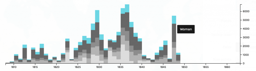
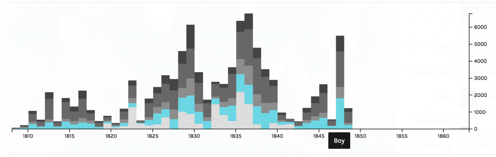
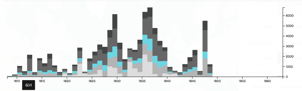
The process of transforming my research question to suit the concerns of network analysis taught me a great deal about Gephi. I quickly learned that the approach I took to my general research interest in mapping the relationship between the cartographer and the rastaman through place in Kei Miller’s The Cartographer Tries to Map a Way to Zion was not so much concerned with relations within the text as simply visualizing geography. Instead of attempting “to portray a new unfamiliar territory” I only considered portraying a familiar one (Lima 80). With some more thought about relationships between words that may be fruitful to my research I came to was: How are words that signify systems of measure used beyond “Quashie’s Verse” — the poem in the collection I am most familiar with. This included rereading the collection and looking out for words that are related to measurement of some kind. For additional efficiency I searched for keywords in an electronic copy when I identified them in order to see if the word was repeated elsewhere in the poetry collection. Though I considered using Voyant to do a differential reading I decided against it because I was focused more on specific word choice than on word frequency for example, so it was necessary to do a close reading. Examples of the words I found are “measure”, “arc”, “distance”, “miles” and “length” — each appearing at different frequencies. The process of creating the nodes and edges table prompted me to read around the words I found, for some words surprised me, and I discovered language of measurement is almost only used by the rastaman and not the cartographer. What was not so surprising was that he uses these words to demonstrate the indeterminacy of European systems of measure, or the “immappancy of dis world” (Miller 21). With this in mind I was more prepared to delve into the cartography of networks.

This is the first visualization I created with a smaller data set for testing, the spatial quality of this visualization produced randomly by Gephi inspired my interest in creating a network that aesthetically mirrored the mathematical, even angular imagery invoked by cartography.

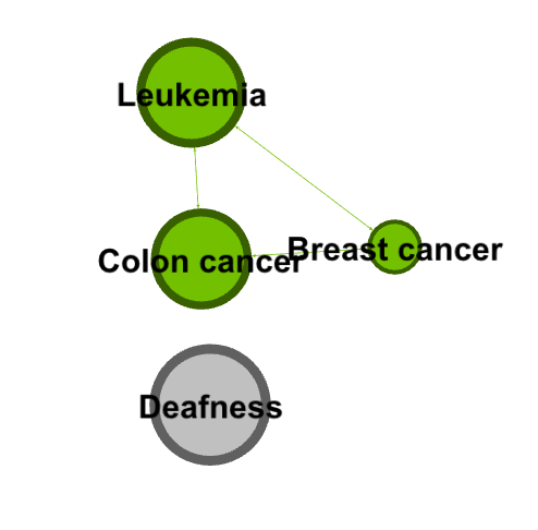
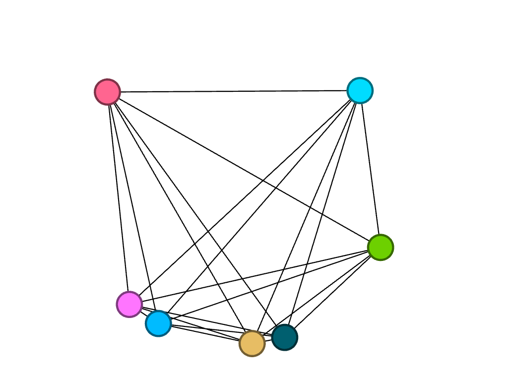
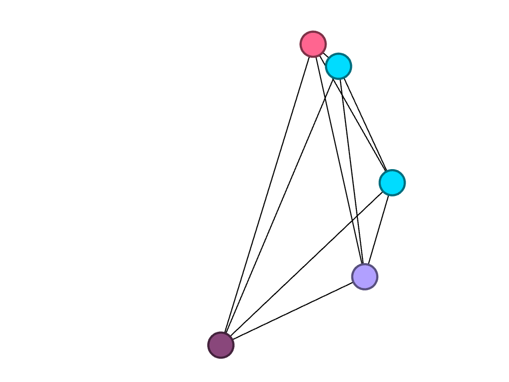
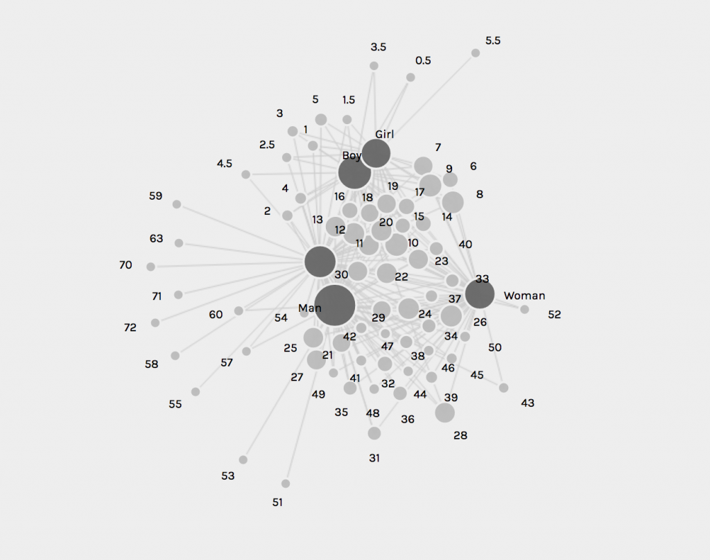
Creating the visualization allowed me to map the relationships between words related to metric in Kei Miller’s The Cartographer Tries to Map a Way to Zion. This was particularly fruitful considering the cartographic concerns of the text. The nodes are words signifying systems of measure, and the edges represent occurrence in the collection, which each word is attributed to a particular poem in the collection.

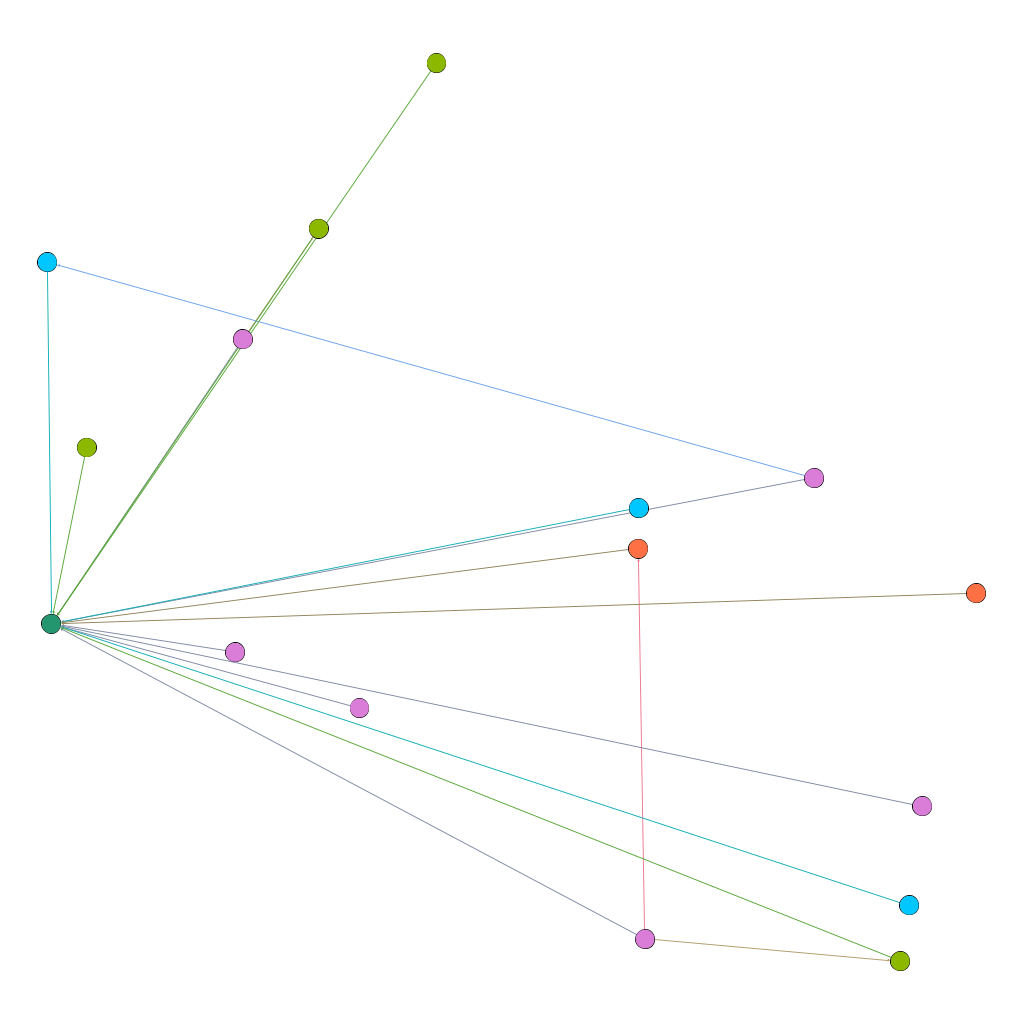
This is an ego network, where the words the rastaman uses concerning measurement are linked to him, and each node is partitioned according to degree, the colors of the nodes and edges representing the poems that have the most connections in the network. However, I did not find this method of visualization particularly illuminating.

This visualization was created using Force Atlas, with an increased repulsion strength

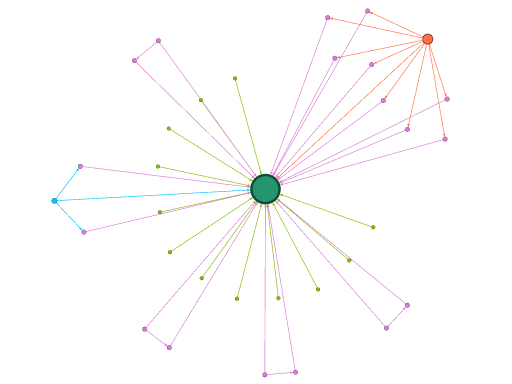
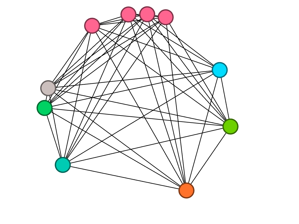
I was fascinated by the shape proceeded so I did not change the layout. Instead I partitioned by modularity class and found the results eyeopening. Seeing the communities of poems grouped according to the linguistic connections between them gave me more insight on Miller’s project with his collection. It reaffirmed Lima’s statement that “network visualization is also the cartography of the indiscernible, depicting intangible structures that are invisible and undetected by the human eye” (Lima 80).

Here, I changed the partition to modularity class, which added clarity and generated new ideas

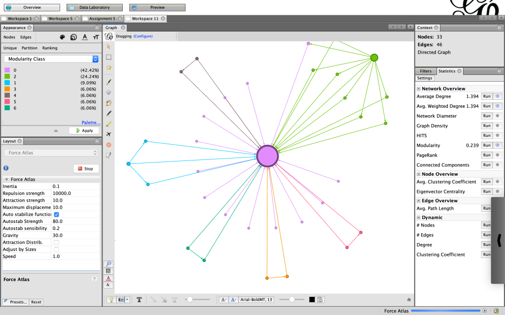
I felt more confident about my choices knowing that “The best community detection approach is the one that works best for your network and your question; there is no right or wrong, only more or less relevant” especially since I am not mapping a community of people, but rather a community of words (Graham 229). Reading Graham’s work was particularly helpful to understand the elements of networks in general and each of the functions on Gephi in particular. Moreover, the approaches to creating a network in practice were useful. Instead of sticking to what I thought was the only “correct” way to proceed – a Hypothesis-driven network analysis – I felt free to be more exploratory, knowing “that the network is important, but in as-yet unknown ways” (Graham 236).

My Final Visualization

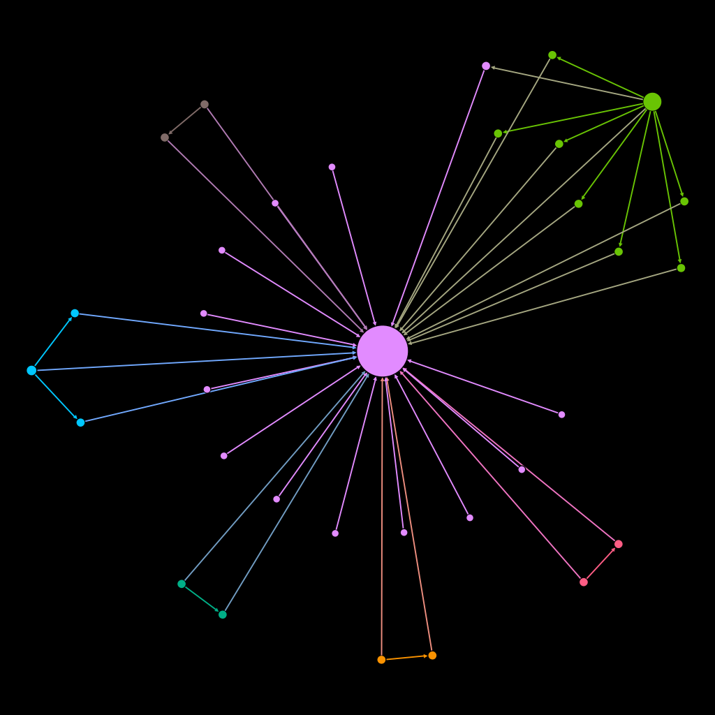
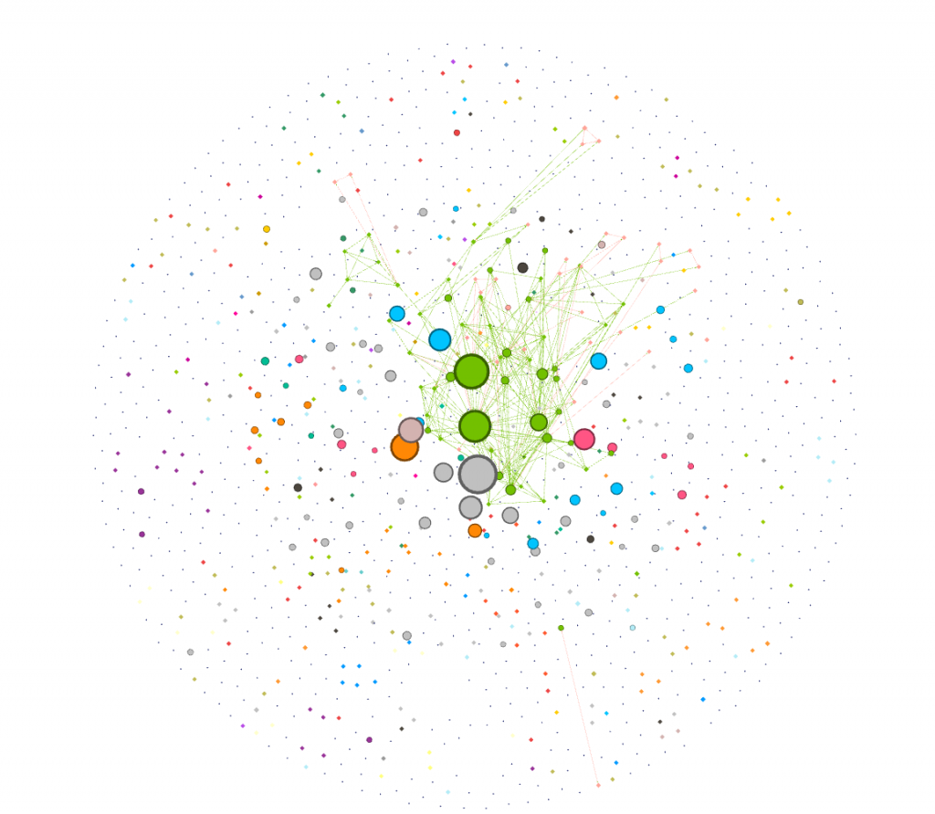
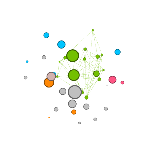
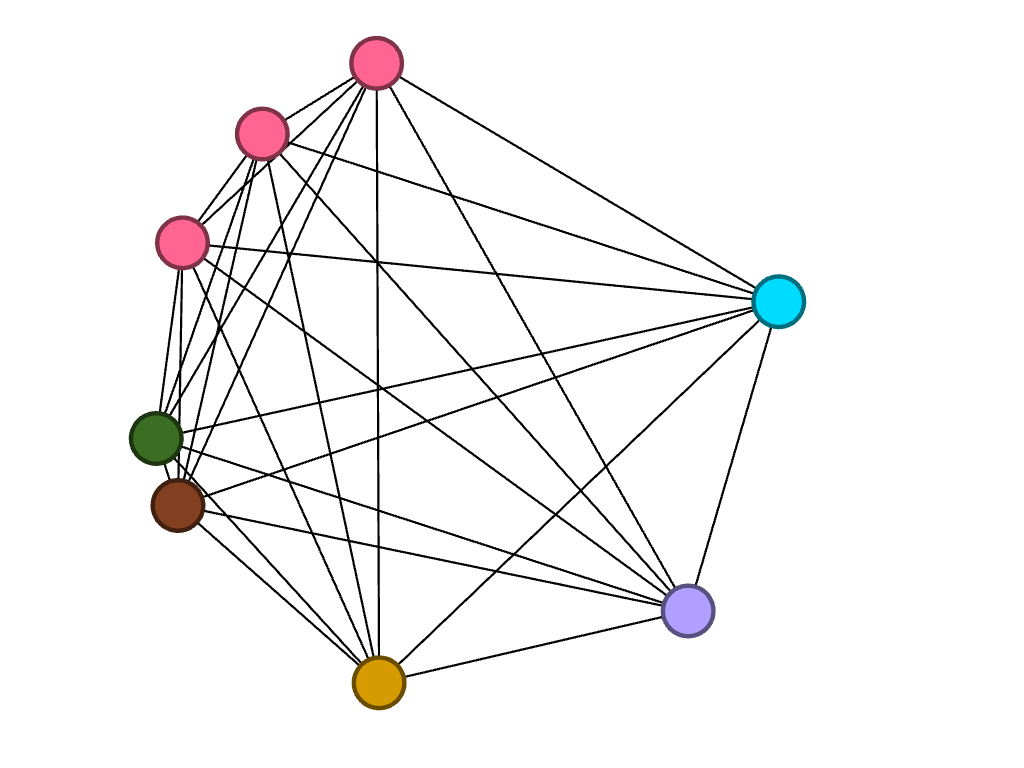
For my final visualization I chose to use a black background to highlight not only the color but also the unique shapes produced by the network. The shape at the top right corner was of particular interest because it resembles a spider. The spider, specifically Anancy, is a figure mentioned in the collection who plays with and plays on language, governing the process of interpretation. Seeing a version of Anancy appear in this new map prompts me to think more about how maps can be visible or invisible, and ways that lines, measurements and algorithms may be humanistic. “You cyaa climb / into Zion on Anancy’s web – or get there by boat or plane or car” (Miller 62). This web invoked by the visualization does not arrive at Zion, in the same way the cartographer discovers there is no one way to map a place that is not quite a place.

Categories
Uncategorized

Assignment 5

I chose to analyze a dataset of diseases and genes and how they are interconnected. I think the visualization method employed was very effective for this particular data set — I really appreciated the structure of network diagrams. Networks work really well for data in which there are many nodes with multiple, complex connections. Lima articulates the beauty of networks: “Cities, the brain, the World Wide Web, social groups, knowledge classification and the genetic association between species all refer to the complex systems defined by a large number of interconnected elements, normally taking the shape of a network. This ubiquitous topology, prevalent in a wide range of domains, is at the forefront of a new scientific awareness of complexity…” (Lima 69). The relationships of different diseases to each other would be hard to visualize in any other way. The complexity and multiple layers of this data were the most interesting part to me, which is why I chose to focus my analysis on how the most connected disease (colon cancer) is connected to other diseases within the set.

With this set of data on diseases, I was initially interested in visualizing how many of the nodes in this network were cancer, and how these nodes were connected to each other. To find this out, I first used the inter edges filter to filter for just cancers (6.2% of the data).

filtered for cancers

I was curious about which cancers were the most connected to other cancers. I dragged the degree filter under the inter edges filter, as a sub filter, and gradually eliminated cancers that had a low degree number from my visualization. I added labels in as the visualization shrank to show which cancers were the most connected. I have screenshotted the steps I took and included them below.

filtered at: 26
filtered at: 76

Next, I went to the Data Laboratory to see a complete list of all the cancer that colon cancer was connected to. I filtered for Colon cancer (114), and waited for targets to show up. I was presented with a long list of ID numbers. One challenge I had with gephi was that I had to go back to the main data set and cross reference the filtered IDs to find the names of the cancers (I wish the edges tab, where I filtered this data, had a column for name as well!). 

colon cancer and targets (this was only half of the targets)

I then filtered my visualization by modularity to detect communities. I filtered it further by degree to make communities and their relation to colon cancer more clear.

I found that learning gephi was slightly easier than the other platforms. I mainly learned through experimentation, and trying different filters and settings until I learned how to filter towards the specific part of the data I was looking at (cancers). I enjoyed this process of learning gephi and exploring the data. I created my visualization and my analysis through exploratory network analysis, which Graham defines as being based around the idea that: “ the network is important, but in as-yet unknown ways”. Researchers “ explore that dataset in order to find whatever interesting information may arise from it” (Graham 236). I took a very large data set and focused in on one area that I found interesting, and then through exploring the gephi software and the data set, I was able to pull some interesting analysis. 

Categories
Assignment 5 Uncategorized

Assignment 5

Building networks is a complicated process, requiring much analytical thinking and an understanding of multidimensional data. Using programs like Gephi allows for a parsing of complex relationships between this data. I happened to work with Gephi briefly during my foundation seminar of freshman year, but not nearly as in depth as we are now. Initially, working with Gephi in this class was intimidating, as there was so much to learn and it doesn’t seem as user friendly as the previous platforms we have worked with.  However, after spending a few days playing with the program and finding new things, I’ve found that Gephi’s many benefits allow for a powerful visualization. I decided to build my own dataset on demographics of the Bucknell Women’s Cross Country team, with the intent of discovering and analyzing the different majors being studied by the women of all four class years as well as finding any trends that there may be within the data. I began the process by sending out a survey to collect the information before creating the CSV file containing the data.  At first glance, I immediately noticed biochemistry to be a frequent major. This was exciting for me, as I was interested in how Gephi would work to display this common theme across team members.   

Due to Gephi only allowing for a mapping of relationships between the same types of nodes, the process of portraying what I would like the viewers to understand has been particularly difficult for me. When discussing the purpose of nodes and edges, Graham says,  “Everything about a network pivots on these two building blocks” (Graham, 202). In networks, nodes can be further defined by attribute rather than seen as just dots. Each individual node is representative of each team member, and the edges refer to the undirected  relationships between them. Because the connections I chose to make between people (major) have no beginning or end, the relationships can be considered as “rhizomatic relationships” (Lima 44). Rhizomes acknowledge multiplicity in data. They “connect any point to another in  a way that allows for a flexible network to emerge” (Lima 44). Gephi was able to create a flexible network that could I could parse further to produce the relationships I portrayed. I filtered by degree and got an average degree of 28.8, representing the number of edges adjacent to each node.

There is no modularity in my data set, as all team members were already connected due to being a part of the same team. In a way, the team is it’s own “small world.” Each member (node) is interconnected with one another through an edge, simply because  they are apart of the same “world.” When choosing which layout to apply, I began by using the circular layout due to it being simple and easy to understand visually. Graham states, “It is easy to become hypnotized by the complexity of a network, to succumb to the desire of connecting everything and, in doing so, learning nothing” (Graham 201). Therefore, I knew that I wanted my network visualization to be as simple as possible. Nodes are colored based on major. The edges occupying the rest of the visualization are the connections between each member of the team.  I then reconstructed the original layout by dragging nodes of the same major and placing them alongside each other to allow for an easier visual of the frequency of each. My network formed the following: 

overview mode
preview mode

It is clear from this overview that there is a dominant major among team members, which happens to be biochemistry. I can’t infer any reasoning behind this through my data set, but I thought that it was an interesting trend that I knew I wanted to look more closely at. I have learned that because there are no arrows connected to the edges between nodes, the relationships between each node are equally significant, having no direction in the relationships. 

So that the user can add to the depth of their network, the program allows for a search of metrics that provides more insight into the overall network. I chose to first partition by major which allowed me to visualize how many people belong to each major category. Those who shared the same major had more connections to each other than to those of different majors. Because I chose to look into the frequency of the biochemistry major throughout the team, below is the visualization displaying the nodes directly linked to each other through the biochemistry “edge.” Filtering my data through partitioning by major allowed me to create the following: 

partition filter

I then decided to partition by class year to look at what majors were studied by girls of different years, in particular, biochemistry. Because the nodes are all different colors, I found that of the seven freshmen, no majors were shared:

Of the ten sophomores, biochemistry was a common major between four people, represented by the four pink nodes closely connected to each other.

Of the eight juniors, three of them are studying biochemistry.

Lastly, of the five seniors, only one studies biochemistry. However, two of them study biology, which is represented by the connected blue nodes.

As Lima said, network visualization allows for the portrayal of “intangible structures that are invisible and undetectable to the human eye” (Lima 80). By filtering the data in the way that I did, I was able to visualize something that may not have been so obvious before.  Gephi allowed for me to explore the cross country team’s academic side, something that I don’t consider very often. I liked discovering that biochemistry seems to be a subject of interest among my teammates, despite not knowing of a correlation behind reasoning.

Categories
Uncategorized

Assignment 3

In creating this visualization, I first charted the country of origin and the date of arrival. Then, I further filtered the map by looking at a chart of gender, and which years numbers of different genders came. The graph compares the amount of men and women arriving in the 1800s. Specifically, I am looking at the years 1820,1830, and 1848. 

First graph of arrival and country of origin
Filtered graph of male and female slave arrival

In the year 1820, the amount of slaves arriving dropped dramatically. 1820 is one of the lowest points on the graph in terms of both men and women arriving. The spatialization of data on the graph allowed for me to very easily see at which points the numbers were the lowest. Based on this dip in numbers, I did some research on why this might be. In 1819, a bill was passed that allowed armed cruisers to patrol the coasts of the United States and Africa to supress the slave trade. Another act in 1820 ensured that the slave trade was came under piracy laws, which was punishable by death. Ships were despatched to defeat slave traders and pirates. So laws and policies in and around 1820 provide some explanation for the drop in slave arrival.

In 1830, there was a spike in the arrival of slaves. This spike is one of the highest on the chart. Something I found interesting about this year was the ratio of men to women slaves was closer to equal than at any other year on the graph. The var graph as a mode of visualizing allowed me to see this phenomenon very clearly. As Drucker discusses, visualizing data in the most fitting form is essential in preventing distortion or misinterpretation, and in allowing the viewer to gain the most knowledge from the visualization. The bar graph allowed for me to understand both the overall amount of slaves arriving at certain dates, and to compare the amount of each gender arriving. In terms of why so many women arrived in 1830, I did not find a lot of historical explanation. One theory I had was that the spike in slaves arriving in and around 1830 made Nat’s Rebellion, which occurred in 1831, more possible. The increase in slave numbers could have increased confidence and a “strength in numbers” mentality that fueled the rebellion.

In 1848, there was another big spike. This spike was interesting because again, it is one of the largest spikes on the graph, and it is surrounded by very low numbers in slave arrival. One possible explanation for this drastic increase in arrival is the Mexican-American War, in which the United States gained control of the Mexican territory. With this new area, there was bound to be some expansion and demand for more slaves, despite general anti-slavery sentiment that was growing in the country. Additionally, reports from this time showed that American ships were not pursuing slave traders. 

I think the visualization of how many male and female slaves came in the span of years is a generation of knowledge, not merely a representation. I created the gender visualization by filtering a larger visualization. From the gender graph, I then identified interesting time periods in which the arrival of both or one of the genders charted was significant. This data is generated knowledge because it is filtering knowledge that was already graphed, and displaying it new ways that lead to new conclusions. Although, as Drucker states, all visualizations are representations, or substitutions of data that pass themselves off as presentations of the information itself, focusing in on specific data points does generate more knowledge about the data set, regardless of whether that knowledge is wholly accurate or not. Charting specific parts of a larger data set, and then narrowing in on even more specific dates reveals insight that could not have been generated otherwise.

Categories
Uncategorized

Assignment 3

As Johanna Drucker described, “graphical expression is premised on assumptions about data, knowledge design, content models, and file formats that need explicit attention if they are going to be understood from humanistic perspectives and reworked for humanities projects”. Given that the data being expressed in this visualization is slave data, it is more than important to provide “explicit attention” to the model at hand. Further, as Drucker later explains, one must be aware that “data visualizations are representations”, and an observer must do their best to not pass these representations off as “presentations” (Drucker, 245). Using the African Names Dataset, I created a representation using the variables “Arrival” and “Sex”. While Palladio is often associated as the platform to be used to create an overview of knowledge, the layered timeline I was created revealed a significant amount of information that trigged me to to explore further. The graphs below are crucial in locating and understanding trends that appeared in the time of slavery. Figure 1 displays the number of men that arrived year to year, Figure 2 depicts the number of boys, Figure 3 shows the arrival of women, and Figure 4 illustrates the total amount of girls. From these series of graphs, we see a consistent trend that the total number of men arriving year to year dominate the total number of other sexes. Another prevalent trend from the timeline indicate that that there were a spike in arrivals around 1829, 1837, and 1848. In order to gain further insight on what was the political climate surrounding slavery was during these years, I decided to narrow my lens and analyze these years in Timeline JS. I want to better understand the political climate, the well-being of the economy, and the societal factors that drove a desire for more slaves. As an observer of the following timeline slides, one should note that I look specifically into the United States during the years of 1829, 1837, and 1848. While the data provided does not give light to the activity occurring within America (as the slave trade ended in 1808), I found it to be insightful to dive deeper into a world power country and their position regarding slavery. Countries around the world were looking at the United States as if it were on a pedestal, so the question I asked myself was, what kind of example were we setting for slavery to still be so prevalent around the world? 

I continued to explore other components of Palladio, including the graph tab. I created a graphical expression as indicated in Figure 5 using the variables “Disembarkation” and “Arrival”. In an Excel spreadsheet, it is quite difficult which islands were sending the largest influx of African Americans. Using Palladio to organize this specific criteria enabled me to see that Freetown sent the greatest number of slaves out for disembarkation and is the oldest port. Havana follows in later years sending a significant number of slaves out, and then the Bahamas is the smallest port of disembarkation. A follow up question this visualization led me to is why did the Bahamas only sent slaves over in 1836?

The final visualization I created using Palladio’s platform is shown in Figure 6. The graphical expression filters the variables “Sex” and “Age”. I proceeded to size the nodes to uncover what the most common age was of the arriving African Americans. It appears as though the most prevalent age of the enslaved individuals was between 20-30 years of age. While the ability to arrange the nodes and highlight them in order to get a better understanding of the knowledge being depicted, I do think the spatialization of Palladio is unimpressive. There is, as Drucker would argue, a fault in the graphical form in that there is too much information, it is hard to read. 

Figure 1
Figure 2
Figure 3
Figure 4
Figure 5
Figure 6

https://cdn.knightlab.com/libs/timeline3/latest/embed/index.html?source=1SIkS_rTR2bXGEzi-G69x9bov-7Jk4aqvwTfeq07TbQw&font=Default&lang=en&initial_zoom=2&height=650