A skill that is becoming more and more essential to daily life in contemporary time is data literacy. Especially, when one considers our world’s increasing shift towards digitalization along with the seemingly endless technological advances made daily. Much of the data that is being presented to the public eye comes in the form of digital charts, maps, tables, graphs, along with other visual displays. The days of folks reading long, drawn-out abstracts that present data in a rather bland and verbose manner are a distant memory due to the increasingly fast-paced tempo of our society. The everyday person does not want to spend a lengthy period of time trying to make sense of data, rather they want to be able to quickly look at something, process it, then get on with their day. This is why the basic skill of data literacy is important because people need to know what exactly they are looking at, and if there is something not quite right possess the know-how to identify it in a timely manner. Below are two examples of data sets that are in every sense of the word “inaccurate” and poorly presented.
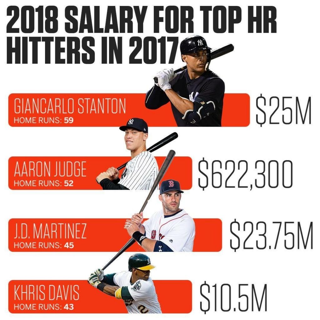
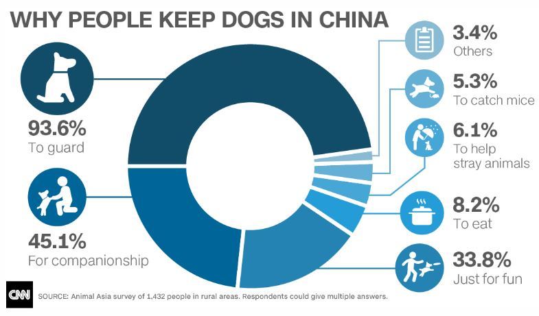
The first graph illustrates the MLB’s salaries for the top homerun earners in the 2017 season. However, the issue with this graph is that the salary of Aaron Judge is not at all proportionate with the salaries of the other players presented. An individual with basic data literacy would be able to immediately realize this and draw the conclusion that this graph is poorly done. The second data set lists the percentages of why people keep dogs in China. Almost immediately one can observe that the percentages total over 100% which from a mathematical standpoint is impossible. What can be drawn from both examples is that data literacy is crucial to prevent the circulation of false information.
Being able to read, interpret, and manipulate data is an essential skill in being able to create data visualizations. Dubois discusses in his chapter that a good visualization design can be used to communicate across cultural boundaries to display information. Data literacy is also necessary for understanding digital visualizations that are made from data sets. Without basic data literacy people would not be able to gather and understand information on public issues. A well designed data visualization, along with data literacy, the understanding of new information on issues can be expressed more easily between people and cultures.
There has to be data literacy on both sides of visualizations, the people who are making them, in addition to the people who are reading them. If one party is unable to accurately read a data set, then the information on a visual can be misinterpreted by the reader, creating false news.
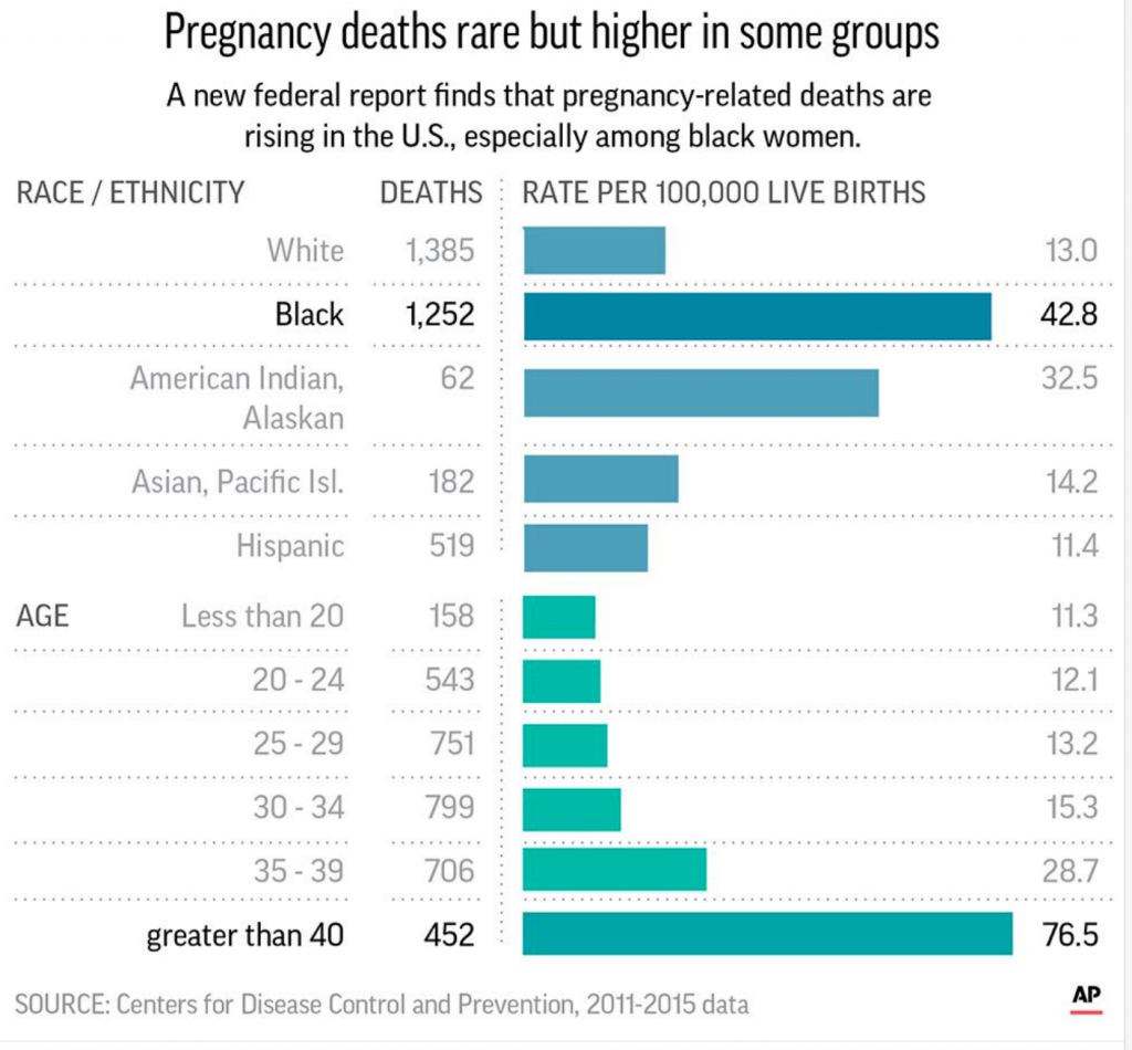
Below is an example of how someone who has done a poor job displaying data can ultimately enhance the odds of a reader misinterpret a federal report on a public issue. The Center of Disease Control and Prevention released this bar chart on pregnancy deaths rates between different groups of women to show that deaths related to pregnancy in black women is rising. However, due to how it scaled the bars, it makes readers believe that there are just as many deaths for black women as there are for women giving birth over the age of forty, which is simply not true. Data literacy in this case would be able to stop this confusion and creation of false information.
A badly created bar chart using data from Centers of Disease Control and Prevention. https://viz.wtf/
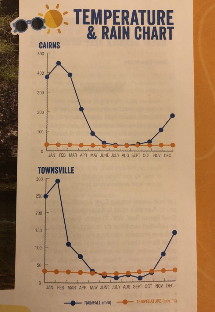
The Temperature and Rain Chart below from https://viz.wtf/ also displays how data literacy is absolutely necessary in creating visuals to display basic information in a simple manner. Having two set of information being shown on a single y-axis is confusing for readers to interpret. As seen below, it looks as if the temperature never changes throughout the year, but the amount of rainfall drastically does- this is not the case though. The scale does not fit both variables. If the person who made this chart had a stronger knowledge on data literacy, then the trend that the data showed between temperature and rainfall could have been displayed and gathered by readers.
A poorly made rainfall versus temperature chart https://viz.wtf/
In today’s fast paced technological world, data visualization is extremely important. People spend very little time reading and taking in information; they have very short attention spans. Accordingly, it is important to have data literacy skills in order to properly interpret and question information presented to you. Quick passes are often not enough to catch important information. Knowing some basic data literacy skills can help spot misleading data quickly. Our discussions and reading this week alluded to the biases that can be present in data. In addition to biases in the actual collection of the data, biases can be present in the data presentation, misleading the consumer into false conclusions about the data.
We analyzed a few examples of poor graphics in order to examine the core principals that they violated. The two examples I examined are below.
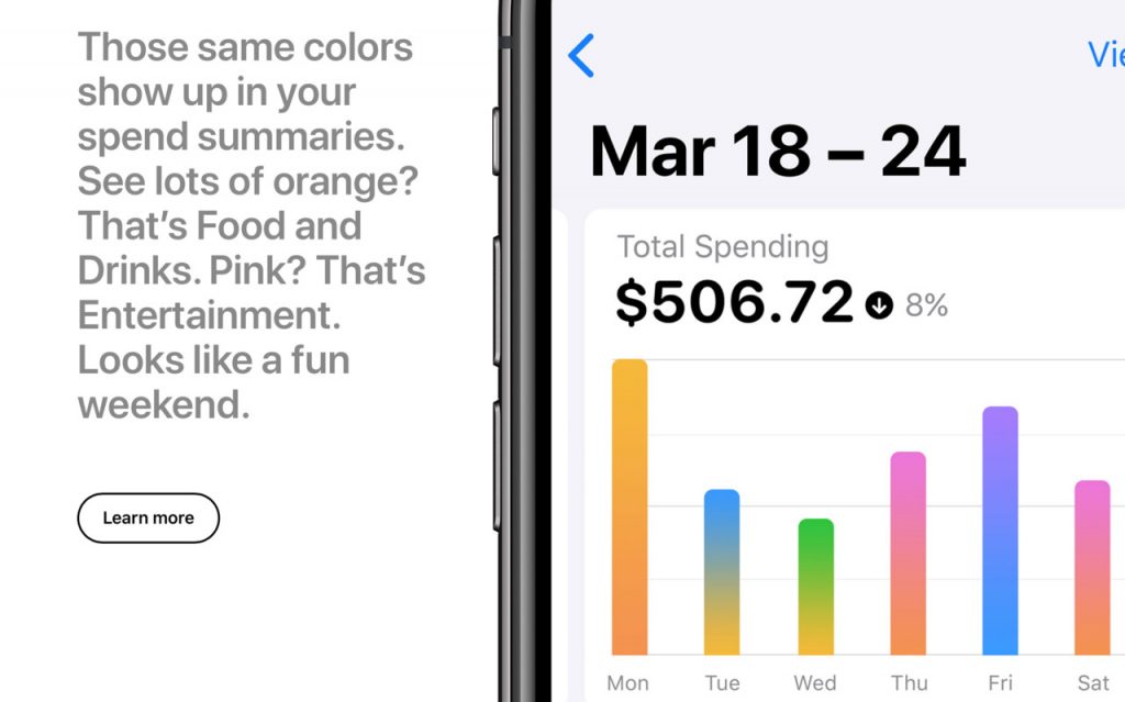
Apple graphic
This first graphic violates the principal about scale. They mention that orange is food and drinks and that entertainment is pink. However, they do not provide a scale. It is impossible to tell where orange ends and pink begins, they just melt together. The user essentially gains no information from viewing this graph. Also, while the relative magnitudes of the days can be seen, a lack of a vertical scale also makes it impossible to tell how much was actually spent. It looks like Monday ~2* as much money was spent as Tuesday, however it could be $1 vs $2 or equally it could be $100 vs $200.
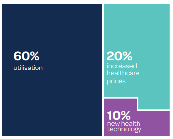
This graphic has major issues on all accounts. First off, besides the obvious typos, the numbers do not add up to 100%. There is a 10% segment that is not counted, which is misleading. Additionally, the block on the left is the same size as the two blocks on the right added together, however the block on the left is double the combined percentage of the two on the right. It should therefor be twice as tall. This violates the lie factor.
“Then it dawned upon me with a certain suddenness that I was different from the others; or like [them perhaps] in heart and life and longing, but shut out from their world by a vast veil. I had thereafter no desire to tear down that veil, to creep through; I held all beyond it in common contempt, and lived above it in a region of blue sky and great wandering shadows.” (DuBois, The Souls of Black Folk)
The metaphor of the veil described here can be extended to the invisible mechanisms that inform data sets and systems created by dominant groups in positions of power. There is a veil that covers the visualization of data – the end product of these systems – and data literacy has the potential to make us aware of its invisible presence. Contrary to the belief that data is pure, scientific and unbiased, “Bring Back the Bodies” highlights the discriminatory potential and the harmful realities of disembodied data collection and analysis, which misrepresents bodies under the guise of objectivity. One salient example of this is the visualization design technique used to depict maps. Maps are often mistaken to be “truthful, accurate, and free of bias” but feminist philosopher Donna Haraway draws attention to “the god trick.” In explaining this trick that renders the bodies involved in the map’s creation invisible she also equips her readership with data literacy. From this point we have more tools to analyse the complex operations that lead to data visualizations.
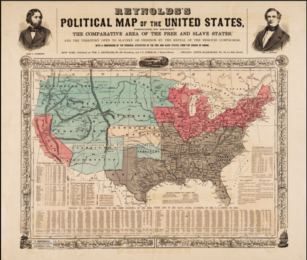
The goal of the one who wants the viewer to focus on the “big picture” is similar to that of DuBois who lives above the veil. What is different is that his data visualization is a response to the ‘default’ position of the privileged. Not only does DuBois illustrate his double consciousness through language, it is also illustrated visually in his contributions to the American Negro Exhibit. “For example, the map depicting routes of the African slave trade… which served as the lead image for the Georgia study, situates Georgia (represented by a star) at the center of the map’s diasporic cartography, bringing the Georgia study into the orbit of the global scope of the second series while also maintaining its more local orientation” This technique bears similarities to “Reynold’s Political Map of the United States” found in Persuasive Cartographies.
This map uses census data with a clear political agenda. In order to have a persuasive effect he manipulates the appearance of the ‘objective’ map: “the relative size of the northern states is reduced and that of the southern states is increased, as if the globe is being viewed from above the southern states, foreshortening the northern ones” (Reynolds). Data literacy positions the one visualizing the data with the ability to construct a persuasive argument grounded in verifiable/good quality data. Furthermore, bodies are present on the map, indicating the diversity in perspectives. Similarly, DuBois chooses to highlight specific parts of the world and locates his data as central to a particular place. These perspectives are not “the view from nowhere” that Haraway critiques, we know who the data is about and the intentions behind who is portraying it. Another advantage of data literacy is manipulating data to tell your story.
This task is not an easy one:
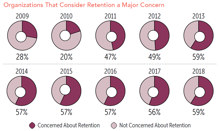
The manipulation of the “donuts” here, is a misuse of data visualization. Though each one is meant to represent an equal amount of time, each donut is created differently with no one “donut hole” in the same place. Despite the years 2014-2016 measuring 57% they all appear unequal in value. Data literacy allows us to distinguish between good representations and poor ones, and encourages an awareness of the implications of these successes and failures.
Data visualization is the vehicle for crucial data to be presented to the public. The “Bring Back the Bodies” reading points to how good data visualization can uncover injustices and inform the public. The article uncovered how little data there was on women’s childbirth and rates of death, and also how black mothers were at higher risk during childbirth than white mothers. Data literacy is essential for public understanding of such issues. The Dubois chapter touches on how data visualization can be specific for specific cultural topics, like how current day data visualization of the Harlem Renaissance refers back to visualizations in 19th century that connect to slavery. He also discusses how good design can be used to communicate beyond cultural barriers, specifically in how he conveyed American racial data to a European audience. Data literacy facilitates understanding connections between issues, importance of new data, and provides a method of universal communication through design with people different from you.
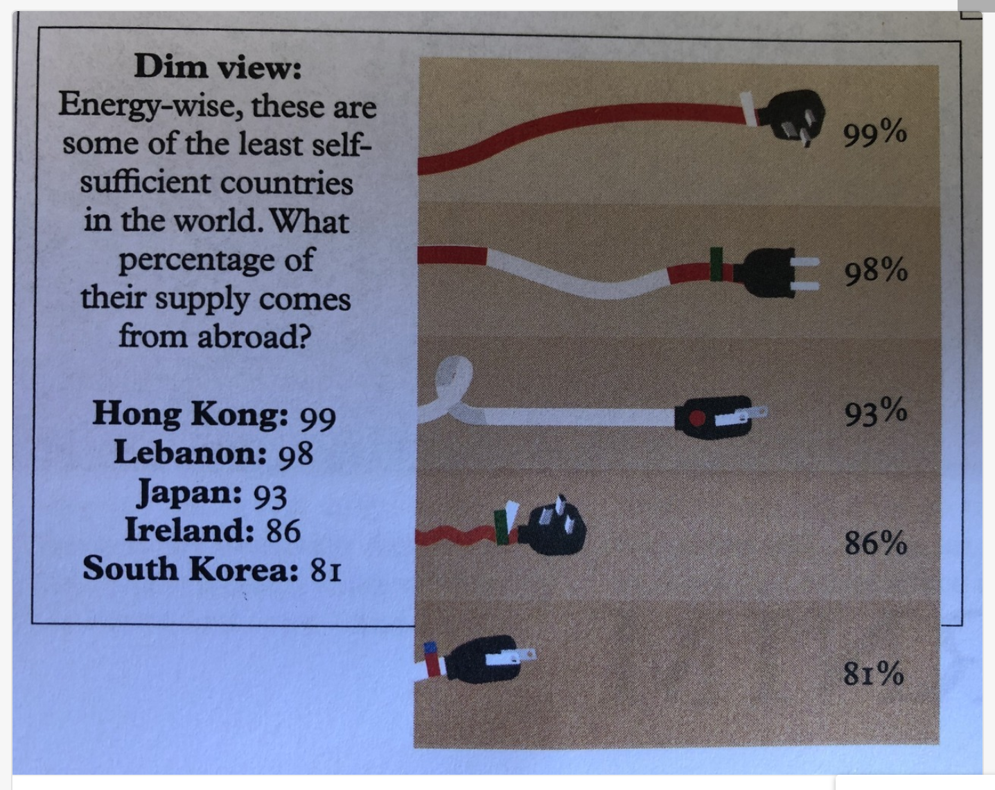
Even if one has good data literacy skills, sometimes a poorly created graphic can make data impossible to understand. For example, this visualization attempts to compare what percentage of these countries’ energy comes from abroad. Poor size representation skews the information – – the 81% chord is a fraction of the size of the 99% chord.
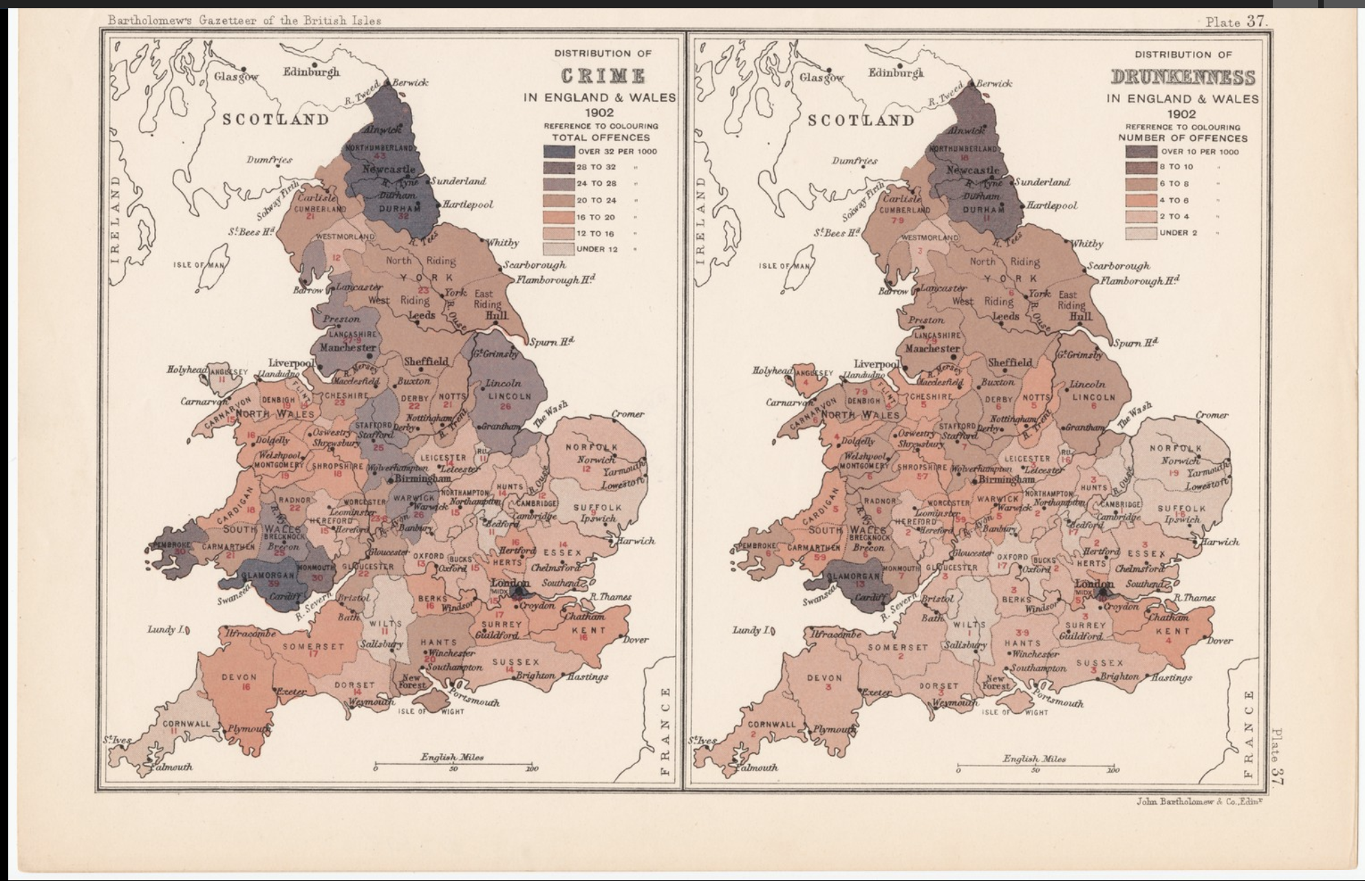
On the other hand, here is an example of data visualization done well. This graphic compares the total offenses (per 1000) of drunkenness versus crime in England and Wales. It has a clear key that explains which colors correlate to the amount of offenses and the presentation of the maps side by side conveys the comparison well.