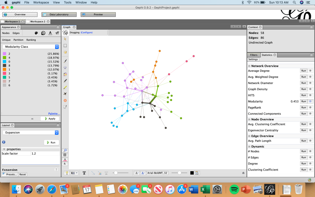
Though initially frustrating to use and maneuver, as became more familiar with Gephi and its functions, I actually grew to like it more as well. I was chiefly concerned about the lack of an “undo” button – a button that I have come to realize I ordinarily rely heavily upon. The moment I reframed this in my mind from a bad thing to a good thing was the moment I began having fun with Gephi, in the sense that every click of every button was done with intent rather than simple exploration of the program.
With this, I knew that whatever data set I chose, it had to be something I was comfortable with – I wanted to make sure that I knew exactly what it was that I was exploring. As we looked in class at examples of social networks, dialogue between characters in Les Mis, and other datasets I browsed on my own, I discovered that I was actually really fascinated with network visualizations. When initially clicking through premade datasets, I tested the effects of pressing buttons like “filter” and seeing how it would impact the visualization. As I became more familiar with Gephi, though, I knew what questions I could ask that Gephi would be able to answer. I would be able to look at the visualization of the Marvel Cinematic Universe, for instance, and know how many times Iron Man interacted with Thor.
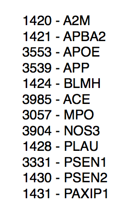
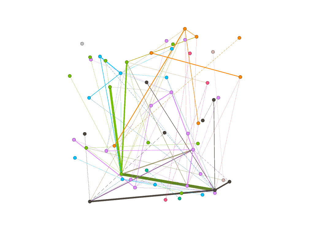
For my visualization, I chose to do an “exploratory data analysis . . . based around the idea that the network is important, but in as-yet unknown ways” by inputting my own data from my water polo team roster (Graham). I wanted to look at connections between my teammates based off of their home state, which club team they played for in high school, and whether or not they are in the College of Management at Bucknell. These connections are complex in that their variables are “highly interconnected and interdependent,” which are integral components of network visualizations (Lima).
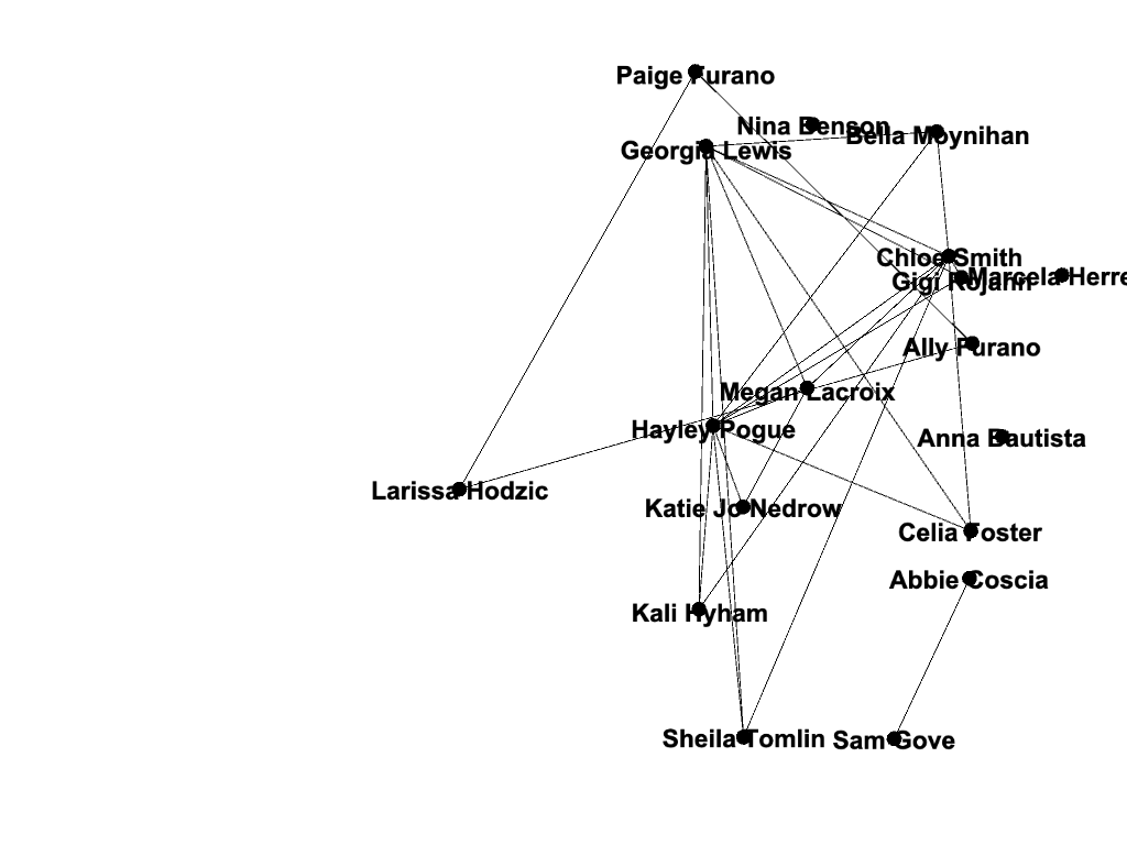
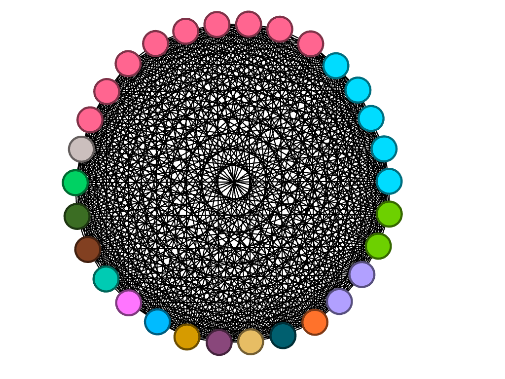
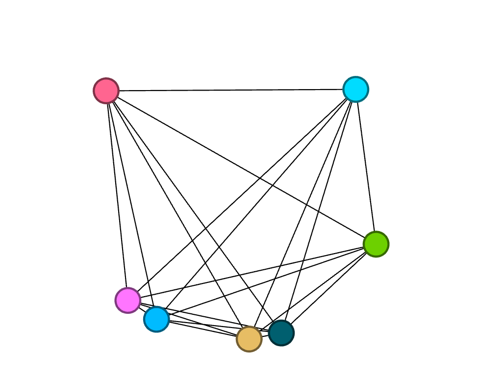
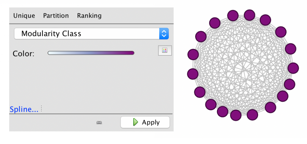
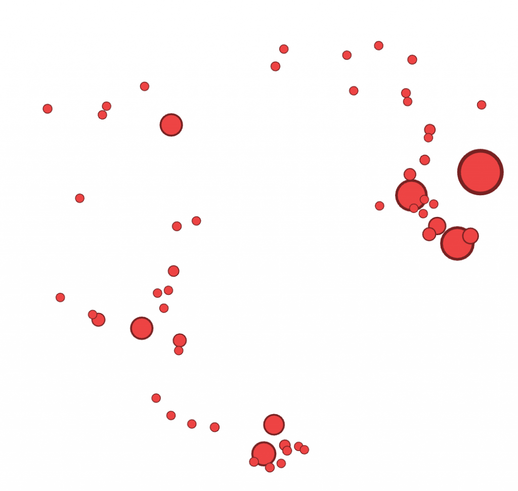
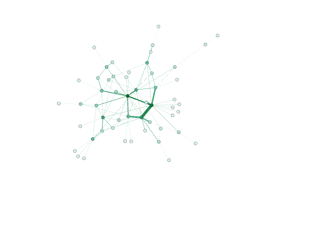
No filters 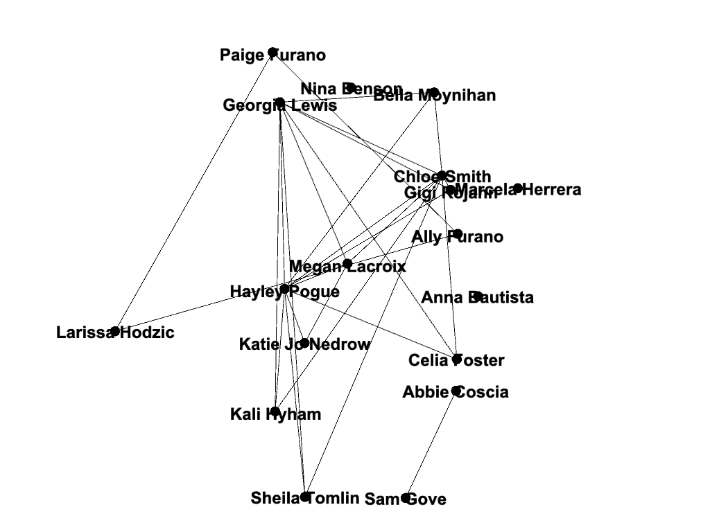
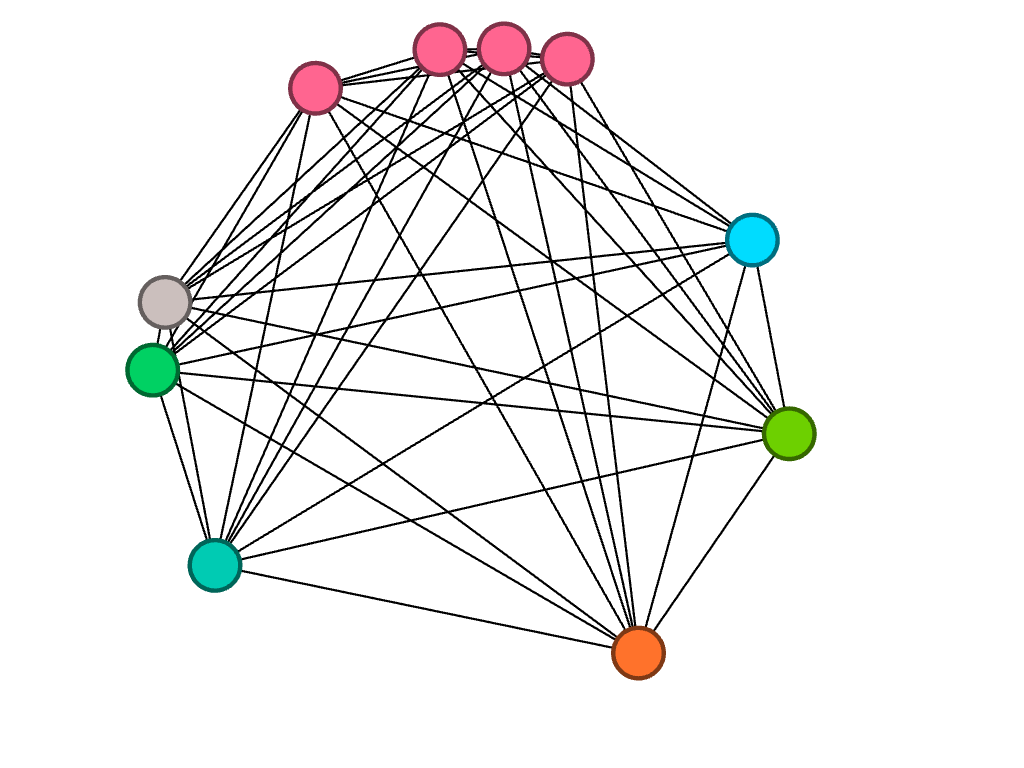
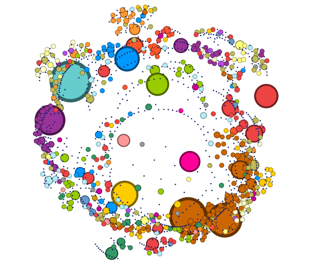
Filtered by modularity and degree 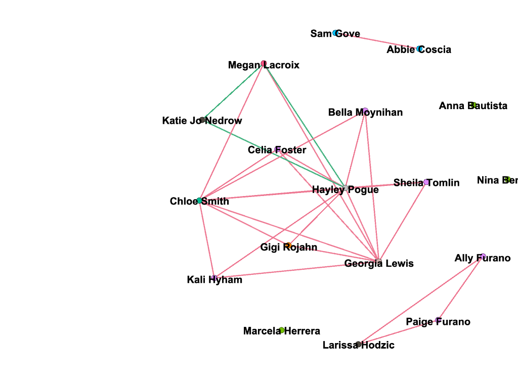
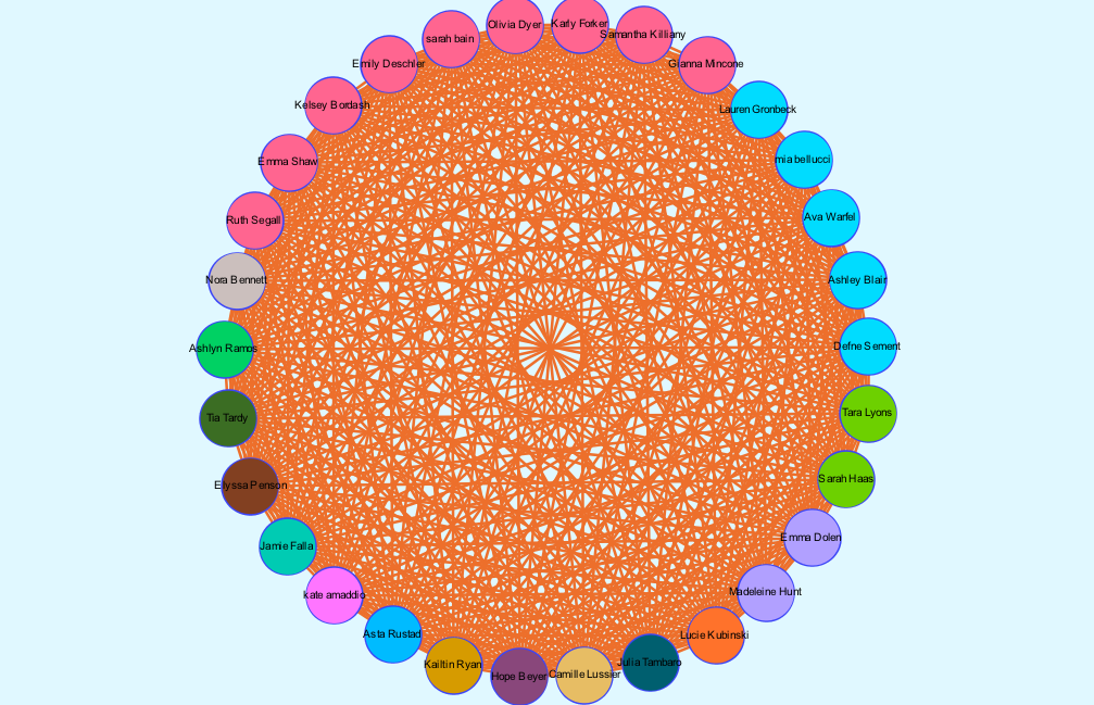
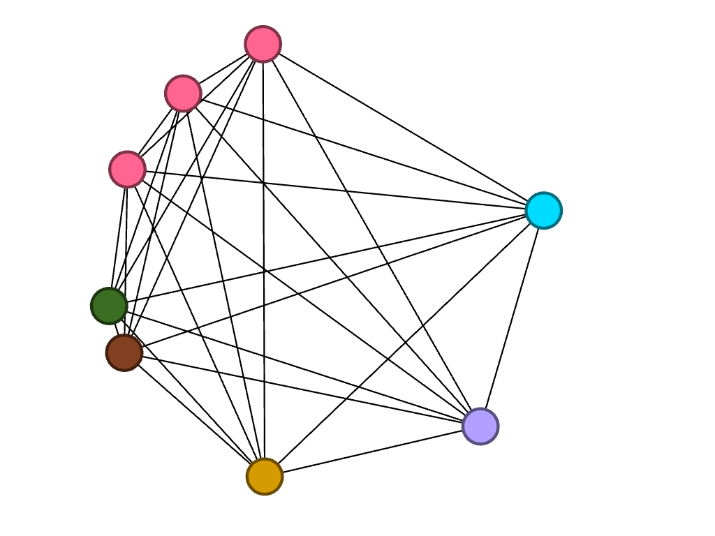
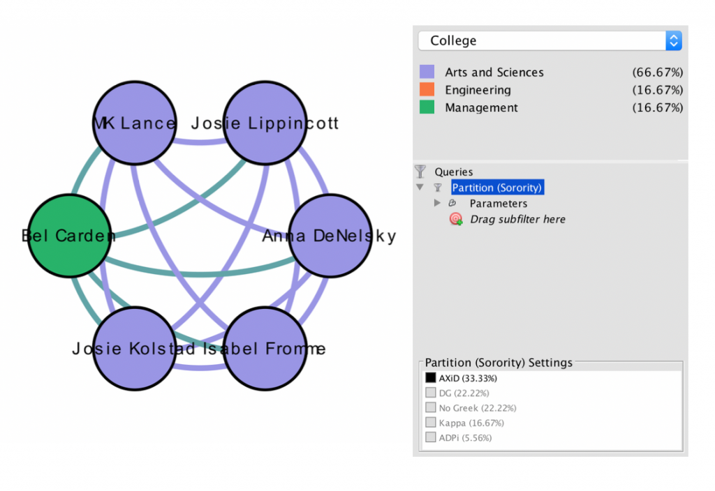
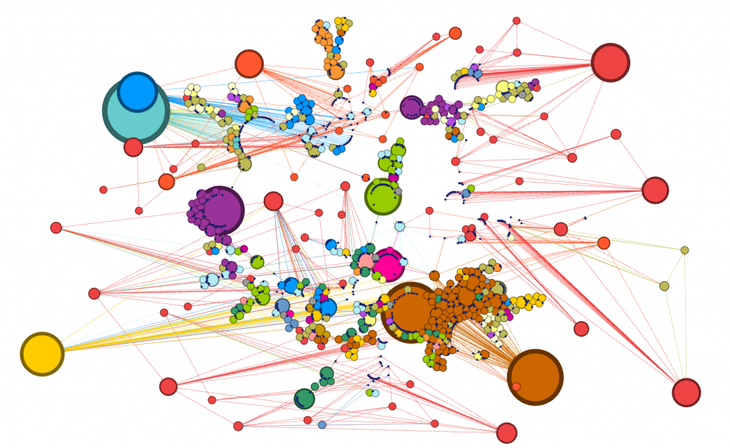
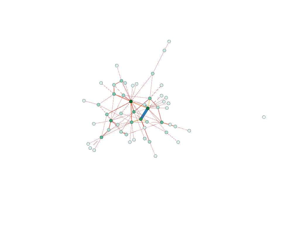
Filtered by college, partition (home state) and edge type 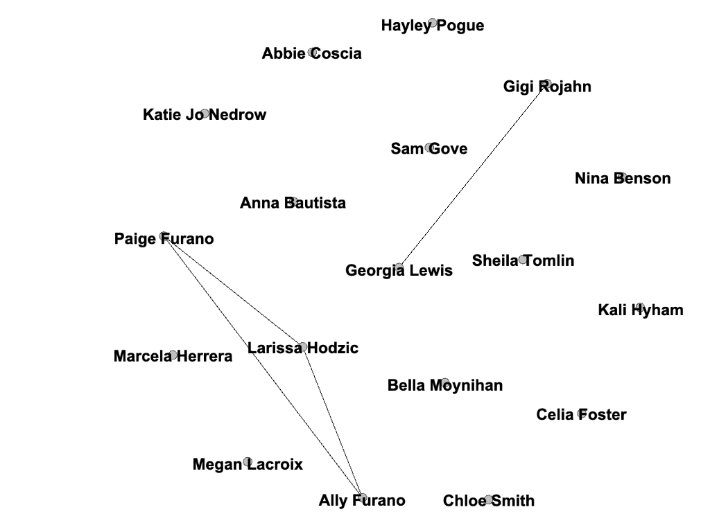
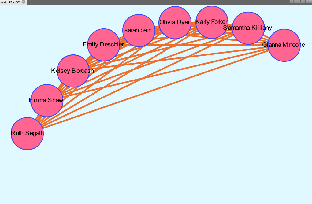
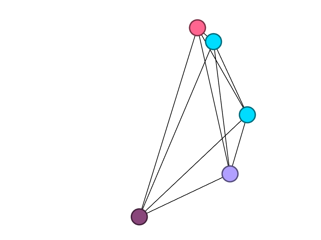
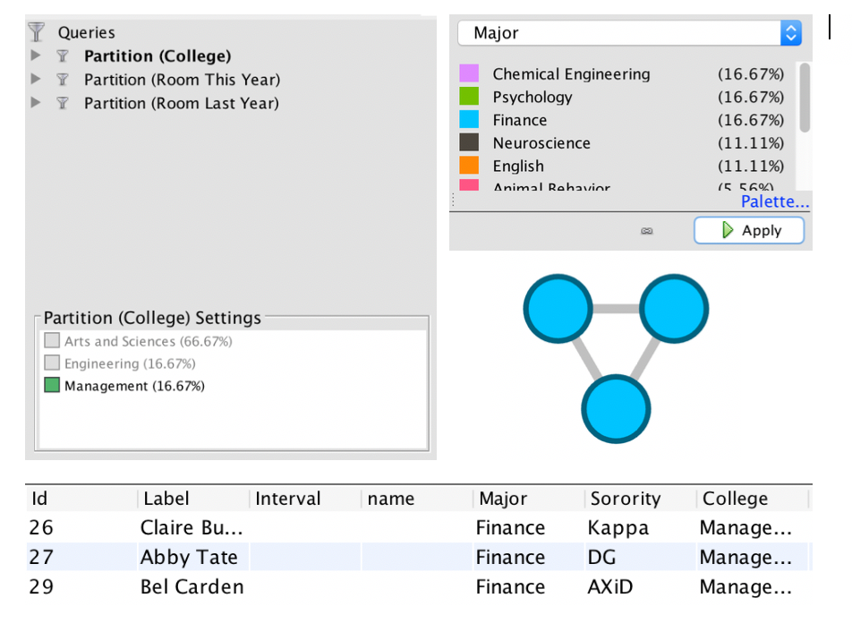
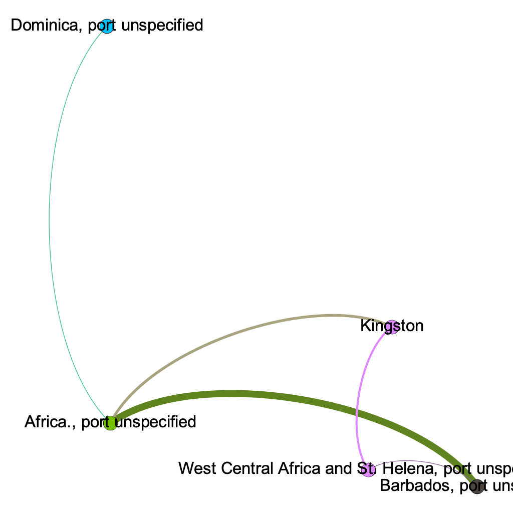
Players who played for the same club team (before Bucknell)
As demonstrated by the network, many of my teammates are from California; this shared quality is the most prevalent commonality within the parameters of my network. This makes sense because water polo is a sport that, in the United States, is most popular on the west coast (likely due to the warmer weather and outdoor pools). If we had a team comprised of international students (which isn’t uncommon for water polo teams), my prediction is that the visualization representing club teams would be much more connected. In countries like Serbia, where water polo is a very popular sport, there are only a few club teams, and even fewer that play at a high enough level to pique the interest of US college coaches.
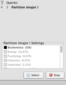
I also found it interesting that only three of us are in the College of Management. Most of my other teammates are in the College of Arts and Sciences, though their majors range anywhere from biology to international relations.
Unsurprisingly, two individuals in particular had a lot in common: Ally and Paige Furano, a junior and a sophomore, respectively. They are sisters and have played water polo together since the very beginning. Larissa Hodzic played for the same club team as them in high school, so these connections existed before they even entered Bucknell as freshmen. It would be interesting to add the men’s roster to my visualizations to see how our teams have crossed paths throughout the years.
I chose a random or “stochastic” layout, which is possible and legible using my data but “becomes more difficult to read as a network grows” (Graham). I used the stochastic layout because I thought it was unique; though my team functions as a unit, the network allows me to see how – at least at a very basic level – many of us are also different, some of us being so different that we aren’t even connected to others within the visualization! People who are otherwise key players on the team may not be central to the visualization; I think that this is interesting because it acknowledges the power that the creator of the visualization has and the bias that he or she may inadvertently have over the network’s structure. This network would look very different if I had chosen different parameters, but I didn’t – and that is the power of the creator. The importance of the network is that it demonstrates facets “such as decentralization, emergence, mutability, nonlinearity, and ultimately, diversity,” and yet it is critical that viewers are aware of the potential for information bias, even within this context. Overall, Gephi has been a very useful tool for me in illustrating the importance of looking at visualizations critically, and to take everything with a grain of salt. I would be interested to know how connected my team would be if I took more random variables into consideration.