Categories
Assignment 3

Assignment 3

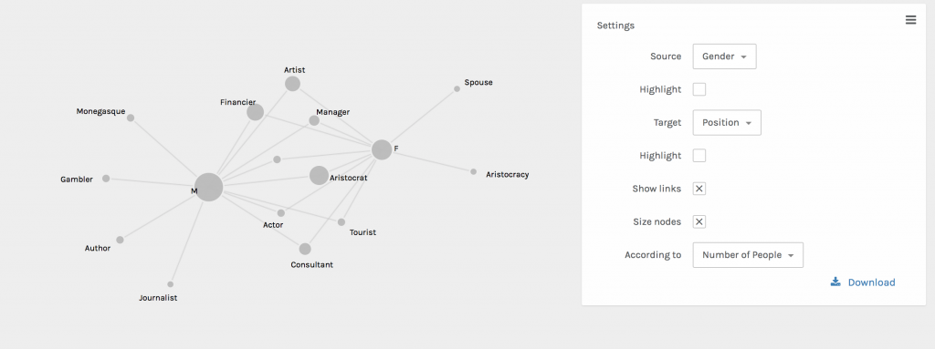
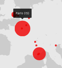
Using the Trans-Atlantic Slave Voyages dataset, I decided to look at the relationship between the European colonial powers, the largest ports for slave disembarkation, and the years in which the most slaves landed at them. After first looking at the dataset, I saw that Bahia and Rio de Janeiro both had the largest number of slaves land at them, and I hypothesized that there must be a reason for Brazil to need such a large number of slaves, more than any other region. 

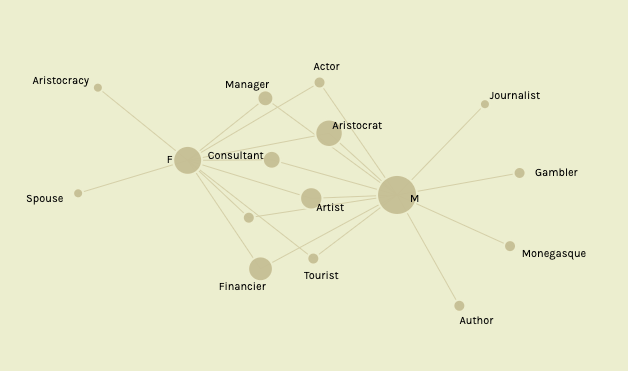
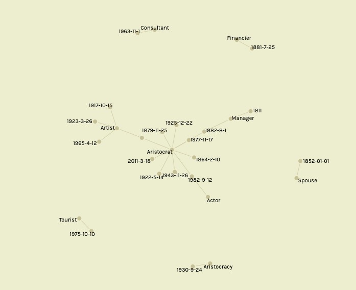
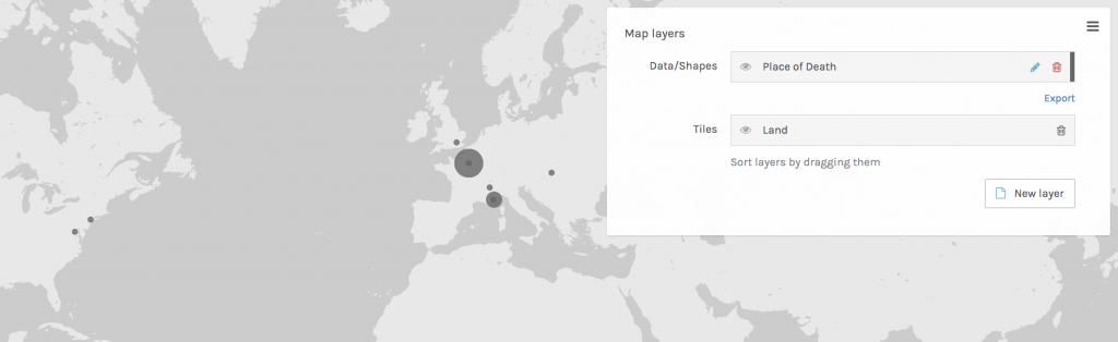
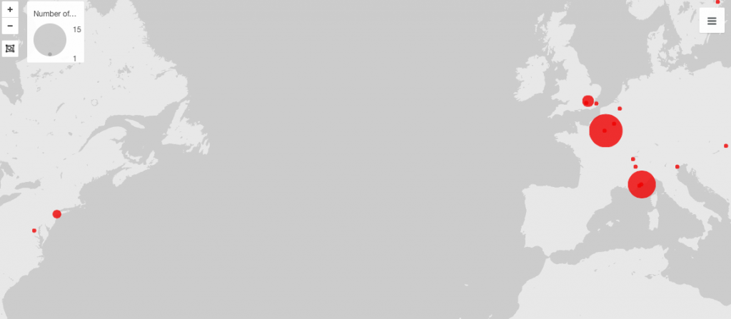
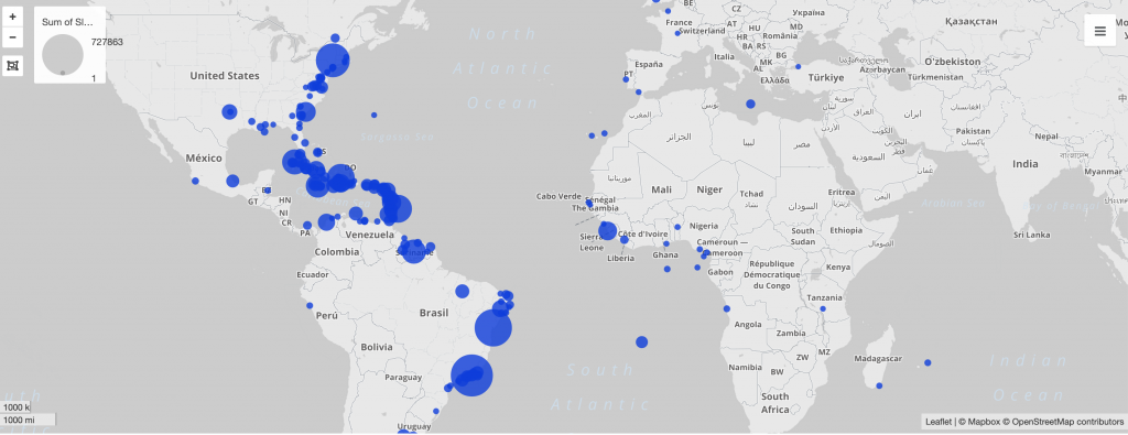
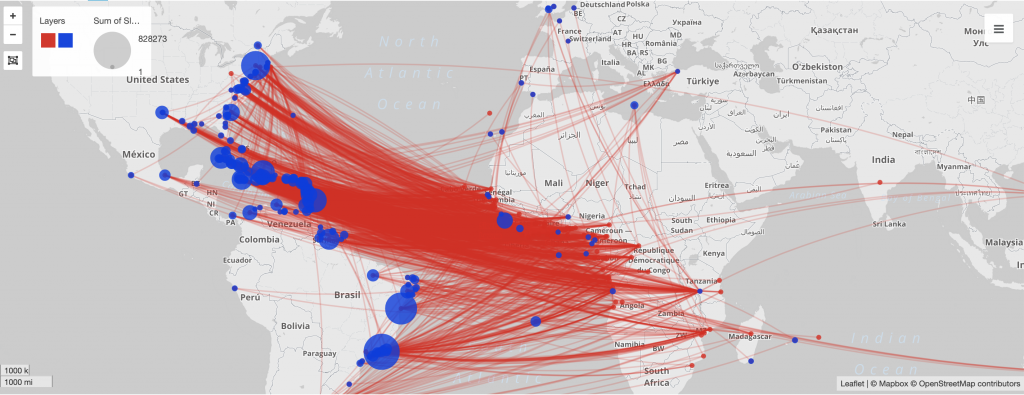
In Palladio, I used the dataset to not only map, but put a timeline to the connections between Portuguese colonies and the number of slaves entering into them. Figure 1 displays the relative number of slaves that arrived at each port, and where those ports are. I then mapped in Figure 2 the connections between these landing places with the place of purchase for each slave, which produced a map that proves that the majority of the slaves in the Americas were bought from African colonies. I then narrowed in to looking at the largest landing ports, those of which were in Portuguese colonies, and took a closer look at where exactly those slaves were being purchased in Figure 3.

Figure 1: Landing sites of slaves sized to number arrived at port
Figure 2: Place of slave purchase to landing sized to number arrived at port
Figure 3: Place of slave purchase to major landing ports in largest Portuguese colonies

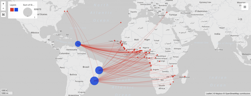
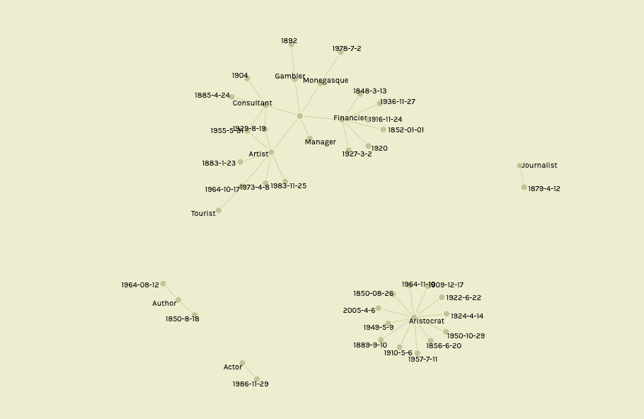
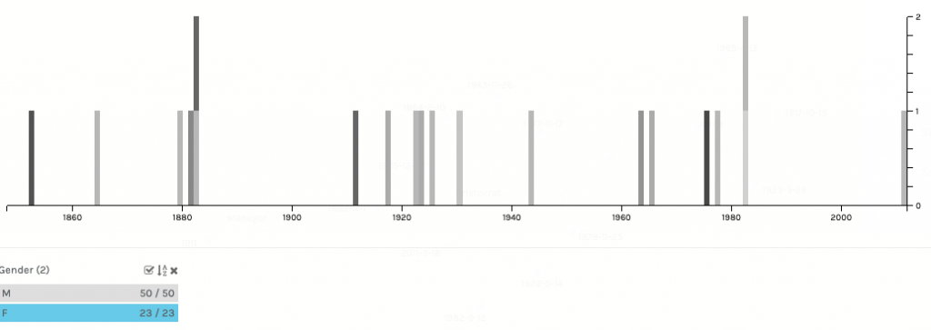
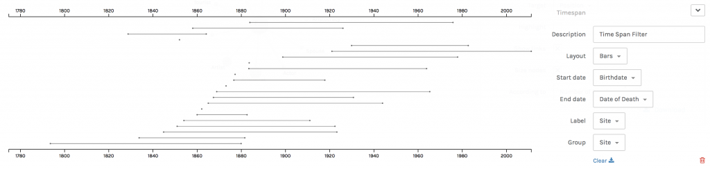
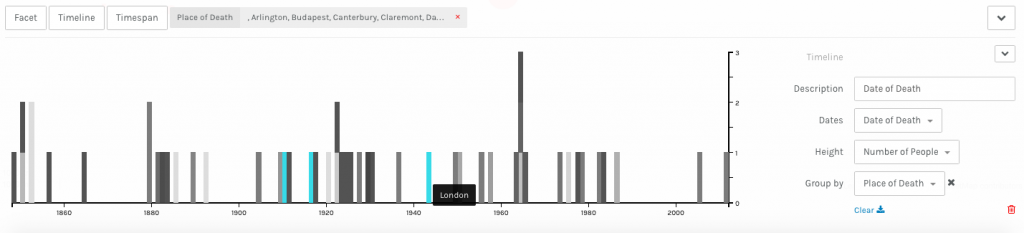
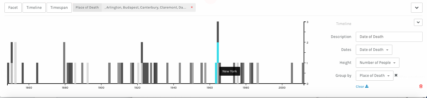
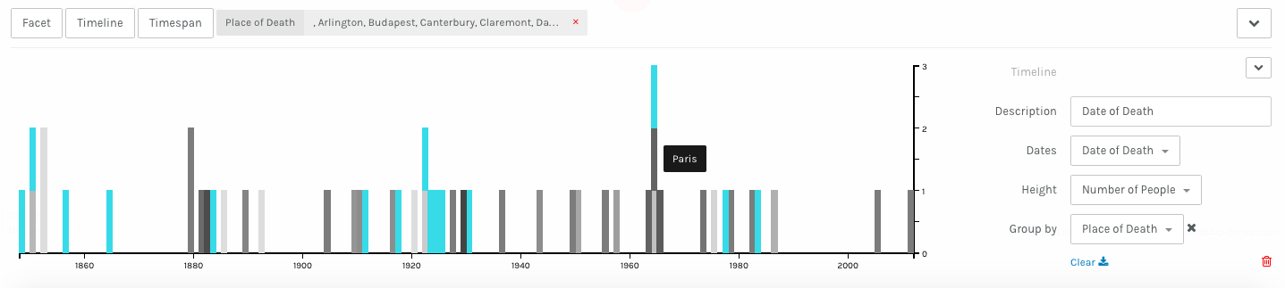
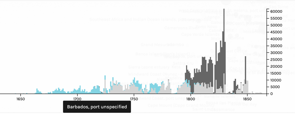
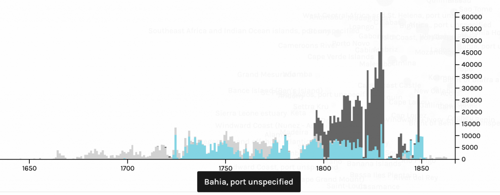
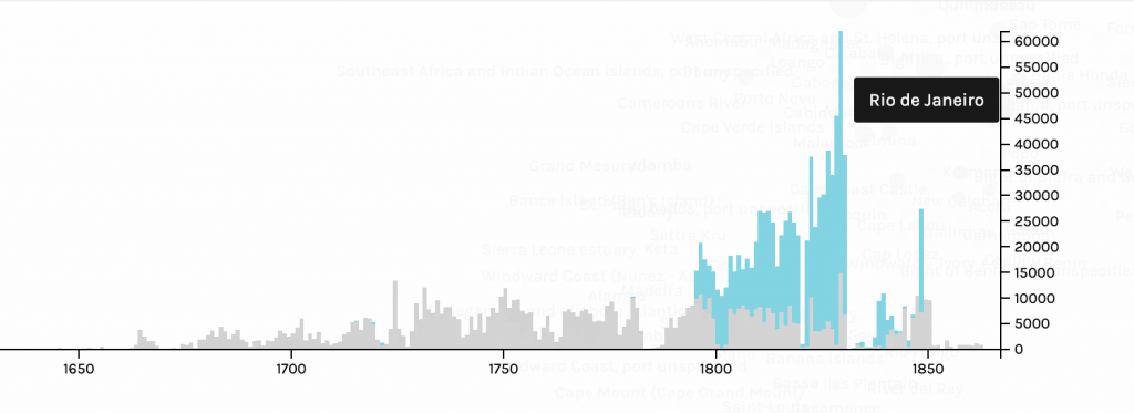
After looking at what ports received the most amount of slaves, and finding out that many of them indeed come from the Western coast of Africa, I wanted to put a timeline to the Atlantic slave trade between Portugal and Africa. In Figures 4, 5 and 6, I highlighted the number of slaves that each landing port had between the years 1650 and roughly 1880. In both the ports in Brazil, Bahia and Rio de Janeiro, there was a significant spike in the number of slaves arriving in the late 18th and early 19th century. I wanted to find the reason for this, and after looking in to it I found out that not only did Portugal have a colony in Angola, a major slave trading colony, that there was a boom of gold fields that were discovered in Brazil in the 18th-early 19th century. More slaves were needed to work in the fields, which resulted more slaves being imported to Brazil through its two major ports, Bahia and Rio de Janeiro. As seen on the timeline, there is a sharp decline in slave trade in the mid 1800s, which can be further explained through Brazil abolishing slave trade in 1851 and then Portugal closing the last Trans- Atlantic slave trading route in the late 1800s.

Figure 4: Number of slaves landed in Barbados per year
Figure 5: Number of slaves landed in Bahia per year
Figure 6: Number of slaves landed in Rio de Janeiro per year

Visualizations are able to explain datasets and bring out patterns in them in a way that an excel spreadsheet is unable. The type of visualization greatly affects what information will be extracted from data and how it will be perceived by viewers. As Drucker states, “the means by which a graphic produces meaning is an integral part of the meaning it produces” (Drucker, 239). This idea is essential in making visualizations from datasets. I was able to display the pattern between Portuguese colonies and their large influx of slaves imported in the 18th and 19th century by using mapping and timelines to visually make the key patterns pop out to the viewer. Without mapping and the use of a timeline, the connection between Brazil, a Portuguese colony, Portugal, Angola, and the boom of gold fields would not have been made.

Categories
Assignment 3

Assignment #3

In working with the Cushman Collection data, I was curious about the relationship between an individual’s gender and their position in the workforce. I theorized that – especially during the earlier years of the dataset – men would hold positions that were considered more prestigious when compared to positions held by women.

Positions Held by Women and Men

In using Palladio, I first wanted to look at all of the data; in this context, all of the positions held by both men and women for the provided dates. In this sense, this data is representational because the data must be understood within the context of its time. The arrangement of this visualization is important because it shows not only what positions are exclusive to men or women, but also which positions overlap in the two groups. Women’s positions that are exclusively for women are positions that embrace hegemonic femininity, or the traditional view of a woman’s place in society. The positions that are exclusively made up of women are ‘spouse’ and ‘aristocracy,’ positions that derive worth from some sort of outside source, whether it be a woman’s husband or a woman’s wealthy family. In contrast, the positions that are exclusively made up of men include positions such as author and journalist, positions that are often well-respected and viewed as legitimate. Positions that were shared between men and women range in how they are viewed by society, with the high-level shared positions being consultants, managers, and financiers. In first looking at the data, my hypothesis was that these higher-level positions would not be held by women until after the 20th century.

After getting an overview of positions held by both men and women in this dataset, I wanted to explore how these positions would be impacted with the passing of time. I did this by filtering the data by gender, then by date of the individual’s death (thus determining the time period in which they lived). Many of women’s positions shown on Palladio were post-1920s, whereas men’s positions were fairly evenly distributed throughout the available dates. In an effort to explore these relationships further, I moved onto Timeline JS to determine what was happening in the United States around this date range. I chose only a few key events and turning points to include in the timeline, because there are truly so many important events that have occurred surrounding the topic of women’s rights.

This information is valuable because, as Drucker notes, “almost all information visualizations are reifications of mis-information.” Being able to analyze the data for women’s positions in the United States both literally with regards to their careers as well as socially with regards to legislation allows viewers to gain context and understanding for the different positions that women have held over the years.

Categories
Assignment 3

Lippincott Assignment 3

Palladio Visualizations

Palladio: Sex-Segregated Workforce

When utilizing sample data on Palladio I became interested in the connections between gender and positions (occupations) in the workforce during the era this data was pulled from. When looking at the graph above I was fascinated by the amount of women who seemed to have jobs in what I assumed to be predominately male industries during the time period. As one analyzes this visualization it appears that, from the data provided, most women and men shared the same occupations. I was particularly interested in the female financier as even now the industry is predominantly male, although it is changing as we speak.

Palladio Time Span: Years Women Were Alive

When analyzing this further I took at look at the years these women were alive. The range of the years the women were alive spans from 1800 to 2011, showcasing that most of them were alive during the women’s suffrage movement. This made me believe that this movement lead to these women being some of the first females in their field. This parallels with the Palladio graph because after doing outside research on the women’s suffrage movement I understood how the visualizations were connected.

Palladio Map: Place of Death for Women

In order to conduct more research for my visualizations I created a map showcasing where the women died, assuming that they died in or around where they worked. The cities highlighted in the visualization are still leaders in the business world so I was not surprised to see Paris, London, and New York had women in the workforce. In order to tell a story with this data, and understand my findings more, I took what I had concluded and conducted my own outside research to visualize on a timeline in Timeline JS.

Timeline JS

Timeline JS: Sex-Segregated Workforce

In this timeline I utilized the insight I gained from my visualizations on Palladio to understand the time period of these events.

Timeline JS: Education of Women

When looking at the map of where women died I decided to dive deeper and see what was going on in those cities during the 1800/1900s. I came across the movement to educate women and was fascinated by it. I presume that the women included in the data I used were more involved in the workforce because they were educated. As I say on the slide: “Women saw their first chance for change in 1830. They fought for centries to be recognized as potential univeristy students. The first form of education for women was teacher training. This lead to public school being introduced across the US. In the 1940s women’s rate of literacy raised and women started to enroll in colleges and univerities. The first US women graduated with a bachelor’s degree on July 16th of 1840. This was followed by Elizabeth Blackwell being the first US woman to graduate from medical school, a prodominatly male practice. It took more than 100 years for women to account for 50% of college students. The availiblity of education contiues to grow every year.” Elizabeth Blackwell graduated from an institution in New York, leading me to assume that women could attend college there, leading to them finding jobs in the city. I think that this time period was very crucial for society and the women’s suffrage movement as it allowed women to enter the workforce with the same education men had.

Timeline JS: Woman in Finance 1877

I also wanted to conduct more research on the woman who was in finance. By doing research on her I learned that: “Marie Charlotte Blanc was born in Fance. At the age of fourteen she entered the workforce as a maid. After the death of her husband in 1877 she operated the Monte Carlo Casino. As a finiancer she redifined the sex-segregated workforce. Blanc continued to run the casino and worked with Charles Garnier to build the Opéra de Monte-Carlo until she died in 1881.” Marie Blanc was one of the earliest women I have learned of that worked in such a male driven industry so early in the movement for women’s suffrage. Although she did not necessarily ‘apply’ for the job she took over graciously and was able to build another profitable building, the opera house, from her experience with the casino.

Timeline JS: Women’s Suffrage Movement

In order to tie together my three visualizations on Palladio and my other two slides on Timeline JS I conducted research on the US Women’s Suffrage Movement. The important dates I found include: “In 1848 Cady Stanton writes ‘The Declaration of Sentiments’ sparking women’s activism for decades to come. 1919 The senate finally passes the Nineteenth Amendment and the ratification begins. August 26th of 1920 American women win full voting rights.” I expected the suffrage movement to have impacted the events I addressed. I was surprised to learn that the movement started after the other events, causing me to believe that the development in the education of women as well as women starting to enter the predominantly male work force were leading factors in to the start of the Women’s Suffrage movement. Below I have included a link to my Timeline JS work.

Learning from Drunker, Meirelles, and Lima

Drucker emphasizes the importance of reading visualizations as graphical expression accurately is crucial. The data used to create these visualizations was taken from a spreadsheet organized by columns and rows, a form of graphical information. This form allows users to document a system of relations thus creating meaning from numbers. I feel as though when utilizing Palladio to showcase data is creates visualizations that are representations not necessarily data sets. Drunker shares that information visualizations can frequently showcase “mis-information” and through my experience I understand why. Without using Timeline JS and outside research to aid your visualization, data is sometimes hard to analyze and understand, and as I learned on Assignment 2 you cannot always trust your data!

Meirelles argues in chapter three that our concepts and corresponding visuals are organized around linear and cyclical times. Linear times can be visualized with timelines, like I used for the years women in my data were alive. These timelines are chronological and sequential narratives of historical events, which help readers of visualizations understand what they are looking at.

Lima discusses in chapter two the importance of network visualization. The graph I created showcasing the connection between gender and jobs is an example of a network as it is a connection of nodes (the job or gender) and the links that connect a person to a position showcasing a connection.

Categories
Assignment 3

Assignment 3

Lima’s Chapter Two discusses the transition from trees to networks in the world of data visualization. He describes network visualization as an “ubiquitous data sphere,” containing tangled networks of nodes and links, representing huge volumes of data while using optimal screen space. Networks are an omnipresent structure, symbolizing data as a non-hierarchical autonomy, almost as an art of multidimensional behaviors from which we can reveal new knowledge and patterns as well as abstract new meanings

I used the sample data set in Palladio to analyze a set of relations on the names in the data set based on the place of death according to the number of people that died at those locations. I added a point-based map layer from the data, focusing on place of death. Through my visualizations, I found that more deaths occurred in Paris, Moraco, New York, and London than in any other locations in the set. This conclusion was drawn from the bigger node sizes on those locations, due to my size points being based on number of people. The visualization allows the viewer to hover over each node, and a tool top then indicates how many people from the data have died in that location. Examples are included below.

Palladio Map: Place of Death

Furthermore, space and time are two significant concepts in the digital humanities. Meirelles writes that our concepts and corresponding visuals are organized around the difference between linear and cyclical times. Linear times can be visualized with timelines, typically represent historical time. Timelines contain chronological and sequential narratives of historical events, using space to communicate temporal distance through intervals. By mapping time and events in this uniform way, it enables viewers to make an easy comparison of time intervals. In the digital humanities, digital timelines enable navigation through time by means of sliding back and forth along the structure. Inclusion of historical context and the ability to filter data by certain thresholds makes digital timelines an effective, sometimes detailed method for representing events over time.

I then used Palladio’s timeline tool to create a representation of date of death’s according to the number of people, grouped by place of death. This created an easy-to-read, interactive visualization that allowed for me to gain knowledge of numbers of deaths in each country during certain time periods according to the data set. Taller bars correspond with a greater amount of deaths and by hovering over each bar, it highlights and indicates which country is being focused on. Below, I have inserted a timeline screenshots focusing on London, New York, and Paris to demonstrate this portrayal.

Palladio: London Timeline
Palladio: New York Timeline
Palladio: Paris Timeline

Timeline JS

Timeline JS is an open-source tool that enables anyone to build visually rich, interactive timelines. Creating a timeline with this program can be as simple as using a Google spreadsheet. After doing some research, I decided to use Timeline JS to hone in on three significant events that occurred in London, New York, and Paris that may have caused an increased death count and node size at certain times. The timeline is embedded above so that viewers can interact with and grasp an understanding of the events at hand, and consider possible reasons for death rates in certain countries at indicated times in the data set.

Johanna Drucker

The means by which a graphic produces meaning is known as graphical expression. Drucker (2016) emphasizes that knowing how to read visualizations as graphical expression is crucial. One particular form of graphical information is the columnar form of the spreadsheet. Discrete boxes and the grouping of data through columns allows for a meaningful result. For this assignment we used data organized by cells, rows, and columns in a spreadsheet to generate visualizations from which we can document a system of relations to create meaning.

Additionally, Drucker argues that “almost all information visualizations are reifications or mis-information.” I agree with her claim, as I believe that visualizations are representations that seem like presentations. Viewers are often presented with a situation that is further removed from the original work. Therefore, I feel the visualizations that I created with Palladio are representations, rather than knowledge generators, of the data sample that I chose to use. They are generated using only the specific data in the provided sample, with no outside knowledge. However, the viewer can draw conclusions, similar to the ones in this post. In that case, viewers can generate their own knowledge from the visualization, similar to how I used destructive historical events to justify higher death rates in London, New York, and Paris.