Slave Location
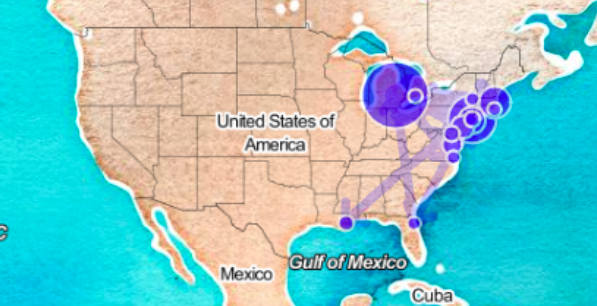
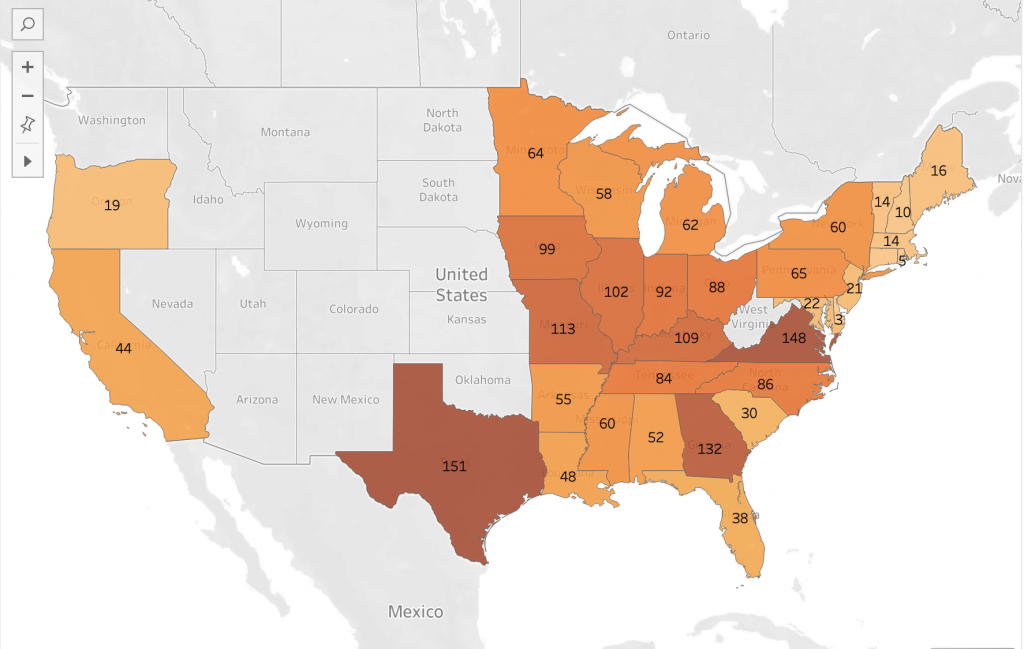
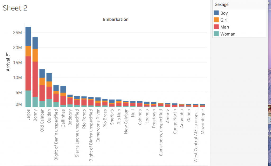
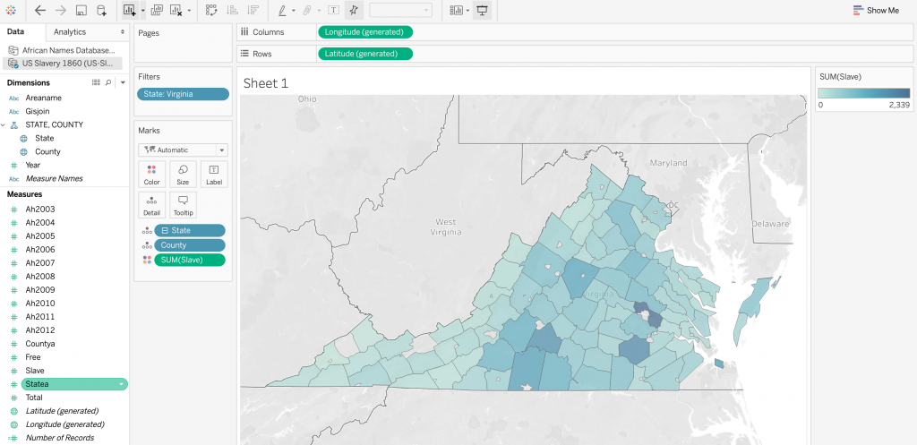
I used Voyant to analyze the seven slave narratives, those of which named locations in the U.S., by creating a dreamscape visualization that resembles a map. The map focuses in on the states mentioned throughout the narratives with circles representing each state. The bigger the circle location, the more frequently it is mentioned in the narratives. Voyant also has the ability to visualize links between states that are mentioned together in the texts. The visualization clearly shows the circles to be located on the East Coast and in the general Northeast area. This is due to the authors mentioning these areas in their narratives. Bigger, darker circles represent more popular areas in the texts. Links between states that the author mentioned together in the texts are represented by the arrows on the map. I used Tableau to create the second visualization. The program used data from the US Slavery 1860 data base to display the number of slaves of the United States on a map. A higher population of slaves is represented by darker hues of orange, as shown in the legend that I included. Although Voyant and Tableau visualize two different kinds of data, textual and quantitative, both programs seemed to display the same takeaway from the data. I thought it was interesting to notice the similarity between the two maps in the sense that the slave narratives and the slavery database focused in on similar areas of the country.
Creating two different visualizations with different programs and data to portray a central idea takes some thought. I knew to use Voyant for the slave narratives as it is a tool for textual analysis, allowing for me to sort through the words in all seven texts. At the same time, it was able to pick out which words were states, helping to create the map visualization. Tableau, being more of a tool for quantitative data, allowed for the creation of visualizations from databases. The program darkens the color of shaded states based on density. The more number of records accounted for in the data, the darker the shade of the state on the map.
However, I think that the different abilities of Voyant and Tableau did not well together to present the data I wanted, being the location and population of slaves in the United States during that specific period. Tableau created a better representation of the slave representation in the United States, spanning all the way from the North East to the South, and even over to the West. Anyone with a general idea of slavery in the U.S. would look at the visualization with an understanding of why certain states were shaded the way they are. On the other hand, Voyant’s visualization of states mentioned in the slave narratives is a misrepresentation of the slave population. The map’s nodes mainly focus on the Northeastern states, with few connections to the Southern states, which were a prominent part of slavery during the time period. This could be due to a focus on northern states throughout the slave narratives, but in regards to reasoning, I can’t seem to figure out why. Therefore, I think that using the slave narratives to create visualizations regarding slave population in the States is misleading and inaccurate. Rather, using the US Slavery 1860 data base gives a better representation of slavery overall during this time period in history.
Children
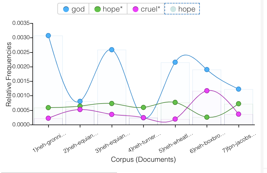
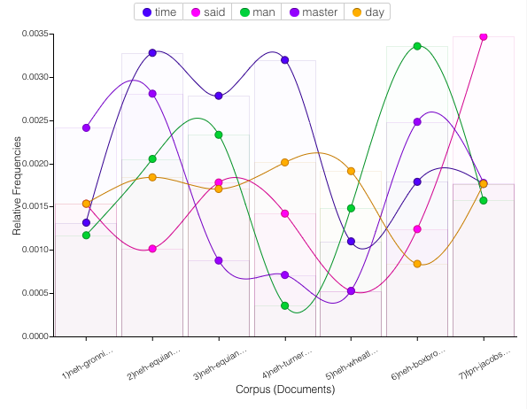
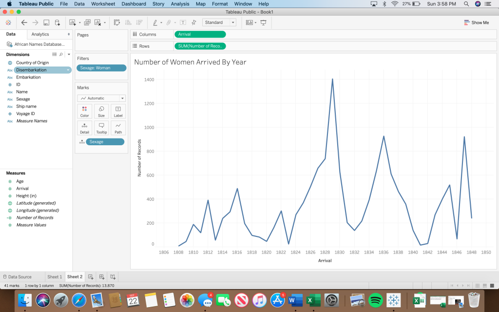
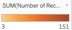
Once again, I used Voyant to portray a similar correlation between three terms throughout the seven slave narratives; child, young and sold. One could assume that “sold” is referring to being sold as a slave, so I thought it would be interesting to take notice of how often young children are related to the world “sold” throughout the texts. From the line graph I created with Voyant, an association can be made between the three terms, as their lines tend to follow the same trend throughout the narratives. Although it is sad to think about, the strong correlation displayed by the visualization makes it clear that children being sold into slavery was a prominent topic of discussion throughout the texts.
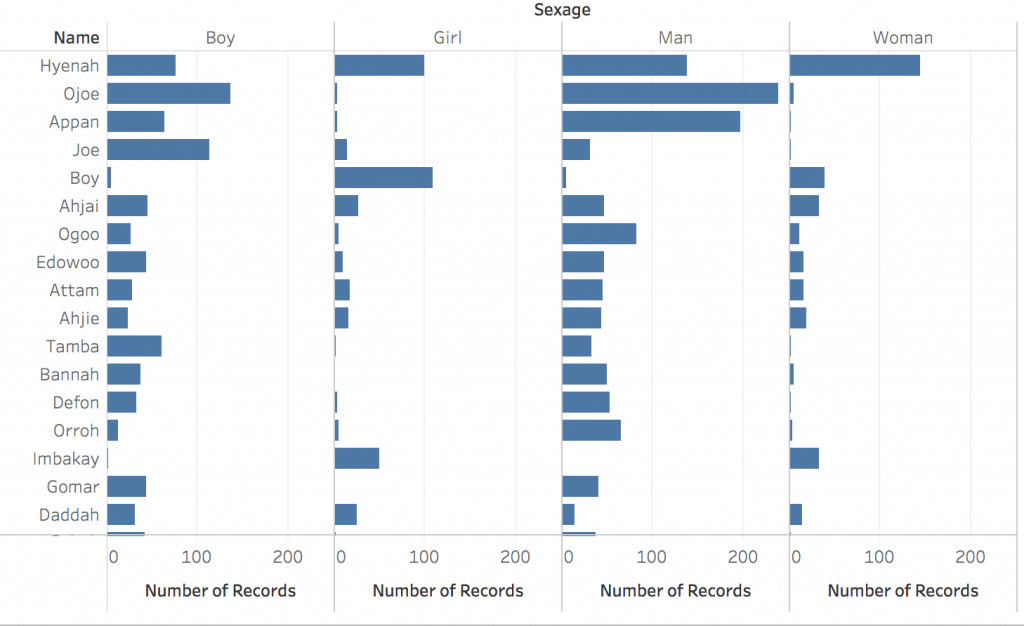
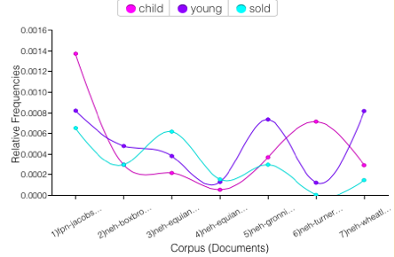
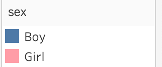
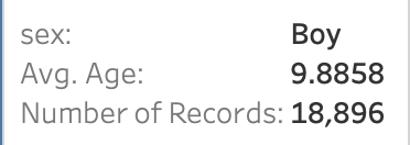
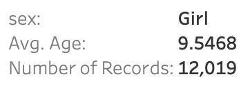
Using age and sexage data from the African Names Database, I then used Tableau to create a bar graph which displays the average age of children in slavery. The bar graph focuses on children by only pulling data from the “boy” and “girl” sexages. I utilized the tool tip again by adding the number of records in order to show just how many young children were apart of slavery during the time. This visualization furthers my point regarding young children being sold into slavery. If the average age of children in slavery was around nine/ ten years old, there were definitley children much younger involved. Data visualization tools like Voyant and Tableau allow for the analyzation of data in ways that people may not have considered before. For example, you may have never known just how young slaves were if it were not for Tableau!
Gender
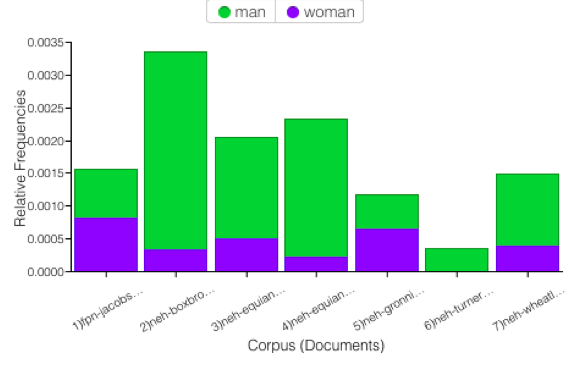
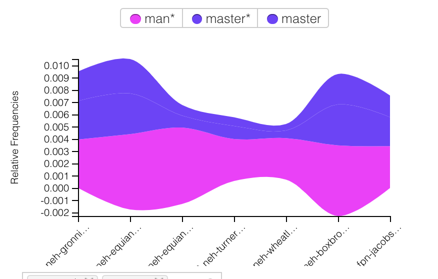
I used Voyant to showcase how much more dominant men were than women in the narratives. The bar graph displays the relative frequencies of the words “man” and “woman” throughout the texts. It is very clear that, for the most part, men are discussed much more than women are. We can see that in Turner’s text, women were actually completely left out. Without Voyant’s easy-to-use program, it would be a lot harder to make this assumption about a set of texts without reading them. This tool allows for a general analyzation of something in a simple, time-sufficient way.
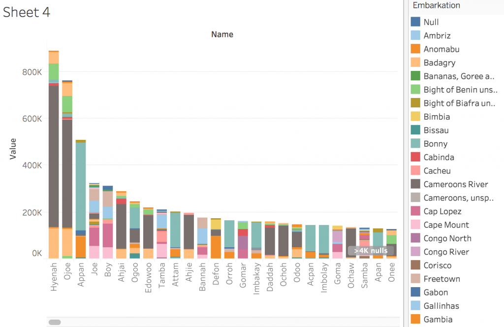
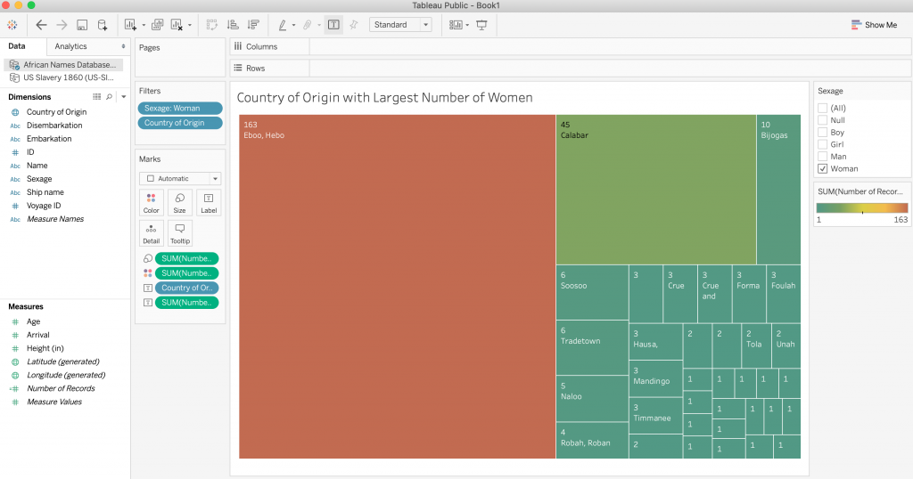
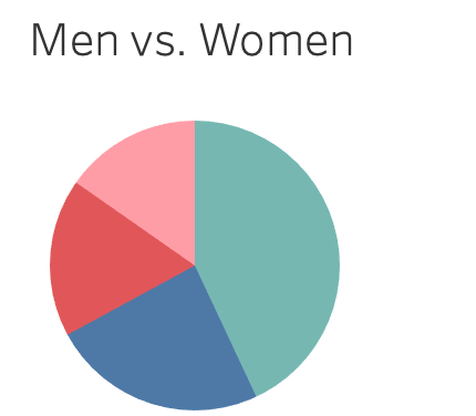
Using Tableau and the African Names Database, I was able to create a pie chart portraying the genders and ages of slaves in the data set. I thought it was interesting to compare to my Voyant visualization to, once again, display how insignificant females were in comparison to men at this point in time. Males (man and boy) are represented by green and blue colors while females (woman and girl) are represented by red and pink colors. The chart shows that men are the most dominant group of slaves, followed by boys, women, and girls. The tooltip in Tableau allows for the viewer to more clearly see the order of most common gender and age group.
After working with Voyant and Tableau, I now understand what each does and for what kind of data visualization they fit best. Voyant allows us to present qualitative data in an interactive, visually appealing way. Similarly, Tableau allows us to work with quantitative data sets to present information. Voyant is extremely useful for finding keywords in a corpus. Additionally, one can compare one work to another without having to read either piece, which can be very useful when considering long narratives. I found Tableau to be a little more complicated than Voyant, but after exploring its possibilities more, it became more familiar. To me, Tableau is much more impressive than Voyant in the sense that it compares such specific elements of each data set. In addition, it creates previews of what your visualizations may look like with the “show me” tab, which is something that I really liked about it. After becoming more familiar with the program, I was able to illustrate very interesting concepts.
Tanya Clement
The process of corpus construction and the creation of visualizations using Voyant and Tableau has verified Tanya Clement’s concept of “differential reading.” She observed that the use of visualization platforms “combines the video streams from these cameras, and the resulting images duplicate a multidimensional viewpoint. That we are aware it is a virtual reality keeps us mindful of the processes we use to produce it, but the experience of this encompassing vantage point allows for a feeling of justice or authenticity that is based on plausible complexities, not simplified and immutable truths.” These processes allowed me to see features that I might not have seen with other platforms. While creating visualizations and using different data to display similar concepts, I was given the chance to see data from different perspectives, creating the multidimensional viewpoint she discusses in her observation of visualization platform. This viewpoint is important so that the viewer can experience multiple viewpoints and grasp a thorough understanding of the subject at hand. This can lead to a feeling of authenticity of the created visualizations.