Categories
Assignment 2

Assignment 2 – Tableau & Voyant

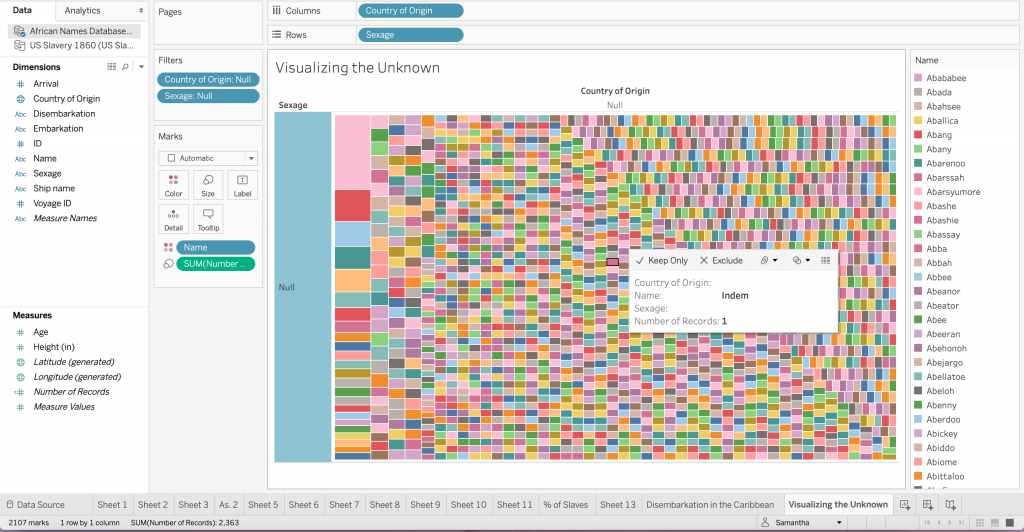
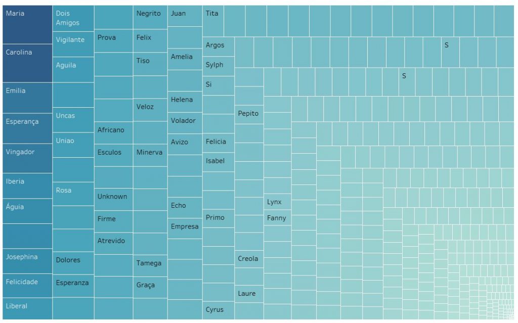
I used the 1806 Slave database, the slave voyages database, and the African names database to create six unique visualizations to showcase important information that might otherwise be hidden, especially if one were to use a close reading method. The African name database and the 1806 Slave database both required a significant amount of “data plumbing” in order to move them into a state in which they can easily be visualized. With both of those visualizations, manual data modification was necessary to match the entries in Tableau to a physical location, because some of them were unknown or, in the case of the African names, they were locations that have changed names or no longer exist. 

Voyant

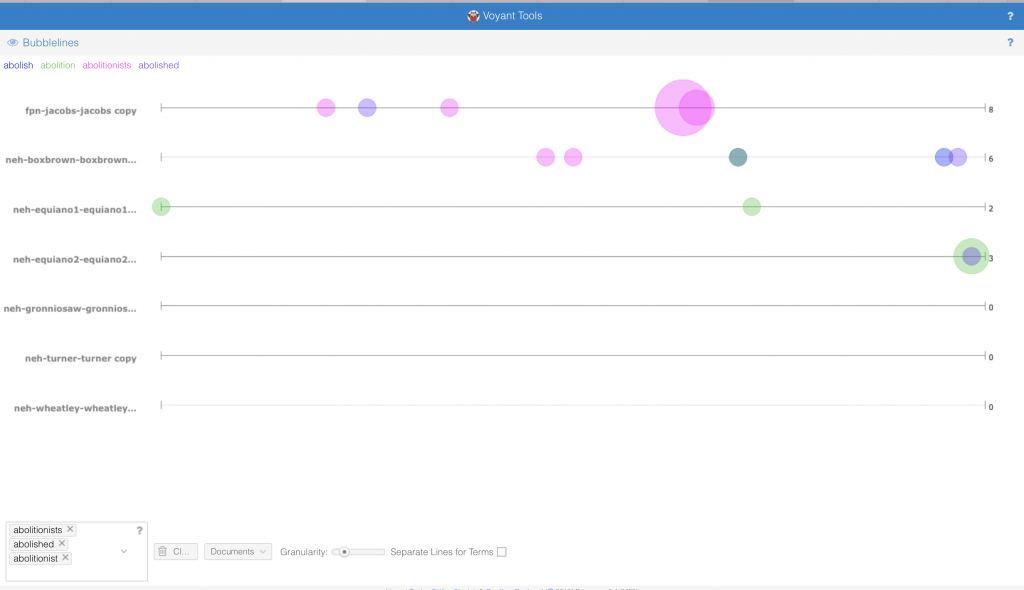
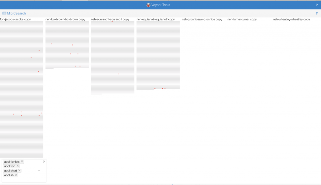
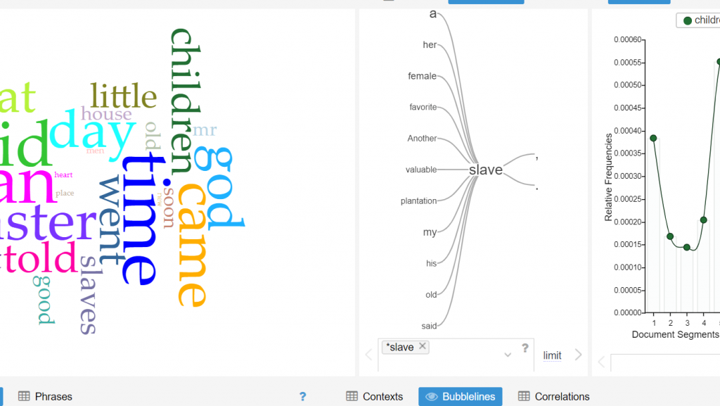
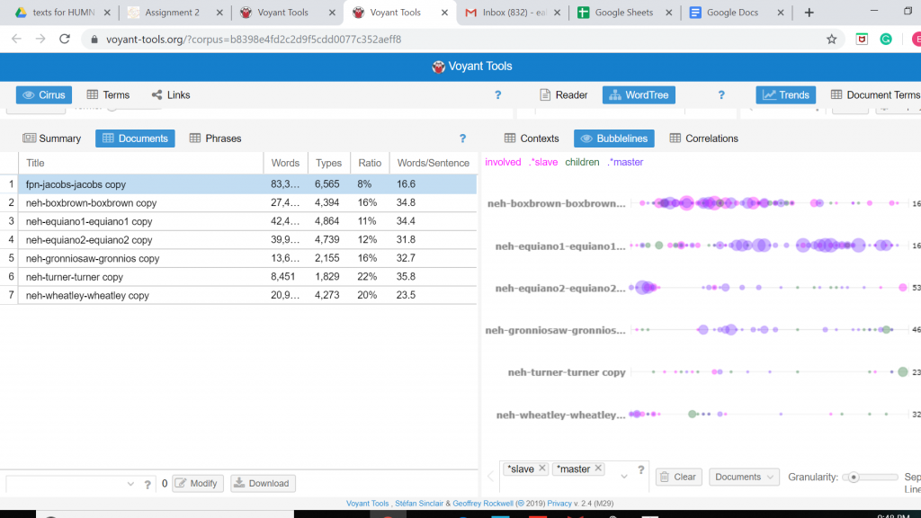
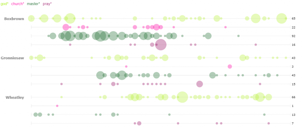
For my first visualization in Voyant, I decided to use the bubblelines tool. I used the keywords God, Master, Pray, and Church. These were plotted for several of the stories across the length of the story. I was not surprised by the small correlation between the usage of God, Pray, and Church. However, I was surprised to see that many of the occurrences (not necessarily the high density occurrences) of the word “pray” were also closely accompanied by the word master. Looking deeper into the texts I only found one example of an explicit prayer for a master, however the singular existence leads me to wonder if many of the slaves in these narratives prayed for their masters. I was also struck by the minimal usage of the word “master” in Wheatley as compared to one of the other two narratives, particularly Boxbrown.

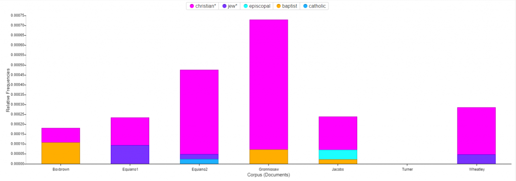
For the second Voyant visualization, I was interested to see a breakdown of the religions mentioned in the narratives. The stacked graph easily portrays the dominance of Christianity as compared to the rest. I was puzzled by the fact that Turner has no mentions of religion at all in their story. In order to find mentions of the various religions I utilized two methods. The first was brute force guessing of many of the common religions which yielded all of the entries shown except for one. In order to find that one, I used a word tree centered around the word “Church”. With a wide context setting I was able to see all of the religions that I had found by brute force in a neat list, along with the additional entry that I had not considered, Baptist. 

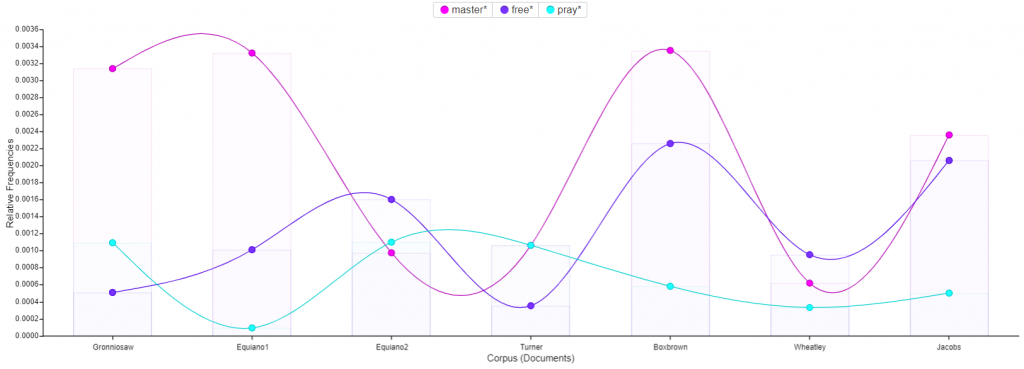
Next I utilized the trends tool to track the usage of the words : master, free, and pray across the corpus. The most interesting find from this visualization was the small inverse correlation between the usage of the word pray and the usage of the word free. For several of the texts, one of the two words has a high frequency and the other has a low frequency. This could suggest that slaves who talk more about freedom pray less, or conversely slaves who pray more talk less of freedom. 

Tableau

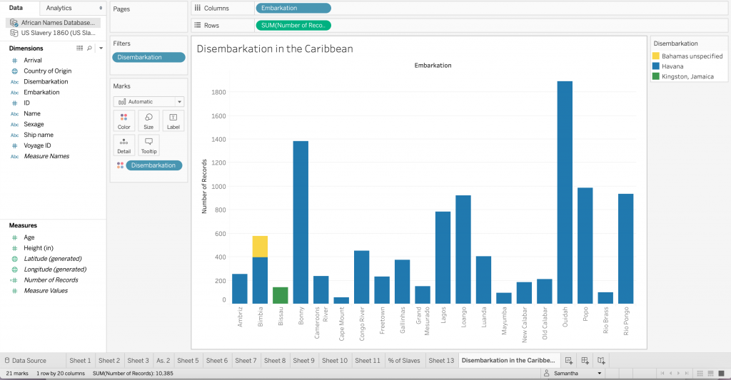
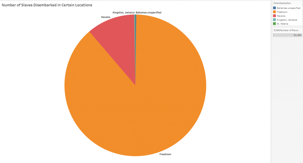
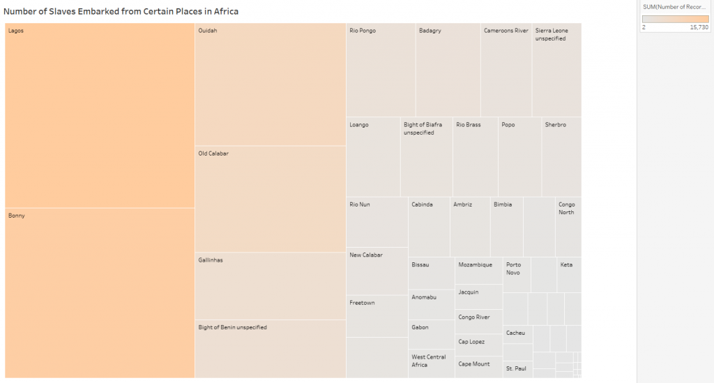
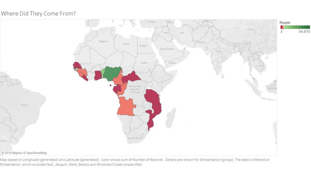
For my first Tableau visualization, I mapped the embarcation locations of the slaves. The countries are highlighted to indicate where people came from, and colored to indicate the number of slaves who came from the area. This visualization was tricky, because I had to do quite a bit of research to match some of the old African countries and regions to their modern day locations. There were several locations that I had to filter out entirely because they did not produce any results when searching for them.  After that plumbing was complete however, the visualization shows the fact that many of the slaves come from the coasts of Africa. Considering they traveled by boat, this makes sense. 

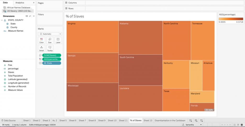
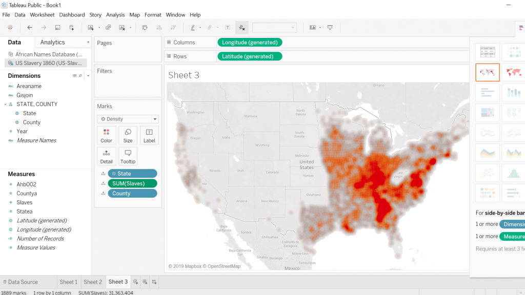
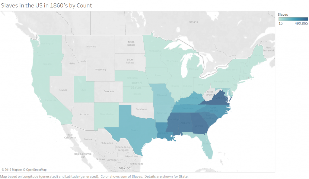
The Second (2 maps) visualizations in Tableau are 2 maps of slave populations in the united states, which I have broken down by state (I chose state over county purely for aesthetic reasons, and because this choice did not impact the ability to show the story that I wanted to show).  Comparing the two maps leads to the discovery that not all of the locations that have the most slaves also have the highest population of slaves. There are a few states that are outliers and have smaller numbers of slaves but a higher percentage. There are, of course, still some states (Virginia and Georgia) which are high in both raw number and percentage. This visualization allowed me to play with the calculation feature of Tableau, which is incredibly powerful because you can write equations to format your data into any form you need.

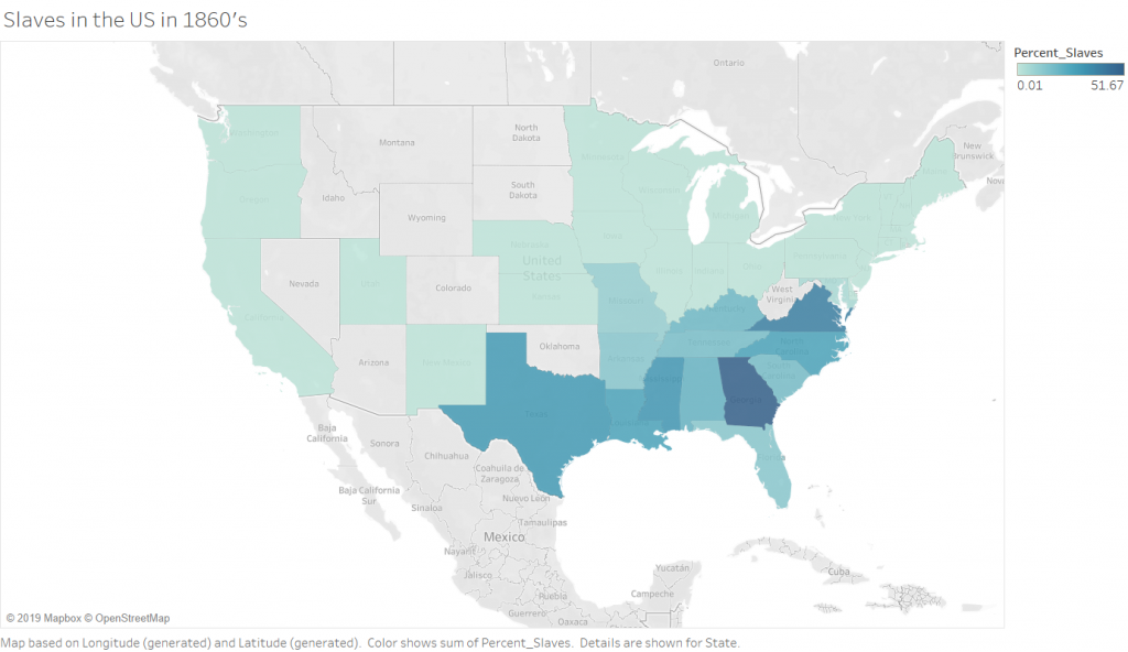
Percentage of Slaves in the 1860’s by State

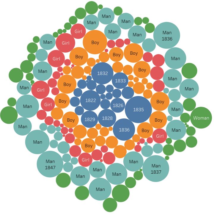
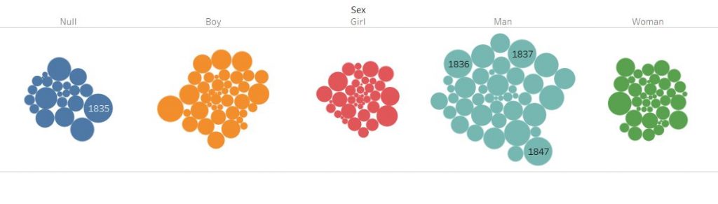
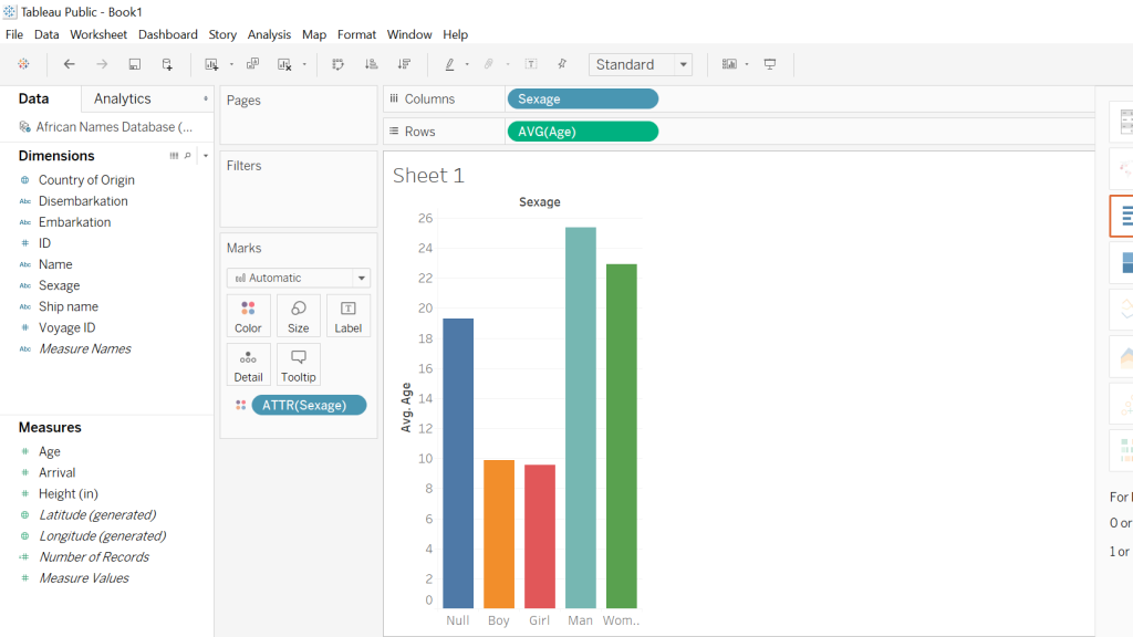
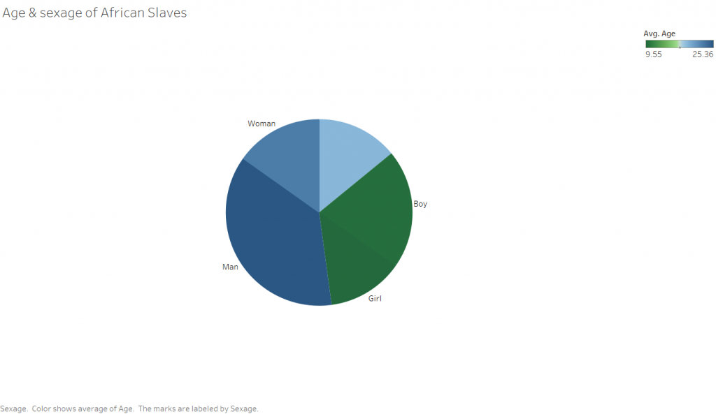
The third rather simple Tableau visualization is a pie chart showing the sexage of the slaves. The angle of the slices is determined by the number of people in that particular sexage, and the color corresponds to the average age. I was surprised with this visualization that there were so many records missing for sexage. This leads me to wonder how this data was collected, and ask why someone didn’t simply makeup a sex for the unknowns as I would expect to happen in a situation where someone has to enter a large amount of information into a database of some kind, be it a paper one in this case or a computer in modern days.

Between the two platforms, I certainly prefer Tableau. Both programs are able to take in data and output visually appealing representations of the input, however Tableau is far more customization. This does not provide the full picture however. The two are designed for completely different purposes. Tableau excels at visualizing numbers and quantitative data that characterizes something qualitative, such as the number of individuals who are male or female. Tableau does not do a very good job with qualitative data such as text. That is where Voyant comes in. Voyant is excellent at analyzing corpuses of text and breaking them down so that you can get a “zoomed out view”, or a quantitative view of something qualitative. Tableau’s “Show Me” pane makes easy the process of determining what type of visualizations are available to depict the story you are trying to tell about the data. This is especially helpful if you have a pattern that you want to show, but are not sure how to show it. While Voyant does not suggest the types of visualizations that would work for your particular data, it does allow you to quickly play around with all of the tools in its arsenal, allowing you to get an idea of they tool’s capabilities relatively quickly. 

The ability to step back from a dataset and visualize something about it as a whole is incredibly powerful, and only made more powerful with tools that allow for quick and easy close analysis of a phenomena found in a distant reading. The example I would propose for this (though not related to DH in the least) is in the form of a lateral thinking puzzle I recently read, which asked why a corporate database was analyzed to find that a customer was four times as likely to have their birthday on any of the following days than on another : February 22nd and November 11th. This would be the distant reading of the dataset, finding the significant phenomena that so many customers have birthdays on certain days. The closer reading finds that the dates, entered in numerical format are “11-11” and “2-22”. The store clerks were simply lazily punching numbers into the system rather than asking customers for their birthdays. Without a closer reading of this problem, one could form the conclusion that those are lucky days to have children, and indeed it is more probable that a given person will have their birthday on one of those days. The closer reading here provided the reasoning behind the phenomenon. This ties into Tanya Clements work, in that she suggests that the DH gives wide perspectives that are necessary to be able to grasp new and important information about texts. She also talks about the balance provided by close reading techniques. 

Categories
Assignment 2

Assignment 2

Using Tableau and Voyant to engage with quantitative and qualitative data presented different questions and varying solutions. In Tableau I tried to allow the available data to inform my choices, with the goal of creating some sort of story from the data. I created two visualizations using the African names database, the first of which is an examination of slave disembarkation in Caribbean. This bar chart illuminates the most prevalent location (Cuba) in this dataset. I began thinking about this data with the Caribbean in mind, and initially with disembarkation as a column and embarkation as a color, but after experimenting with the axis and the colors I found a more interesting way of illustrating the data. Those who embarked in Bimbia disembarked in both Cuba and the Bahamas (despite differing ships) – a detail that could have been easily overlooked without this method of visualization. 

For the second visualization I considered what it would look like to see the “null” or unknown data. I think the lack of documentation can tell us something. So instead of simply excluding the “null” data I created a tree map only consisting of this information. The diversity of colors represent stories that are not told through data or otherwise. To draw from D’Ignazio and Klein’s idea of bringing the bodies back into the conversation, I do not believe that the absence of ‘country of origin’ and ‘sexage’ make these records, or rather these people invalid. All of these people have an untold story, I think this visualization demonstrates the diversity of possibilities.

The third visualization comes from the US Slavery 1860 dataset. After creating the map in class and thinking about the usefulness of picturing geographic data in a medium other than a map I created a tree map to visualize the percentage of slaves in each state. This was helpful for me because seeing how the size of the sector correlated with the number of slaves while the color showed the states with the highest percentage of enslaved people was important so as not to get confused by the physical size of the state. The darkness of the orange in Florida makes a statement despite its small sector, or perhaps because of it.

On reflecting upon the complex publication history of slave narratives and their function in the abolitionist movement I thought about how frequent abolition came up in the course of each narrative. The contexts tool in Voyant not only allowed me to see the appearance of iterations of ‘abolish’, including ‘abolition’ and ‘abolitionist’, but also their relative location in the texts. The narratives of Henry Box Brown, Harriet Jacobs and Olaudah Equiano each have some version of abolish/abolition in their texts while the others do not. Bubblelines show the frequency and temporal distribution in the narrative using colored bubbles instead of text. The temporalities of these texts may allow us to understand the diction. The word frequency in Equiano’s narratives (1789), Box Brown’s (1851) and finally Jacobs’ (1861) increases with time. However, there is a substantial gap between Equiano’s two part narrative and the second two. I began to question how the abolitionist movement featured in this trend. After conducting the distant reading I attempted to do a close reading with the goal of a differential reading in mind. I discovered that Equiano had many abolitionist friends and was a pioneer of the movement, which explains such early uses of words like abolition and abolished in this kind of text. In the mid to late nineteenth century the movement was most charged, and Brown and Jacob’s narrative were likely used directly for this purpose whereas Nat Turner’s (1831) for example could not be so explicit in that way. Having already read Turner’s narrative I was able to understand how that text fits in with the corpus, and how forces outside the usual publication history would account for lack of abolitionist discourse. Voyant’s tool allowed me to trace in incline of words like abolish and abolitionist, and how this incline mirrors the timing and momentum of the abolitionist movement.

The Microsearch tool provides a different way of seeing the same data, simulating a paragraph that signifies the length of each narrative. The placement of the dots indicates the relative frequency of the words among the texts. Instead of using multiple colors to represent multiple words, the red operates like a density graph or chart – where darker areas signify greater word frequency. Something I found interesting, however, is that if a word did not appear in a text that representative paragraph was erased instead of being left empty. The absence of the paragraph like structure does not allow for a direct comparison between the length of all narratives and the frequency of the word. It also has problematic implications: if a writer/narrator does not use particular vocabulary, is his or her narrative unimportant to the conversation?

Veliza, an experimental tool is a way of visualizing how texts may literally talk to each other. This simulation is eerily similar to an iMessage conversation from an aesthetic standpoint. Voyant Tools Help states that “the original Eliza was designed as a (parody of a) Rogerian psychotherapist, so the more you write content that sounds like it could be expressed to a psychologist, the more satisfying your results are likely to seem.” In this instance the user is encouraged (by the programmers and the program itself) to focus on feeling and puts the user in the shoes (for lack of a better term) of the enslaved person. The interaction with the visualization is like conversing with the enslaved, and psychoanalyzing their experience of slavery feels inappropriate. Also on the user is put in the odd position of the slave by using this interface. This does not seem to give the one who is enslaved agency, but functions in a similar way to the storyteller/transcriber structure that characterizes the slave narrative. It almost reads as abolitionist propaganda. While very interesting, this tool does not seem tailored to this sort of material. This brings back to mind how blackness is often not considered by those with the power to program, and the ways these programs function to reinforce racist ideologies.

I believe that the etymology of the words Tableau and Voyant, illustrate the differences in each visualization tool. The former, from the 17th century demotes a picture, representing a scene from a story or quite literally a small table. Alternatively, the latter comes from Old French voiage, meaning ‘provisions for a journey’. In my experience of both platforms Tableau indeed operates like a picture using quantitative data to create a static visual, while Voyant’s tools foster a more dynamic interaction with the qualitative data by showcasing the movement of data. So, while Tableau is able to ‘picture’ data, Voyant actually supports some measure of dialogue, exemplified in my last visualization. This prompted me to think about the interface and agency, along with its limitations. The question of who creates these data visualizations resurfaces. Who are these platforms made for? Can the text speak for itself, or does the reader/user speak for it? Overall more control in Tableau to manipulate data while Voyant has specific built-in methods to accomplish a similar end. The approaches, however, seem to stand for opposing ideologies of piercing a text versus ranging over a text. A logbook for example would hold data used to create the African Names database and the various slave narratives are the sources for the corpus used in Voyant. While there is likely to have been more than the clean categories of the dataset in the logbook, it is ‘pierced’ in order to locate value or meaning. Alternatively, in Voyant we are invited to range over the entirety of the text, seeing how each part informs the whole.  

Despite these differences I think both platforms allow the user to see data from multiple angles and how each way of handling the data is informed by a particular goal. Furthermore, the opportunity to play with the data emphasizes that without a goal in mind one can freely observe how the dataset interacts with itself. With an understanding of how Tableau and Voyant operate as users we can choose either to take a snapshot or to embark on a journey. While Voyant prompted me to do a close reading, Tableau encouraged me to find a way to see information that could not be close read.

Categories
Assignment 2

Assignment 2

I started my visualizations with Voyant Tools, to visualize the narratives of enslaved people. First, I prepared the corpus by arranging the text them based on the date written and filtered out more stopwords from the text off the most frequent 25 words, taking out the following: day, told, soon, people, men, man, thought, soon, said, saw, mr, heard, went, come, came, knew, know, like.

Out of the remaining words, I was interested to see that the word ‘children’ was mentioned many times, so I tried to focus on it to see if there were any meaningful connections. Looking at the trendline, Harriet Jacobs was the only one who wrote significantly about this, and by examining the bubblelines visualization, she used the word ‘children’ quite often throughout her narrative. Referring to the title of the memoir, “Incidents in the Life of a Slave Girl. Written by Herself,” it could refer to her own childhood.

Interested in exploring this further, I looked into different visualizations and found that a wordtree yielded the most information about what Jacobs was writing about. In the following visualization, we can see that a lot of the connections made with the word children are varied, and we can through most of the connections that she was talking about the children that she has encountered in her life, e.g. connections such as “master’s, grandmother’s, mother’s.”

Aiming to deconstruct the text further, I shifted to a more analytical collocate view of the word. Reading through the list, I discovered that some terms that had more negative connotations, such as suspicious, jail, or unhappy, had significantly less mentions. For me, this visualization raised up the question of how much editing was done for a white audience back then, and hence, how true are the narratives to the author’s real feelings?

Shifting to Tableau, I used the African Names Database to construct some visualizations. Preparing the data involved correcting the categories, such as setting the arrival year as a date rather than a number value. The first thing I wanted to find out about was if there were any connections in the data for enslaved children. For this dataset, I set up a time versus count of names to visualize the enslaved people over the years, and added an age attribute filter to see how much the data would change based on two age ranges, 1-18 and 19-77. The data that came out, however, showed that the graphs between the two stayed relatively similar, leading to my hypothesis that children under 19 made up half the dataset.

The next topic I wanted to explore was the ships themselves and how many people were usually on them. For this, I looked into making a tree map and successfully a visualization of how many people ships might have carried. The answer ranged from the most populous from 1116 enslaved people on the Maria to as few as just one on board. The tree map shows a very large number of ships which reveals a little bit of how many people had been taken from their homeland then.

The final topic I looked into was the distribution of gender. Playing around with the data, I managed to put it into a packed bubble visualization, and then categorized them by sex. The data shows some clear information. Men were the most enslaved compared to other sexes, and there are a surprising number of non-records.

Using both Voyant and Tableau, I found a stark difference between the two. Voyant, being more capable of qualitative analysis, gave me visualization upon visualization, no matter what I wanted to focus on, or if there was no specific focus at all. The avenues of exploration really let the user find more possible connections. However, Voyant’s results are mostly connections that need to be built on with other, different views that rely on the user making these assumptions. However, when it came to using Tableau, I needed to be very specific on what I wanted from the data. Unless I was able to supply the data types that Tableau needed for the visualizations, there would be no meaningful visualizations. This brings a bit of frustration in setting up the data for success, but the results are, therefore, more concrete than Voyant. A commonality between these two tools, however, is that they show connections that we might not have seen before by looking at the data without them. These tools either save time as well, either by pulling out metadata to analyze or building correlations with numerical data.

From this assignment, it was using Voyant that strongly verified Tanya Clement’s observation of a visualization platform combining multiple views and creating a multidimensional standpoint. Using a single view of the Voyant tools did not give a meaningful view into the slave narratives, but using them together with the viewpoint focused on the word ‘children’ helped layer more meaning onto the visualizations, resulting in a stronger argument that is based on ‘plausible complexities’ as Clement states. For quantitative information, it is harder to not end up with simple answers, due to the defined fields that we must put the data in to get the desired visualizations. However, as with the Voyant visualizations, putting together more data in Tableau allows for a more complete picture, as we pick and select what data to highlight in each of our visualizations, potentially leaving some data unexplored.

Categories
Assignment 2

Assignment 2

To visualize the African Name Database and the U.S. Slavery in 1860 Database I used the platform Tableau due to the nature of the data being numerical sets on a spreadsheet. For the Slave Narratives Database, I relied on the Voyant platform since it is most useful with large collections of text (corpora). The Tableau platform took some meddling with to get data visualizations that would best display the data in a way that made sense. As for the Voyant platform, I have previous experience in navigating the program thus it just required a bit of a refresher, but overall the experience went quite smoothly when compared to trying to utilize Tableau for the sake of this assignment. Once I refamiliarized myself with both platforms I began looking for patterns and visible trends in the data that were intriguing to elaborate on.

Word Tree Tool on Voyant

The middle of this screenshot displays the word tree tool on the Voyant platform which proved to be quite useful for the purpose of analyzing the Slave Narrative Database. With this tool, one can essentially enter any word that is contextually relevant to the corpus, and one word that I noticed that appeared numerous times throughout the entirety of the corpus was the word “slave”. One is able to observe the most frequent words that associate closely with “slave” by use of the word tree tool, what stood out to me in this word tree that words such as “valuable”, “plantation” and “favorite” are closely linked to the word “slave”. This especially makes sense considering the historical context in which slavery existed and a possible inference that can be made is that slaves were viewed by their owners to be valuable assets to the function of the plantation’s operation. However, what can also be deduced is that the slaves living on the plantations were viewed as an item rather than a human being.

Voyant Bubbleline Tool

The screenshot is again from the Voyant platform that shows the use of the Bubblelines Tool. What makes this tool useful for visualizing a data set is that by utilizing Bubblelines the individual has the ability to view the frequency of which a particular word appears throughout the corpus and in this instance the several different slave narratives. I thought it would be interesting to test the frequency of which the word “slave” would appear in the various narratives and by using Bubblelines. As one may notice the word “slave” is very heavily used in the Box Brown and the Equiano narratives when compared to the other narratives.

Tableau 1860 U.S. Slavery

The first screenshot is what I was able to come up with when working with Tableau and the 1860 U.S. Slavery Database. My intentions for this visualization was to display the geographic regions in which concentrations of slaves were highest in the United States in the year 1860. This required a bit of cleaning on my part so that the visualization was clear and showed up in legible fashion. Tableau proved to be quite a useful tool for creating a geographic visualization.

As for the second screenshot this visualization was again created by utilizing the Tableau platform, my intentions remained, for the most part, the same with a slight twist in that I wanted to display a graph that compared the total amount of slaves residing in a particular state. What caught my eye is that the majority of slaves resided in the traditionally thought of southern states along with some of the southern coastal states as well.

Tableau Slave Names Database

Both screenshots show the Tableau platform displaying two different graphs that I was able to construct using the Slave Names Database. The first graph I created was in response to my curiosity about the average age of slaves coming from various African countries. In order to accomplish this, I took the country of origin and then the average ages of the slaves and what one can see is an easily accessible, clear representation of the different African countries with the respective average ages of the slaves. The following screenshot is attempting to illustrate the average ages of the different sexes of slaves coming from Africa, almost immediately one notices that there is a disproportional amount of men when compared to the other sexes. Another noticeable aspect is that the “null” sex is the third-largest bar which to me was a little disturbing because this suggests that there was little effort on the part of rescuers to accurately record data.

By utilizing both the Voyant and Tableau platform I was able to create useful data visualizations from which a great deal of information can be drawn from. Also, another aspect worthy of mention is that both platforms allowed for the use of the “differential reading” practice which is discussed in depth by Tanya Clement in her piece Text Analysis, Data Mining, and Visualizations in Literary Scholarship. What the methodology of differential reading allows for in essence is the defamiliarization of, “… texts, making them unrecognizable in a way (putting them at a distance) that helps scholars identify features they might not otherwise have seen, make hypotheses, generate research questions…” (Clements). Tableau and Voyant allow for the user to take large sets of data that otherwise would take a lifetime to synthesize and puts them into a nicely constructed visual that is easy to draw information out of and share with the public domain.

Categories
Assignment 2

Assignment 2- Slavery Data Visualizations

Using the Slave Names database, US Slavery in the 1860s and Slave Narratives, I created six visualizations that are meant to display the journey many slaves took to the new world. I did this through looking at words that are associated with traveling and the hopes and also the realities it embodied for these people.

Voyant Visualizations

This wordtree with ship as the root word shows that the words most commonly associated with ship include those such as, merchant, gun, slave, and large. These word associations allow us to draw conclusions what the text was about and what might the person writing it was experiencing.

This bubbleline displays where in the seven texts are the words ship, captain, and freedom are located and the occurrence of them. As seen, a few of the texts barely mention these words, however in Olaudah Equiano’s writing it is shown that there is a chronological connection between talking about a ship, a captain and freedom.

A link visualization, similar to that of the word tree displays a network of words that are of higher frequency and words that are in high proximity to one another. In this case, the words in blue, the root words, are connected to words that are commonly associated which we can look at to determine what freedom meant to the author, or that time was a large aspect of being on a ship and gaining freedom.

Tableau Visualizations

The slaves that were accounted for in the dataset disembarked in one of five places, and this pie chart visually displays the large number of slaves that disembarked in Freetown and Havana. The stark differences in numbers allows readers to draw conclusions that many more slaves must have been present in Freetown, or that there was a mistake or bias in the data.

This tree map displays the places that slaves embarked from, and the concentration of slaves from that place. The color and the size of the rectangle display the concentration, showing that some of the areas of Africa were affected more than others.

Similar to the tree map, this packed bubble chart shows the concentration of slaves who embarked on certain ships. Seeing the data in this way it is easier to see that many of the slaves who were accounted for were on a few major boats, or that those ships were much larger than others.

Comparison

Voyant is a platform that analyses qualitative data and creates visualizations based on them. Tableau is similar in that it creates visualizations of data to make it easier to view and understand, however it looks specifically at quantitative datasets. Voyant is able to look deeper into the written words of authors and analyze biases and backgrounds and how they might affect the writing and content of texts, where tableau is able to look at numbers and make assumptions based off of looking at relationships of numbers.

Visualization Practices

The creation of interactive visualizations and construction of text corpuses has verified Tanya Clement’s observation that visual platforms allow for greater insight, vantage points, and authenticity of data because they bring new light to datasets that cannot be seen by looking at numbers of texts in a spreadsheet. They can highlight relationships between variables that seemingly are not related prior, but indeed draw interesting conclusions. Defamiliarizing and deconstructing texts is helpful in creating a multidimensional viewpoint, looking at more than just the words on a page, but what they mean and why they are used. Digital visualizations do not simplify the data, it makes it easier to understand and analyze, showing immutable truths.