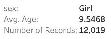
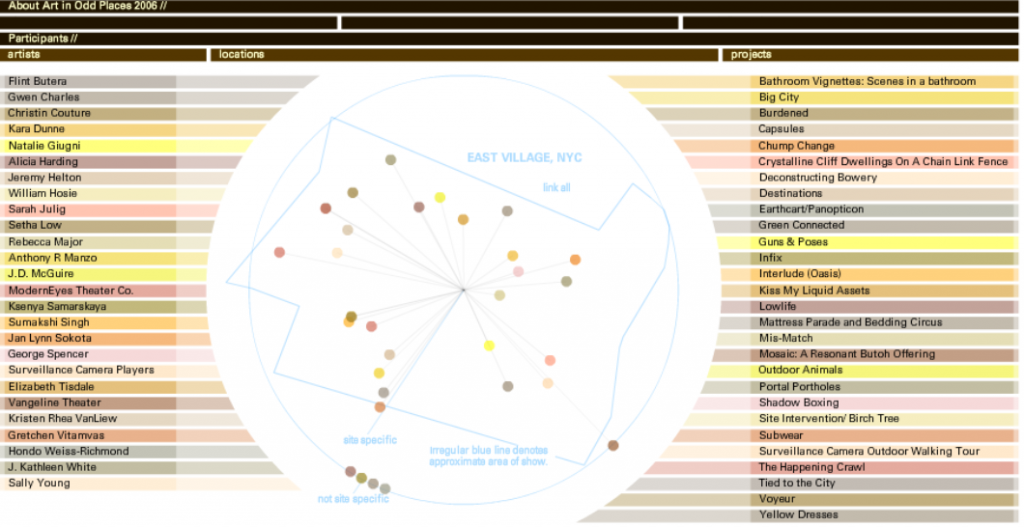
Building networks is a complicated process, requiring much analytical thinking and an understanding of multidimensional data. Using programs like Gephi allows for a parsing of complex relationships between this data. I happened to work with Gephi briefly during my foundation seminar of freshman year, but not nearly as in depth as we are now. Initially, working with Gephi in this class was intimidating, as there was so much to learn and it doesn’t seem as user friendly as the previous platforms we have worked with. However, after spending a few days playing with the program and finding new things, I’ve found that Gephi’s many benefits allow for a powerful visualization. I decided to build my own dataset on demographics of the Bucknell Women’s Cross Country team, with the intent of discovering and analyzing the different majors being studied by the women of all four class years as well as finding any trends that there may be within the data. I began the process by sending out a survey to collect the information before creating the CSV file containing the data. At first glance, I immediately noticed biochemistry to be a frequent major. This was exciting for me, as I was interested in how Gephi would work to display this common theme across team members.
Due to Gephi only allowing for a mapping of relationships between the same types of nodes, the process of portraying what I would like the viewers to understand has been particularly difficult for me. When discussing the purpose of nodes and edges, Graham says, “Everything about a network pivots on these two building blocks” (Graham, 202). In networks, nodes can be further defined by attribute rather than seen as just dots. Each individual node is representative of each team member, and the edges refer to the undirected relationships between them. Because the connections I chose to make between people (major) have no beginning or end, the relationships can be considered as “rhizomatic relationships” (Lima 44). Rhizomes acknowledge multiplicity in data. They “connect any point to another in a way that allows for a flexible network to emerge” (Lima 44). Gephi was able to create a flexible network that could I could parse further to produce the relationships I portrayed. I filtered by degree and got an average degree of 28.8, representing the number of edges adjacent to each node.
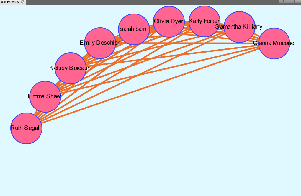
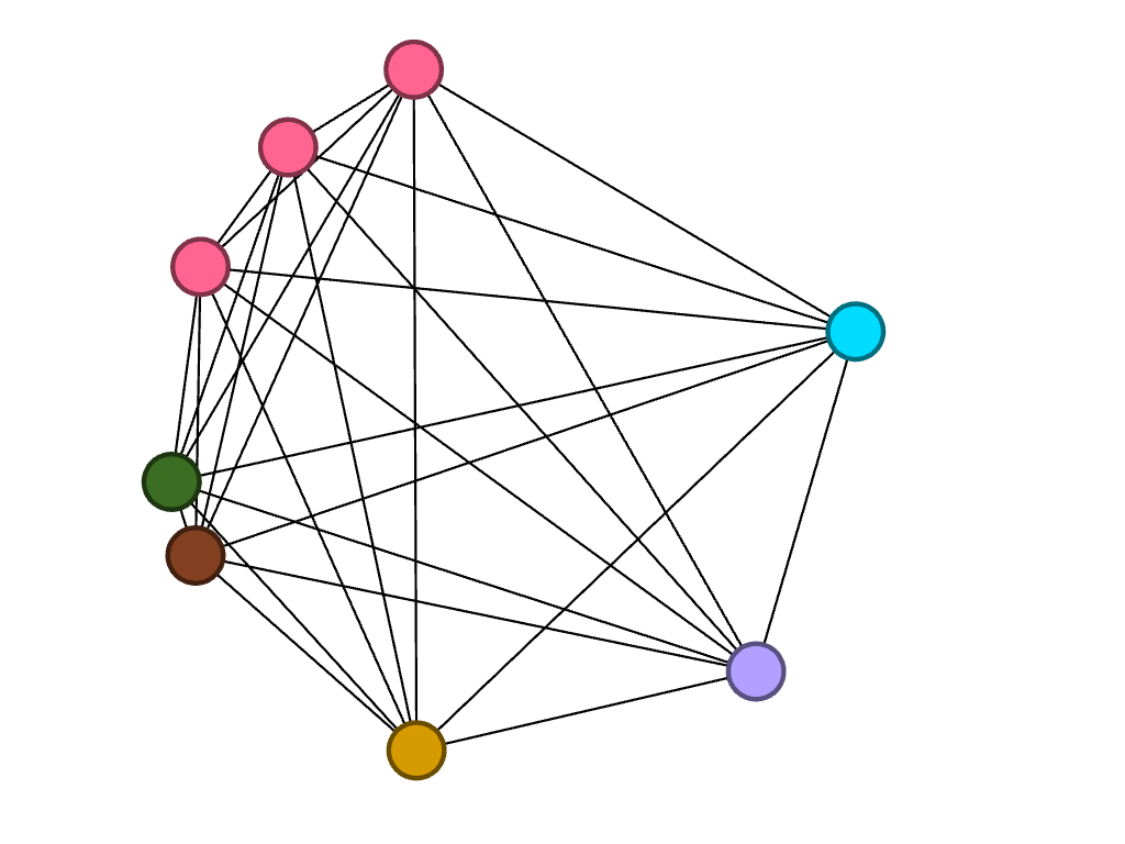
There is no modularity in my data set, as all team members were already connected due to being a part of the same team. In a way, the team is it’s own “small world.” Each member (node) is interconnected with one another through an edge, simply because they are apart of the same “world.” When choosing which layout to apply, I began by using the circular layout due to it being simple and easy to understand visually. Graham states, “It is easy to become hypnotized by the complexity of a network, to succumb to the desire of connecting everything and, in doing so, learning nothing” (Graham 201). Therefore, I knew that I wanted my network visualization to be as simple as possible. Nodes are colored based on major. The edges occupying the rest of the visualization are the connections between each member of the team. I then reconstructed the original layout by dragging nodes of the same major and placing them alongside each other to allow for an easier visual of the frequency of each. My network formed the following:
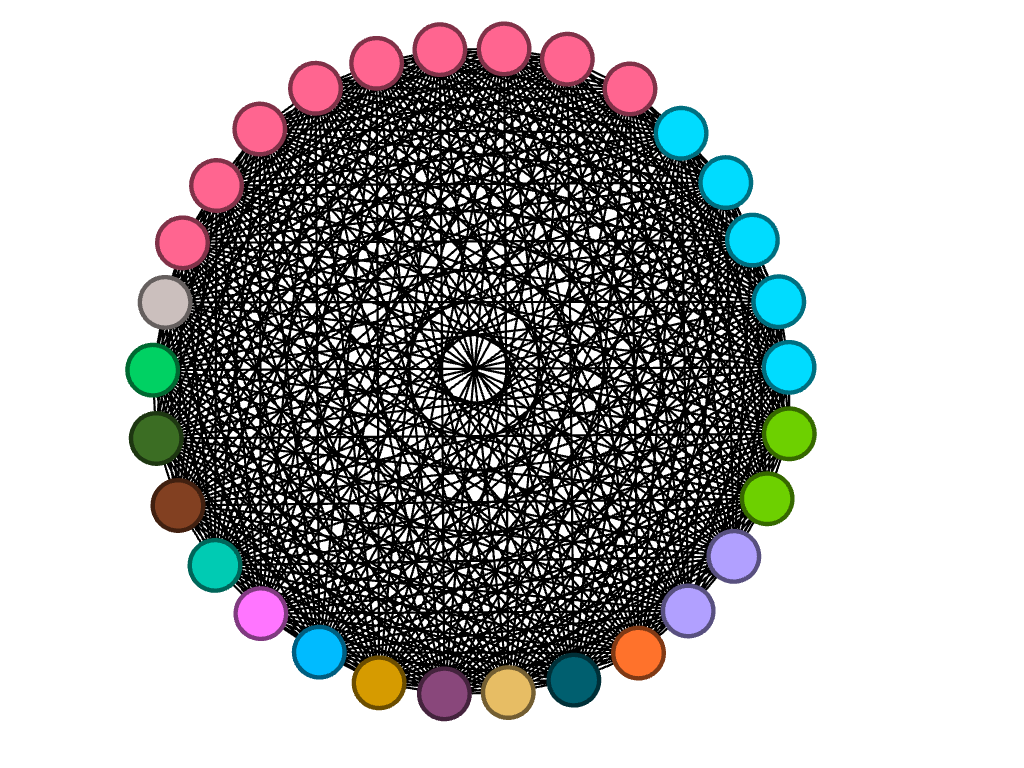
It is clear from this overview that there is a dominant major among team members, which happens to be biochemistry. I can’t infer any reasoning behind this through my data set, but I thought that it was an interesting trend that I knew I wanted to look more closely at. I have learned that because there are no arrows connected to the edges between nodes, the relationships between each node are equally significant, having no direction in the relationships.
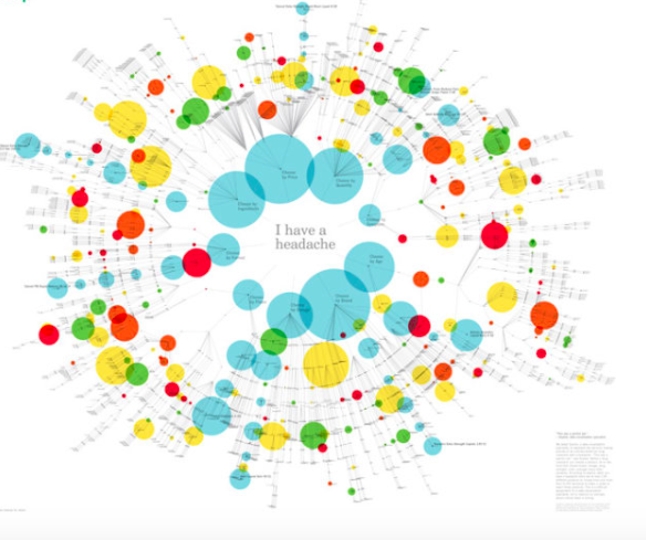
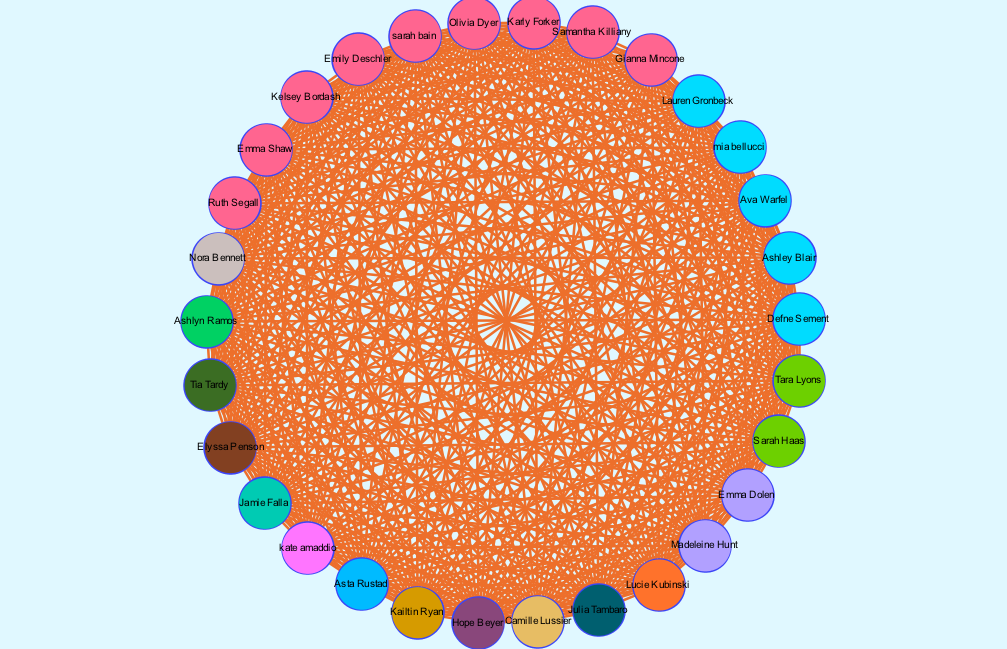
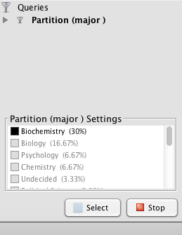
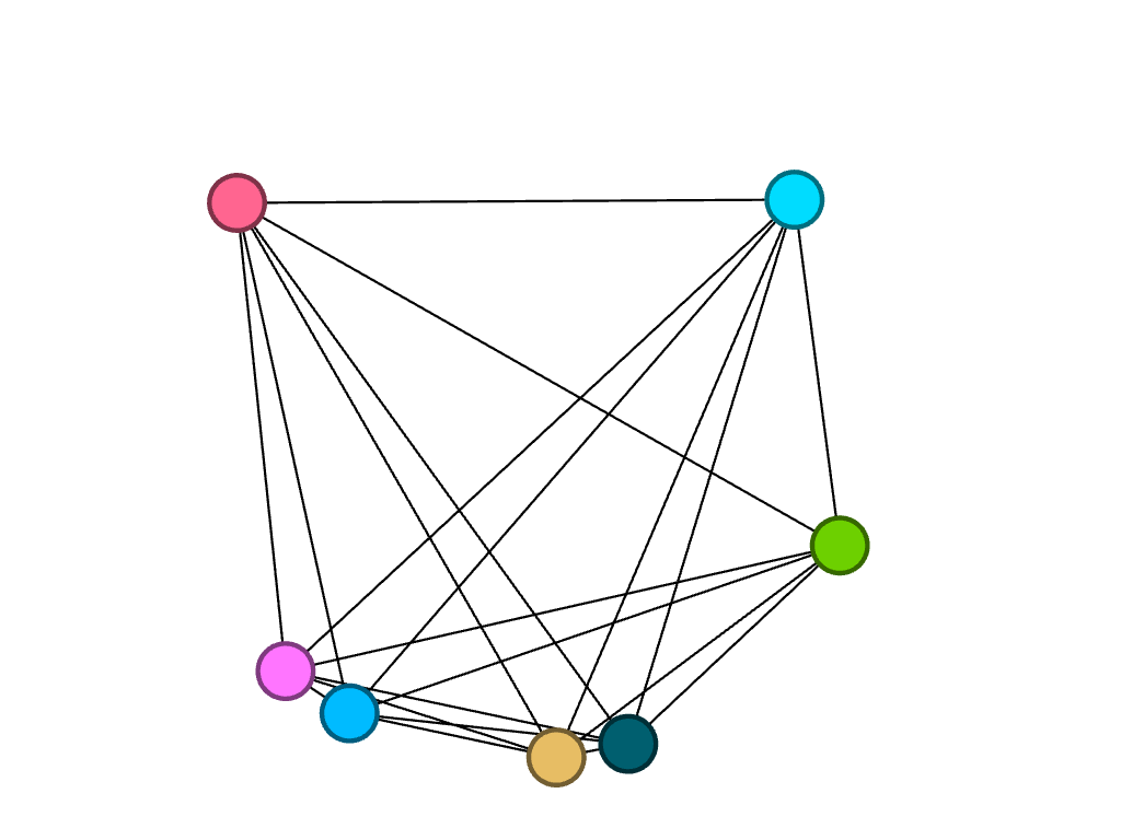
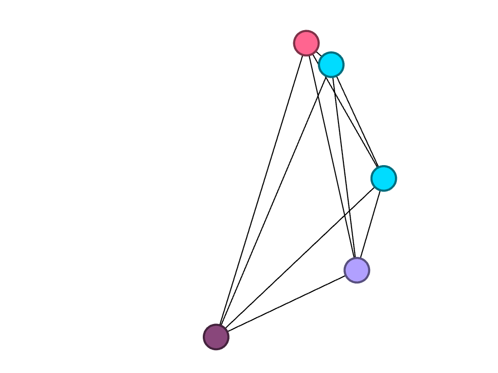
So that the user can add to the depth of their network, the program allows for a search of metrics that provides more insight into the overall network. I chose to first partition by major which allowed me to visualize how many people belong to each major category. Those who shared the same major had more connections to each other than to those of different majors. Because I chose to look into the frequency of the biochemistry major throughout the team, below is the visualization displaying the nodes directly linked to each other through the biochemistry “edge.” Filtering my data through partitioning by major allowed me to create the following:
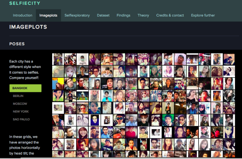
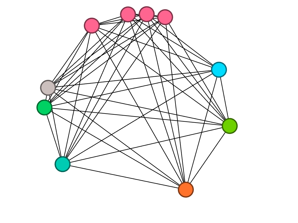
I then decided to partition by class year to look at what majors were studied by girls of different years, in particular, biochemistry. Because the nodes are all different colors, I found that of the seven freshmen, no majors were shared:
Of the ten sophomores, biochemistry was a common major between four people, represented by the four pink nodes closely connected to each other.
Of the eight juniors, three of them are studying biochemistry.
Lastly, of the five seniors, only one studies biochemistry. However, two of them study biology, which is represented by the connected blue nodes.
As Lima said, network visualization allows for the portrayal of “intangible structures that are invisible and undetectable to the human eye” (Lima 80). By filtering the data in the way that I did, I was able to visualize something that may not have been so obvious before. Gephi allowed for me to explore the cross country team’s academic side, something that I don’t consider very often. I liked discovering that biochemistry seems to be a subject of interest among my teammates, despite not knowing of a correlation behind reasoning.