“Then it dawned upon me with a certain suddenness that I was different from the others; or like [them perhaps] in heart and life and longing, but shut out from their world by a vast veil. I had thereafter no desire to tear down that veil, to creep through; I held all beyond it in common contempt, and lived above it in a region of blue sky and great wandering shadows.” (DuBois, The Souls of Black Folk)
The metaphor of the veil described here can be extended to the invisible mechanisms that inform data sets and systems created by dominant groups in positions of power. There is a veil that covers the visualization of data – the end product of these systems – and data literacy has the potential to make us aware of its invisible presence. Contrary to the belief that data is pure, scientific and unbiased, “Bring Back the Bodies” highlights the discriminatory potential and the harmful realities of disembodied data collection and analysis, which misrepresents bodies under the guise of objectivity. One salient example of this is the visualization design technique used to depict maps. Maps are often mistaken to be “truthful, accurate, and free of bias” but feminist philosopher Donna Haraway draws attention to “the god trick.” In explaining this trick that renders the bodies involved in the map’s creation invisible she also equips her readership with data literacy. From this point we have more tools to analyse the complex operations that lead to data visualizations.
The goal of the one who wants the viewer to focus on the “big picture” is similar to that of DuBois who lives above the veil. What is different is that his data visualization is a response to the ‘default’ position of the privileged. Not only does DuBois illustrate his double consciousness through language, it is also illustrated visually in his contributions to the American Negro Exhibit. “For example, the map depicting routes of the African slave trade… which served as the lead image for the Georgia study, situates Georgia (represented by a star) at the center of the map’s diasporic cartography, bringing the Georgia study into the orbit of the global scope of the second series while also maintaining its more local orientation” This technique bears similarities to “Reynold’s Political Map of the United States” found in Persuasive Cartographies.
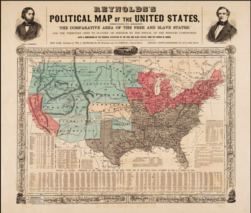
This map uses census data with a clear political agenda. In order to have a persuasive effect he manipulates the appearance of the ‘objective’ map: “the relative size of the northern states is reduced and that of the southern states is increased, as if the globe is being viewed from above the southern states, foreshortening the northern ones” (Reynolds). Data literacy positions the one visualizing the data with the ability to construct a persuasive argument grounded in verifiable/good quality data. Furthermore, bodies are present on the map, indicating the diversity in perspectives. Similarly, DuBois chooses to highlight specific parts of the world and locates his data as central to a particular place. These perspectives are not “the view from nowhere” that Haraway critiques, we know who the data is about and the intentions behind who is portraying it. Another advantage of data literacy is manipulating data to tell your story.
This task is not an easy one:
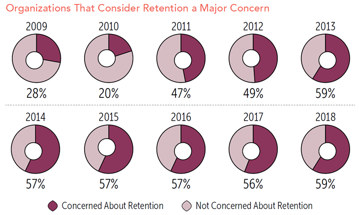
The manipulation of the “donuts” here, is a misuse of data visualization. Though each one is meant to represent an equal amount of time, each donut is created differently with no one “donut hole” in the same place. Despite the years 2014-2016 measuring 57% they all appear unequal in value. Data literacy allows us to distinguish between good representations and poor ones, and encourages an awareness of the implications of these successes and failures.