Categories
Assignment 6

(In)visible Maps

This project began with the name Quashie. More specifically it comes from a poem “Quashie’s Verse” I am examining in my master’s thesis. In this poem the poet/ sculptor Quashie negotiates how to create his poem in the shape of a clay jar, as opposed to a traditional verse form like a sonnet, for example. This poem is not only concerned with form but also with measurement. The shape of clay jar embodies the opposition between the linear European system of measure and a more dynamic, indeterminate approach to creating poetry. This idea recalls discussions of timelines and the transition to network theory. Isabel Meirelles succinctly describes the origins and orientation of the timeline: “The first graphical timelines that appeared in the mid-eighteenth century depicted time horizontally, with time moving from left to right … The orientation corresponds to the horizontal preference for depicting time, and the directionality of the authors’ European writing systems. Literature in perception and cognition has shown that we tend to use the direction of our writing systems to order events over time” (Meirelles 88). These are the very systems Quashie attempts to resist with his poetry.

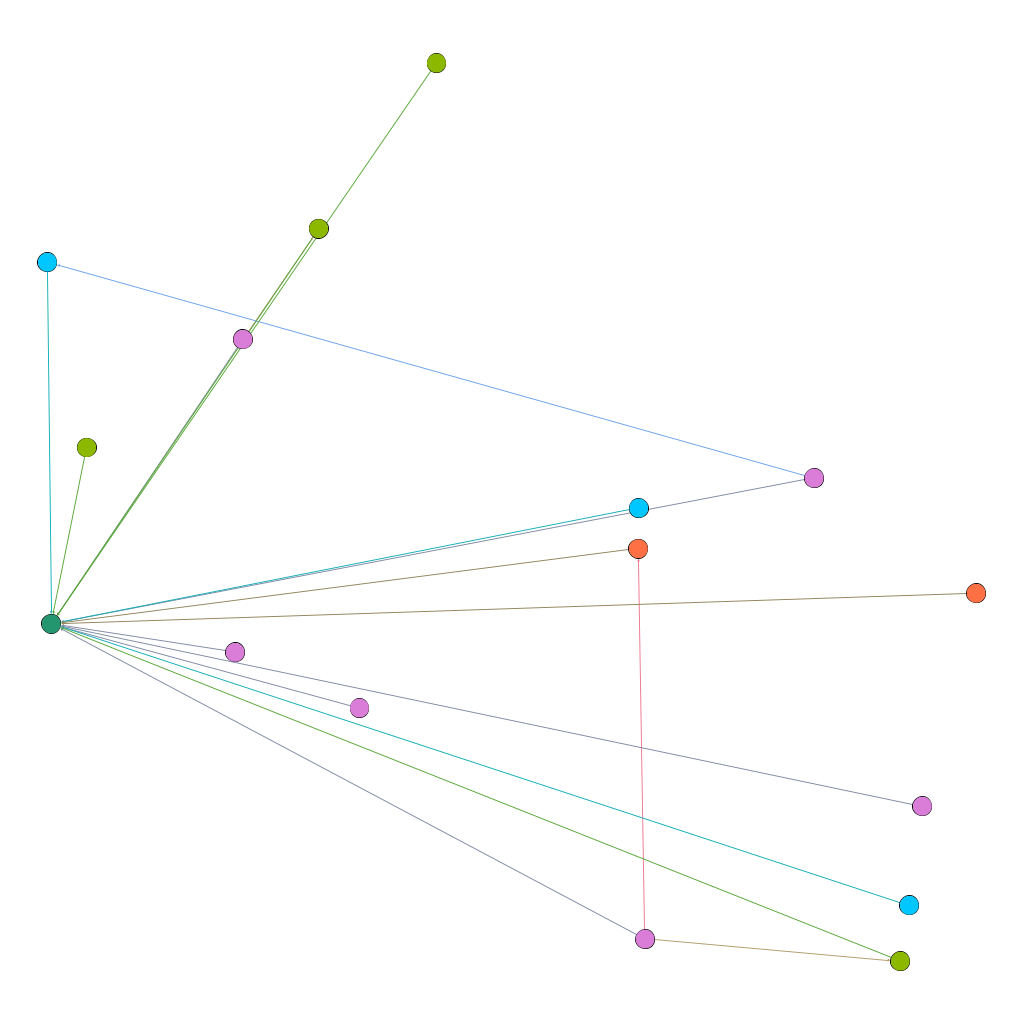
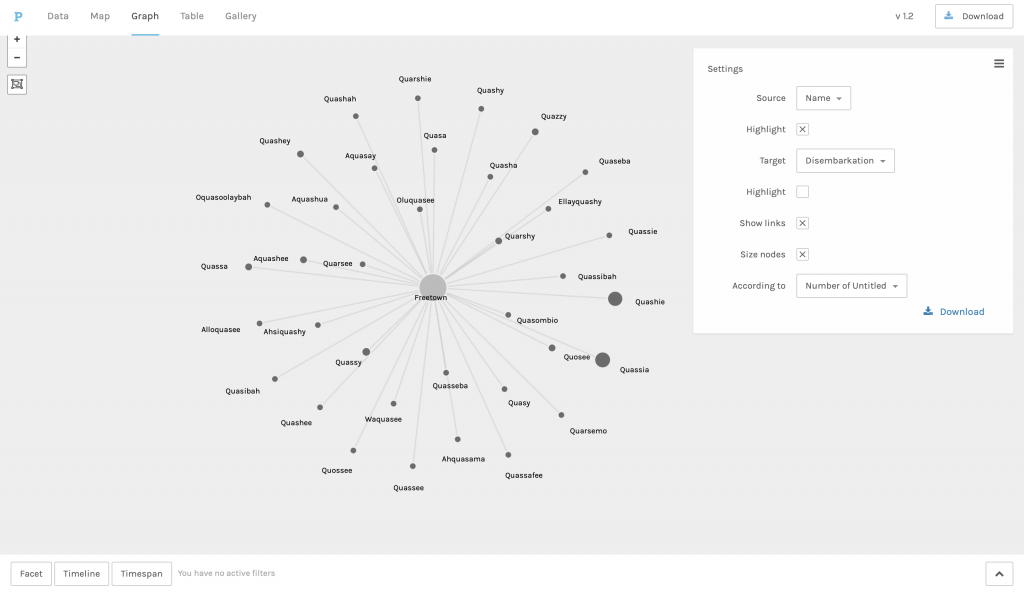
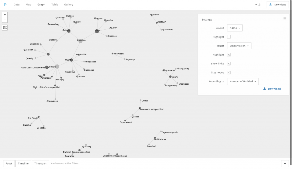
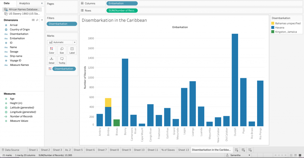
I was happy to engage with network visualization, a form that resists arboreal structures, to understand more about Quashie’s origins. In Palladio I was able to create visualizations of the relations between Quashie and other iterations of the name through time using the African names database. The temporal boundaries were dates of embarkation and disembarkation. What was illuminating was the difference between the visuals depending on the organization of the data. The aesthetics of filtering by disembarkation signified a wholeness or unity among the names with one location and the center of the network. But placing the focus on embarkation created a visual that was truncated and broken, demonstrating the heterogeneity of the ‘origins’ of the names. Recognizing ways that networks could not only show relationships but also map geographies led to my continued exploration of Miller’s poetry in Gephi. 

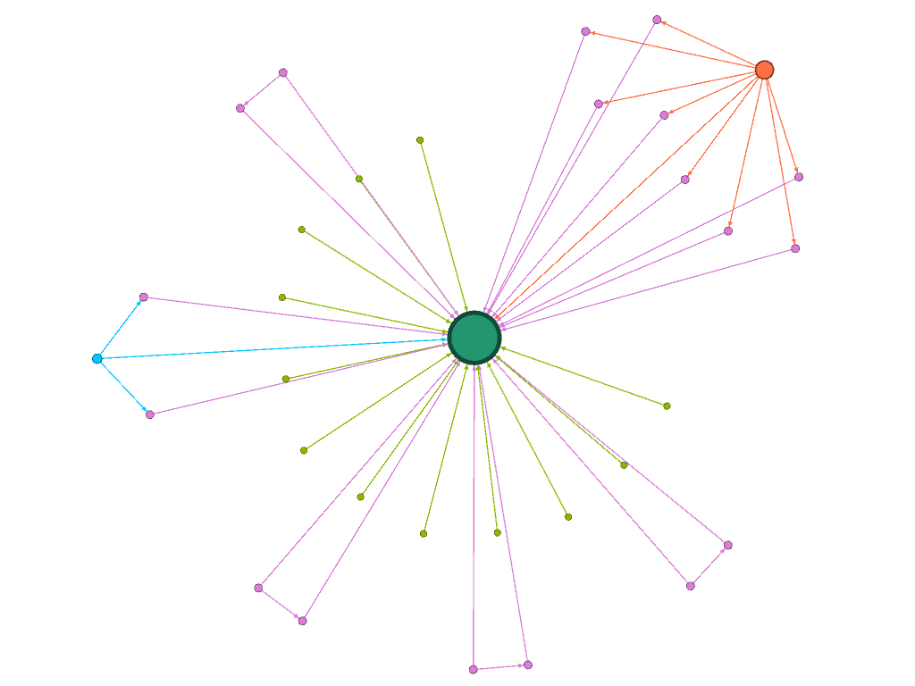
How does Kei Miller produce invisible maps through his poetry? This question is motivated by Manuel Lima’s statement that “network visualization is also the cartography of the indiscernible, depicting intangible structures that are invisible and undetected by the human eye” (Lima 80). In Gephi I explored how words that signify systems of measure are used beyond “Quashie’s Verse,” mapping the relations between words like “measure” and “distance” in his collection, The Cartographer Tries to Map a Way to Zion. My investigation of the cartography of networks, has been largely motivated by the cartographic concerns of Miller’s poetry collection generally and “Quashie’s Verse” specifically. For this reason, I paid attention to the shapes produced by the community of words among the poems. I borrow from Johanna Drucker’s assertion that “graphic expression is always a translation and remediation” (242). For and I am concerned with demonstrating how data may be understood as an art object and ways that the re-spatialization of the text carries meaning differently from its original form. I was fascinated by the shape produced by the Force Atlas layout, for in the top right corner of the visualization emerges a spider. The spider points toward Anancy, who is constantly metamorphosing from man into spider and back, and he appears several poems across the collection. The Anancy figure is significant, for he is a trickster who plays with and plays on language, and on an epistemological level invokes an endless play of signifiers. Then, seeing a version of Anancy appear in this new map prompted me to think more about how maps can be visible or invisible, and ways that lines, measurements and algorithms may be humanistic.

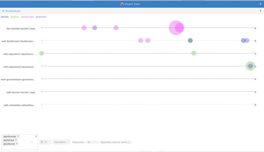
My project, then, picks up where I left off with Gephi. While I am interested in this unfamiliar or distant way of approaching my reading of Miller’s collection, I find it valuable to create a more nuanced picture or map of relations using tools that allow me to engage with the poetry in their original form. First, I turned to Poemage, a visualization tool for exploring the “sonic topology” of a poem. I am interested in visualizing the relationships between sounds in the poems that include Quashie. While Gephi allowed me to draw or create a map of relationships between specific words in the collection, Poemage allows me to create a map between specific sounds in individual poems. Using these tools, I analyze the shapes that emerge from mapping the relationship between words and sounds in the collection and within the poems. To accomplish this, I do a combination of close reading and distant reading to produce what Tanya Clement calls a differential reading. She notes that this method “defamiliarize[s] texts, making them unrecognizable in a way (putting them at a distance) that helps scholars identify features they might not otherwise have seen, make hypotheses, generate research questions, and figure out prevalent patterns and how to read them” (2). In addition to Poemage I use Voyant to get a view that combines the closeness with the text that Poemage fosters and the distance from the text that Gephi offers, allowing me to engage with The Cartographer Tries to Map a Way to Zion in both familiar and unfamiliar ways.

I also wanted to continue exploring network visualization and analysis in Miller’s collection with Gephi. With that I turn to the field of geocriticism, where “To draw a map is to tell a story in many ways and vice versa” (Tally 4). The narrative between the cartographer and the rastaman not only tells a story, it also draws a map. Since the writing of the poems function to create maps I decided to extend the community of words I map to words related to poetry and verse. To do this I appended my initial nodes and edges table to include words like “shape”, “draw”, and “lines,” along with the poems they appear in. To create a more fulsome picture of the mapping relationships, I also decided to include all the iterations of the word “map” in my dataset.

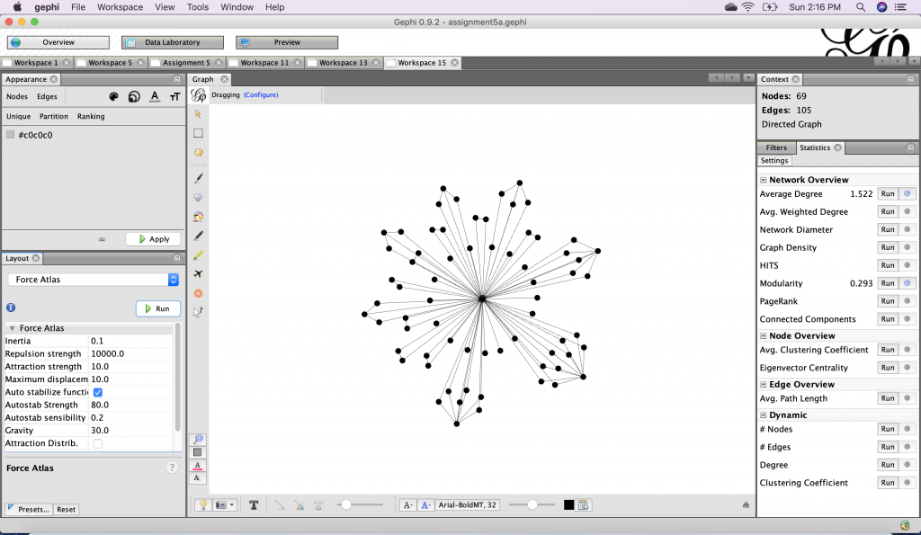
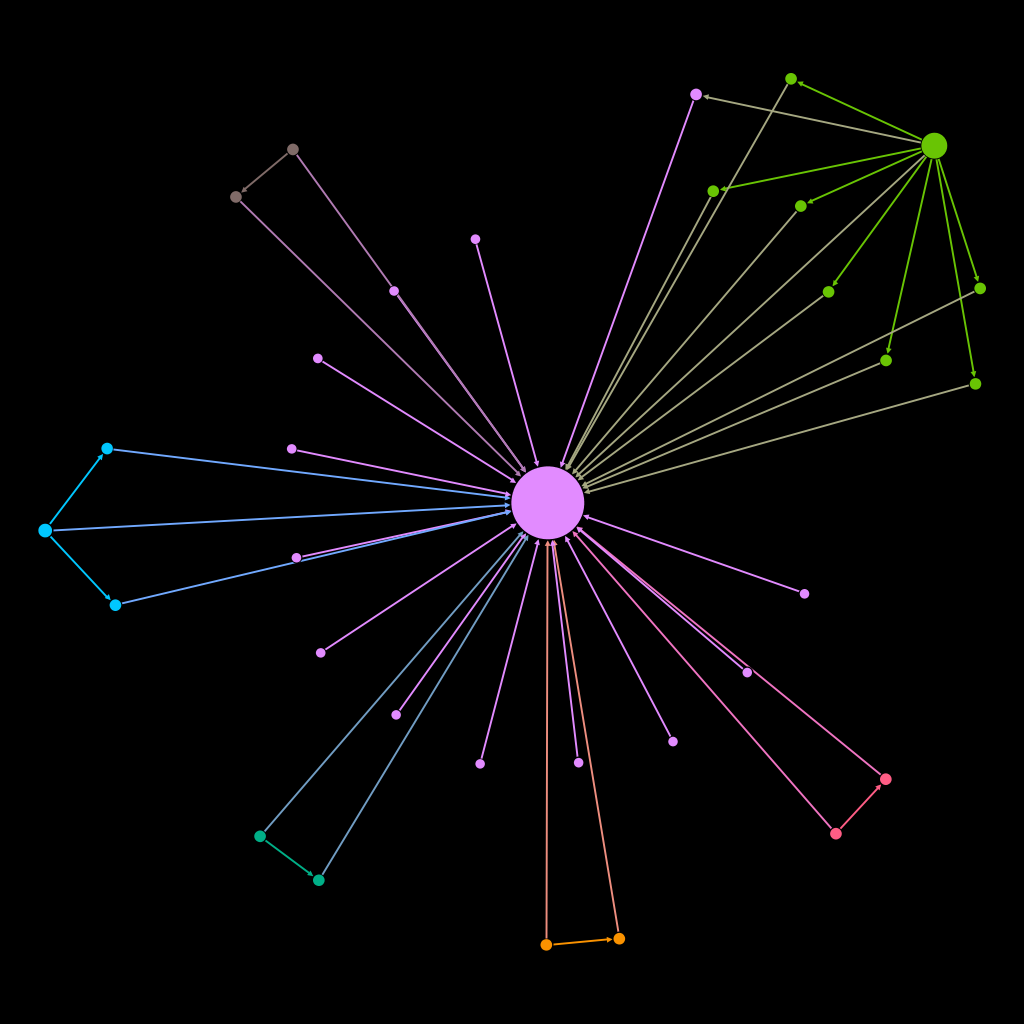
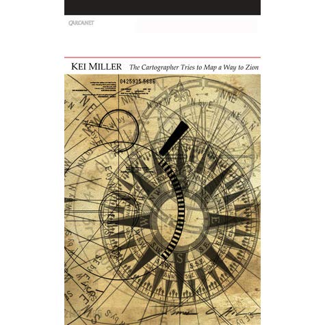
In Gephi the image produced using Force Atlas has a striking resemblance to a compass. I noticed this because there is a compass on the cover of The Cartographer Tries to Map a Way to Zion

An important distinction between the two is that in my design the rastaman at the center. This displaces the cartographer as the symbolic figure of mapping and map design. The visualization I created also demonstrates the play between each of the character’s operations. Insightfully, in “xx” the cartographer states that “every language, even yours, / is a partial map of this world” (2-3). Comparing the first network to the second one I produced in Gephi, it becomes clear that the first – with fewer nodes and edges – is indeed a partial map of the collection. But the same could be said of the second one, as the biases of my own research (specific words) implicate the resulting image. No one view or perspective is definitive. This motivated me to see what may be revealed if I changed the layout.

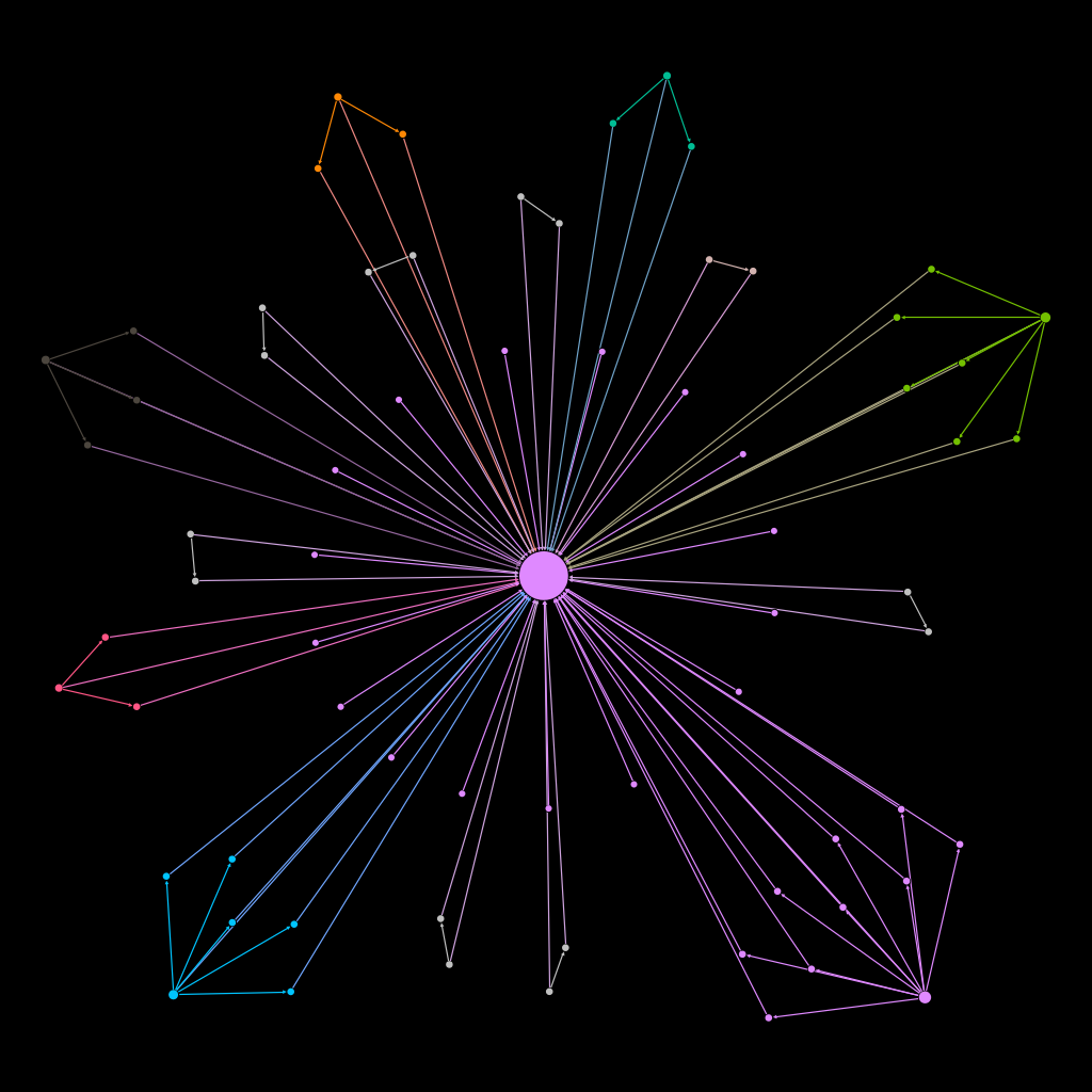
I created the second visualization using the Fruchterman Reingold layout to demonstrate the diverse relationship between the different words in The Cartographer Tries to Map a Way to Zion. Each word is customized to have a distinct color. I used the custom palette to color the nodes with browns and neutral tones in an attempt to mimic the cover image. But I ultimately decided to switch the palette to a variety of bright colors in order to illustrate the variety of words that make up this map as opposed to uniform colors that risk implying there is uniformity in navigating through a space or place. 

By using a variety of dark browns and earth tones I was hoping to replicate the cover image of The Cartographer Tries to Map a Way to Zion.

I understand the following visualization to operate as a compass, not necessarily to orient the viewer within the collection but to point toward its complexities in a nonlinear way. 

Though seeing the relationship between the variety of words in a network diagram is illuminating, I had the desire to map some of these words in their individual contexts. When I first tried using Poemage I was interested to use the tool to investigate “Quashie’s Verse” especially because of the distinct shape it has. However, after fiddling with the poem in a plain text file I discovered that the formatting in the program did not substantially change.

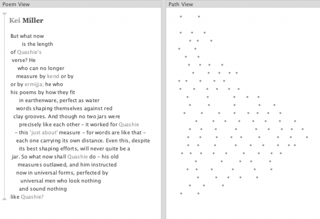
Instead I focused on a poem that also included Quashie, crafting poetry and rhythm. Miller’s “xvii” replicates a dub poem, which is a form of performance poetry that incorporates a beat, usually from a drum – this made it a good candidate for Poemage. After uploading the poem to the program, I decided to focus on assonance. Doing this sort of distant reading allowed me to see a sonic pattern; I noticed the lines that connected words with an “ae” sound.

The light green line represents the appearance of the “ae” assonance within the poem.

This prompted me to think more about the relationship between “rastaman”, “iambic” and “Quashie.” When considering Quashie’s project of writing with a verse form intuitive to him instead of the way he has been “instructed / now in universal forms” generates similarities between his task and that of the rastaman (17-18). Both of these men resist what the iambic metre represents. Playing on the meaning of metre as a unit of measure to create maps and a measure with which one crafts poetry is not only a way to showcase the rigidity traditionally associated with these endeavors, it also links these elements in a way that resists it. The use of assonance is then a way that Miller creates an invisible map, for he also takes space into consideration (even outside of his concrete poem). With Poemage I noticed the even line spacing between those instances of “rastaman”, “iambic” and “Quashie.” Each of the words frame the repeated “DUP-dudududu-DUP-DUP” sound, which speaks to the departure from the iambic metre with one that is intuitive to the speaker/rastaman. Moreover, this highlights the relationship between the rastaman and Anansi in illustrating a “partial map” of Jamaica, one that is not seen by the cartographer, and figures that represent this mathematical, objective and even colonial perspective. 

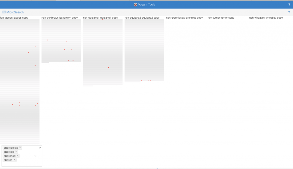
This examination was so fruitful in augmenting the work I began with Gephi that I was excited to use Voyant. The corpus consists of each of the thirteen poems that contain a version of the word “map.” After transcribing a few of the poems to experiment with in poemage I continued to put each of the poems in their own plain text files to upload them to Voyant Tools. I had the idea to visualize the “map” in Voyant spatially. This idea came from my experience negotiating whether to distinguish “map” from “mapped” and “mapping” in the nodes table for Gephi and their frequencies within a single poem. Using a text analysis tool lends itself to working with the text in its ‘whole’ form and observing trends within the entire corpus. In this way Voyant kind of combines my desire to think about the collection as well as the individual poems by examining how a group of these poems relate to each other.

The Trends graph allowed me to see the most frequent words in the corpus, two of which included “map” and “maps.”  I also used the cirrus tool to visualize the relative frequencies of words in the shortest poem. Despite its short length, it contains one of the most significant lines in the collection and to my argument: “I will draw a map of what you never see” (19). It is ironic that some of the smallest words are “bigger” and “larger” while one of the bigger ones is “guess.” I believe this speaks to the pivotal place of indeterminacy in the way the rastaman (and Quashie) understands mapping. It also calls an important connection into sharper focus; the shortest poem is the one that contains the largest number of the word “map.”

Thinking about this interesting occurrence, prompted me to consider using a tool within Voyant to visually contextualize the appearance of “map” and “maps.”

Instead of a traditional arboreal structure with one root, this Word Tree has multiple ‘roots’ that foster various connections and spread out in a meaningful way.

Like the Gephi Force Atlas layout, if one looks closely this Word Tree visualization also resembles a spider. The repetition of the spider speaks to the network that a spider like Anancy would produce by spinning his web. This web is a complex one, made up of words, and like many spider webs remain nearly invisible to the human eye. Flexing my design skills in Gephi and making use of the built-in algorithms in Poemage and Voyant I am able to show several versions of the (in)visible maps that Kei Miller creates through his poetry.

Works Cited

Clement, Tanya. and Price, Kenneth M. “Text Analysis, Data Mining, and Visualizations in Literary Scholarship.” Text Analysis, Data Mining, and Visualizations in Literary Scholarship, 2013.

Drucker, Johanna. “Graphical Approaches to the Digital Humanities.” Schreibman, Susan, et al. A New Companion to Digital Humanities. Chichester, West Sussex, UK, 2016.

Lima, Manuel. Visual Complexity: Mapping Patterns of Information. Princeton Architectural Press, 2011.

Meirelles, Isabel. Design for Information : An Introduction to the Histories, Theories, and Best Practices Behind Effective Information Visualizations. Rockport, 2013.

Miller, Kei. The Cartographer Tries to Map a Way to Zion. Carcanet, 2014. 

Tally, Robert T. Topophrenia: Place, Narrative and the Spatial Imagination. Indiana UP, 2019.  

Categories
Assignment 5 Uncategorized

Assignment 5

The process of transforming my research question to suit the concerns of network analysis taught me a great deal about Gephi. I quickly learned that the approach I took to my general research interest in mapping the relationship between the cartographer and the rastaman through place in Kei Miller’s The Cartographer Tries to Map a Way to Zion was not so much concerned with relations within the text as simply visualizing geography. Instead of attempting “to portray a new unfamiliar territory” I only considered portraying a familiar one (Lima 80). With some more thought about relationships between words that may be fruitful to my research I came to was: How are words that signify systems of measure used beyond “Quashie’s Verse” — the poem in the collection I am most familiar with. This included rereading the collection and looking out for words that are related to measurement of some kind. For additional efficiency I searched for keywords in an electronic copy when I identified them in order to see if the word was repeated elsewhere in the poetry collection. Though I considered using Voyant to do a differential reading I decided against it because I was focused more on specific word choice than on word frequency for example, so it was necessary to do a close reading. Examples of the words I found are “measure”, “arc”, “distance”, “miles” and “length” — each appearing at different frequencies. The process of creating the nodes and edges table prompted me to read around the words I found, for some words surprised me, and I discovered language of measurement is almost only used by the rastaman and not the cartographer. What was not so surprising was that he uses these words to demonstrate the indeterminacy of European systems of measure, or the “immappancy of dis world” (Miller 21). With this in mind I was more prepared to delve into the cartography of networks.

This is the first visualization I created with a smaller data set for testing, the spatial quality of this visualization produced randomly by Gephi inspired my interest in creating a network that aesthetically mirrored the mathematical, even angular imagery invoked by cartography.

Creating the visualization allowed me to map the relationships between words related to metric in Kei Miller’s The Cartographer Tries to Map a Way to Zion. This was particularly fruitful considering the cartographic concerns of the text. The nodes are words signifying systems of measure, and the edges represent occurrence in the collection, which each word is attributed to a particular poem in the collection.

This is an ego network, where the words the rastaman uses concerning measurement are linked to him, and each node is partitioned according to degree, the colors of the nodes and edges representing the poems that have the most connections in the network. However, I did not find this method of visualization particularly illuminating.

This visualization was created using Force Atlas, with an increased repulsion strength

I was fascinated by the shape proceeded so I did not change the layout. Instead I partitioned by modularity class and found the results eyeopening. Seeing the communities of poems grouped according to the linguistic connections between them gave me more insight on Miller’s project with his collection. It reaffirmed Lima’s statement that “network visualization is also the cartography of the indiscernible, depicting intangible structures that are invisible and undetected by the human eye” (Lima 80).

Here, I changed the partition to modularity class, which added clarity and generated new ideas

I felt more confident about my choices knowing that “The best community detection approach is the one that works best for your network and your question; there is no right or wrong, only more or less relevant” especially since I am not mapping a community of people, but rather a community of words (Graham 229). Reading Graham’s work was particularly helpful to understand the elements of networks in general and each of the functions on Gephi in particular. Moreover, the approaches to creating a network in practice were useful. Instead of sticking to what I thought was the only “correct” way to proceed – a Hypothesis-driven network analysis – I felt free to be more exploratory, knowing “that the network is important, but in as-yet unknown ways” (Graham 236).

My Final Visualization

For my final visualization I chose to use a black background to highlight not only the color but also the unique shapes produced by the network. The shape at the top right corner was of particular interest because it resembles a spider. The spider, specifically Anancy, is a figure mentioned in the collection who plays with and plays on language, governing the process of interpretation. Seeing a version of Anancy appear in this new map prompts me to think more about how maps can be visible or invisible, and ways that lines, measurements and algorithms may be humanistic. “You cyaa climb / into Zion on Anancy’s web – or get there by boat or plane or car” (Miller 62). This web invoked by the visualization does not arrive at Zion, in the same way the cartographer discovers there is no one way to map a place that is not quite a place.

Categories
Assignment 3

Assignment 3

I began with the African names database in Palladio to examine the network of a particular name, Quashie, along with versions of that name, including different spellings and “qua” sounds to see how the name developed through time. I am interested in exploring data related to what my final project may include and Kei Miller’s “Quashie’s Verse” is a poem I imagine using as a data source. Only having an idea of what the name signifies in the Jamaican context, seeing it appear in the database sparked my interest in understanding how the name developed during the period of enslavement.

My first attempt at mapping these relations, using name and disembarkation. I also use the ‘size nodes’ option highlighting the names to demonstrate the frequency of each iteration of Quashie.

The graph function in Palladio supports the visualization of the relations between Quashie and iterations of the name through time, using embarkation and disembarkation as those temporal boundaries. In order to make these relationships legible I did some data plumbing, extracting the names that have a phonetic similarity to Quashie before loading it to Palladio. The hidden pattern then emerged from the larger database, all the iterations of Quashie, some spelled Quashee, Quarshy, Quarsee Quashy, to name a few. Others seemed to be derived from Quashie, like Aquasay and Ahquasama, or feminine versions of the presumably masculine name. 

The timeline and timespan features reveal new knowledge, notably the frequency in the documentation of the name Quasia, and then that of Quashie from 1810-1850. The network graph, timeline and timespan allow for multidimensional interaction between visualizations of the data. For example, the Time span filter to group the names by sex, demonstrating that some names were attributed to both men and women. 

Timeline filter (grouped by name with arrival date as the measure)
Time span filter (grouped by sexage)

Furthermore, by reorganizing the data in the network using embarkation in contrast with disembarkation, two significantly different visuals are produced. The aesthetics of the latter implies wholeness or unity among the names with Freetown in the center, while the broken or truncated system produced by the former evokes a diverse relationship, highlighting the heterogeneity of the ‘origins’ of the names. They are not unified or homogenous, despite the similarities among names many came from different places. The image created depends on what the user prioritizes.

A visualization of the same names but representing their relations with embarkation, highlighting the locations instead of the names.

Thinking of these visualizations as art fosters an interesting connection with the visual or concrete poem that inspired this exploration. The idea of critically reading or examining the digital links Tanya Clement’s work with Johanna Drucker’s. In terms of Clement I did a kind of distant reading using the ‘find and replace’ tool in Excel to locate “qua” names and then doing a sort of close reading by examining the words that the program identifies to see if they fit my criteria for phonetic similarity – producing a differential reading. While Drucker’s argument about giving attention to and questioning the tools that digital humanists use, prompting an investigation into the (mis)representations produced by any visualization is made clearer not only by my extraction of the data, but also what I choose to highlight to make an argument.

In an effort to contextualize the visualizations I began with an article from David DeCamp titled “African Day-Names in Jamaica” (1967). He discusses the chronology of male and female African day-names, where “An infant born on Sunday would be named if a male, Quashé, if a female Quasheba, and so on, each sex receiving a name proper and peculiar to each day of the week according to the following table” (140). Gosse’s use of the tabular format recalls Drucker and her discussion of the mechanisms of the columnar form and its complex readings (the starting point for the Palladio and the Timeline JS visualizations). One reading I offer is that by beginning with Sunday and ending with Saturday Gosse adopts or reifies a particular conception of time – that it has a direction. It may even present a hierarchization of the names, despite Drucker’s claim that “grid forms do not express a hierarchy in their graphical systems” because DeCamp seems to take this cue and spends significant time discussing Quashie, the Sunday name (240). Using and citing “Quashie”, “Quashé” and “Quashee” throughout the article, DeCamp illustrates the indeterminacy (in spelling and meaning) of the Sunday male name. Finding phonetic versions of this name throughout the records in the African Names database was then particularly noteworthy.

DeCamp notes the scattered references to the day-names between 1774 and 1851. The end date is supported by the timeline I created in Palladio. But these dates represent the arrival to the New World, not the date of birth of the enslaved. However, the dates are significant because the names taken from court records are likely one of the earlier documentions of these names. How may have documentation practices created new names or destroyed them? What is the ‘correct’ spelling of Quashie? Who made that decision? The authority, then, given to these records implicate the visual representation of this dataset. To return to Drucker, this is an example of the “reification of mis-information” for the biases in the capta are reflected, and further distorted in the visualizations I have created – an inevitable process.

Categories
Assignment 2

Assignment 2

Using Tableau and Voyant to engage with quantitative and qualitative data presented different questions and varying solutions. In Tableau I tried to allow the available data to inform my choices, with the goal of creating some sort of story from the data. I created two visualizations using the African names database, the first of which is an examination of slave disembarkation in Caribbean. This bar chart illuminates the most prevalent location (Cuba) in this dataset. I began thinking about this data with the Caribbean in mind, and initially with disembarkation as a column and embarkation as a color, but after experimenting with the axis and the colors I found a more interesting way of illustrating the data. Those who embarked in Bimbia disembarked in both Cuba and the Bahamas (despite differing ships) – a detail that could have been easily overlooked without this method of visualization. 

For the second visualization I considered what it would look like to see the “null” or unknown data. I think the lack of documentation can tell us something. So instead of simply excluding the “null” data I created a tree map only consisting of this information. The diversity of colors represent stories that are not told through data or otherwise. To draw from D’Ignazio and Klein’s idea of bringing the bodies back into the conversation, I do not believe that the absence of ‘country of origin’ and ‘sexage’ make these records, or rather these people invalid. All of these people have an untold story, I think this visualization demonstrates the diversity of possibilities.

The third visualization comes from the US Slavery 1860 dataset. After creating the map in class and thinking about the usefulness of picturing geographic data in a medium other than a map I created a tree map to visualize the percentage of slaves in each state. This was helpful for me because seeing how the size of the sector correlated with the number of slaves while the color showed the states with the highest percentage of enslaved people was important so as not to get confused by the physical size of the state. The darkness of the orange in Florida makes a statement despite its small sector, or perhaps because of it.

On reflecting upon the complex publication history of slave narratives and their function in the abolitionist movement I thought about how frequent abolition came up in the course of each narrative. The contexts tool in Voyant not only allowed me to see the appearance of iterations of ‘abolish’, including ‘abolition’ and ‘abolitionist’, but also their relative location in the texts. The narratives of Henry Box Brown, Harriet Jacobs and Olaudah Equiano each have some version of abolish/abolition in their texts while the others do not. Bubblelines show the frequency and temporal distribution in the narrative using colored bubbles instead of text. The temporalities of these texts may allow us to understand the diction. The word frequency in Equiano’s narratives (1789), Box Brown’s (1851) and finally Jacobs’ (1861) increases with time. However, there is a substantial gap between Equiano’s two part narrative and the second two. I began to question how the abolitionist movement featured in this trend. After conducting the distant reading I attempted to do a close reading with the goal of a differential reading in mind. I discovered that Equiano had many abolitionist friends and was a pioneer of the movement, which explains such early uses of words like abolition and abolished in this kind of text. In the mid to late nineteenth century the movement was most charged, and Brown and Jacob’s narrative were likely used directly for this purpose whereas Nat Turner’s (1831) for example could not be so explicit in that way. Having already read Turner’s narrative I was able to understand how that text fits in with the corpus, and how forces outside the usual publication history would account for lack of abolitionist discourse. Voyant’s tool allowed me to trace in incline of words like abolish and abolitionist, and how this incline mirrors the timing and momentum of the abolitionist movement.

The Microsearch tool provides a different way of seeing the same data, simulating a paragraph that signifies the length of each narrative. The placement of the dots indicates the relative frequency of the words among the texts. Instead of using multiple colors to represent multiple words, the red operates like a density graph or chart – where darker areas signify greater word frequency. Something I found interesting, however, is that if a word did not appear in a text that representative paragraph was erased instead of being left empty. The absence of the paragraph like structure does not allow for a direct comparison between the length of all narratives and the frequency of the word. It also has problematic implications: if a writer/narrator does not use particular vocabulary, is his or her narrative unimportant to the conversation?

Veliza, an experimental tool is a way of visualizing how texts may literally talk to each other. This simulation is eerily similar to an iMessage conversation from an aesthetic standpoint. Voyant Tools Help states that “the original Eliza was designed as a (parody of a) Rogerian psychotherapist, so the more you write content that sounds like it could be expressed to a psychologist, the more satisfying your results are likely to seem.” In this instance the user is encouraged (by the programmers and the program itself) to focus on feeling and puts the user in the shoes (for lack of a better term) of the enslaved person. The interaction with the visualization is like conversing with the enslaved, and psychoanalyzing their experience of slavery feels inappropriate. Also on the user is put in the odd position of the slave by using this interface. This does not seem to give the one who is enslaved agency, but functions in a similar way to the storyteller/transcriber structure that characterizes the slave narrative. It almost reads as abolitionist propaganda. While very interesting, this tool does not seem tailored to this sort of material. This brings back to mind how blackness is often not considered by those with the power to program, and the ways these programs function to reinforce racist ideologies.

I believe that the etymology of the words Tableau and Voyant, illustrate the differences in each visualization tool. The former, from the 17th century demotes a picture, representing a scene from a story or quite literally a small table. Alternatively, the latter comes from Old French voiage, meaning ‘provisions for a journey’. In my experience of both platforms Tableau indeed operates like a picture using quantitative data to create a static visual, while Voyant’s tools foster a more dynamic interaction with the qualitative data by showcasing the movement of data. So, while Tableau is able to ‘picture’ data, Voyant actually supports some measure of dialogue, exemplified in my last visualization. This prompted me to think about the interface and agency, along with its limitations. The question of who creates these data visualizations resurfaces. Who are these platforms made for? Can the text speak for itself, or does the reader/user speak for it? Overall more control in Tableau to manipulate data while Voyant has specific built-in methods to accomplish a similar end. The approaches, however, seem to stand for opposing ideologies of piercing a text versus ranging over a text. A logbook for example would hold data used to create the African Names database and the various slave narratives are the sources for the corpus used in Voyant. While there is likely to have been more than the clean categories of the dataset in the logbook, it is ‘pierced’ in order to locate value or meaning. Alternatively, in Voyant we are invited to range over the entirety of the text, seeing how each part informs the whole.  

Despite these differences I think both platforms allow the user to see data from multiple angles and how each way of handling the data is informed by a particular goal. Furthermore, the opportunity to play with the data emphasizes that without a goal in mind one can freely observe how the dataset interacts with itself. With an understanding of how Tableau and Voyant operate as users we can choose either to take a snapshot or to embark on a journey. While Voyant prompted me to do a close reading, Tableau encouraged me to find a way to see information that could not be close read.

Categories
Assignment 1

Assignment 1

“Grand Taxonomy of Rap Names” was not only striking due to the eye-catching colours, the subject matter was also a significant point of interest. I was curious about the connections, and wanted to investigate the grand claim the title makes. Taxonomy is a biological term, which recalls arguments made by Lima regarding classification, particularly those concerning the ordering of nature. This visualization, while concerned with classification does not use a hierarchical model (tree structure) but instead uses a network – as it better fits the data. The title, then, becomes rather ironic, for placing value on rap names – a field dominated by black bodies – subverts what Linnaeus accomplished by his own ordering system which fueled scientific racism. DuBois makes a similar move with his infographics using “the map depicting routes of the African slave trade… which served as the lead image for the Georgia study” and “situates Georgia (represented by a star) at the center of the map’s diasporic cartography” (11). The producers of “Grand Taxonomy” visualize rap names in a way that demonstrates new ways of understanding “how various name origins, from physical attributes to audacious misspelling, are all interconnected” the way that DuBois draws lines between countries and continents. “Grand Taxonomy” also bears similarities to D’Ignazio and Klein’s goal in creating Data Feminisms. Their document an annotated one, making connections outside itself, and it accomplishes the task of social collaboration that both Lima and Meirelles discuss in their networking chapters. Network thinking is also integrated in the process of creating the visualization, but because it originates from a poster there are not multiple ways to interact with the data. Though it may be described as a static visualization, the links between the nodes are dynamic for they are built on multiple relations.

A relationship between “Grand Taxonomy” and “The Guardian: A Semantic Network Graph on Lebanon” is formed through the concept of the rhizome. Lima quotes Deleuze and Guattari who argue, “the rhizome is an acentered, nonhierarchical, nonsignifying system without a General and without an organizing memory or central automaton, defined solely by a circulation of states.” Both of these visualizations depart from the arboreal structure and adopt a network structure, which allow them to convey information in a way that represents those dynamic relationships.

Because I come from the field of literary studies, I am interested in the relationship between words and “A Semantic Network Graph on Lebanon” seemed to be a promising exploration of those relationships. This visualization bears similarities with those examined previously insofar as its manipulation of proximity, use of colour and relative size (of the nodes) are used to communicate meaning. This work is quite literally about new perceptions, and it also visualizes many perspectives: “The goal was to understand how Lebanon was perceived abroad by understanding the main actors, relations, and most relevant topics.” Furthermore, there are multiple iterations of the network graph that move from the ‘raw’ sketch to increasing detail that populates the network with nodes and labels, showing the progression. It uses the architecture of decentralization. With the focus on Lebanon, parallels may be drawn with Lima’s discussion of flaws in city planning, and understands “the city as a living organism in constant mutation, a highly complex network involving a vast number of variables” (Lima 48). This concept is echoed in the visual project pursued by students in a digital lab. The ‘finished’ product, however, is presented on a physical page, deeming it a static visualization. But one difference between this visualization and the former is the inclusion of images of ‘zoomed in’ clusters. Their technique is similar to a particular digital strategy outlined by Meirelles: “Other effective strategies involve enabling the user to change the camera view or zoom into the graph, for example. So-called focus + context techniques involve operations that keep the contextual view of the whole graph while enabling a selected area to be represented in detail” (58). This effort may blur the lines between what we understand to be static and dynamic visualizations.

From the DH Sample Book:

American Panorama: An Atlas of American History

This digital project can be clearly situated in the field of dynamic visualizations. An interactive map, it allows the user to navigate the clusters of data and has an effective filtering system. It facilitates an effective transmission of information that does not suffer from disorder or an overwhelming amount of data, like the treemap it is a“space-efficient display of large structured datasets” (Meirelles 30). For example, in the Renewing Inequality project on family displacements from 1950-1960 allows one to view the same space through the lens of demographics and incomes or from the perspective of redlining. 

Mapping Metaphor

This project uses the Historical Thesaurus of English as its primary source, and furnishes us with a dynamic way of interacting with that text. While it uses a circular network layout, the ideology motivating the visualization is a hierarchical one. One of the first bullet point on the homepage reads: “This circle represents all of knowledge in English: every word in every sense in the English language for over a millennium.” This statement embodies the centralism and finalism that Lima critiques, and stands in direct opposition with the idea of the rhizome. While the data can be viewed through different perspectives, these seem to function to reinforce the idea of absolute understanding.