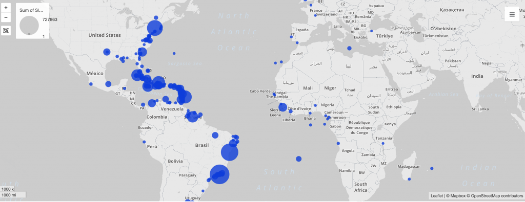
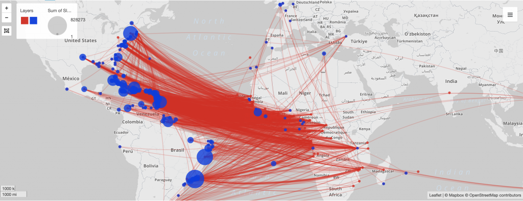
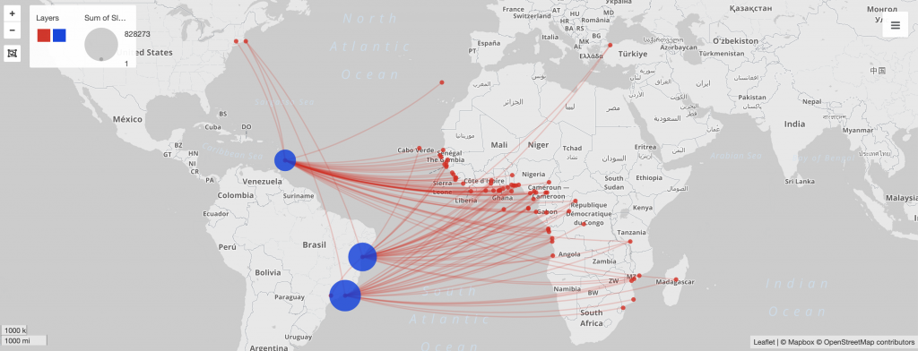
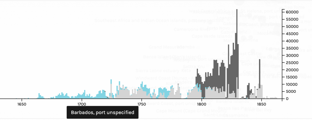
Networks show relationships between everything and everyone. Lima believes that “network visualization can be a remarkable discovery tool, able to translate, structural complexity into perceptible visual insights aimed at a clearer understanding. It is through its pictorial representation and interactive analysis that modern network visualization gives life to many structures hidden from human perception” (Lima 79). Using Gephi to analyze a dataset, one is able to take a group of people, and highlight the connections within the group through their common attributes. The goal of using Gephi in this way is to create a network visualization that clarifies the group and bring new information to light, that is difficult to find on a spreadsheet.
For this assignment, I wanted to see the relationship between major and home state of my teammates on the rowing team. I was curious if there was some sort or relationship between these attributes, but also if any particular members were more connected than others. I started by creating a node table of every member of the Bucknell Women’s Rowing team from the graduating years 2019-2023. Unlike other visualization platforms, I had to sort through my data and organize it to show the nodes in the simplest way. I then created the edge table which connects every person on the team, each node, with each other on the common connection that they are or have been all on the rowing team. This process was particularly difficult for that I had to go back between the Google spreadsheet and Gephi to make sure all of the nodes were connected correctly, and there was not any extra connections. As I found out by doing this, “it is easy to become hypnotized by the complexity of a network, to succumb to the desire of connecting everything and, in so doing, learning nothing” (Graham 201). By not analyzing and sorting out the network, my visualization was crowded and nearly impossible to read.
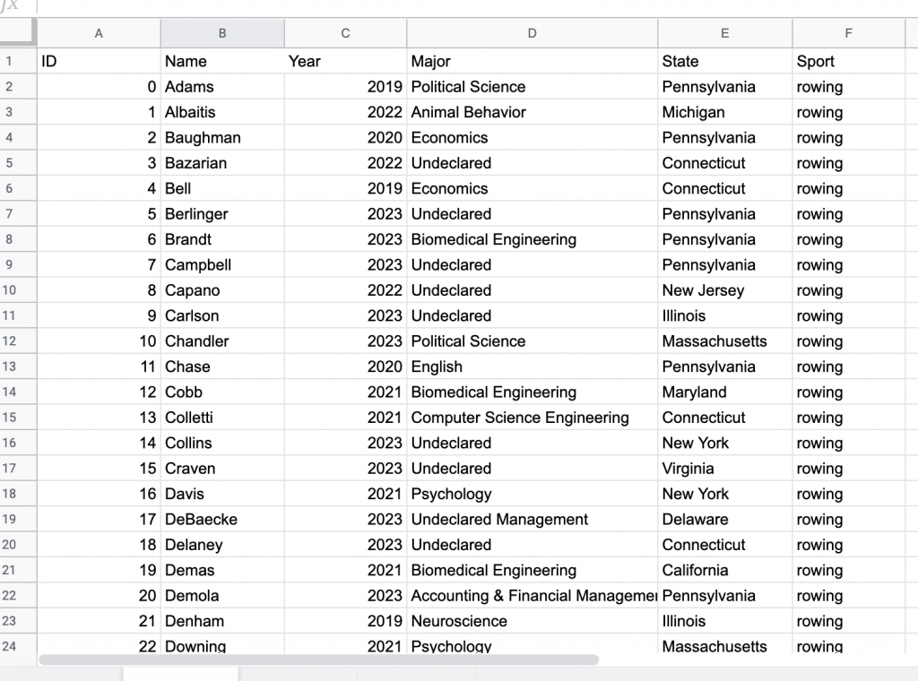
Node Table 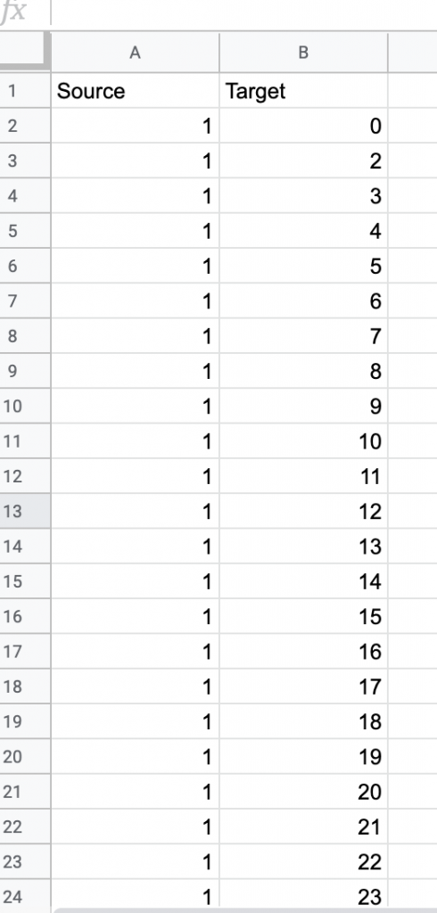
Edge Table
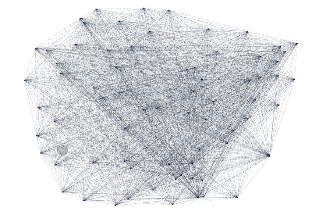
As Graham mentioned, by having every node connected, it is very difficult to learn anything about the dataset. I wanted to look at degree for that “in fairly small networks, up to a few hundred nodes, degree centrality will be a fairly good proxy for the importance of a node in relation to a network” (Graham 217). However, because each node is connected to every node only once, every node at the degree of 72, so every edge have the same weight of zero. And for this same reason when I ran the statistics test for modularity, it also came up with zero for that each node is connected in the exact same ways. This made analyzing the information a little bit more difficult.
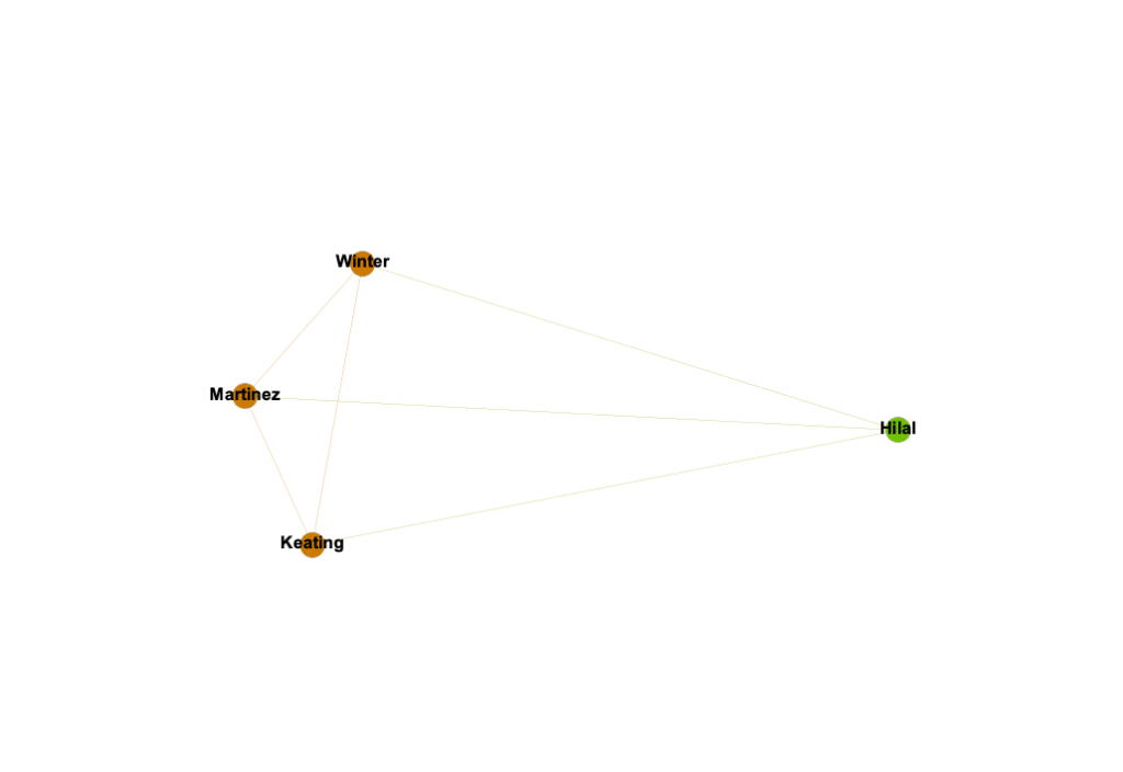
Lima states, network visualization is “a potential visual decoder of complexity, the practice is commonly driven by five key functions: document, clarify, reveal, expand, and abstract” (Lima 80). I wanted to document the potential relationships within my rowing team on the attributes of Name, Graduation Year, Home State, Major, and Sport Team. To clarify the data I played with the different attribute filters and partition coloring. By doing this, I revealed that there is a very strong relationship between Winter, Martinez, and Keating, which could be potentially be expanded in a larger, more focussed project, and possibly use it as an abstract representation for some larger connection.
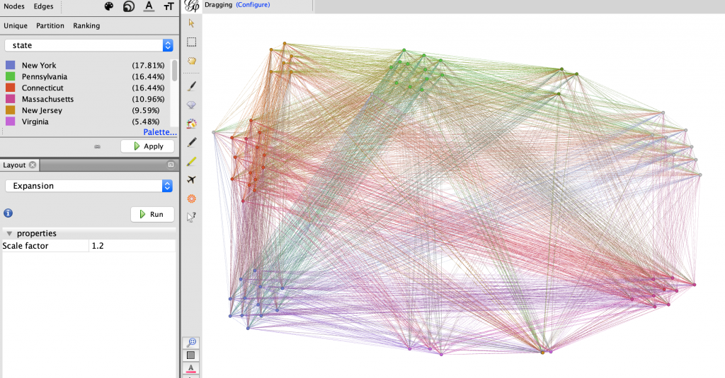
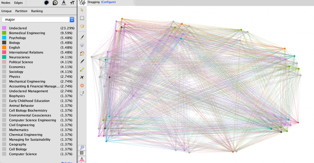
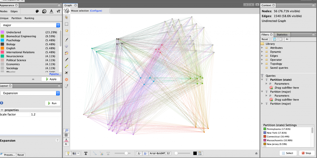
I started analyzing the data by partitioning the data by home state and generally grouped the nodes accordingly using the dragging tool, as seen in Figure 2. This proved to show that much of my team is from the North-East United States. I then partitioned the every member’s major, keeping the grouping as home state to see what they most common majors were within the team, and possibly within certain states. As seen in Figure 3, the partitioning in this way did not show very much. I then filtered the data in Figure 4 to display only the nodes with states within the north-east.
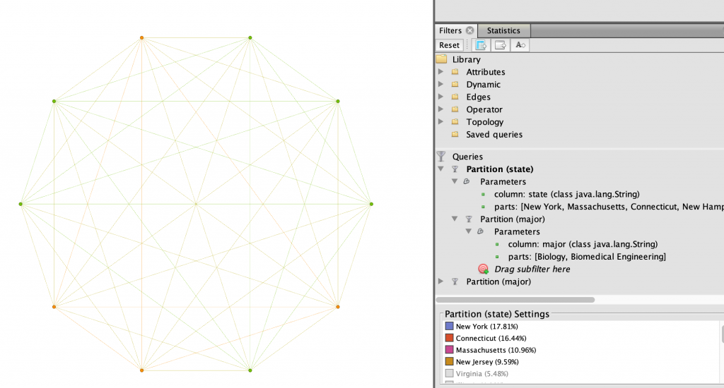
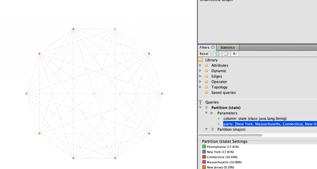
After seeing only the nodes in the north-east, I further filtered the data to show only the top two STEM majors on the team, Biomedical engineering and Biology. I thought that there might be a relation between those living in the north-east and their likelihood of being a science, technology, engineering, or mathematics majors. In Figure 5, I showed this relationship using the Circular layout. I then became curious what states these women were from, so I used the same layout and filters, and in Figure 6 I changed the partition color to states in the north-east instead of major.
I wanted to further expand which of my teammates had the strongest connections in terms of what region they were from and their majors. I filtered the state parameter even further to only include the tri-state region of New York, New Jersey, and Connecticut. This revealed to me in Figure 7 that three of the four women who were from this particular region are Biology majors. Thus allowing me to find that there is a very strong relationship between Winter, Martinez, and Keating.
Through learning Gephi I have found it to be extremely useful in displaying relationships between nodes. The filtering, color and size partitions, and layouts were ideal in customizing the network in a way that is visually appealing and highlights the important information being shown. However, one thing that Gephi does not do unlike other platforms we have used this semester is the ability to change the edge relationships easily. At times I wanted to have the edges connect nodes with the same state attribute, or major, but I found it to be more difficult that worth. How I created my edges was simple, however still took close to an hour to create the edge table for it in a spreadsheet. Interacting with the dataset at the spreadsheet phase was new and quite a learning experience in comparison to the other visualization platforms we have used, which were given to us in the way that worked with the software. Overall, Gephi is fussy to work with, although in the end it is all worth the beautiful networks that can be created.