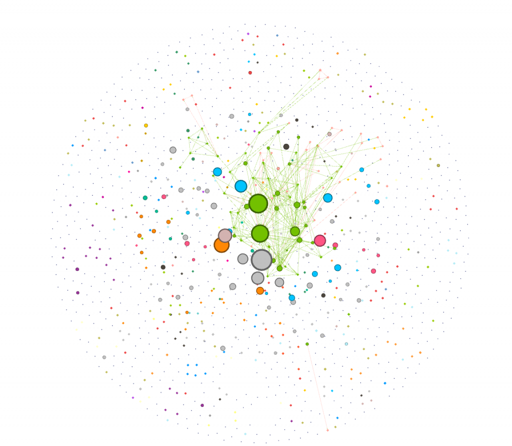
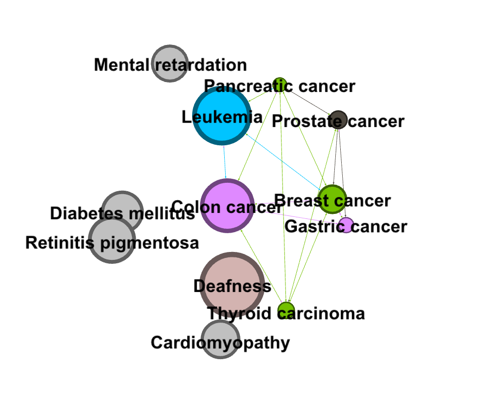
I chose to analyze a dataset of diseases and genes and how they are interconnected. I think the visualization method employed was very effective for this particular data set — I really appreciated the structure of network diagrams. Networks work really well for data in which there are many nodes with multiple, complex connections. Lima articulates the beauty of networks: “Cities, the brain, the World Wide Web, social groups, knowledge classification and the genetic association between species all refer to the complex systems defined by a large number of interconnected elements, normally taking the shape of a network. This ubiquitous topology, prevalent in a wide range of domains, is at the forefront of a new scientific awareness of complexity…” (Lima 69). The relationships of different diseases to each other would be hard to visualize in any other way. The complexity and multiple layers of this data were the most interesting part to me, which is why I chose to focus my analysis on how the most connected disease (colon cancer) is connected to other diseases within the set.
With this set of data on diseases, I was initially interested in visualizing how many of the nodes in this network were cancer, and how these nodes were connected to each other. To find this out, I first used the inter edges filter to filter for just cancers (6.2% of the data).
filtered for cancers
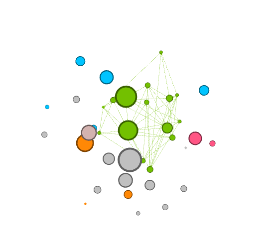
I was curious about which cancers were the most connected to other cancers. I dragged the degree filter under the inter edges filter, as a sub filter, and gradually eliminated cancers that had a low degree number from my visualization. I added labels in as the visualization shrank to show which cancers were the most connected. I have screenshotted the steps I took and included them below.
filtered at: 26filtered at: 76
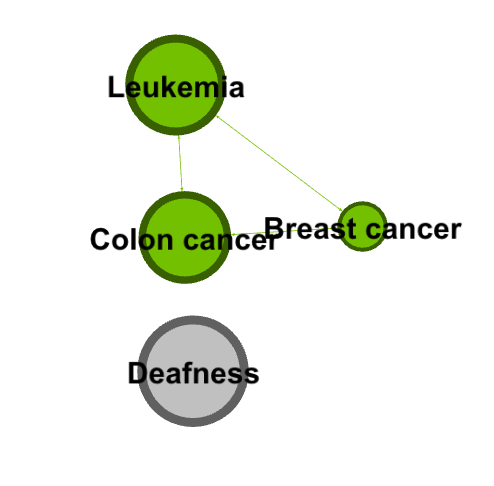
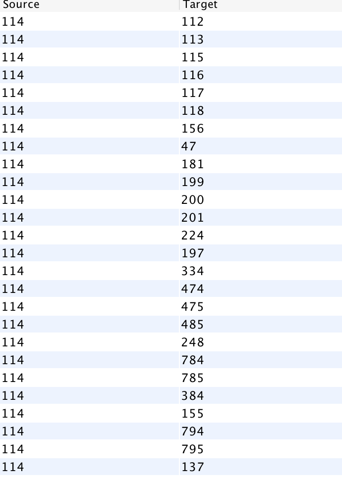
Next, I went to the Data Laboratory to see a complete list of all the cancer that colon cancer was connected to. I filtered for Colon cancer (114), and waited for targets to show up. I was presented with a long list of ID numbers. One challenge I had with gephi was that I had to go back to the main data set and cross reference the filtered IDs to find the names of the cancers (I wish the edges tab, where I filtered this data, had a column for name as well!).
colon cancer and targets (this was only half of the targets)
I then filtered my visualization by modularity to detect communities. I filtered it further by degree to make communities and their relation to colon cancer more clear.
I found that learning gephi was slightly easier than the other platforms. I mainly learned through experimentation, and trying different filters and settings until I learned how to filter towards the specific part of the data I was looking at (cancers). I enjoyed this process of learning gephi and exploring the data. I created my visualization and my analysis through exploratory network analysis, which Graham defines as being based around the idea that: “ the network is important, but in as-yet unknown ways”. Researchers “ explore that dataset in order to find whatever interesting information may arise from it” (Graham 236). I took a very large data set and focused in on one area that I found interesting, and then through exploring the gephi software and the data set, I was able to pull some interesting analysis.
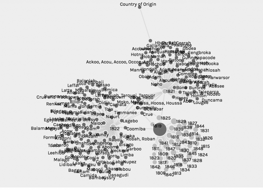
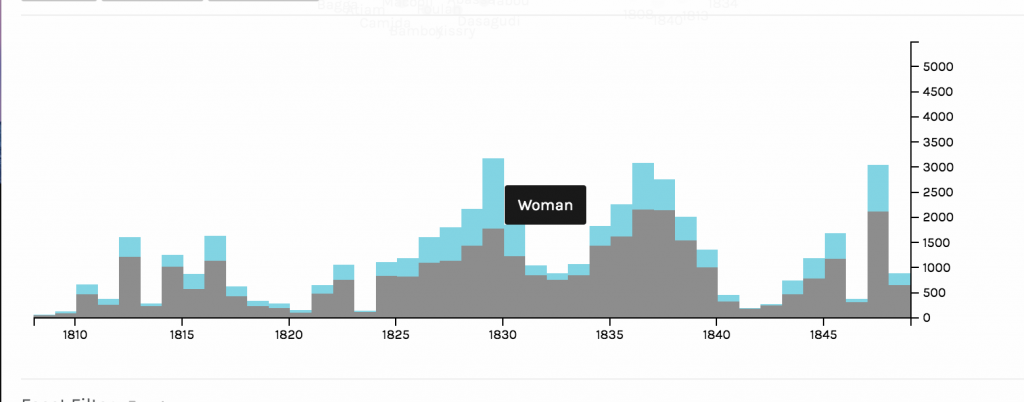
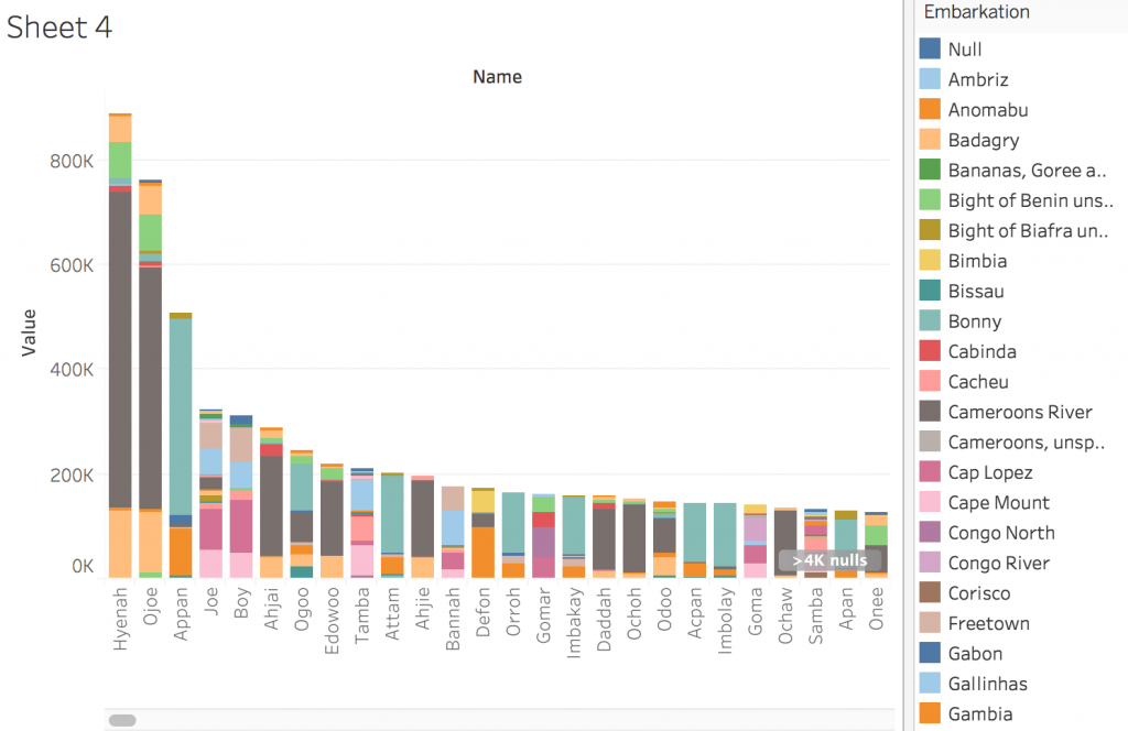
In creating this visualization, I first charted the country of origin and the date of arrival. Then, I further filtered the map by looking at a chart of gender, and which years numbers of different genders came. The graph compares the amount of men and women arriving in the 1800s. Specifically, I am looking at the years 1820,1830, and 1848.
First graph of arrival and country of originFiltered graph of male and female slave arrival
In the year 1820, the amount of slaves arriving dropped dramatically. 1820 is one of the lowest points on the graph in terms of both men and women arriving. The spatialization of data on the graph allowed for me to very easily see at which points the numbers were the lowest. Based on this dip in numbers, I did some research on why this might be. In 1819, a bill was passed that allowed armed cruisers to patrol the coasts of the United States and Africa to supress the slave trade. Another act in 1820 ensured that the slave trade was came under piracy laws, which was punishable by death. Ships were despatched to defeat slave traders and pirates. So laws and policies in and around 1820 provide some explanation for the drop in slave arrival.
In 1830, there was a spike in the arrival of slaves. This spike is one of the highest on the chart. Something I found interesting about this year was the ratio of men to women slaves was closer to equal than at any other year on the graph. The var graph as a mode of visualizing allowed me to see this phenomenon very clearly. As Drucker discusses, visualizing data in the most fitting form is essential in preventing distortion or misinterpretation, and in allowing the viewer to gain the most knowledge from the visualization. The bar graph allowed for me to understand both the overall amount of slaves arriving at certain dates, and to compare the amount of each gender arriving. In terms of why so many women arrived in 1830, I did not find a lot of historical explanation. One theory I had was that the spike in slaves arriving in and around 1830 made Nat’s Rebellion, which occurred in 1831, more possible. The increase in slave numbers could have increased confidence and a “strength in numbers” mentality that fueled the rebellion.
In 1848, there was another big spike. This spike was interesting because again, it is one of the largest spikes on the graph, and it is surrounded by very low numbers in slave arrival. One possible explanation for this drastic increase in arrival is the Mexican-American War, in which the United States gained control of the Mexican territory. With this new area, there was bound to be some expansion and demand for more slaves, despite general anti-slavery sentiment that was growing in the country. Additionally, reports from this time showed that American ships were not pursuing slave traders.
I think the visualization of how many male and female slaves came in the span of years is a generation of knowledge, not merely a representation. I created the gender visualization by filtering a larger visualization. From the gender graph, I then identified interesting time periods in which the arrival of both or one of the genders charted was significant. This data is generated knowledge because it is filtering knowledge that was already graphed, and displaying it new ways that lead to new conclusions. Although, as Drucker states, all visualizations are representations, or substitutions of data that pass themselves off as presentations of the information itself, focusing in on specific data points does generate more knowledge about the data set, regardless of whether that knowledge is wholly accurate or not. Charting specific parts of a larger data set, and then narrowing in on even more specific dates reveals insight that could not have been generated otherwise.
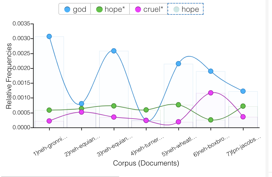
In my visualizations, I was mainly interested in how slaves were dehumanized, how society reinforced this cruelty, and in what ways enslaved people persevered. In my visualizations through Voyant, I was focused on the relationships different words throughout the texts have to one another. I was interested in which words often coincide with other words, and if there is a relationship between them, even if they are seemingly contradictory words. The first graph I created analyzed how often the words “God”, “hope”, and “cruel” were used throughout all 7 of the texts. I chose these words because I wanted to see if there was a connection between “God” and “hope”, in the sense that slaves found hope through religion. I noticed that “God” was either used a lot, or hardly at all in the texts, and when it was used, it did not overlap much with “hope”. One observation I made about this graphic was how the words “cruel” and “hope” aligned in many of the texts. In the first 4 texts, and the 7th text, “hope” and “cruel” are used a similar amount, which I found interesting because they are such contrasting words. Specifically in the context of slavery, the fact that these two words were used together so often is a little shocking – when there is cruelty, there is also hope. It is almost to say that in spite of the cruelty, there was hope.
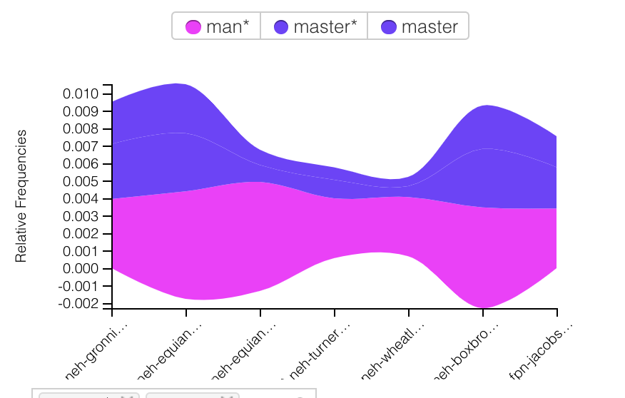
The next graph I created analyzes the use of “man” and “master” throughout the texts. Similar to my first graph, I was surprised by how often these words overlapped. “Man” and “master” specifically seem to be used together a lot, which is logical as the slaves would refer to white men as “master”, and slave owners might refer to their slaves simply by gender (which is furthered referenced in the Tableau graphs). The correlation between “man” and “master” speak to the clear roles established in this time period.
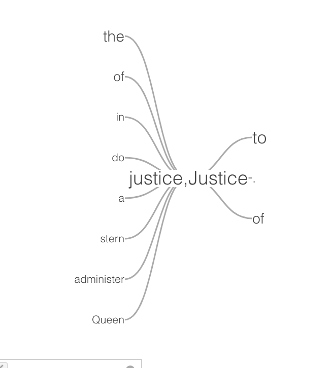
The last graph I made using Voyant was a word tree centered around the word “justice”. There were some expected small words, like “the”, “do”, etc, but some of the other words shocked me. I found “queen” and “stern” in particular interesting. The idea of justice being associated with the queen is telling of the time period being written about. It also makes me question how just “justice” was. Using “stern” in reference to justice supports this doubt – stern justice sounds like cruelty being disguised as doing what is right. This association of words with justice says a lot about what was considered right and wrong at the time, and how this contributed to the cruelty touched on in the first two graphs. This idea of stern justice, being endorsed by the most powerful dictator of justice, provides some insight into how this dehumanizing and cruelty to the slaves occurred.
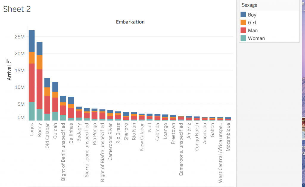
In Tableau, the first graph I created analyzed the genders of people coming from different embarkation locations. It breaks down the total number of people from each location into categories of man, woman, boy, and girl. I found it interesting how consistently the populations were male heavy – it lead me to question whether people were being gendered correctly. Based on my observations in Voyant, I was interested in which ways slaves were being dehumanized, and denied justice, and treating them as genderless, nameless, animals was one of them.
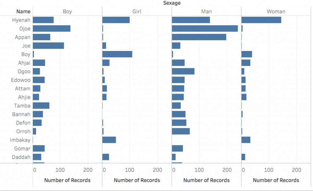
Next, I graphed how many men, women, boys, and girls had the same name. For example, the name Hyenah was used very frequently for all of the four categories. Another interesting categorization that confirmed my suspicion on lack of correct gendering, the name “boy” was used mostly for girls, and often for women, and very little for actual boys and men. This completely inaccurate gendering just goes to show how little the capturers were concerned with the slaves’ identity. Calling many people by simply “boy” reduces their identity to a hugely broad gender that, in most cases, was not even accurate.
Lastly, I created a graph that showed which names were coming from which embarkation location. For example, people named Hyenah were coming mostly from the Cameroons River. This visualization made me curious about how people were being assigned names. Was the name Hyenah very common in places like the Cameroons River, or did the white capturers just clump people together under the same name for convenience sake?
Tableau and Voyant were very useful for visualizing two totally different sets of data. Tableau creates graphs using numbers, which was perfect for visualizing the huge amount of slaves being transported, and their genders, names, and places of origin. I think Tableau was particularly good at combining different aspects of the same data set (for example, name, number of people, and embarkation location all in one graph). I also think Tableau provided many user friendly ways to customize graphs and make them more complex – for example, I found the tool tip feature very useful and effective in adding layers to visualizations. Also the ability to change colors and labels was useful and allowed for more creativity. Voyant, on the other hand, was able to visualize a huge amount of literary information in fascinating ways. The ability of this program to draw connections between even the smallest elements of literature, like individual words, is amazing and shockingly helpful for drawing larger conclusions about the text. Voyant was able to compare 7 different lengthy texts, while keeping the visualizations clean and easy to read. When using these two platforms in combination, I was able to draw connections between how slaves were being dehumanized, through a removal of their identity by calling them by gender or incorrect names, and in what ways society continued to enforce it, like through the skewing of the word “justice”.
To address Clement’s observation about visualizations creating multidimensional viewpoints, I think both Tableau and Voyant allow one to synthesize multiple different sources, and thus, multiple different viewpoints, to draw some larger conclusions. Through Voyant, it is possible to analyze 7 different texts at the same time, and find commonalities between all of them in terms of word usage and more. This kind of analysis yields more holistic conclusions and connections. For example, the correlation between the use of words “cruel” and “hope” over multiple texts is much more telling than if that connection were to be observed over just one text. Additionally, the ability to combine multiple aspects of the same data set through Tableau allows for connections to be made across categories that might not have ever been compared, like the relationship between certain names and embarkation locations. In a more broad sense, one aspect of both of these visualization platforms that I found created “a feeling of justice or authenticity”, was the ability to experiment with so many different combinations of data, sources, categories, and forms of visualization. This process made me feel like I had seen the data from many different perspectives, and thus, was able to create accurate and effective visualizations.
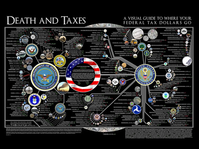
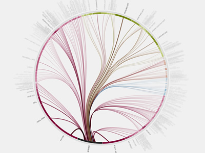
I chose these two visualizations because the visuals were easy to read and navigate and they both covered issues that I think are worthy of analysis. The information flow in science graphic is a dynamic visualization, as it lets users interact and choose specific topics to view more information/ additional visualizations. The US tax graphic is static, as it is not interactive. In the US tax graphic, preattentive features (size, color, and line weight) are utilized to draw the viewer’s attention to most important symbols: “…the objective (of preattentive features) is to support perceptual inference and to enhance detection and recognition” (Meirelles 22). The information flow in science graphic provides interactive ways for the viewer click around the graphic and view different perspectives and journals. All these visualizations are beautiful, but not in such a way that distracts from the information, which was something Dubois stressed in his American Negro Exhibit: “However, the art did not distract from science; it served to reinforce the comprehensive scientific data chronicling the African American journey” (Dubois 34). There is a purposeful organization to this graphic as well – it is in the form of a tree graph, which illustrates the hierarchies in the citation network and the division of journals into four categories and then into subcategories. This method is effective in how it “applies the hierarchical model to show our desire for order, symmetry, and regularity (Lima 25). Additionally, the graphic on US taxes presents new information and a new perspective to the public, who often do not know where their tax money is going. When a large governmental organization holds all the power, data visualization is an important tool that can be used to inform. D’Ignazio and Klein emphasize this point in their discussion of feminism and power: “Feminism is about power–about who has it, and who doesn’t. In a world in which data is power, and that power is wielded unequally, feminism can help us better understand how it operates and how it can be challenged”.
The first visualization I chose from the DH Sample Book is the graph on “Lesbian and Gay Liberatio in Canada”. This graphic is a dynamic visualization that allows the viewer to click through the graph and view specific points in history and further information. It gives the viewer a strong historical perspective to this movement that might otherwise get lost in modern times. Another progressive and interesting part about this graphic is how it includes biographical information on every person involved in the database, which adds validity and depth to the information. This graphic is eye opening and provocative as it prompts questions about the global momentum of this movement. One weak point of this graphic is although it is very organized and clear, the visual aspect is not very exciting or eye catching.
Another visualization I analyzed from the DH Sample Book is “American Panorama”. This visualization looks at the displacement of American families in “slum” neighborhoods of cities in 1955-66. The way the information was presented was very interactive and dynamic, and also very user friendly. The website gave an overview of what the graphic would discuss, provided a key. It then lets you move your mouse over different cities to view statistics on urban displacement. This graphic brings new information to light and highlights specific issues within this larger issue, like race, poverty, and redlining in cities. For example, there is a graph for each city that chats the displacement of families based on race, showing the disparity between how many white families were displaced and how many families of color were displaced. It allows the viewer to understand the situation from the perspective that is different from that taught in textbooks.
Data visualization is the vehicle for crucial data to be presented to the public. The “Bring Back the Bodies” reading points to how good data visualization can uncover injustices and inform the public. The article uncovered how little data there was on women’s childbirth and rates of death, and also how black mothers were at higher risk during childbirth than white mothers. Data literacy is essential for public understanding of such issues. The Dubois chapter touches on how data visualization can be specific for specific cultural topics, like how current day data visualization of the Harlem Renaissance refers back to visualizations in 19th century that connect to slavery. He also discusses how good design can be used to communicate beyond cultural barriers, specifically in how he conveyed American racial data to a European audience. Data literacy facilitates understanding connections between issues, importance of new data, and provides a method of universal communication through design with people different from you.
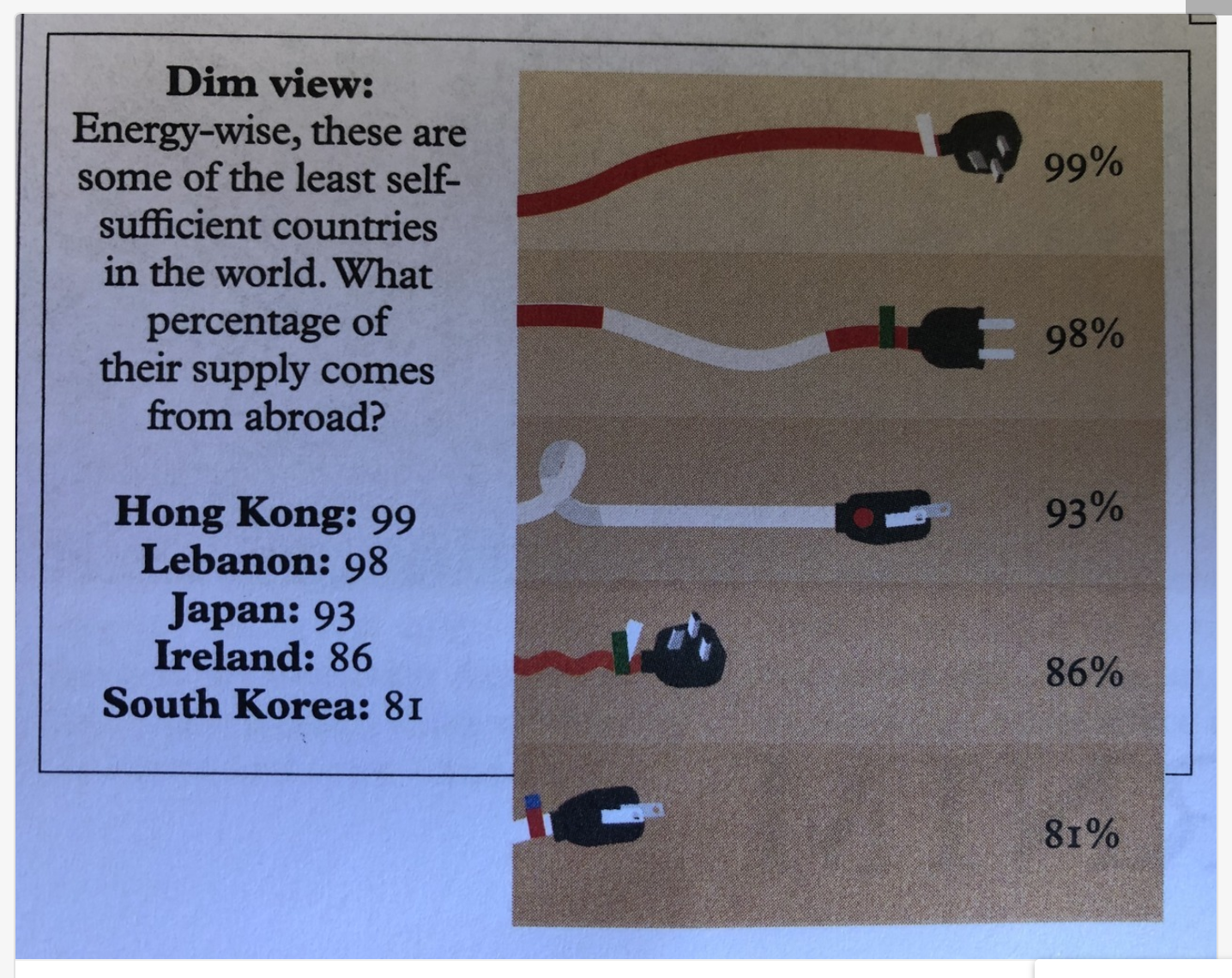
Even if one has good data literacy skills, sometimes a poorly created graphic can make data impossible to understand. For example, this visualization attempts to compare what percentage of these countries’ energy comes from abroad. Poor size representation skews the information – – the 81% chord is a fraction of the size of the 99% chord.
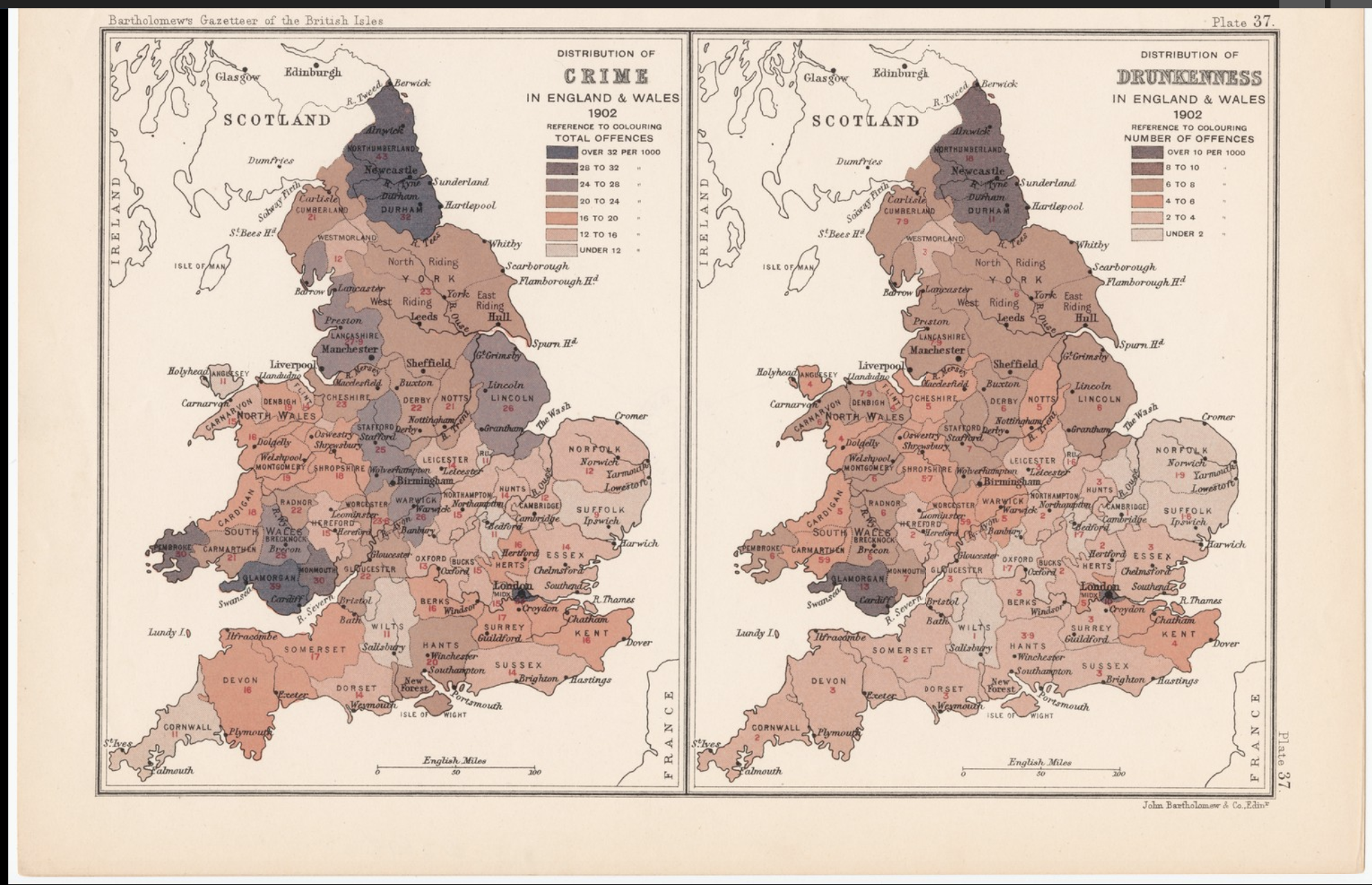
On the other hand, here is an example of data visualization done well. This graphic compares the total offenses (per 1000) of drunkenness versus crime in England and Wales. It has a clear key that explains which colors correlate to the amount of offenses and the presentation of the maps side by side conveys the comparison well.