Categories
Assignment 5

Assignment 5

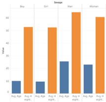
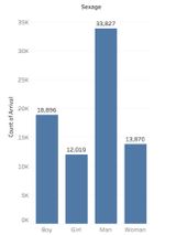
When we break down our day to day life, we are constantly networking. Whether it be adding someone on LinkedIn, friending someone on Facebook, following someone on Instagram, or even texting a friend of a friend who had your professor in the past. Who ever it may be, it is hard for us to go an hour without networking. Over the summer, the most frequent piece of advice I was given was to network. Whether I was introducing myself to a Bucknell alumni, an employee from Darien, or my older sister’s best friend’s ex boyfriend, I was constantly establishing connections with people. Some relationships I was more invested in than others. For example, I placed more weight on my relationship with my boss than I did with a Bucknell graduate working in a different department. However, if you were to look at my boss’s network, I am sure the weight placed on the connection that bounds us together is a lot less for him. Recognizing this, we understand that a network “we need to be extremely careful when analyzing networks not to read power relationships into data that may simply be imbalanced” (Graham, 197). Further, it is important to understand that when we consider a network, “it is easy to become hypnotized by the complexity of a network, to succumb to the desire of connecting everything and, in so doing, learning nothing” (Graham, 201).

Due to our tendency to hyper-analyze networks, it is important to build one with with a research question in mind. Essentially, this question will “act as your yardstick to measure effective outcomes” (PPT). With this in mind, I dove into the dataset of Diseasomes, which is a complied spreadsheet of diseases and genes, with an exploration question that resognated with me personally. 

I first noticed the signs in 2014. It was that summer that Alzheimer’s entered my life and infected my grandmother. Alzheimer’s is a progressive disorder that causes brain cells to waste away degenerate and die. As of now, there is no cure. Since 2014, my mother has exposed us to a new lifestyle in which we have become a lot more conscious about the way we treat our bodies. I am conscious about what I eat, what I drink, how much I work out, how much I sleep, and what I put in my body in general in regards to vitamins, medicines, pain killers (Advil), etc. Although known as a neurological disease, I’ve seen my grandma lose a significant amount of mobility in her legs, hands and mouth. These symptoms are not notorious ones within Alzheimers patients. Using the Diseasome dataset and Gephi’s platform, I want to interpret genes, diseases, and specifically, Alzehimer’s, further. 

The purpose of my analysis is to uncover whether neurological diseases are intertwined with a specific gene that might trigger loss of mobility. This might explain why my grandmother, and possibly other patients, are experiencing symptoms that do not align to Alzheimer’s. I am looking for a “general trend” within the network of neurological diseases and specific genes (Graham, 198).  

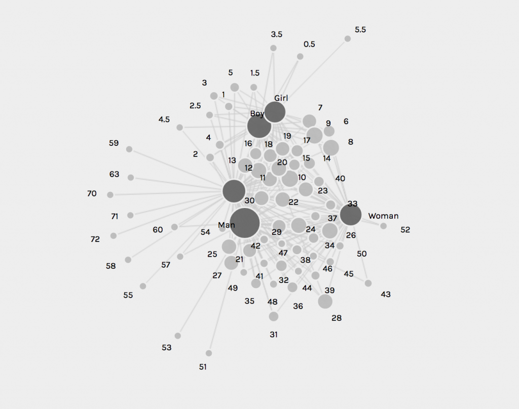
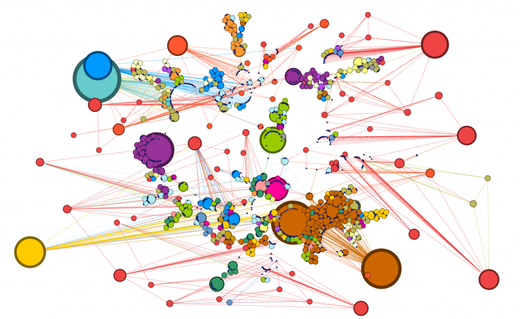
I originally looked at the data unfiltered and without edges. I looked only at the nodes of all diseases and genes included in the study. It is important to note that a node is simply an entity and edges refer to the relationships between edges and nodes. Essentially “everything about a network pivots on these two building blocks” (Graham, 202). I wanted to get the big picture and be able to visualize both classes of disease and gene at the same time knowing that mutations in genes influence the oncoming of diseases.

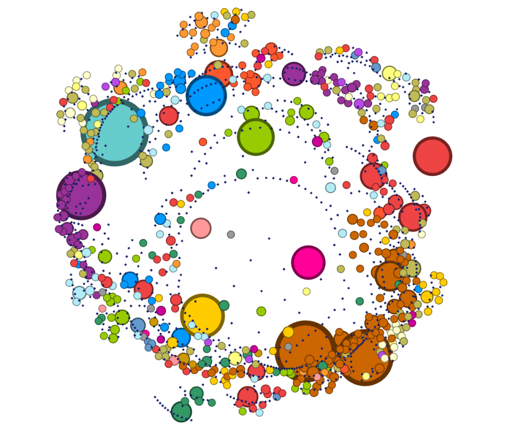
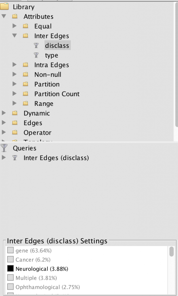
I, then, filtered the nodes to only show neurological diseases. Using this filter process, I am able to see how much of the data is a neurological disease. Approximately 3.88% of the data collected was on neurological diseases, some of that data being Alzheimer’s.

For such a large dataset, such a small amount of the data is focused on neurological diseases. I continued filtered the data to show inter edges within the neurological diseases world. Inter- means between or among groups, therefore connections will be shown between diseases and genes. My decision to filter the data by inter edge using neurological disease as the parameter was because I wanted to be able to visualize the relationships between neurological diseases and genes included in the study. This tool is an exceptional one because I was able to visualize “intangible structures that are invisible and undetectable to the human eye”, for example, all the many genes that a mere imbalance of can result in a neurological disease (Lima, 80).

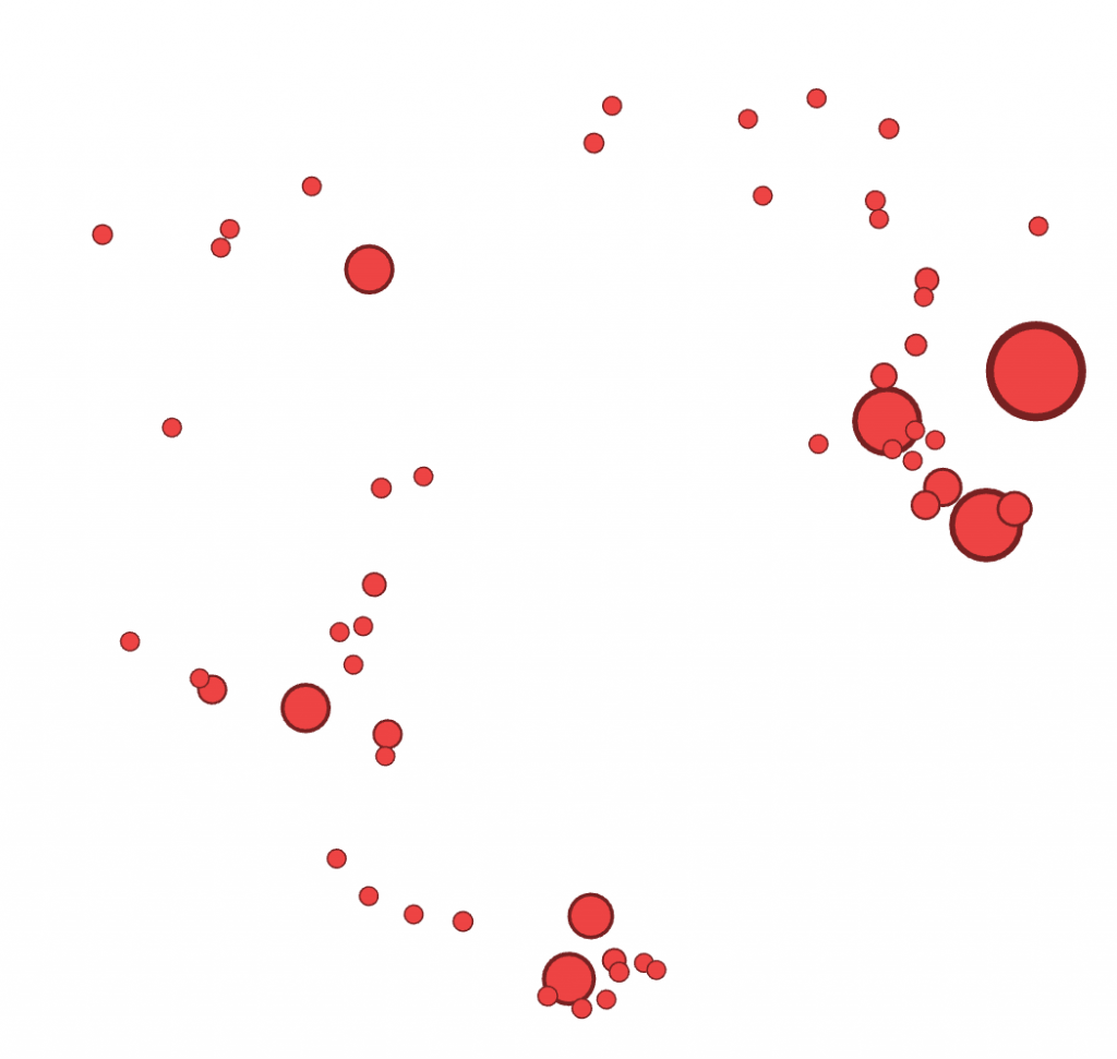
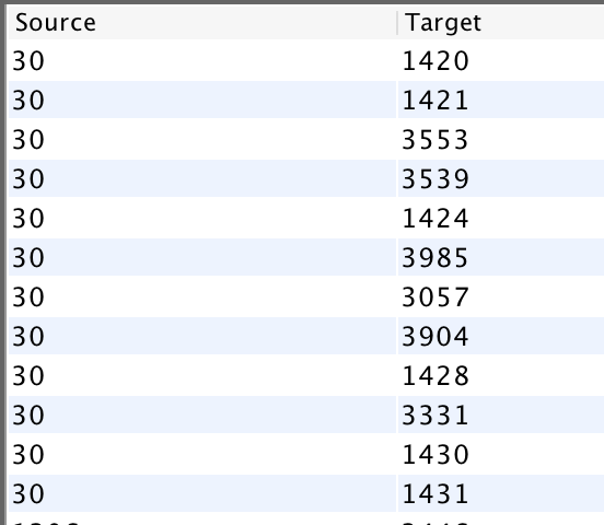
I then proceeded to analyze the dataset further in the Data Library. I saw that not all the connections that appeared within the inter-edge visualization were not red, meaning some of the diseases had ties to other genes – possibly one related to motorized skills one that would explain the situation going on with my grandma. In the Data Library, I again filtered the data to show inter edges. I knew that the ID number of Alzheimers in this dataset was 30. I filtered the Source to be ID: 30, and waited for the Target numbers to appear. I ended up with this list of genes that shared a relationship with Alzheimers. One set back I faced was I then had to take the ID numbers of the targets and look up their gene name on the master dataset. However, once I did this, I looked each of them up to see if any had a relationship to Alzheimers or other diseases that experience these symptoms.

Source: 30 (Alzheimer’s) and Target ID # of the associated genes
Gene ID # and name of Gene

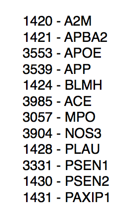
In the end, I found that the gene MPO is a key enzyme in inflammatory and degenerative processes. Many Alzheimer’s and Parkinson’s disease patients have increased levels of MPO protein. MPO causes motor cortex disabilities, meaning the part of the brain that initiates voluntary muscular activity is affected. 

There is no scientific backing to the conclusion I came to, however, it does provide some reassurance to me that what my grandma is experiencing is in fact a part of her disease. The network I built on Gephi led me to uncover and then research a total of 12 genes and their relationship to Alzheimers that I wouldn’t have otherwise. 

Categories
Uncategorized

Assignment 3

As Johanna Drucker described, “graphical expression is premised on assumptions about data, knowledge design, content models, and file formats that need explicit attention if they are going to be understood from humanistic perspectives and reworked for humanities projects”. Given that the data being expressed in this visualization is slave data, it is more than important to provide “explicit attention” to the model at hand. Further, as Drucker later explains, one must be aware that “data visualizations are representations”, and an observer must do their best to not pass these representations off as “presentations” (Drucker, 245). Using the African Names Dataset, I created a representation using the variables “Arrival” and “Sex”. While Palladio is often associated as the platform to be used to create an overview of knowledge, the layered timeline I was created revealed a significant amount of information that trigged me to to explore further. The graphs below are crucial in locating and understanding trends that appeared in the time of slavery. Figure 1 displays the number of men that arrived year to year, Figure 2 depicts the number of boys, Figure 3 shows the arrival of women, and Figure 4 illustrates the total amount of girls. From these series of graphs, we see a consistent trend that the total number of men arriving year to year dominate the total number of other sexes. Another prevalent trend from the timeline indicate that that there were a spike in arrivals around 1829, 1837, and 1848. In order to gain further insight on what was the political climate surrounding slavery was during these years, I decided to narrow my lens and analyze these years in Timeline JS. I want to better understand the political climate, the well-being of the economy, and the societal factors that drove a desire for more slaves. As an observer of the following timeline slides, one should note that I look specifically into the United States during the years of 1829, 1837, and 1848. While the data provided does not give light to the activity occurring within America (as the slave trade ended in 1808), I found it to be insightful to dive deeper into a world power country and their position regarding slavery. Countries around the world were looking at the United States as if it were on a pedestal, so the question I asked myself was, what kind of example were we setting for slavery to still be so prevalent around the world? 

I continued to explore other components of Palladio, including the graph tab. I created a graphical expression as indicated in Figure 5 using the variables “Disembarkation” and “Arrival”. In an Excel spreadsheet, it is quite difficult which islands were sending the largest influx of African Americans. Using Palladio to organize this specific criteria enabled me to see that Freetown sent the greatest number of slaves out for disembarkation and is the oldest port. Havana follows in later years sending a significant number of slaves out, and then the Bahamas is the smallest port of disembarkation. A follow up question this visualization led me to is why did the Bahamas only sent slaves over in 1836?

The final visualization I created using Palladio’s platform is shown in Figure 6. The graphical expression filters the variables “Sex” and “Age”. I proceeded to size the nodes to uncover what the most common age was of the arriving African Americans. It appears as though the most prevalent age of the enslaved individuals was between 20-30 years of age. While the ability to arrange the nodes and highlight them in order to get a better understanding of the knowledge being depicted, I do think the spatialization of Palladio is unimpressive. There is, as Drucker would argue, a fault in the graphical form in that there is too much information, it is hard to read. 

Figure 1
Figure 2
Figure 3
Figure 4
Figure 5
Figure 6

https://cdn.knightlab.com/libs/timeline3/latest/embed/index.html?source=1SIkS_rTR2bXGEzi-G69x9bov-7Jk4aqvwTfeq07TbQw&font=Default&lang=en&initial_zoom=2&height=650

Categories
Uncategorized

Assignment 2

Kat Culliton

a)

It was extremely helpful having Ken come in to walk us through Tableau. He was an expert at data manipulation and visualization. It made me a lot more curious about the platform and all it could do as I followed along with him as he made intricate, yet visually appealing graphs. While I still have a long way to go with learning Tableau, I enjoyed playing around with the colors, filters and different graph styles to create an image that revealed a compelling story. I think the data we were using, specifically in this case study, needed to be shown in a way that did justice to the hard facts revealed in it. The Excel template was a poor way to translate such important, and chilling, data to the eye. It needed to be constructed in a way that told the story through visuals, and not through numbers. 

The data we constructed in Voyant also dealt with slave narratives. As opposed to the Excel sheets we were looking at, the writings of these narratives told a story that definitely did justice to what was occurring during that time. However, by constructing the textual data under a different lens, a new perspective was brought to the texts. We were able to compare and contrast 7 different narratives and uncover a different interpretation of the text.

b.

The role of religion in the text transcripts is interesting to me. In the first corpus, I highlighted the word “god”, to see what other words correlated to it. I was expecting to see words like heart, heaven, mercy and even great. I was surprised to see words like man and children tied to it. I would infer that the relation between children and God, is all of their prayers to God to watch over their children. Man is a more interesting correlation. When I clicked on the word “Man” it was connected to “Slave” and other words such as, “Master”. The other terms were not necessarily biblical, but rather darker, slave-like terminology. 

The second visualization shows the most frequent words transcribed in the text. I think it is important to note that “Mr.”, “Men”, and “Man” are within the top 4 words. During this period of time, we see that society was clearly dominated by males. My follow up question would be are the texts we read today still predominantly masculine? Is there a way to follow the women’s movement throughout text corpuses to compare the frequency of masculine and feminine words throughout time? Although I am a numbers person, literature sometimes shows and speaks more than hard data.

c.

I was interested in building these visualizations – while they might be simple to the eye – I feel as though they tell an important story. I was first interested in analyzing sex. I am currently taking my Econ Senior Seminar, The History of the United States Economy. We dive deep into what composed of the economic sector major throughout time. We look at slavery closely, and analyze how it impacted the economic growth of the nation. It is hard to take an economic lens while analyzing such a fragile topic, but we often talk about the differences in male and female contributions to society. Men did a lot more of the physical labor such as working in the fields and constructing navigation and transportation routes, but women were extremely necessary in the house. While their labor wasn’t as physical, they contributed a lot – yet why were there so few women? I wanted to see the actual difference between men and women slaves in the United States. We see from the graphs that more men and boys are transported than women and female. 

I then wanted to know whether men and boys were physically more equipped and had a greater standard of living than women or not. I added in height as a proxy for health. It is interesting to me that men and women are almost the same height, as well as boys and girls. Further analysis must be done to confidently say that they were equally as healthy, yet men contributed more economically. In reality though, from what I am learning in Econ, that might not necessarily be the truth. I would like to extend this graph further and add an economic component to it. 

d.

It is important to note that the two platforms we are using to analyze and visualize data are unique in the type of data they can construct. Voyant interprets qualitative data, while Tableau interprets quantitative data. As a quantitative person, the Tableau platform came naturally to me in terms of being able to navigate the software. I spent the summer as a financial analyst and sales rep at Bloomberg and am familiar with constructing numbers in a way that is visually appealing to the eye. Although I had never used Tableau, I was immediately intrigued by how clean, yet detailed it was for being a free software. I’ve used Adobe Analytics, ComScore, Excel, and the Bloomberg Terminal to analyze data, and now Tableau. I will say that Tableau had the most user friendly and visually appealing graphics. It is also a “one stop shop” platform. 

I, personally, was more overwhelmed by Voyant. I feel like there is a lot more moving components to it and didn’t necessarily understand the differences between the titles of each visualization. It was easy to play around with, but definitely took some exploration. I was intrigued by it because I don’t spend a lot of time on text analysis tools. I will credit Voyant in saying that the visualizations they gave told a story and allowed me to draw parallels between the texts that I wouldn’t have seen while reading and annotating text by text. I think this would be a useful tool, along with Tableau, to bring back to Bloomberg post-graduation. A lot of trends throughout the news articles (which we are constantly looking at) can be seen clearly and in a user friendly way.

e.

I think it the creation of visualizations and corpuses is verified by Tanya Clement’s statement. It is important to recognize that we are condensing and analyzing a text in a virtual way that is not as authentic as the original text itself – yet by viewing it using the tools of corpus construction, we bring light to many trends, sequences, patterns, and correlations we might have missed otherwise. I believe This encompassing vantage points does bring justice in that an algorithm was able to translate the text into a way that can be analyzed qualitatively, but that the text itself is more authentic. 

Categories
Uncategorized

Practice

When asked to describe the look, organization, and purpose of data in class, I responded the following:

Look: points of time that hold a piece of specific information
Organization: chronologically
Purpose: to validate something

Through the class discussion, I learned that there is a lot more to data than what I had originally perceived. I am a quantitative person, in that I think in numbers and very structurally. I worked in Analytics and Sales at Bloomberg over the summer and the entire foundation of the company is built upon data. To me, data is numbers.
The discussion opened my eyes up to what exactly data entails. Data is factual information that is systematically recorded and analyzed to answer a question. There are multiple categories in which data can be categorized as, such as quantitative, qualitative, mixed, structured, unstructured, and semi structured. I was interested in learning that not all data needs to be visualized in a graph or chart, but can be visualized in multiple mediums - such as photographs. I was very interested to see DuBois using photographs of students in his exhibit. He uses it as evidence to back up his research points. Images of African American students, both male and female, appear throughout his study of the economic and social contributions of African Americans to modern society today. I believe the inclusion of these images help further support his collection of data because it shows exactly who was involved in the research process and the team in which all members are African American - thus, there must be little to no bias in the analysis.