Categories
Assignment 6

Assignment 6

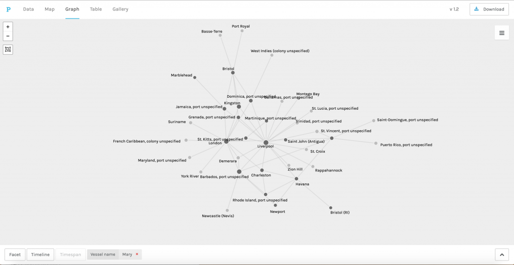
I initially became intrigued with the ship, the Mary, after being introduced to the Trans-Atlantic Slave Trade Database in the beginning of the semester. I wanted to know more about the specific ship and what it could tell me when it was separated from the records in the database. This concept was inspired by the argument made by Segel and Heer: “while stories often concern interacting characters, they may also present a sequence of facts and observations linked together by a unifying theme or argument” (Segel & Heer), and ultimately led me to my research question: what happens to the hairball of Trans-Atlantic Slave Data when I drill down and look at a particular ship? In order to answer my question, I had to rely on several digital visualization methodologies that I learned in class this semester because each helped me approach the question from a different angle.

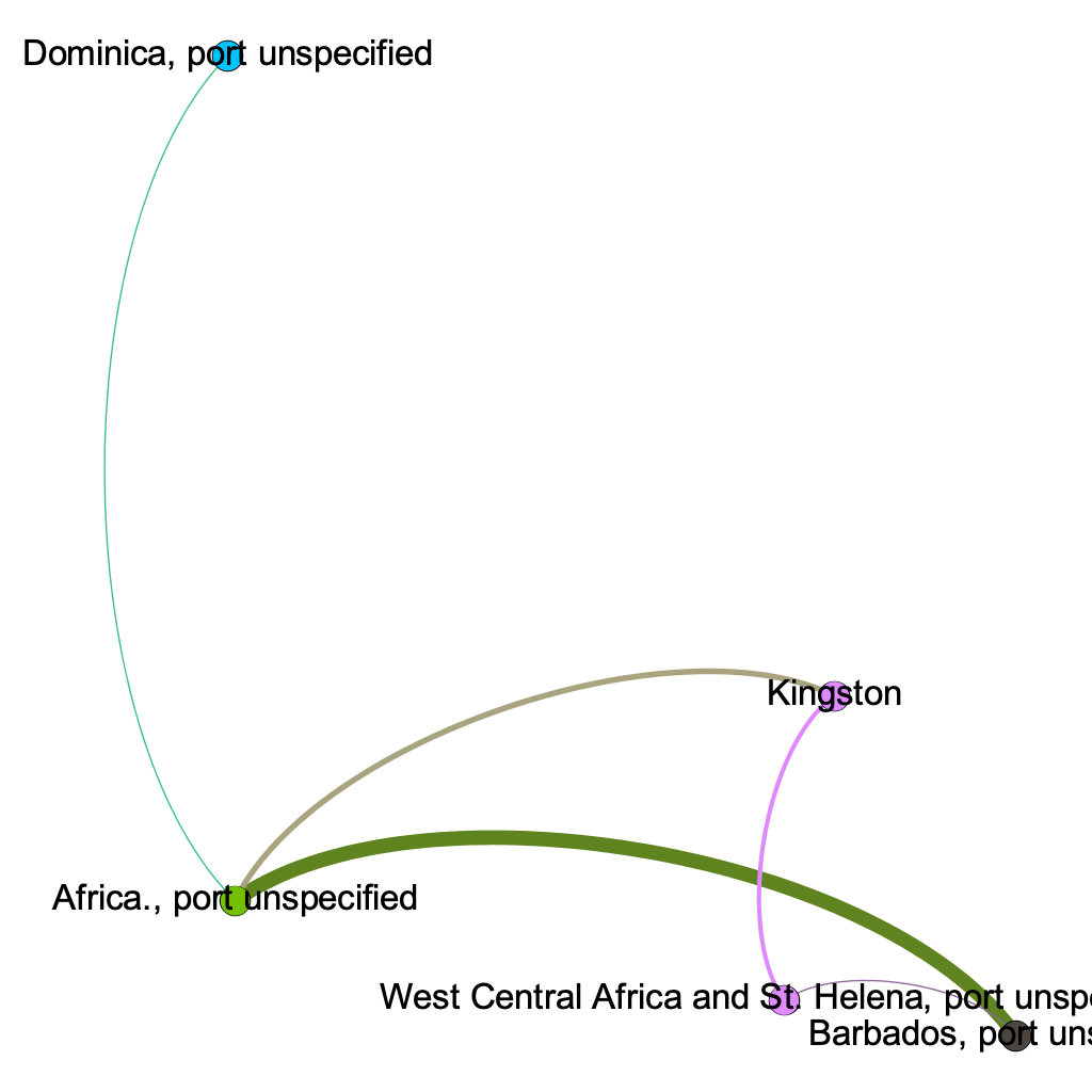
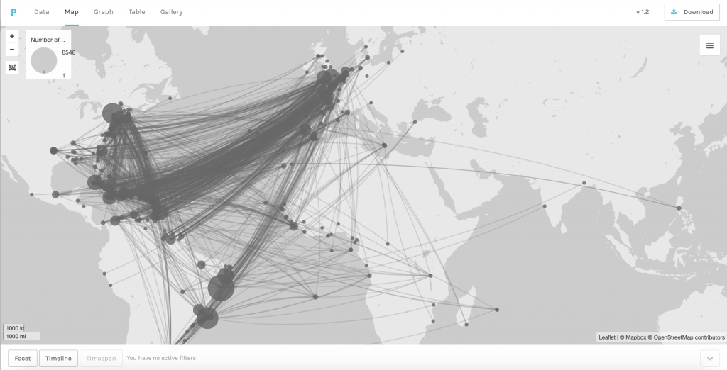
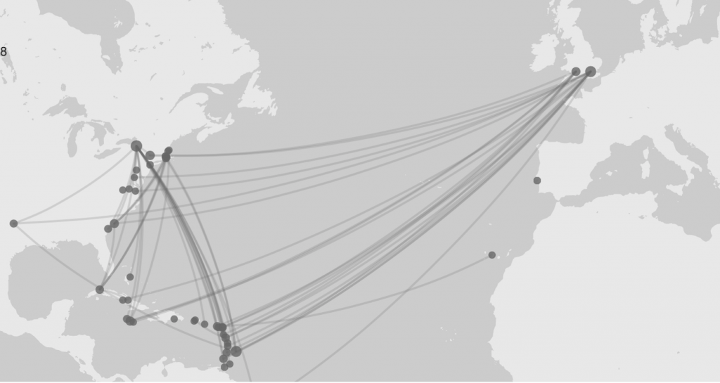
First, I used ArcGIS Online to map the voyages that the Mary took. I created a dataset that consisted of the place of origin for each voyage, the place where the slaves were purchased, and the place the slaves landed. I then had to create a map layer for each set of locations before merging them all together, so that the path taken would show up all on one layer. ArcGIS allowed me to visually illustrate the slave trade and the route that the Mary took. Using the heat map feature, I was able to see that Liverpool,  Bonny, and New York were some of the most common places that the Mary visited.

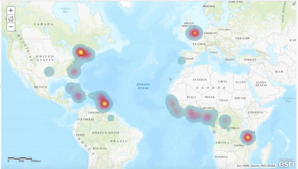
 I was then able to drop down pins in those locations and draw lines connecting them to really demonstrate the path the Mary often took. I ran into some difficulty when trying to map the ports on the basemap because the geographical category varied for each location in the Trans-Atlantic Slave Database. Some records used states to share where the Mary went, while others used countries or cities. However, I was able to overcome this by putting a pin on the locations of the ports in the present day, which is pretty accurate.

After learning what ports the Mary often went to, I wanted to know more about each location and their significance in the greater Trans-Atlantic Slave Trade. I felt that storymap platform in ArcGIS would best help me convey the story of the Mary because it allowed me to tell the story around each of the locations on the map. I had key locations (Liverpool, Bonny, and New York) on the Trans-Atlantic Slave trade and needed to be able to tell the story of them. Through this process, I learned that not only was Liverpool a common port of origin for the Mary, but it also had a significant role in the Trans-Atlantic Slave Trade. I felt that using ArcGIS was an effective way of addressing my research question, especially because I was working with many locations so the map visual was very beneficial. I found this correlation extremely intriguing and decided to do some more research into the relationship. I learned that the Mary was built in Liverpool too! This finding led me to start researching into the owners of the Mary and the various captains of each of the Mary’s journeys. I thought it would be really interesting to learn about each of these individuals and what their role was in the greater Trans-Atlantic Slave trade. I also wanted to see what their relationships were to each other and how those connections could have impacted events that occurred during that time period. 

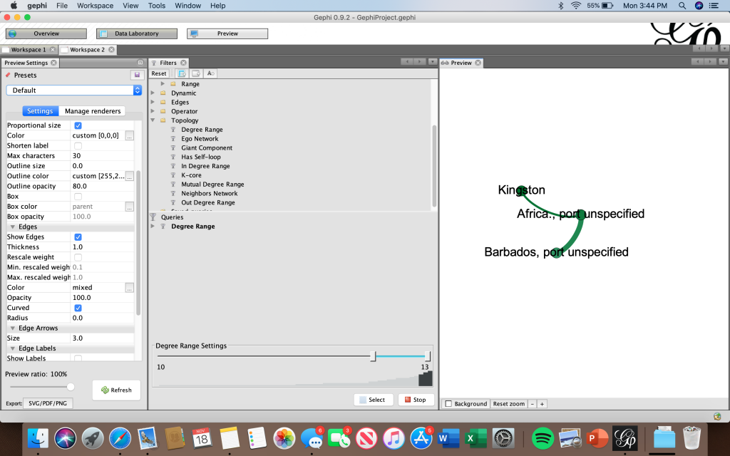
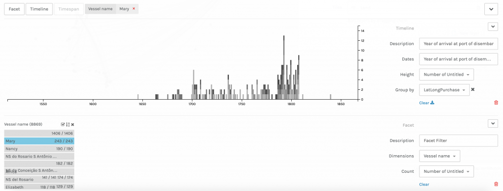
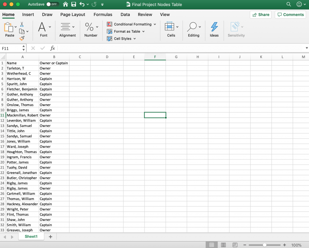
However, I immediately ran into problems when I went back to the database on a quest for more information. I found that because ‘Mary’ is a very common name, there could have been numerous ships with the same name and there was no reliable way of differentiating the ships. There were 243 recorded voyages under the vessel name ‘Mary.’ between the years of 1649 and 1816. However, since my focus was on Liverpool, I filtered the data to only show voyages that began out of Liverpool, which totaled 186. In order to discover the relationships between the different individuals, I had to create a new dataset that included the owner(s) name(s) and the captain(s) name(s).

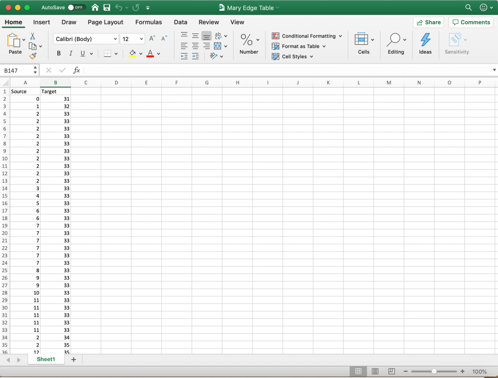
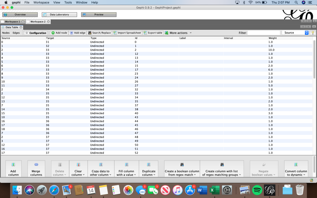
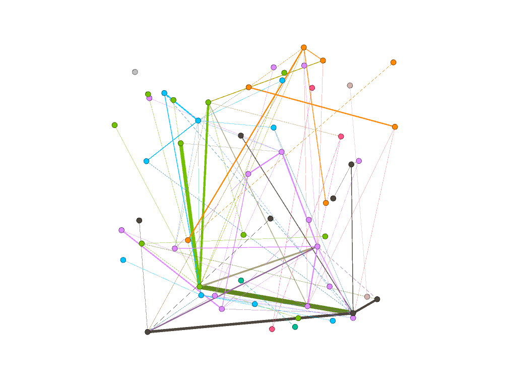
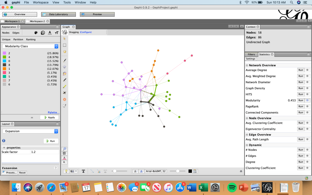
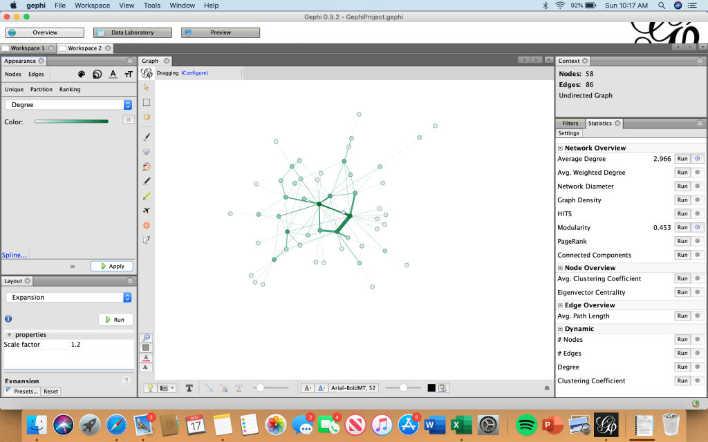
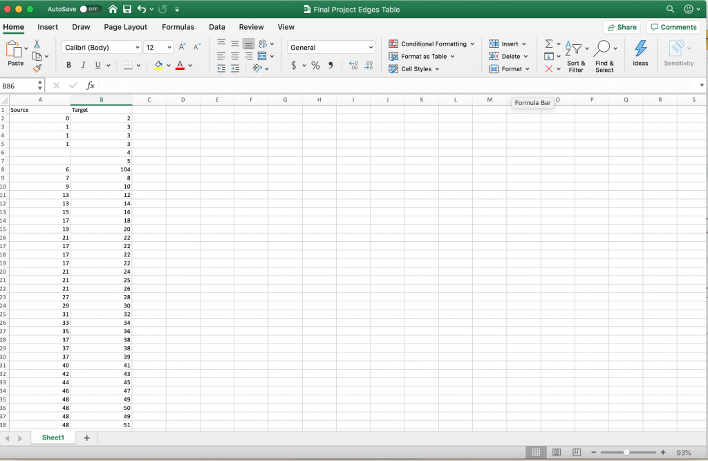
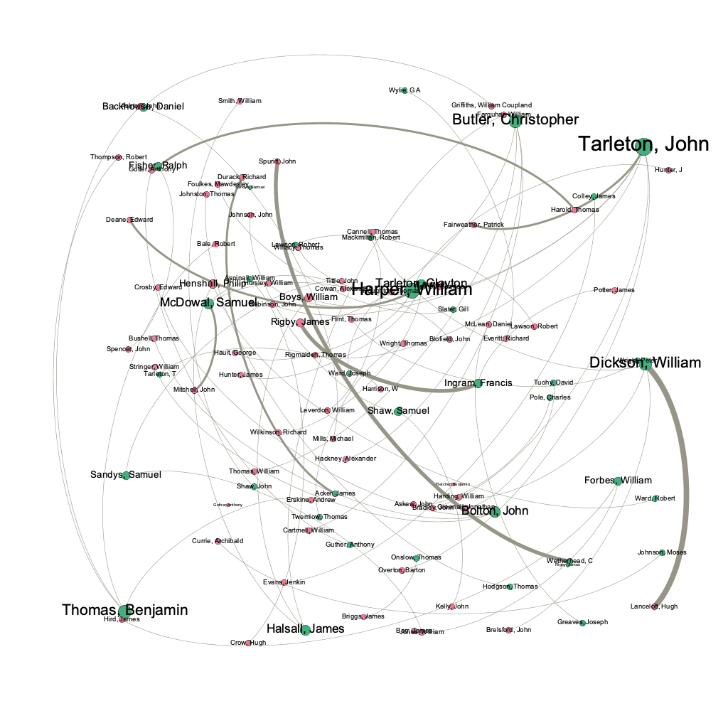
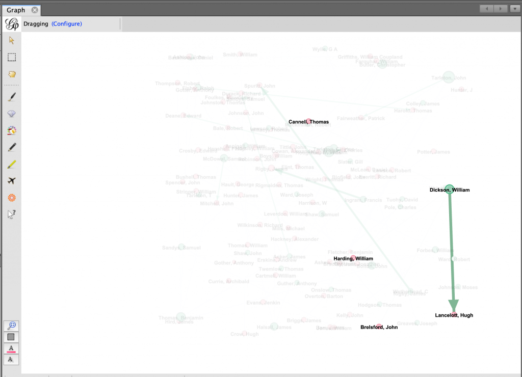
I felt that Gephi would be the best digital visualization methodology to show the relationships among captains and owners of the Mary because the visualizations I can create in Gephi are “the cartography of the indiscernible, depicting intangible structures that are invisible and undetectable to the human eye” (Lima 80). In order to use the platform, I had to again manipulate my data. However, this is where I ran into another problem. For some of the Mary’s voyages, there were multiple owners and multiple captains listed, but Gephi limited me to only using one owner and one captain. To keep things consistent, I used the owner whose name was listed first and the captain whose name was listed first for every voyage. I created a node table, where I listed all of the Mary’s captains and owners. I then inserted the spreadsheet into Gephi and each individual received their own id number. Next, I manually connected the owner of the ship listed for each individual voyage (source) to the captain of the same voyage (target) using each individual’s unique Id number, creating an edge table. Once I uploaded the edge table, I was able to work with the data.

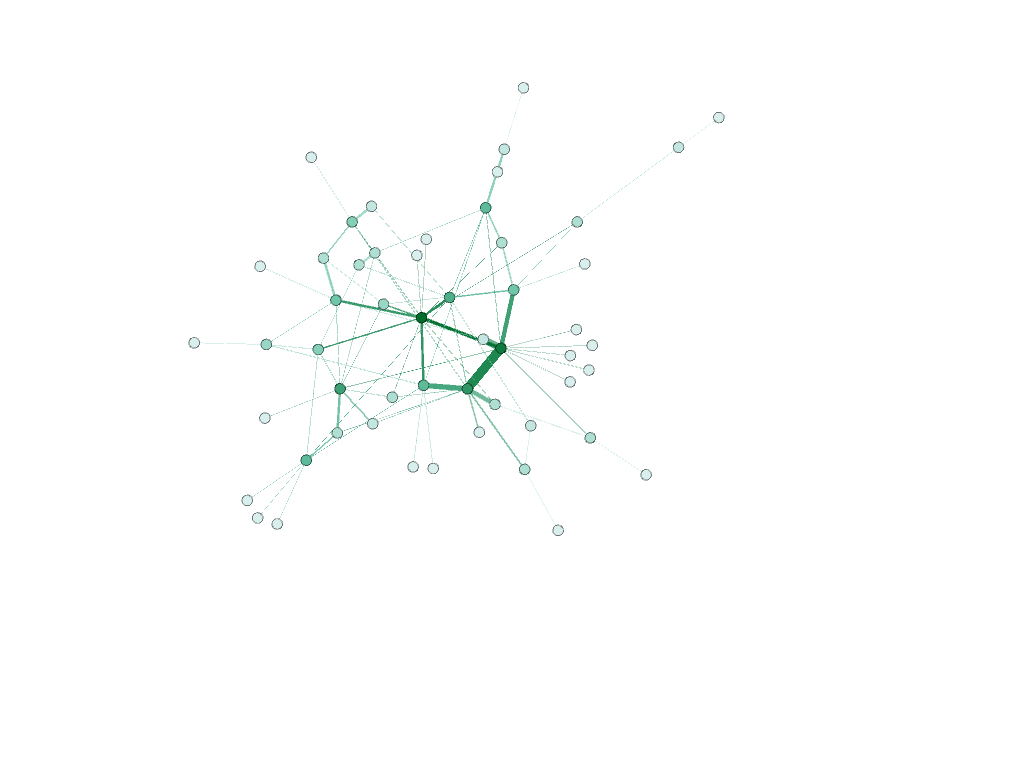
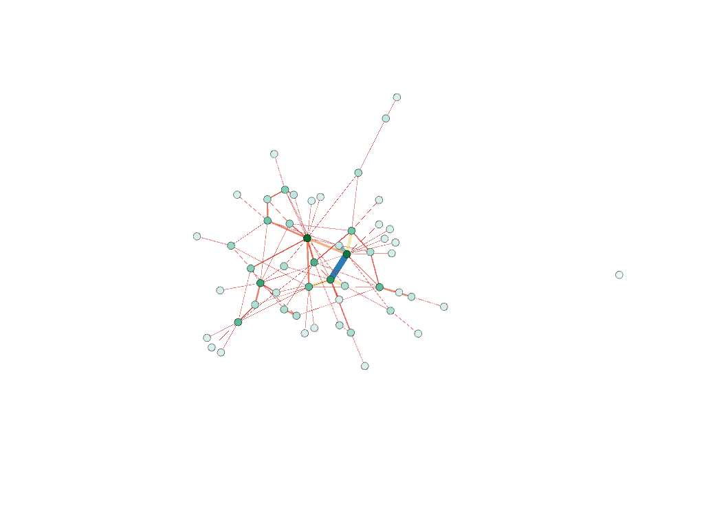
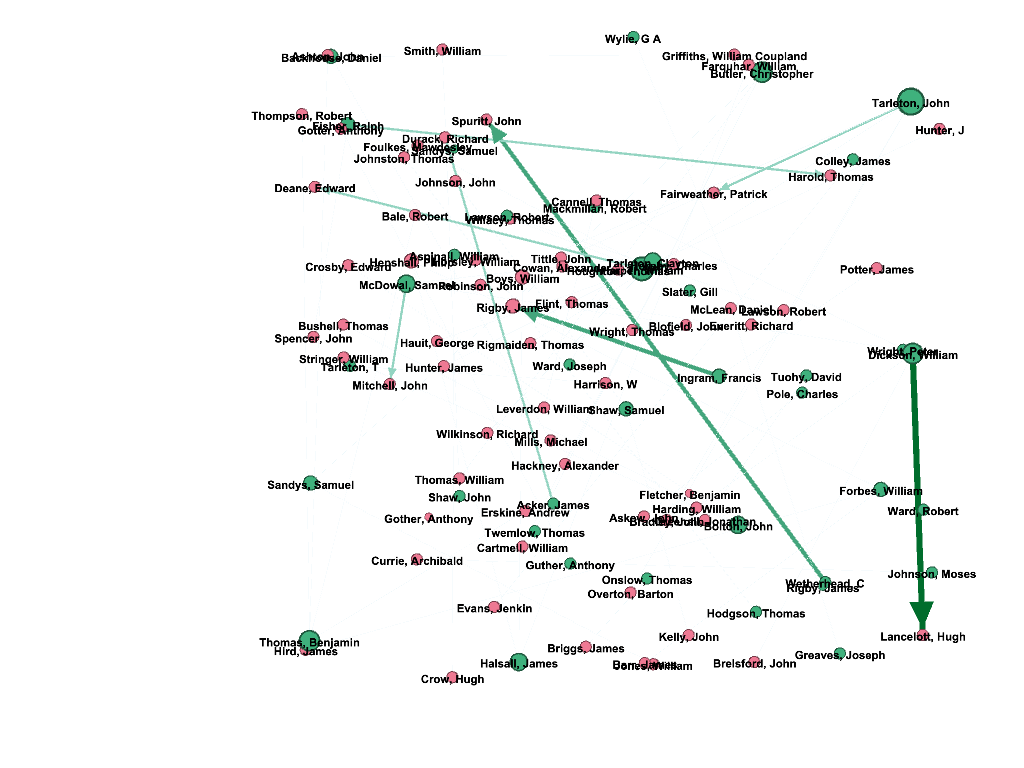
I created a network of people and differentiated the captains from the owners of the ship by making the nodes representing captains pink and owners green. I used the modularity calculation to see if there was a nexus of names that were closely related and then I used the average degree calculation to see how many relationships each individual had. In the visualization I created I made the size of each node represent the degree, so the larger the node, the more relationships a person had. Also, I weighed the edges to represent the strength of the relationship between two individuals using the principal Graham mentioned: “weight is a numeric value quantifying the strength of a connection between two nodes” (Graham 206). Since there is no ‘undo’ button in Gephi, I continued to manipulate my data to see what else I could learn from it. I used numerous different filters and partitioned my results by degree, in-degree, and modularity.

The visualizations I created in Gephi gave me the ability to draw conclusions and see similarities/differences within the data set that I was unable to see in a typical spreadsheet format. Not only did I learn that where a node is in relation to other nodes mattered, but that the weight of the edge between them is also significant. I was able to see certain patterns that I may not have noticed prior that I can further dive into.

I feel that both Gephi and ArcGIS allowed me to narrow down and focus on just the Mary. These platforms gave me the ability to really illustrate the story of the Mary and learn about the numerous people, places, and purposes that went along with it. My findings helped me get a better understanding of the greater Trans-Atlantic Slave trade because I was able to draw connections and see relationships that I would not have previously picked up on.

Link to my WordPress Site: The Mary

Categories
Assignment 5

Assignment #5

Learning Gephi was a very different experience for me than my experience learning the other platforms that we worked on this semester. I felt that I had to do a lot more preparation before using the platform. Not only was there a lot of new terminologies I had to become accustomed to, but how Gephi operates and the data it uses/analyzes is very different from anything I have previously worked with. Unlike Palladio, for example, that allows users to graph two different categories, Gephi only allows users to map relationships between the same types of nodes. This was a concept I had a lot of trouble grasping initially, but I learned the benefits of Gephi rather quickly. Gephi allowed me to measure different relationships and the metrics between the relationships, which is something that I was not able to do on platforms that we previously worked on. Furthermore, Gephi allowed me to look at networks, sets of points joined together by lines in an aesthetically pleasing way, and discover how information can be passed between two people or two entities. Through my preliminary research, I discovered that graphing networks of people helps us, as a society, analyze how people interact with one another, which ultimately helps us understand the behavior of a particular individual. Gephi allowed me to search for different kinds of metrics that will provide more insight into the networks I created. The hardest part for me with Gephi was getting started because I had trouble coming up with what I wanted to show and how I wanted to show it using the data on the Mary from the African Slaves Database. I wanted to illustrate the routes the Mary and the slaves that were on the Mary took. I had to decide what constitutes a connection (what is an edge) which I eventually chose would be the relationship between the place where the slave was purchased and the place the slave landed. 

Finally, I decided to make all of the places nodes. I created a nodes table in excel consisting of all of the ports where slaves were purchased and where slaves landed. I removed any duplicate locations and then saved the file as a csv. I then imported that csv file into Gephi which generated an id number for each of the locations. After that, I went back to the original African Slaves Database and looked at each individual voyage that the Mary took paying particular attention to the port where slaves were purchased and the port where slaves landed. I used the id numbers from Gephi to illustrate each voyage by creating an edge table in Excel. I put each port (using the id number) where slaves were purchased in the “source” column and put the port where the slaves landed into the corresponding “target” column. If the Mary visited the same two ports on different voyages, I would put them in as separate entries. By doing this, I weighed the edges to illustrate the number of slaves that took a specific route. As described by Graham, “weight is a numeric value quantifying the strength of a connection between two nodes” (Graham 206). As evident by the visualizations I created, the thicker edges have more slaves going from the same place of purchase to the same landing place (more closely connected).

Edge Table
Node Table

Then, I imported the edge table into Gephi and was able to use the tools on the platform to reveal statistical calculations and illustrate the relationships between the nodes. I used the “Modularity” algorithm to detect communities. I then filtered by the degree range 8-13. After completing this step, I was able to relate to Graham’s point that “although node and edge lists require more initial setup, they pay off in the end for their ease of data entry and flexibility” (Graham 244).

Modularity (unfiltered)
Modularity (filtered by degree)

I then changed the size of the nodes based on “degree” using the “average degree” calculation.

Unfiltered Degree

These models below show the results of both the modularity and degree calculations. The bottom screenshot illustrates how I filtered degree range to 10-13 to only show the nodes with the highest degree. These nodes were Kingston, Barbados, and Africa (port unspecified).

Gephi not only allowed me to visually see what ports were most visited by the Mary individually, but also let me see what voyages were most common. I was able to see the frequency of these voyages based off the weight of the edges. Through these visualizations, I was able to draw meaning out of the relation between the graphical representations. Like Lima explained, “network visualization is also the cartography of the indiscernible, depicting intangible structures that are invisible and undetectable to the human eye” (Lima 80). The visualizations created in Gephi gave me the ability to draw conclusions and see similarities/differences within the data set that I was unable to see in a typical spreadsheet format. Not only did I learn that where a node is in relation to other nodes mattered, but that the weight of the edge between them is also significant. The specific formatting of this visualization is that of a “rhizomatic relationship” where we do not know beginning or end (Lima 44). I was able to see certain patterns that I may not have noticed prior that I can further dive into.

Categories
Assignment 3

Assignment #3

This visualization illustrates the many voyages taken during the Trans-Atlantic slave trade.

I used the data in the Trans-Atlantic Slave Database to map the numerous voyages taken across the world in Palladio. The first visualization shows the 8548 recorded voyages and plots each one of them using the LatLong of the original port and the LatLong of the location where the slaves landed. I was able to get a general idea of popular ports because of the size of the bubbles on the map, but I found the visualization to be a bit overwhelming. I decided to focus in on a specific vessel, the Mary, because it was the ship with the most recorded number of voyages.

When I was able to filter it down just to the Mary, I got a better understanding of the locations that the ship went. I found the “graph” feature in Palladio extremely useful in helping me see the most visited ports. I used the highlight feature to differentiate the ports of origin from the port that the slaves landed at. I became particularly interested in Liverpool, not only because it was one of the ports that many of the voyages originated at, but it also had the most number of connections with different ports. From the lines connecting the nodes in the visualization and the spatial layout of this particular visualization, I was able to infer that Liverpool served as a hub in the Trans-Atlantic slave trade. I continued to explore the Mary in Palladio.

The “timeline” feature on Palladio was really beneficial for me to see when the Mary took its first recorded voyage, its last recorded voyage, and the most number of voyages. The height of the bars on the timeline shows me the number of recorded voyages each year. I was particularly interested in the years right before 1800 because there was a huge surge in the number of voyages it went on and the year 1807 because there was a dramatic stop in the number of voyages following that year.

Palladio allowed me to be what Johanna Drucker refers to as a “knowledge generator.” I was able to take a large set of data and filter it to display the results I wanted and answer the questions I had. I was able to narrow in on a specific vessel and see where it went and when it went to these locations. The platform allowed me to manipulate the data that I had to produce the answers I needed. I then was able to relate what I learned about the Mary to what was going on in society at the time. Through Palladio, I learned that Liverpool, specifically in the years right before and after 1800, had an extremely important role in the Trans-Atlantic slave trade. However, I wanted to learn more about this, so I did contextual research on the port in Liverpool around the beginning of the nineteenth century and was able to discover more. 

I discovered that Liverpool was a location that many slave voyages occurred from. The port was in a prime location because it had easy access to a network of rivers. It is estimated that “Liverpool ships transported half of the 3 million Africans carried across the Atlantic by British slavers” (International Slavery Museum). This helps to explain the significance of Liverpool as it relates to the Mary. The immediate end to the Mary’s voyages can be explained by the fact that the United Kingdom passed a bill abolishing slave trade in 1807 (The National Archives). Timeline.js allowed me to build on my findings on the Mary, which I discovered in Palladio, and relate them to the overall Trans-Atlantic slave trade in an interactive and educating manner.

Categories
Assignment 2

Assignment #2

I used Tableau to analyze the African Slave Names database and the US Slavery in the 1860s data and Voyant to analyze the Slave Narratives. When initially interacting with the data sets to get a better sense of what the information was about and to better understand the two platforms, I became very interested in the differences between men and women. Specifically, I wanted to get a sense of what it was like to be a woman during the 1800s. I began looking into trends and finding patterns which helped me focus my development of the data.

What caught my eye when looking at the raw Slave Narratives was that both Nat Turner and Phillis Wheatley had their narratives published within three years of each other. I felt that focusing on these two particular narratives would be beneficial in evaluating the differences between men and women because Phillis Wheatley was a woman and Nat Turner was a man and they would be easily comparable given how close the publication dates were to each other.

The above Cirrus reflects the most common words in Phillis Wheatley’s Narrative.

The below Cirrus illustrates the most frequently used words in Nat Turner’s Narrative.

The below illustration depicts the most frequently used words in both narratives as well as the most unique words in each individual narrative.

In Voyant, I first created two wordclouds and put them side by side to one another with the bottom one reflecting Nat Turner’s narrative and the top one illustrating Phillis Wheatley’s narrative. I learned right away that in the wordcloud, size matters. The size of the text is a proportional representation of number of words in the corpus. By looking at the cirruses alongside the summary of frequent and distinctive words, I was able to see that the word “death” appeared frequently in both narratives. Given the state of the country at the time and the terrible conditions both Wheatley and Turner faced, I am not surprised to see how prevalent the word “death” was. On the other hand, it was interesting to me that the word “blood” was used often in Turner’s narrative, but not in Wheatley’s. I continued to question how gender roles played into this result and thought about how Wheatley, as a woman, could have had more of a passive role in the fight against slavery. I kept this in the back of my mind as I continued to explore the data set.

However, what was most interesting to me was when I looked at the most distinctive words in each corpus because I feel that it provided me with insight into the gender differences that occurred. In the Wheatley narrative, the words “heavenly” and “skies” were most unique. After looking at other narratives from other female slaves which were published around the same time period, such as Bethany Veney, I noticed that the female slaves, in particular, relied heavily on religion to get them through the difficult times. They spent a lot of time hoping and praying for freedom and for better days in the future. The women seemed to have more of a positive outlook on the situation than their male counterparts. The comparison of Wheatley’s narrative to Turner’s narrative further affirms this theory as the distinct words in his narrative were “party” and “southampton.” These words are also significant because Turner took a very active role in the fight against slavery. He led a gory rebellion against white people which took place in southampton. He took a much more active role than Wheatley in the fight against slavery which made me consider the stereotype that women are supposed to be more passive and take a more submissive role.

I further investigated my theory of the prevalence of hope in the women’s narrative by comparing the usage of the words “god,” “hope,” and “love” in Wheatley’s narrative to Turner’s narrative. The above visualization reveals my findings. Like I previously suspected, these positive words that I selected are found in Wheatley’s narrative 101 times compared to Turner’s 8 times. This difference is significant and really makes me wonder how much gender stereotypes have played into this.

I continued to look at the trends involving gender when I analyzed the African Slave Names Database and US Slavery in the 1860s data using Tableau. I decided to plot the number of women slaves who arrived in the US by the year in which they arrived. I noticed that 1829 was the year when the most number of women were brought over. To get a historical context for this, I researched significant events that occurred during 1829 in US history. I discovered that this was the year when “David Walker of Boston publishes his fiery denunciation of slavery and racism, Walker’s Appeal in Four ArticlesWalker’s Appeal, arguably the most radical of all anti-slavery documents” (US History). Immediately following 1829, the number of women slaves coming to the US started rapidly declining, which makes me believe that Walker’s work had a strong impact on society. This event is also significant because Walker is from Boston, which is where Wheatley lived after being brought to the US. Around thirty-five years after her death, a movement against slavery began close to where she lived. How come Wheatley was unable to have the same success as Walker? Could it be because more time had passed or is it because Wheatley, as a women, was not taken seriously by society? This process of working with the data sets and analyzing them from different perspectives allowed me to consider these reasonings that I would never had even considered if I was just presented with the raw data.

I wanted to find the country where the most women came from using the African Names Database. I sorted the data so that only the records of women showed and I was surprised at how much of an imbalance I found in the result and how much of a lack of information there was. I found that 163 women came from the country Eboo, Hebo, but I could not find anything about this online. In fact, nothing came up when I searched it. This process of analyzing the data exposed biases in data collection and how populations of people are just unaccounted for. The next country to have the largest amount of women was Calabar. 43 of the women in the database came from there. This is interesting to me that such a large percentage of the recorded women came from one country.

I then decided to pivot a little bit and look into the state of Virginia, where Nat Turner lived after being brought to the US. As illustrated in the visualization below, almost thirty years after his death, slavery was still extremely prevalent in the state of Virginia. The visualization depicts the state of Virginia and the darker colors represent the counties with the largest amount of slaves in the population. Despite Turner’s anti-slavery efforts, the issue remained very apparent even years later.

After working with both Voyant and Tableau, I believe that I got a better sense of what each platform is like and when it is most beneficial to use. Tableau allows me to work with quantitative data sets and present the findings in visually appealing ways. Voyant, allows me to do the same thing, but with qualitative data instead. As discussed in the Faull reading, Voyant “allows for the ‘algorithmic’ reading of literary language, and serves as an entry point into the field of computational and corpus-based linguistic analysis of literary texts” (Faull 4). To me, the most beneficial thing about Voyant is that it provides keywords and contexts in the corpus. It allowed me to take the large narratives filled with huge volumes of text and figure out the main themes and concepts of them without having to read every word. Furthermore, it allowed me to compare the narratives with one another and find similarities and differences in a matter of seconds. Specifically, this was most beneficial when I compared Wheatley’s narrative to Turner’s. I was able to see what the differences in life of Wheatley and Turner were and was able to compare their specific narratives to historical trends to draw conclusions. Tableau was helpful to me because I was able to interact with the two large data files and compare specific elements of each in a creative, aesthetically pleasing way. I found the “show me” tab to be really helpful in getting started with the creation of my visualizations. However, I encountered problems when I tried to put certain dimensions/measurements into a specific column or row and it would not let me. As I began to use the platform more, I became more familiar with it, but still had some difficulty. Tableau helped me illustrate the distribution of slaves in the US on a map, which makes it much easier to the viewer. Instead of having to go through a large excel file, I was able to manipulate the data to produce the outcome I wanted. Both platforms are similar in that they allowed me to go through large sets of data (whether that was qualitative or quantitative) and discover the answers to my questions without having to analyze every single word/number.

Both Tableau and Voyant allowed me to practice the concept of “differential reading” discussed by Tanya Clement. This process of corpus construction and creation of iterative visualizations allowed me to identify features I might not have seen, “make hypotheses, generate research questions, and figure out prevalent patterns and how to read them” (Clements). Voyant, in particular, allowed me to realize how texts differed from one another and how they related. I was able to find patterns and relationships among the data sets. Furthermore, like we discussed in class, this process has allowed me to see the complexities of gender and race. I was able to see the big picture of the data in front of me and get additional “data points” that I would not have seen or have collected without embarking on this process. I was able to get a more holistic representation of society and breakdown any previous misconceptions I had. Utilizing Voyant and Tableau allowed me to synthesize things to make a multi-dimensional, authentic viewpoint.

Categories
Assignment 1

Assignment #1

Periscopic, the creator of the top visualization, analyzed the top words spoken during speeches given by presidential candidates to see what were the major issues they focused on were. I feel that the unique way in which the data was presented allowed me to develop takeaways that I would not have found if I was just listening to the speeches. I believe that I would lose sight of some of the trends that were made obvious by this particular visualization. As Friendly argued in his piece, A Brief History of Data Visualization, the dynamic visualization of the data allowed me “to see phenomena and relationships in new [and] different ways” (Friendly 30). Furthermore, I was able to interact with this visualization and look at specific things that interested me and the impact of those things on society. Like Du Bois argues in his book, Visualizing Black America, Periscopic utilized the “cross-fertilization of visual art and social science” to offer “alternative visions” of the speeches made by presidential candidates (Du Bois 13). This is significant because it allows individuals to become more educated on the issues being discussed and provides the opportunity for viewers to come up with their own interpretations. As D’Ignazio and Klein argued, “embracing multiple perspectives can lead to a more detailed picture of the problem at hand” (D’Ignazio and Klein). The tree-like, web structure of these visualizations allows viewers to “browse, filter, and organize” their understanding of the material “in a nested hierarchy” (Lima 41). I was attracted to this picture due to the bright colors and shapes utilized. I believe that this is because of the preattentive properties this visualization possess. As Meirelles discussed in his book, Design for Information, “studies in psychology have shown that our visual systems favor certain visual features over others. In this case, I was drawn to the colors and shapes Periscopic used.

The second visualization demonstrates “the Flickr ecosystem and the full potential of the popular photo-sharing service” (Glass). As DuBois argued in his book, Data Portraits, I was originally attracted to this diagram because it was visually pleasing and made me want to immediately learn more. Furthermore, the creator utilizes the elements of design that Meirelles discussed in order to help portray the data in an intriguing manner. I particularly took notice of the red-green color scheme and the spatial distance between various elements of the infographic. The creator of this visualization utilized the tree concept that Manuel Lima discussed in his work, Visual Complexity: Mapping Patterns of Information. The tree-like structure of this work allows me to see the fundamental make-up of Flickr because I am able to see the hierarchal structure of the uses of the platform. However, I feel this visualization is limited as it is not dynamic. It is particularly hard to try to look at the material from multiple perspectives because it is merely a reflection of results. As a viewer, I wish I had the ability to interact with the data and find conclusions embedded in the data set.

The visualization, “selficity,” illustrates themes and trends in selfies people take. It uses imageplots to display the thousands of pictures to reveal the results of the findings. The study categorizes the pictures into what types of people take selfies, what their poses are, and what their expressions are. It compared people taking selfies in numerous cities worldwide and then further compared gender and age. It allows viewers to see the set of data used to draw conclusions in an unbiased fashion. It utilizes both quantitative and qualitative metrics to allow for multiple perspectives/measures to be taken into account. I believe that the use of dynamic data allows for users to interact with the data and allows them to know “the sources of data, and it relies upon them to make decisions about data” (D’Ignazio and Klein). However, this raises the ethical problem with this particular visualization. The author/creator did not ask permission to use the photographs so there is a privacy issue. There also could be bodies that are not accounted for in the data sample. Populations of people could be completely unrepresented in the data set, but due to biases and preconceived notions, it could go completely undetected. As Joni Seager argued in Bring Back the Bodies, “‘if data are not available on a topic, no informed policy will be formulated; if a topic is not evident in standardized databases, then, in a self-fulfilling cycle, it is assumed to be unimportant’” (D’Ignazio and Klein). In the case of “selfiecity,” there could be groups of people who are not even on social media or who have public accounts so they are not represented in the data set.

The Mapping of the Republic of Letters uses data visualization to understand the correspondence of networks. The manner in which the data is presented allows viewers to see Voltaire’s correspondence and understand his connections to certain people and places. I feel the creator did a great job of making an interactive, dynamic visualization. I believe that the method used to present the data allows for viewers to come up with their own interpretations and draw their own conclusions. The features of the visualization allow for viewers to see a multi-dimensional perspective of the findings. As discussed in the Friendly reading, the use of dynamic graphic methods, allows for  “instantaneous and direct manipulation of graphical objects and related statistical properties” (Friendly 25). I feel that this is an important characteristic because it eliminates the possibility of the author/creator potentially inserting biases that could get passed down to the viewer. Furthermore, I feel the interactive component of this visualization allows viewers to see things that they would not have previously seen without having the ability to play with and manipulate the data on their own.