Categories
Assignment 5

Assignment #5

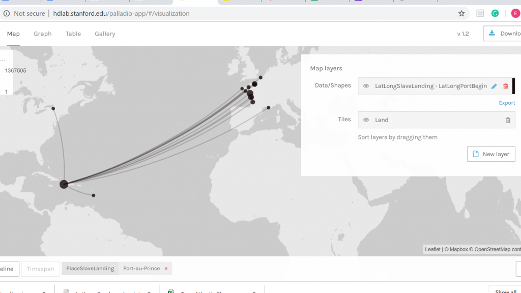
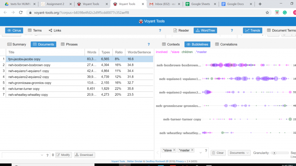
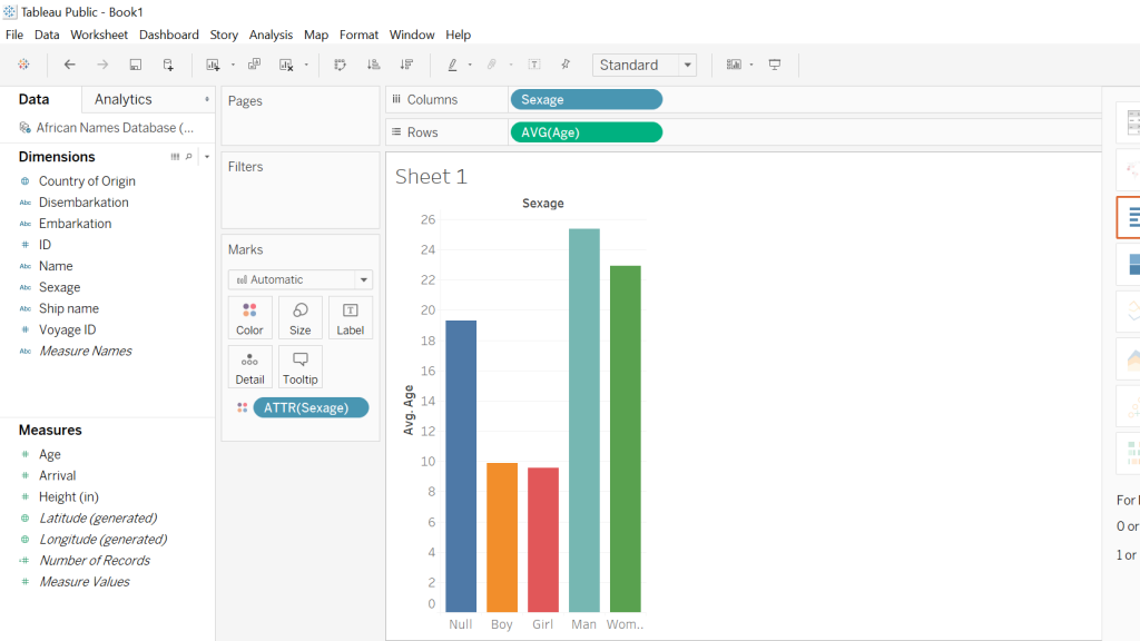
The platform Gephi took home the first place trophy with being one of the most frustrating and difficult data visualization programs that I have ever worked with. It began with the Gephi 9.2 download not working on my computer and took nearly a week for me to figure out what I needed to do. This task involved the download of Gephi 9.1 along with the installation of Java. Also, due to the fact that Gephi 9.1 is different than Gephi 9.2, the quick tutorial was most certainly not quick resulting in the frequent urge to defenestrate the computer out the window, however, I must note that this did not happen. Upon Gephi beginning to function properly, I began to use the pre-made data sheets so that I could become somewhat familiar with the operations such as the Les Miserables and the Southern Ladies sheets. These data samples served as good practice, to say the least, and from there I thought I would try the challenge of creating my own. This was certainly for me was a challenge due to the fact that I am not super handy with Microsoft Excel and Gephi 9.1 is a tad quirkier than Gephi 9.2.

This was when I had just used the Layout tool at the beginning
It was starting to take more of a legible form
Some Modularity Calculation…
Some calculation of degree and how it pertains to teammates from the West Coast…

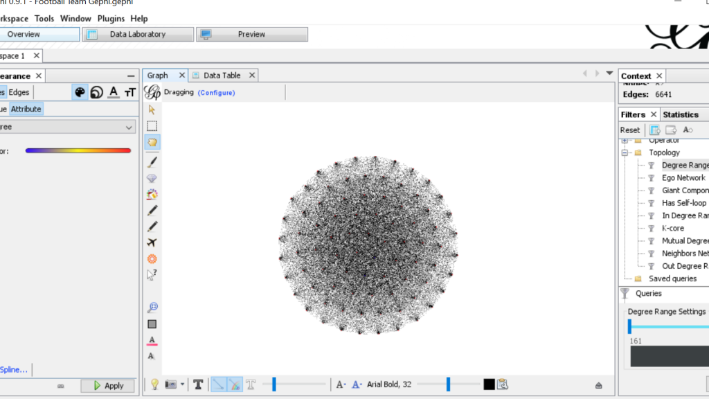
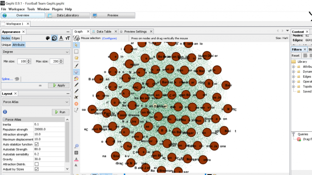
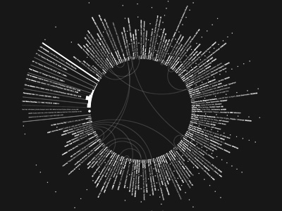
For my Gephi work, I thought it would be appropriate to make my own data sheets in Excel and then import the sheets into Gephi. This creating of the sheets was quite tedious. However, once the data was entered into Gephi the work could begin. I began with the Layout tab and implemented the force-directed layout. According to Graham the force-directed layout, “…attempt to reduce the number of edges that cross one another while simultaneously bringing more directly-connected nodes closer together” (Graham 249). This is visible from the initial visualization to the next visualization illustrated in my screenshot. It greatly reduced the number of edges that were present. Also, some of the key nodes are greatly made more visible which in this case is the members of the football team. This closely coincides with another point that Graham makes when speaking of another analysis when stating, “…noticing immediately some central players in the art world: a few famous dealers, some museums, and so forth” (Graham 252). When looking at this visualization in Gephi it can also be quite complex in nature especially when considering the amount of interconnectedness among the football team. However, according to Manuel Lima when examining these complex visualizations that possess this unity, “…the unaccountable interacting variables and inherent complexity that makes us gaze in awe when contemplating such a landscape…” (Lima 231). And, in the case of the football team visualization in Gephi with the many edges connecting the numerous nodes as in the second screenshot, “…the dense layering of lines and interconnections might enthrall us at a deeper level, leaving us to marvel at the feeling of wholeness from disparate multiplicity” (Lima 231). Which most certainly applies to the visualization of the football team created in Gephi. It is also important to note that Lima later speaks of the notion of diversity in unity this phenomena certainly applies to the visualization that I have created using the Gephi platform.

Categories
Assignment 3

Assignment #3

The data set that I chose to work with was the Trans-Atlantic Slave data set. During the course of looking over the data for quite some time, I began to think of the possibility of highlighting historical events and relating these events to the data set to see if some pattern or relation could be illustrated. In order to accomplish this, I turned to the platform Palladio platform to aid me in this endeavor.

Palladio Map Feature

The first order of business in working with Palladio and the Trans-Atlantic data set was trying to make sense of all the functions, filters, facets, and dimensions. However, with some tinkering, I was able to produce the image above. What this map illustrates is all the Trans-Atlantic slave voyages from the initial port of vessel departure to the port where the slaves were destined to disembark along with the year of the various voyages. As one might observe all the vessels begin their voyage in European ports, the majority of them being French ports and at the end of the links from Europe, the vast majority arrive in the Carribean. Using the Facet features I was able to choose a port of disembarkation which is Port-au-Prince, Hispaniola. Thinking about the historical context of the time period in which these voyages were taking place I was able to come to the realization that this visualization was represenitive of the French colonial period of Hispaniola.

Number of Voyages to Port-au-Prince During French Colonial Period

Once I established that I wanted to examine Trans-Atlantic slave voyages from the starting point of the voyage to where the slaves were to disembark upon arrival in Port-au-Prince the thought of showing a timeline that illustrated the number of voyages to Port-au-Prince during the French colonial period came to mind. What this timeline shows is the number of voyages over time to Port-au-Prince in their perspective years. As one might observe in the timeline there is a significant increase in the number of voyages in the mid to late 18th century. Upon completing historical research I was able to deduce that this was the time period in which colonial French Hispaniola was at its height. Thus, meaning that there was high demand from French plantation owners on Hispaniola for enslaved labor to tend to the plantations. However, it significantly drops at the very end of the 18th century which makes historical sense due to the fact that the Haitian slave revolts began during 1791 and continued until Haitian independence in 1804.

Years of Voyages to Port-au-Prince

This image is of a graph that I was able to create in Palladio that illustrates individually the specific years that Trans-Atlantic slave voyages were arriving in Port-au-Prince. It takes the first image of the timeline previously discussed to a close-up-view where one can individually see each year. And as one might observe the last year chronologically is 1792 which again seems to make historical sense since the Haitian slave revolts began in the year of 1791. The notion of taking data, in this case, the Trans-Atlantic slave dataset, set a step further is touched upon by Drucker when she states, “The dataset is already an extraction from a corpus, text, or aesthetic work and a remediation. The image is another level of translation, further removed from the original act of creating capta” (Drucker). The representations produced by Palladio provide the opportunity to explore the history of French Hispaniola in a more in-depth manner, removed from the original data set.

Not only this, but the timeline from Timeline JS adds historical context to the data visualization created in Palladio. I was only able to create a short timeline that highlights key points in the history of Haiti, however, it allows the onlooker to get a sense of what is going on in the world during the time period of colonial French Hispaniola. And even, perhaps, think more broadly on the topic of the Trans-Atlantic slave trade.

Categories
Assignment 2

Assignment 2

To visualize the African Name Database and the U.S. Slavery in 1860 Database I used the platform Tableau due to the nature of the data being numerical sets on a spreadsheet. For the Slave Narratives Database, I relied on the Voyant platform since it is most useful with large collections of text (corpora). The Tableau platform took some meddling with to get data visualizations that would best display the data in a way that made sense. As for the Voyant platform, I have previous experience in navigating the program thus it just required a bit of a refresher, but overall the experience went quite smoothly when compared to trying to utilize Tableau for the sake of this assignment. Once I refamiliarized myself with both platforms I began looking for patterns and visible trends in the data that were intriguing to elaborate on.

Word Tree Tool on Voyant

The middle of this screenshot displays the word tree tool on the Voyant platform which proved to be quite useful for the purpose of analyzing the Slave Narrative Database. With this tool, one can essentially enter any word that is contextually relevant to the corpus, and one word that I noticed that appeared numerous times throughout the entirety of the corpus was the word “slave”. One is able to observe the most frequent words that associate closely with “slave” by use of the word tree tool, what stood out to me in this word tree that words such as “valuable”, “plantation” and “favorite” are closely linked to the word “slave”. This especially makes sense considering the historical context in which slavery existed and a possible inference that can be made is that slaves were viewed by their owners to be valuable assets to the function of the plantation’s operation. However, what can also be deduced is that the slaves living on the plantations were viewed as an item rather than a human being.

Voyant Bubbleline Tool

The screenshot is again from the Voyant platform that shows the use of the Bubblelines Tool. What makes this tool useful for visualizing a data set is that by utilizing Bubblelines the individual has the ability to view the frequency of which a particular word appears throughout the corpus and in this instance the several different slave narratives. I thought it would be interesting to test the frequency of which the word “slave” would appear in the various narratives and by using Bubblelines. As one may notice the word “slave” is very heavily used in the Box Brown and the Equiano narratives when compared to the other narratives.

Tableau 1860 U.S. Slavery

The first screenshot is what I was able to come up with when working with Tableau and the 1860 U.S. Slavery Database. My intentions for this visualization was to display the geographic regions in which concentrations of slaves were highest in the United States in the year 1860. This required a bit of cleaning on my part so that the visualization was clear and showed up in legible fashion. Tableau proved to be quite a useful tool for creating a geographic visualization.

As for the second screenshot this visualization was again created by utilizing the Tableau platform, my intentions remained, for the most part, the same with a slight twist in that I wanted to display a graph that compared the total amount of slaves residing in a particular state. What caught my eye is that the majority of slaves resided in the traditionally thought of southern states along with some of the southern coastal states as well.

Tableau Slave Names Database

Both screenshots show the Tableau platform displaying two different graphs that I was able to construct using the Slave Names Database. The first graph I created was in response to my curiosity about the average age of slaves coming from various African countries. In order to accomplish this, I took the country of origin and then the average ages of the slaves and what one can see is an easily accessible, clear representation of the different African countries with the respective average ages of the slaves. The following screenshot is attempting to illustrate the average ages of the different sexes of slaves coming from Africa, almost immediately one notices that there is a disproportional amount of men when compared to the other sexes. Another noticeable aspect is that the “null” sex is the third-largest bar which to me was a little disturbing because this suggests that there was little effort on the part of rescuers to accurately record data.

By utilizing both the Voyant and Tableau platform I was able to create useful data visualizations from which a great deal of information can be drawn from. Also, another aspect worthy of mention is that both platforms allowed for the use of the “differential reading” practice which is discussed in depth by Tanya Clement in her piece Text Analysis, Data Mining, and Visualizations in Literary Scholarship. What the methodology of differential reading allows for in essence is the defamiliarization of, “… texts, making them unrecognizable in a way (putting them at a distance) that helps scholars identify features they might not otherwise have seen, make hypotheses, generate research questions…” (Clements). Tableau and Voyant allow for the user to take large sets of data that otherwise would take a lifetime to synthesize and puts them into a nicely constructed visual that is easy to draw information out of and share with the public domain.

Categories
Assignment 1

Assignment 1

The rationale behind me choosing these two visualizations is relatively straightforward. First off, they caught my eye when exploring the different sections, and second, these visualizations display their data in a creative and interesting manner. The first visualization uses Joy Division’s original recording of “Love Will Tear Us Apart” and maps the lyrics of the song in relation to the 85 plus covers of the song done by various bands over time. It is a static visualization meaning it is not interactive, what one sees is what one gets, so to speak. Using the shades of black and white to make the various bands and recordings stand out to the human eye, thus making it easy for the viewer to process the relationships being presented. Which correlates when Meirelles states that, “The hierarchy depends on other features present in the visualization, such as color saturation and the degree of distinctness from surrounding marks” (Meirelles 22). In the case of this visualization the color saturation of black and white play a key role in illustrating the structure of how the various cover songs relate back to the original recording of the song. There is also something to be said for the shape of this visualization, that being it is visually appealing to the eye which DuBois pioneered when he was touring with his exhibits. Until then, “The use of charts and graphs was rare, especially those that were aesthetically pleasing to the eye and the intellect” (DuBois 32). This visualization takes a set of raw data that is not only aesthetically appealing but creative in nature. This brings the discussion to the next visualization “Politilines” which is of the 2012 presidential candidates Barack Obama and Mitt Romney and the top issues that both candidates bring up in various speeches during the presidential race. This visualization differs from the first one mentioned because it is a dynamic visualization meaning that the viewer can physically interact with the visualization by clicking on the various issue topics to see how often and how each candidate touches on upon them. The creator of this visualization uses bright, colored, bold lines and shapes to construct a chart that displays the data in a visually interesting and gripping manner to draw the viewer in. The structure of how this visualization is constructed relates to when Lima mentions, ” We can once more perceive the tree metaphor, not only to express the various relations between topics, but also as a unifying element, connecting all areas of knowledge under the same foundation” (Lima 36). Also, this visualization brings into perspective the topics being discussed by both presidential candidates which when one is elected office will possess a significant amount of power over the direction of the U.S. D’Ignazio and Klein touch upon this idea of power when they write that “In a world in which data is power, and that power is wielded unequally, feminism can help us better understand how it operated and how it can be challenged” (D’Ignazio and Klein). From this excerpt, one can deduce that this visualization and the data it presents how the candidates view the importance of the various topics.

From the DH Sample Book, I chose the visualization “Native Lands” which is a dynamic visualization of where different indigenous tribe’s territory they inhabited is displayed on a large map of the world. It predominately shows the tribes of North America and Australia. The viewer can click on the different areas which are brightly colored to get more in-depth information about the tribe like languages spoken, how they interacted with other nearby tribes and the treaties that affected them. It really is an interesting visualization because of the sheer scale and size along with the information it provides on each indigenous group.

The second visualization I selected from the DH Sample Book is the “Old Weather” visualization. This particular one was very interesting to me on many different levels, the most significant one being that for me personally, the maritime history is something that I enjoy learning about. What this project is an archive of the ship logs from voyages to the Arctic and old whaling ship logs. One can view various ship logs that are presented on the site which are static, however dynamic at the same time because the viewer can scroll through to view the different ship logs. What really stood out to me was how information-packed some of these ship logs were and it can act as a window to a time period that there was a lot going on in the world.

Categories
Practice

Practice Post

A skill that is becoming more and more essential to daily life in contemporary time is data literacy. Especially, when one considers our world’s increasing shift towards digitalization along with the seemingly endless technological advances made daily. Much of the data that is being presented to the public eye comes in the form of digital charts, maps, tables, graphs, along with other visual displays. The days of folks reading long, drawn-out abstracts that present data in a rather bland and verbose manner are a distant memory due to the increasingly fast-paced tempo of our society. The everyday person does not want to spend a lengthy period of time trying to make sense of data, rather they want to be able to quickly look at something, process it, then get on with their day. This is why the basic skill of data literacy is important because people need to know what exactly they are looking at, and if there is something not quite right possess the know-how to identify it in a timely manner. Below are two examples of data sets that are in every sense of the word “inaccurate” and poorly presented.

The first graph illustrates the MLB’s salaries for the top homerun earners in the 2017 season. However, the issue with this graph is that the salary of Aaron Judge is not at all proportionate with the salaries of the other players presented. An individual with basic data literacy would be able to immediately realize this and draw the conclusion that this graph is poorly done. The second data set lists the percentages of why people keep dogs in China. Almost immediately one can observe that the percentages total over 100% which from a mathematical standpoint is impossible. What can be drawn from both examples is that data literacy is crucial to prevent the circulation of false information.