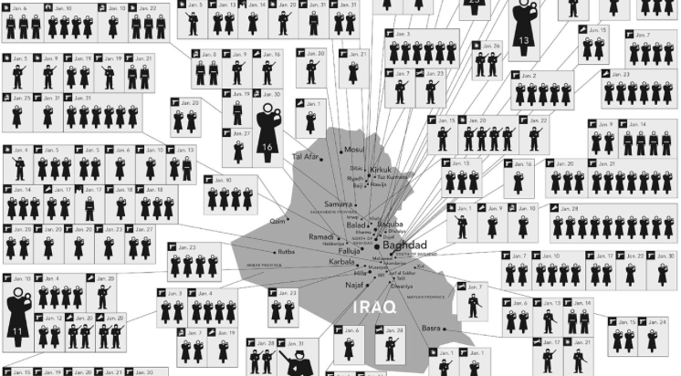
I chose these two visualizations various reasons. The top visualization shows a map of Iraq showing deaths from January 2006. The bottom one is a visualization of different programming languages and their influences. The first visualization is a static visualization, where you can look through the image but cannot interact with it. Although it is static, it does present the data in a new perspective. It shows the deaths over a month, where most of the people who died are civilians. This visualization attempts to show the humans who died rather than just giving a number. As D’Ignazio and Klein stated, “the perspective of only one group of bodies becomes invisibly embedded in a larger system”; in this case the perspective of the American media is the only perspective we see. This perspective usually fails to show the innocent lives lost in Iraq due to war. Much like how Du Bois had “the politics of visuality, and the very question of black visibility” in the back of his mind, the visualization attempts to make visible the invisible innocent lives lost during the war (15). It shows the human cost of war.
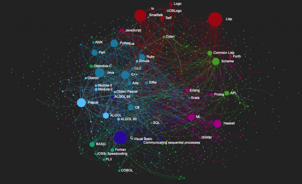
The second visualization is dynamic and interactive. The visualization shows a hierarchical system where languages are connected to their influencers and languages they influenced. This visualization can be seen as a genealogy tree, which “incorporates the tree to illustrate growth and subdivision over time” (Lima 25). The interactive aspect of the second visualization allows user to click on any specific language to focus and center it. The shape represents the numbers of languages influenced by it. The color represents the type of language. As Meirelles states, “we process spatial properties separately from object properties” (19). Here it is apparent that one type of language can influence another type. These visualizations allow users to explore, understand and discover new ways of understanding the data.
Native Land 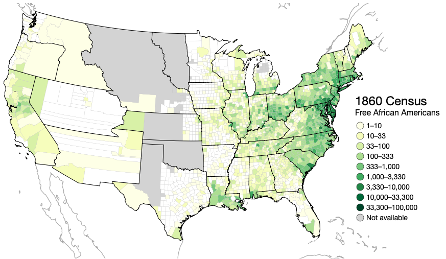
The Spread of U.S Slavery
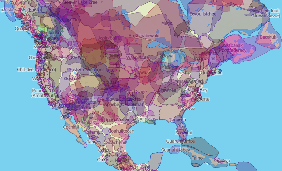
The two visualizations from the Digital Humanities Sample Book I chose are the Native Land and the Spread of U.S. Slavery. I chose these two maps because they help visualize information in different ways. The Native Land is an Indigenous-led project created by Victor Temprano. The map is dynamic meaning users can click through and see what native tribe lived in specific area. Users can look by territory, language and treaties. It provides users multiple ways to look through the data.
The Spread of U.S. Slavery is a map created by Lincoln Mullen. The dynamic map can be used to look at the number of slaves from 1790-1860. It also shows the number of free African Americans in particular place in the US. The timeline on the map can be used to see how the spread of slavery moves down to the south while the number of free African Americans starts increasing in the north. Both of these visualizations allow users to look at the data through different perspective as well as learn and discover information.