Link to Visualization https://public.tableau.com/profile/aung.pyae.phyo#!/vizhome/APPDataVizFInal/3?publish=yes
Website Link
dataviz2019phyo.blogs.bucknell.edu
Ever since my first year at Bucknell, I’ve been really interested in the patterns of international students pursuing higher education in the United States. I wanted to know why people would travel all the way to the middle of Pennsylvania for their future. I knew why I came to Bucknell, a decision that was made with the consultation of my high school, research into my field of study and the uniqueness of the program I wanted to go for. Interested in this, I take a look into the information available online, I only found the factbook, which had information, but it was not interactive in any way, and was very hard to get through because it was all numbers. The information was also focused a long term institutional outlook rather than a student-focused study. During in-class consultations, Agnes had suggested looking at the University’s interactive dashboards for data. Looking at these sources, they were not as specific about the international community at Bucknell as I wanted to see.

So for my final project, I wanted to take a look at five years’ worth of international student data, from the class of 2019 to 2023. My initial idea when I started thinking about this project was to make a Bucknell international student-specific infographic showing where we were from and how the community has grown over this five-year period. The data that I used for the project was obtained from the International Student Services at Bucknell. The information contains the student’s gender, class year, college within Bucknell, major, country of origin, their high school, and the category of their field of study. Within the data, I have the information of 279 students total. Data plumbing was minimal, as all I had to do was combine append the data of all international students in the academic year 2019-2020 with the data of seniors from the academic year before.
To interpret the data, I wanted to use Tableau to look at the demographics, and make the results interactive, with the user able to change various settings to look at their own specific research questions. Furthermore, I also wanted to look into the connections between high school and enrollment, to see how much secondary education mattered when choosing a college. To do this, I chose to use Gephi and map out connections between the students. The final tool I wanted to use was Timeline JS, to build a timeline about the international students at Bucknell in context to global events. By employing all three tools, I hope to effectively show a more complete look on the international student population with more interesting insights.
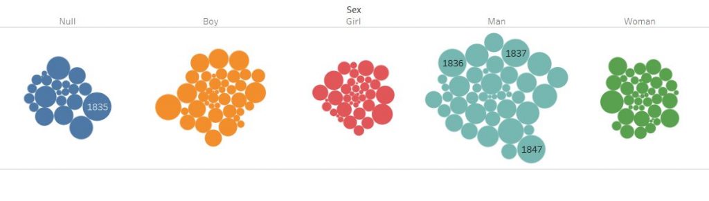
For the tableau visualizations, I was thinking about what people might be interested in when they think about international students. In a lot of demographics infographics, we are represented as a number of countries or a percentage statistic. It’s not wrong to do so, it comes up as fascinating data. I just wanted to make sure that my infographic would convey the same information, but in a way that I feel makes me feel personally visible. This is where Tableau’s symbol map comes into play. Throughout my survey of infographics, that was the most visually engaging methods of communicating the international demographic. It also is a great way to highlight the countries that are not represented as well.

Tableau is also the final part of my infographic. By ending on an interactive visualization that gives you tools to play around and explore the data, I want to encourage others to become knowledge generators themselves, to have their small research questions easily explorable. By using the martini glass structure, I hope to take the viewers through my narrative to inform them about what the dataset is and inspire them on what can be done with the final visualization, allowing for free exploration on a path of their choice.
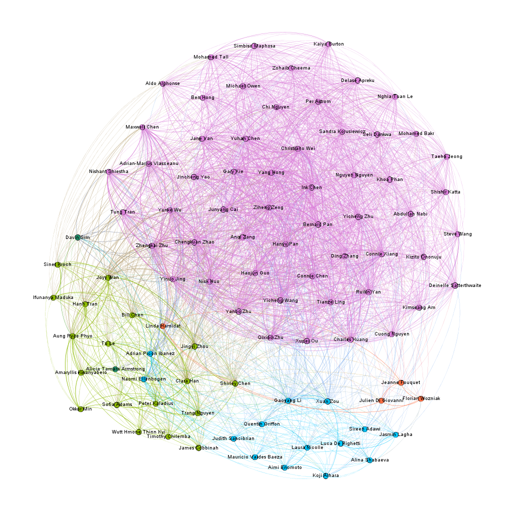
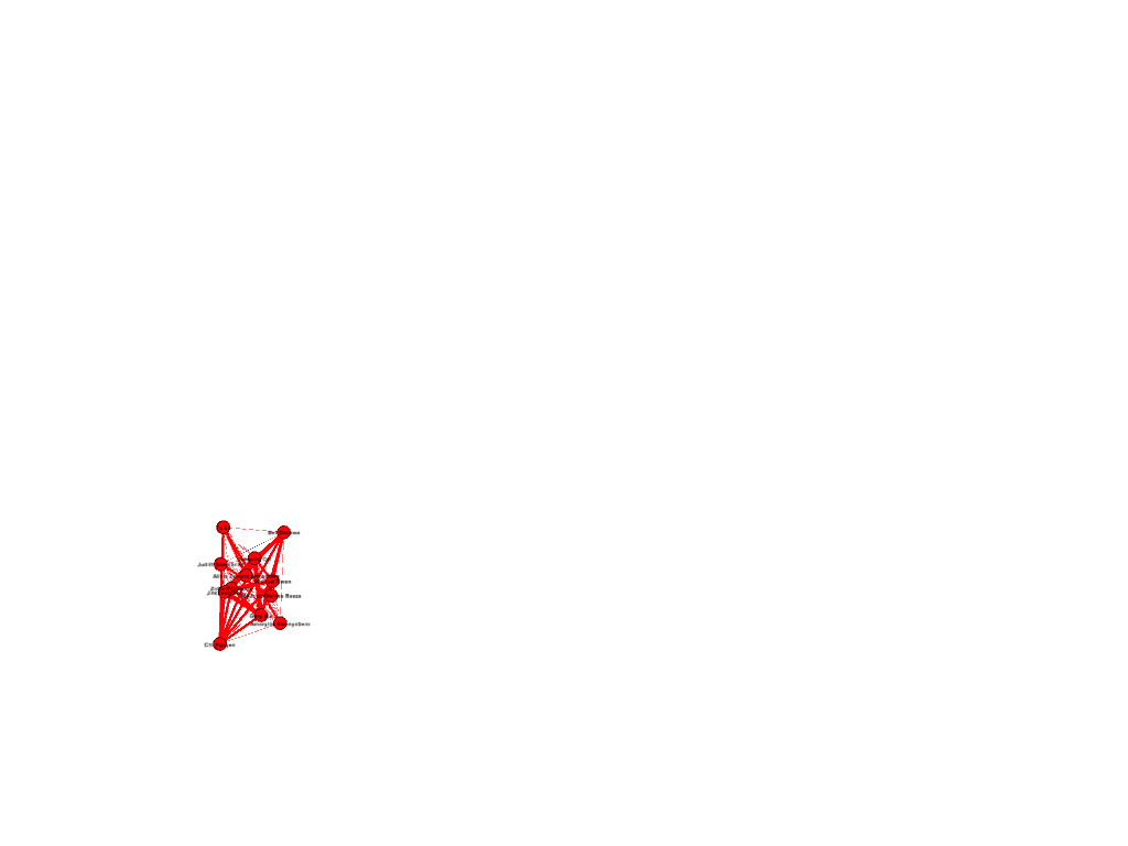
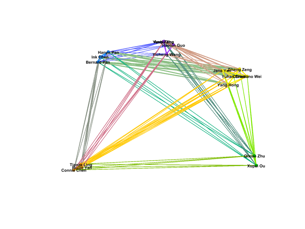
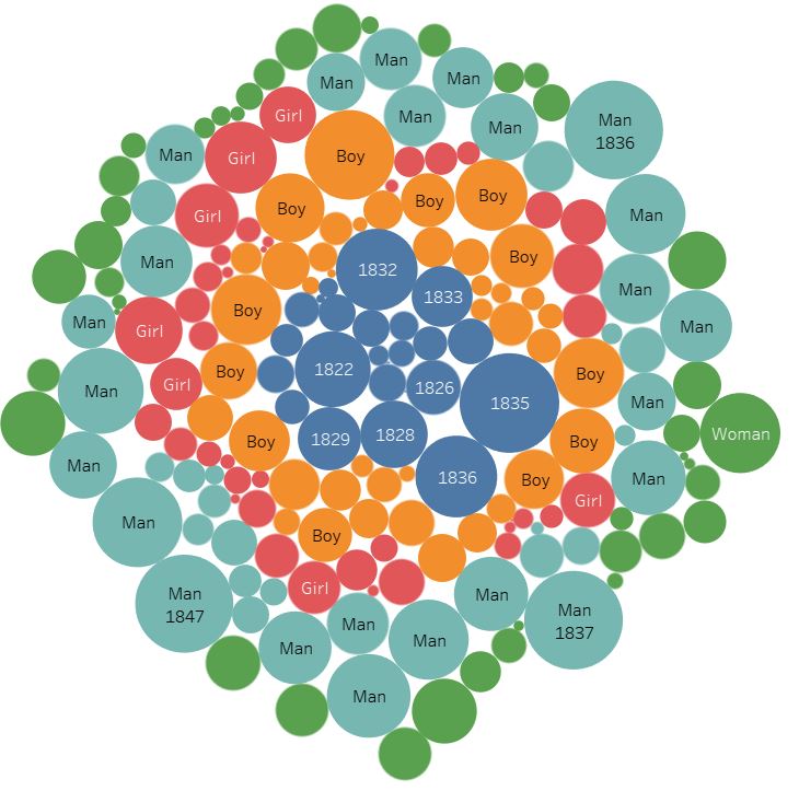
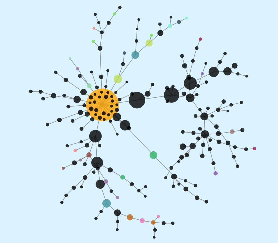
My first foray into the project was the Gephi component, which I was most interested in. My decision to look at Bucknell as an option was mainly because I knew students from my high school who went to Bucknell. To that end, I set out to connect people who came from the same high school, and gave them more weight if they belonged to the same year. After building the edge table, I used the Radial Axis Layout, grouping the nodes by class year. This produced a visualization that, in my opinion, created a pretty strong argument that the high school that an international student went to plays a significant part in deciding if future students apply. Of course, this dataset only contains the number of students who are enrolled, and not those that apply, and thus, this factor might have meaning if looked at in a college application context rather than in a college enrollment context.

For the final part of the project, I wanted to put in a timeline that shows some important events that influenced higher education in the US, Bucknell University, and international students who want to pursue a degree in the US. These events required more research (and from time of writing, more events that actually impacted international students.) For now, major events have been highlighted, and I hope to continue on this project and add more later on.
Working with this project was an interesting exercise in the release of data. I spent a lot of time thinking about how not to single people out because of how unique individuals can be in a small dataset. Due to the low number of international students at Bucknell, it became a scramble to try to find ways to hide the information that was unique enough to identify the individual student. Around half of international students are the only one from their own country, and while their country being represented is not a problem, the other data that comes with the dataset would not be appropriate to release.
Through this project, I think that I have been able to dive into the datasets that I received to produce some interesting visualizations. In particular, Gephi has really helped in my search for an answer about the correlations between enrollment and high school. Tableau has also opened up the path to be interactive with the data and let the readers decide what they want to explore. By being able to employ these tools, I believe that I have created an interface that will help people make their own visualizations, and creating more knowledge generators.
Works cited
Bucknell University, “2018-2019 Fact Book”
https://www.bucknell.edu/sites/default/files/2019-05/fact_book_2018-19.pdf
Bucknell University “Diversity Dashboards”
Segel, E, and J Heer. “Narrative Visualization: Telling Stories with Data.” IEEE Transactions on Visualization and Computer Graphics, vol. 16, no. 6, 2010, pp. 1139–1148.
Dataset from Bucknell University’s International Student Services