Learning Gephi was a very different experience for me than my experience learning the other platforms that we worked on this semester. I felt that I had to do a lot more preparation before using the platform. Not only was there a lot of new terminologies I had to become accustomed to, but how Gephi operates and the data it uses/analyzes is very different from anything I have previously worked with. Unlike Palladio, for example, that allows users to graph two different categories, Gephi only allows users to map relationships between the same types of nodes. This was a concept I had a lot of trouble grasping initially, but I learned the benefits of Gephi rather quickly. Gephi allowed me to measure different relationships and the metrics between the relationships, which is something that I was not able to do on platforms that we previously worked on. Furthermore, Gephi allowed me to look at networks, sets of points joined together by lines in an aesthetically pleasing way, and discover how information can be passed between two people or two entities. Through my preliminary research, I discovered that graphing networks of people helps us, as a society, analyze how people interact with one another, which ultimately helps us understand the behavior of a particular individual. Gephi allowed me to search for different kinds of metrics that will provide more insight into the networks I created. The hardest part for me with Gephi was getting started because I had trouble coming up with what I wanted to show and how I wanted to show it using the data on the Mary from the African Slaves Database. I wanted to illustrate the routes the Mary and the slaves that were on the Mary took. I had to decide what constitutes a connection (what is an edge) which I eventually chose would be the relationship between the place where the slave was purchased and the place the slave landed.
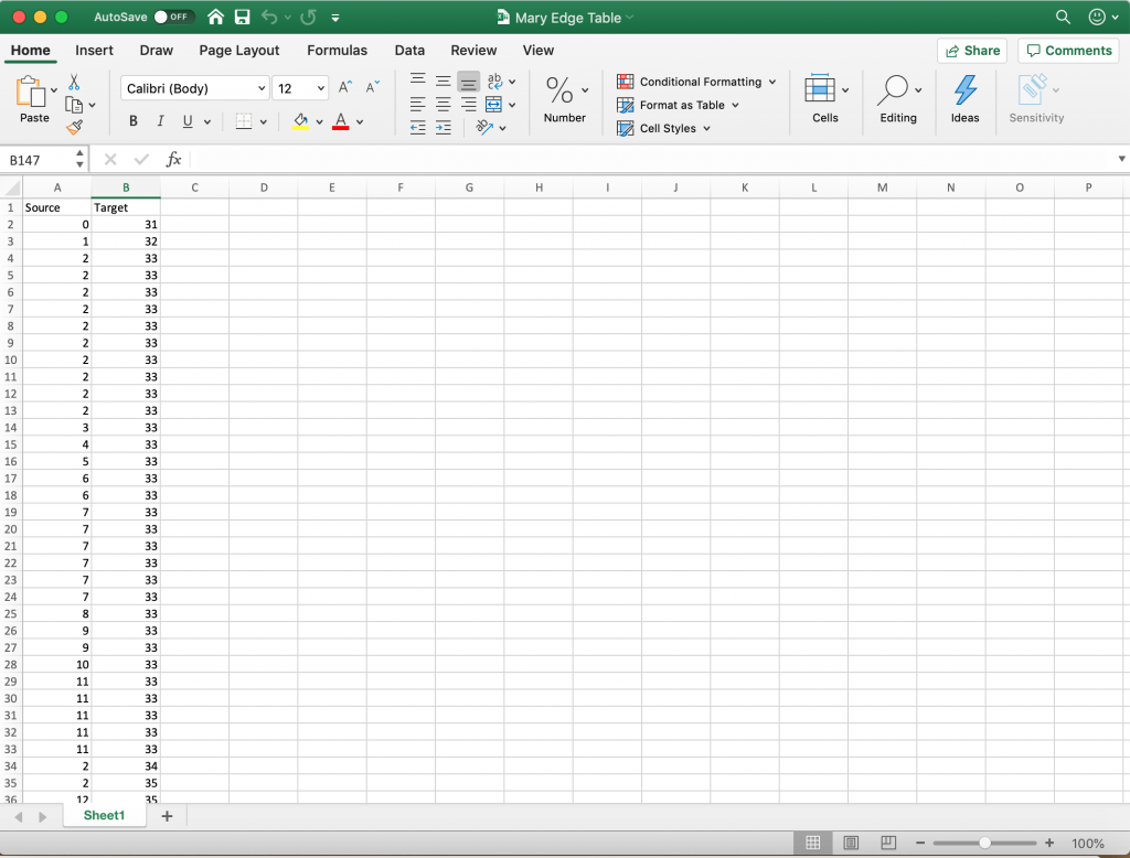
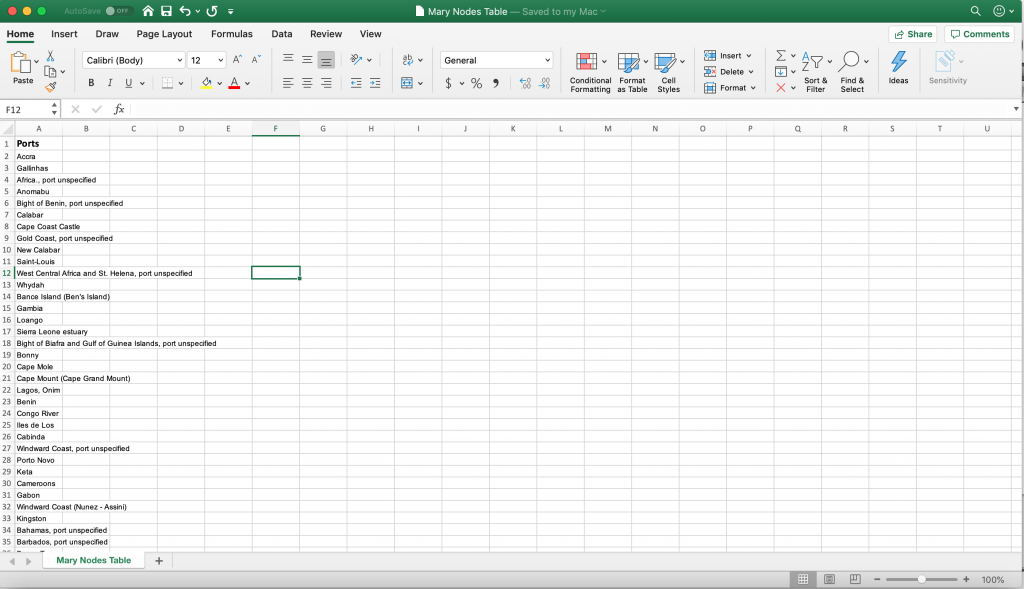
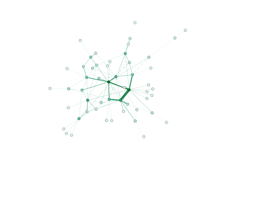
Finally, I decided to make all of the places nodes. I created a nodes table in excel consisting of all of the ports where slaves were purchased and where slaves landed. I removed any duplicate locations and then saved the file as a csv. I then imported that csv file into Gephi which generated an id number for each of the locations. After that, I went back to the original African Slaves Database and looked at each individual voyage that the Mary took paying particular attention to the port where slaves were purchased and the port where slaves landed. I used the id numbers from Gephi to illustrate each voyage by creating an edge table in Excel. I put each port (using the id number) where slaves were purchased in the “source” column and put the port where the slaves landed into the corresponding “target” column. If the Mary visited the same two ports on different voyages, I would put them in as separate entries. By doing this, I weighed the edges to illustrate the number of slaves that took a specific route. As described by Graham, “weight is a numeric value quantifying the strength of a connection between two nodes” (Graham 206). As evident by the visualizations I created, the thicker edges have more slaves going from the same place of purchase to the same landing place (more closely connected).
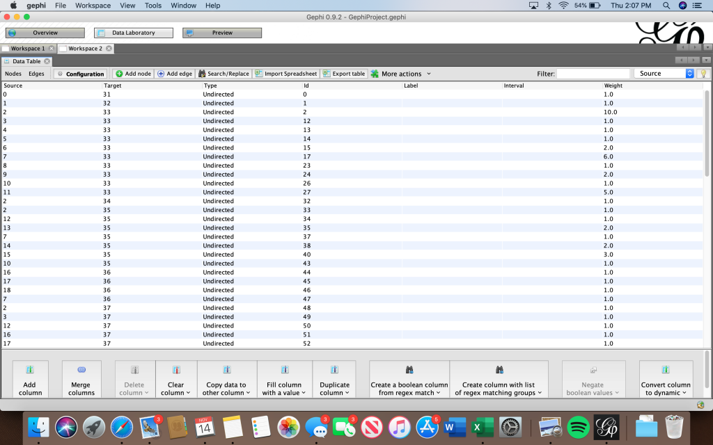
Then, I imported the edge table into Gephi and was able to use the tools on the platform to reveal statistical calculations and illustrate the relationships between the nodes. I used the “Modularity” algorithm to detect communities. I then filtered by the degree range 8-13. After completing this step, I was able to relate to Graham’s point that “although node and edge lists require more initial setup, they pay off in the end for their ease of data entry and flexibility” (Graham 244).
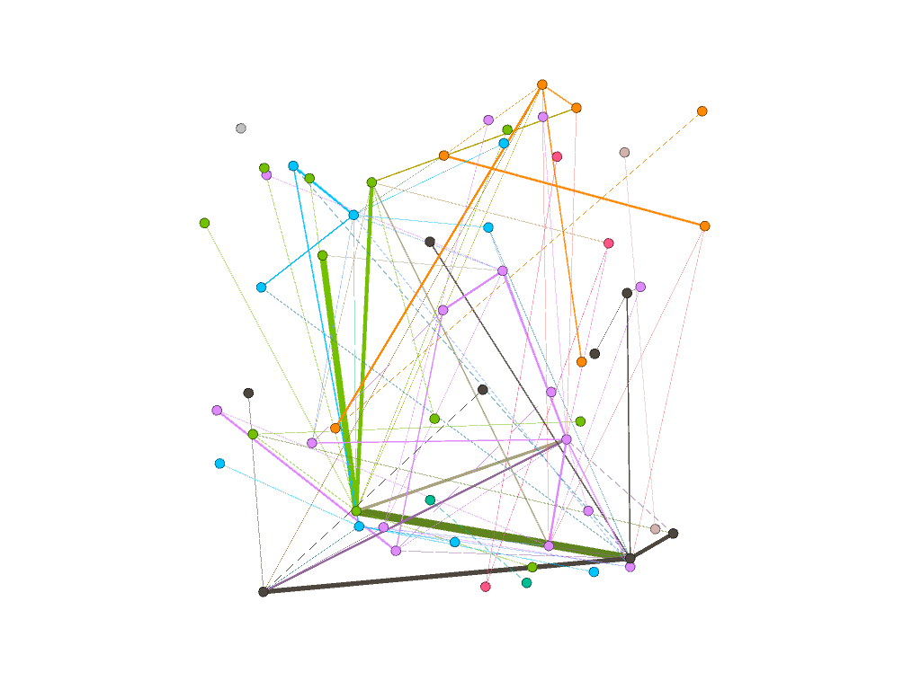
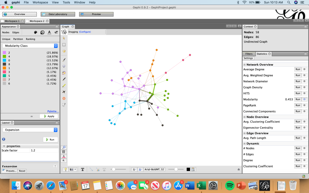
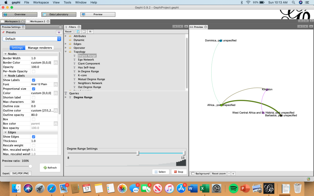
I then changed the size of the nodes based on “degree” using the “average degree” calculation.
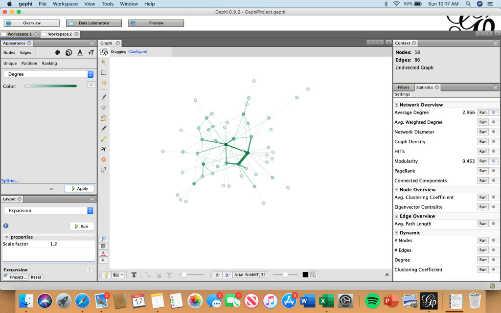
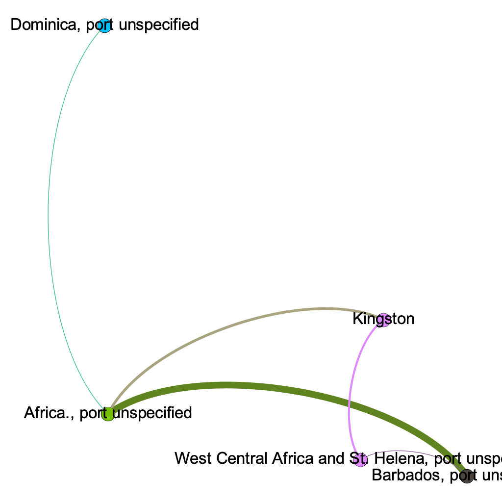
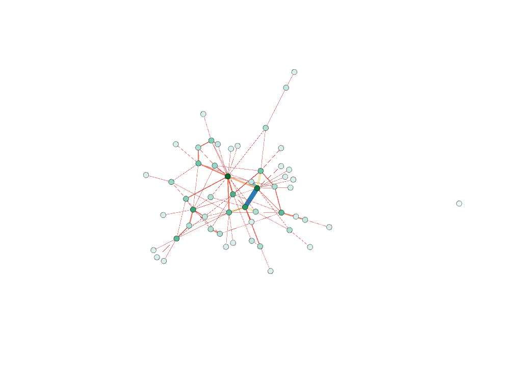
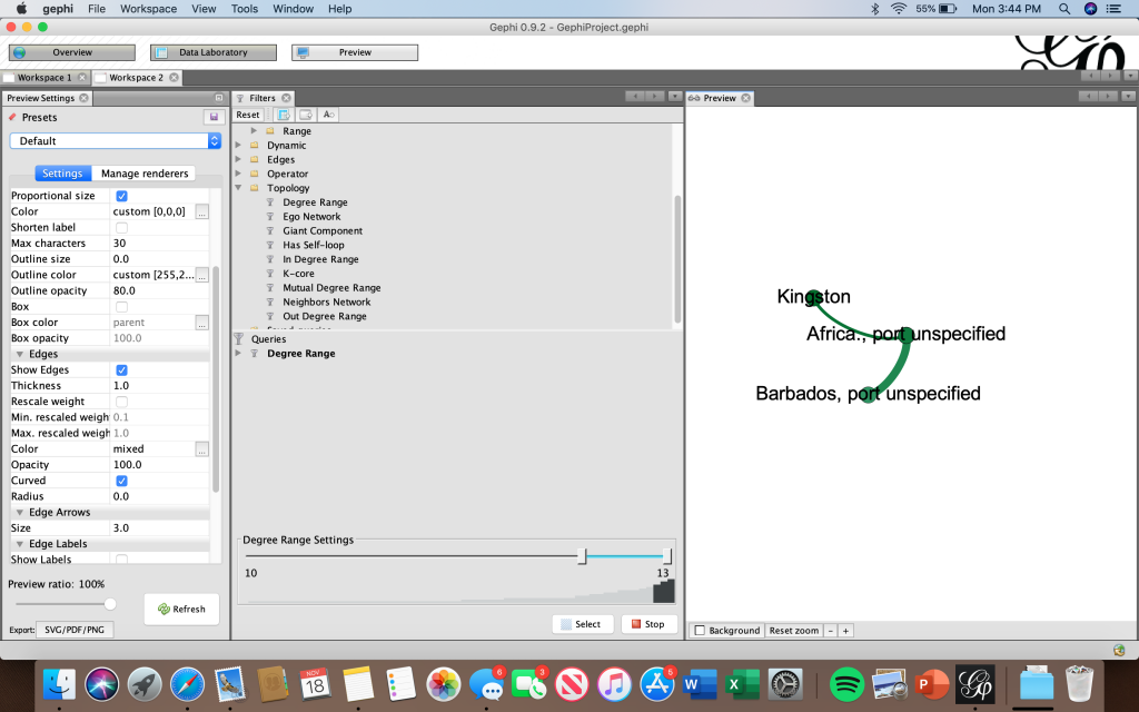
These models below show the results of both the modularity and degree calculations. The bottom screenshot illustrates how I filtered degree range to 10-13 to only show the nodes with the highest degree. These nodes were Kingston, Barbados, and Africa (port unspecified).
Gephi not only allowed me to visually see what ports were most visited by the Mary individually, but also let me see what voyages were most common. I was able to see the frequency of these voyages based off the weight of the edges. Through these visualizations, I was able to draw meaning out of the relation between the graphical representations. Like Lima explained, “network visualization is also the cartography of the indiscernible, depicting intangible structures that are invisible and undetectable to the human eye” (Lima 80). The visualizations created in Gephi gave me the ability to draw conclusions and see similarities/differences within the data set that I was unable to see in a typical spreadsheet format. Not only did I learn that where a node is in relation to other nodes mattered, but that the weight of the edge between them is also significant. The specific formatting of this visualization is that of a “rhizomatic relationship” where we do not know beginning or end (Lima 44). I was able to see certain patterns that I may not have noticed prior that I can further dive into.
