Palladio Visualizations
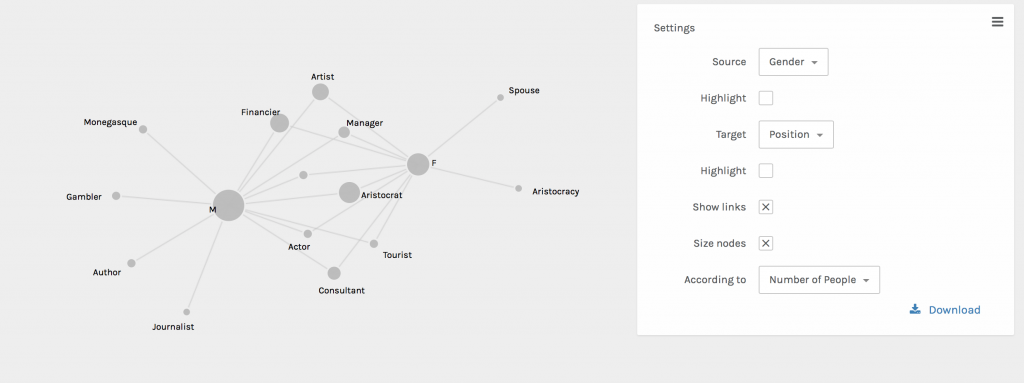
When utilizing sample data on Palladio I became interested in the connections between gender and positions (occupations) in the workforce during the era this data was pulled from. When looking at the graph above I was fascinated by the amount of women who seemed to have jobs in what I assumed to be predominately male industries during the time period. As one analyzes this visualization it appears that, from the data provided, most women and men shared the same occupations. I was particularly interested in the female financier as even now the industry is predominantly male, although it is changing as we speak.
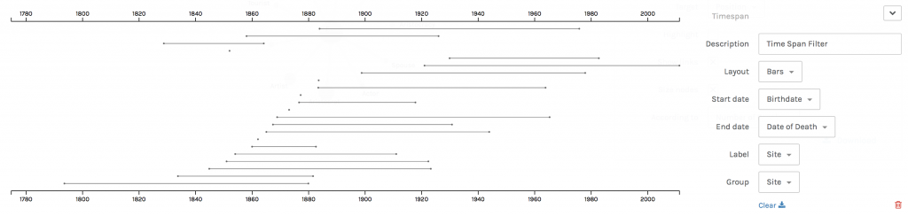
When analyzing this further I took at look at the years these women were alive. The range of the years the women were alive spans from 1800 to 2011, showcasing that most of them were alive during the women’s suffrage movement. This made me believe that this movement lead to these women being some of the first females in their field. This parallels with the Palladio graph because after doing outside research on the women’s suffrage movement I understood how the visualizations were connected.
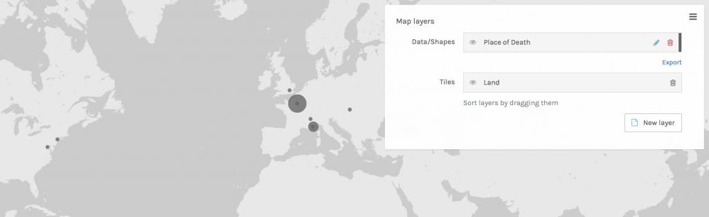
In order to conduct more research for my visualizations I created a map showcasing where the women died, assuming that they died in or around where they worked. The cities highlighted in the visualization are still leaders in the business world so I was not surprised to see Paris, London, and New York had women in the workforce. In order to tell a story with this data, and understand my findings more, I took what I had concluded and conducted my own outside research to visualize on a timeline in Timeline JS.
Timeline JS
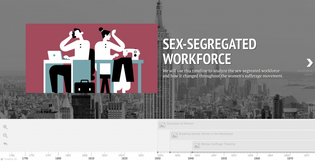
In this timeline I utilized the insight I gained from my visualizations on Palladio to understand the time period of these events.
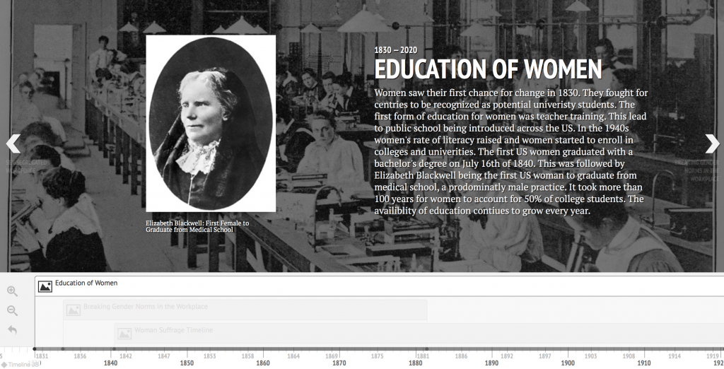
When looking at the map of where women died I decided to dive deeper and see what was going on in those cities during the 1800/1900s. I came across the movement to educate women and was fascinated by it. I presume that the women included in the data I used were more involved in the workforce because they were educated. As I say on the slide: “Women saw their first chance for change in 1830. They fought for centries to be recognized as potential univeristy students. The first form of education for women was teacher training. This lead to public school being introduced across the US. In the 1940s women’s rate of literacy raised and women started to enroll in colleges and univerities. The first US women graduated with a bachelor’s degree on July 16th of 1840. This was followed by Elizabeth Blackwell being the first US woman to graduate from medical school, a prodominatly male practice. It took more than 100 years for women to account for 50% of college students. The availiblity of education contiues to grow every year.” Elizabeth Blackwell graduated from an institution in New York, leading me to assume that women could attend college there, leading to them finding jobs in the city. I think that this time period was very crucial for society and the women’s suffrage movement as it allowed women to enter the workforce with the same education men had.
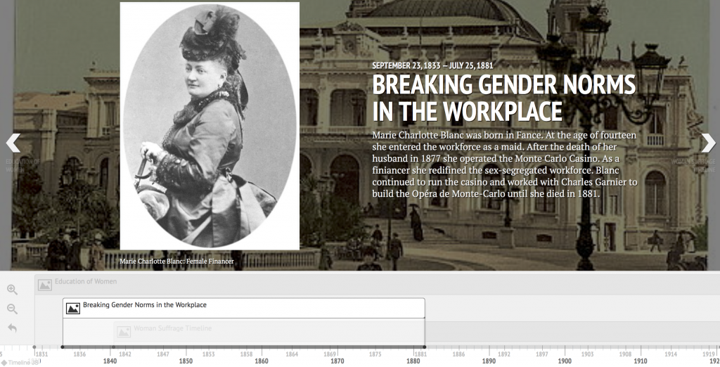
I also wanted to conduct more research on the woman who was in finance. By doing research on her I learned that: “Marie Charlotte Blanc was born in Fance. At the age of fourteen she entered the workforce as a maid. After the death of her husband in 1877 she operated the Monte Carlo Casino. As a finiancer she redifined the sex-segregated workforce. Blanc continued to run the casino and worked with Charles Garnier to build the Opéra de Monte-Carlo until she died in 1881.” Marie Blanc was one of the earliest women I have learned of that worked in such a male driven industry so early in the movement for women’s suffrage. Although she did not necessarily ‘apply’ for the job she took over graciously and was able to build another profitable building, the opera house, from her experience with the casino.
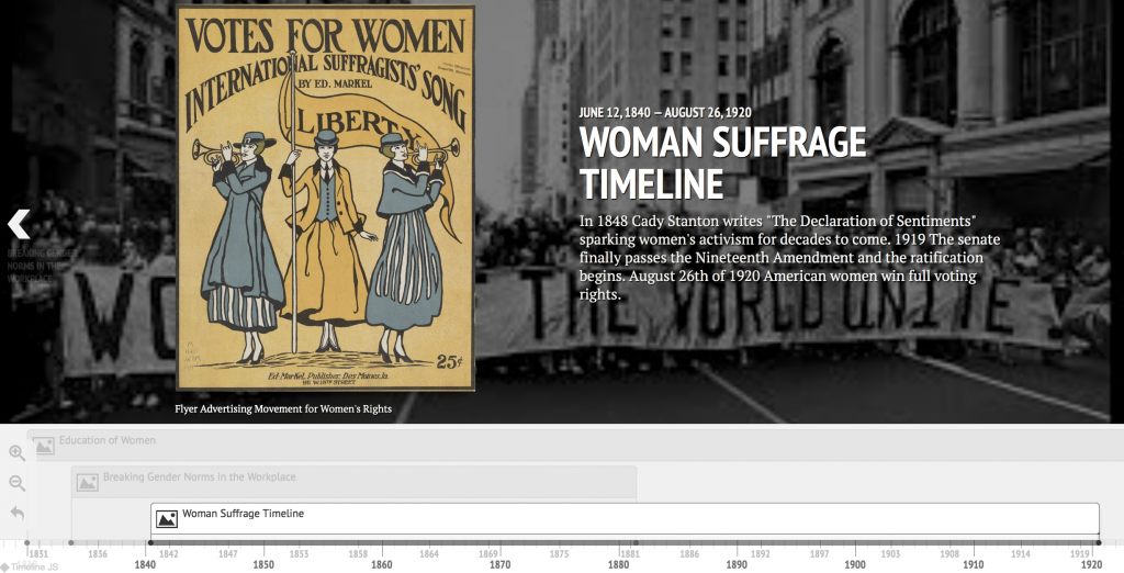
In order to tie together my three visualizations on Palladio and my other two slides on Timeline JS I conducted research on the US Women’s Suffrage Movement. The important dates I found include: “In 1848 Cady Stanton writes ‘The Declaration of Sentiments’ sparking women’s activism for decades to come. 1919 The senate finally passes the Nineteenth Amendment and the ratification begins. August 26th of 1920 American women win full voting rights.” I expected the suffrage movement to have impacted the events I addressed. I was surprised to learn that the movement started after the other events, causing me to believe that the development in the education of women as well as women starting to enter the predominantly male work force were leading factors in to the start of the Women’s Suffrage movement. Below I have included a link to my Timeline JS work.
Learning from Drunker, Meirelles, and Lima
Drucker emphasizes the importance of reading visualizations as graphical expression accurately is crucial. The data used to create these visualizations was taken from a spreadsheet organized by columns and rows, a form of graphical information. This form allows users to document a system of relations thus creating meaning from numbers. I feel as though when utilizing Palladio to showcase data is creates visualizations that are representations not necessarily data sets. Drunker shares that information visualizations can frequently showcase “mis-information” and through my experience I understand why. Without using Timeline JS and outside research to aid your visualization, data is sometimes hard to analyze and understand, and as I learned on Assignment 2 you cannot always trust your data!
Meirelles argues in chapter three that our concepts and corresponding visuals are organized around linear and cyclical times. Linear times can be visualized with timelines, like I used for the years women in my data were alive. These timelines are chronological and sequential narratives of historical events, which help readers of visualizations understand what they are looking at.
Lima discusses in chapter two the importance of network visualization. The graph I created showcasing the connection between gender and jobs is an example of a network as it is a connection of nodes (the job or gender) and the links that connect a person to a position showcasing a connection.
