To visualize the African Name Database and the U.S. Slavery in 1860 Database I used the platform Tableau due to the nature of the data being numerical sets on a spreadsheet. For the Slave Narratives Database, I relied on the Voyant platform since it is most useful with large collections of text (corpora). The Tableau platform took some meddling with to get data visualizations that would best display the data in a way that made sense. As for the Voyant platform, I have previous experience in navigating the program thus it just required a bit of a refresher, but overall the experience went quite smoothly when compared to trying to utilize Tableau for the sake of this assignment. Once I refamiliarized myself with both platforms I began looking for patterns and visible trends in the data that were intriguing to elaborate on.
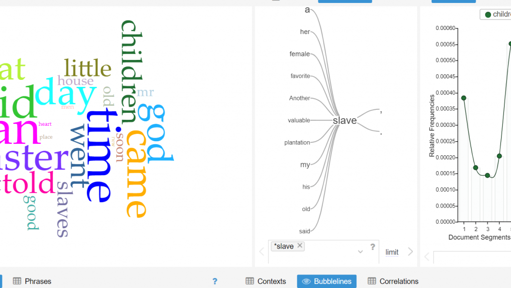
The middle of this screenshot displays the word tree tool on the Voyant platform which proved to be quite useful for the purpose of analyzing the Slave Narrative Database. With this tool, one can essentially enter any word that is contextually relevant to the corpus, and one word that I noticed that appeared numerous times throughout the entirety of the corpus was the word “slave”. One is able to observe the most frequent words that associate closely with “slave” by use of the word tree tool, what stood out to me in this word tree that words such as “valuable”, “plantation” and “favorite” are closely linked to the word “slave”. This especially makes sense considering the historical context in which slavery existed and a possible inference that can be made is that slaves were viewed by their owners to be valuable assets to the function of the plantation’s operation. However, what can also be deduced is that the slaves living on the plantations were viewed as an item rather than a human being.
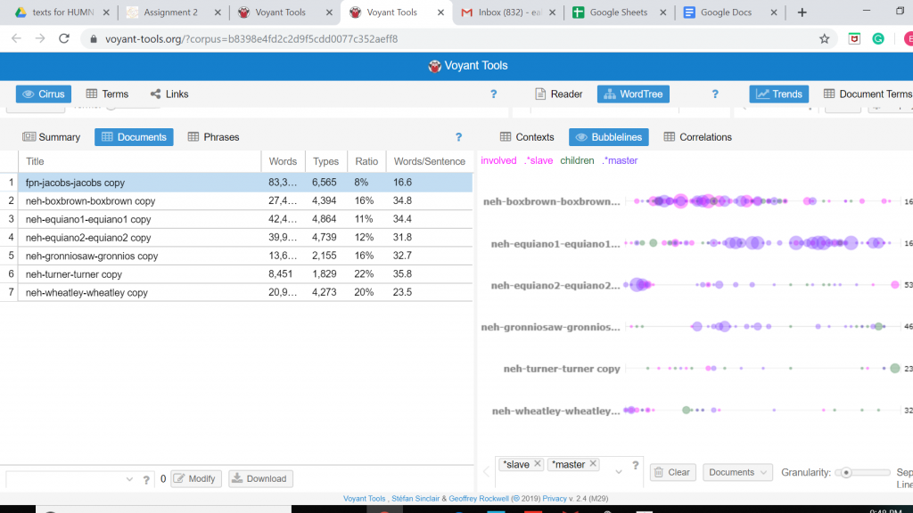
The screenshot is again from the Voyant platform that shows the use of the Bubblelines Tool. What makes this tool useful for visualizing a data set is that by utilizing Bubblelines the individual has the ability to view the frequency of which a particular word appears throughout the corpus and in this instance the several different slave narratives. I thought it would be interesting to test the frequency of which the word “slave” would appear in the various narratives and by using Bubblelines. As one may notice the word “slave” is very heavily used in the Box Brown and the Equiano narratives when compared to the other narratives.
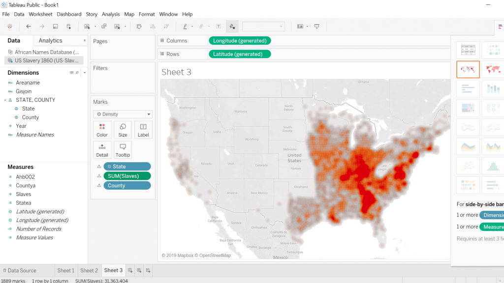
The first screenshot is what I was able to come up with when working with Tableau and the 1860 U.S. Slavery Database. My intentions for this visualization was to display the geographic regions in which concentrations of slaves were highest in the United States in the year 1860. This required a bit of cleaning on my part so that the visualization was clear and showed up in legible fashion. Tableau proved to be quite a useful tool for creating a geographic visualization.
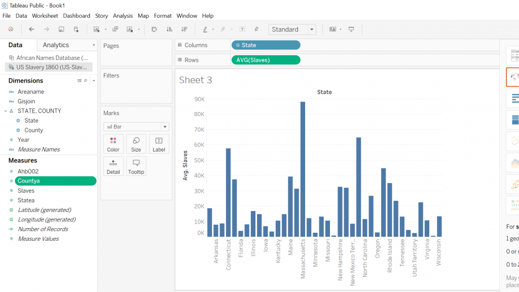
As for the second screenshot this visualization was again created by utilizing the Tableau platform, my intentions remained, for the most part, the same with a slight twist in that I wanted to display a graph that compared the total amount of slaves residing in a particular state. What caught my eye is that the majority of slaves resided in the traditionally thought of southern states along with some of the southern coastal states as well.
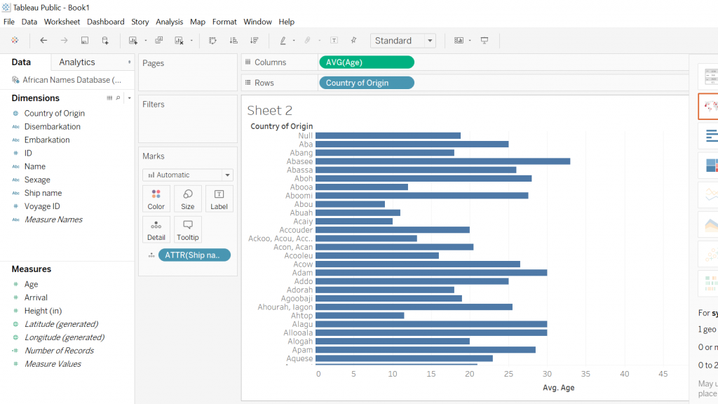
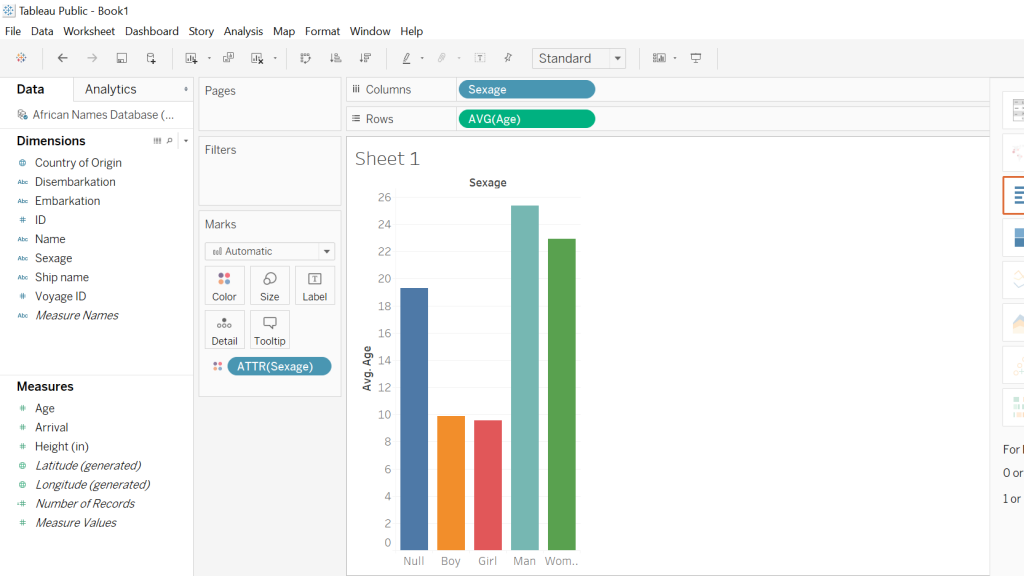
Both screenshots show the Tableau platform displaying two different graphs that I was able to construct using the Slave Names Database. The first graph I created was in response to my curiosity about the average age of slaves coming from various African countries. In order to accomplish this, I took the country of origin and then the average ages of the slaves and what one can see is an easily accessible, clear representation of the different African countries with the respective average ages of the slaves. The following screenshot is attempting to illustrate the average ages of the different sexes of slaves coming from Africa, almost immediately one notices that there is a disproportional amount of men when compared to the other sexes. Another noticeable aspect is that the “null” sex is the third-largest bar which to me was a little disturbing because this suggests that there was little effort on the part of rescuers to accurately record data.
By utilizing both the Voyant and Tableau platform I was able to create useful data visualizations from which a great deal of information can be drawn from. Also, another aspect worthy of mention is that both platforms allowed for the use of the “differential reading” practice which is discussed in depth by Tanya Clement in her piece Text Analysis, Data Mining, and Visualizations in Literary Scholarship. What the methodology of differential reading allows for in essence is the defamiliarization of, “… texts, making them unrecognizable in a way (putting them at a distance) that helps scholars identify features they might not otherwise have seen, make hypotheses, generate research questions…” (Clements). Tableau and Voyant allow for the user to take large sets of data that otherwise would take a lifetime to synthesize and puts them into a nicely constructed visual that is easy to draw information out of and share with the public domain.
