In order to construct my data, I met with Professor Faull to get a grasp on what it was that I wanted to look at. I hadn’t worked with Voyant nor Tableau before, so I felt overwhelmed with possibilities on what it was I could do. Professor Faull helped me to decide to look at “who are the enslaved people?” and to put this within the context of the 1860s texts.
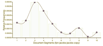
Using Voyant, I analyzed both the corpus as a whole and the Jacobs reading. I chose the Jacobs reading specifically because it was the one document that was published in the 1860s, the time period of our data for the Tableau work. With Voyant, I studied the frequency of the word “slaves” as it appears in the Jacobs writing, which is meant to be a persuasive tool for the general public surrounding the idea that the ownership of slaves is wrong. I found it interesting that after the use of the word peaks around section 3 of the document, it has a sharp drop and doesn’t really rise back up.
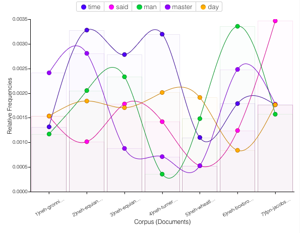
Another idea I looked at with Voyant was the most popular words used throughout the corpus and how often each document used the most popular words. The main takeaway I gathered from this is how much more the Jacobs document uses the word “said” compared to the other documents in the corpus, indicating that this document is likely very different stylistically from the other documents; perhaps in its structure or point of view. Further, some consider higher use of the word “said” to indicate text that is less reliable than works that have less reported text.

Where did the enslaved people come from?

With Tableau, I was interested in mapping the geographical locations of slaves, both before they were enslaved and as they were enslaved people. It was challenging to find coherent information for the data surrounding the enslaved people’s country of origin, because there were many slight differences in some spellings of countries, e.g. “the Democratic Republic of Congo” vs “Congo.” Nonetheless, the data that was available for the number of enslaved people living in the United States was slightly more readily accessible, and I mapped it on Tableau by percentage of the county population that was enslaved.
In doing my own research, I wanted to know what other sources had to say about where enslaved people typically came from. I went to history.com, which noted that “of those Africans who arrived in the United States, nearly half came from two regions: Senegambia, the area comprising the Senegal and Gambia Rivers and the land between them, or today’s Senegal, Gambia, Guinea-Bissau and Mali; and west-central Africa, including what is now Angola, Congo, the Democratic Republic of Congo and Gabon.” Comparing this information to the maps I created makes sense for both the maps and the website, as the concentrated areas on my map primarily represent Senegambia and west-central Africa.
One thing I found interesting about the data set I was working with is how it left out some interesting and important details about the individuals who were taken from Africa to the Americas: some did not make it (source: gilderlehrman). In fact, about twelve percent of those who embarked did not survive the voyage to the Americas, but no one would know that by simply looking at the visualizations I created. A more effective visualization would be able to take this into consideration, as well as the number of individuals from/to each location.
Using Tableau and Voyant together is beneficial to an individual’s broader understanding of a topic. Tableau allows people to visually map data and quite literally see where people had been to where they were sent as enslaved people, which is quite powerful. Voyant allows people to gauge patterns and apply those to specific dates or time periods. Using the two pieces of software together makes for a powerful tool. Tanya Clement observed that the use of a visualization platform “combines the video streams from these cameras, and the resulting images duplicate a multidimensional viewpoint” and went on to discuss the encompassing vantage point, which is relevant through the use of Tableau and Voyant because the programs provide what Lima introduced in Chapter 2 as organicism. Organicism states that reality is best understood as an organic whole; in this context, Tableau and Voyant not only provide geographical locations, they also provide patterns of speech and text.
These tools allow us to perform what Clement describes as “differential reading,” which means to be both close and distant; subjective and objective. We do this through looking at human elements and analyzing things like vocabulary to deconstruct and then reconstruct data and text. As Professor Faull says in her essay, “The earliest ventures into thinking about visualization and literature are not at all digital, but rather focused on both the graphical rendering of plot and character and also the extraction of metadata from collections of documents.”
