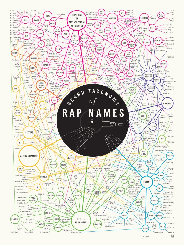
“Grand Taxonomy of Rap Names” was not only striking due to the eye-catching colours, the subject matter was also a significant point of interest. I was curious about the connections, and wanted to investigate the grand claim the title makes. Taxonomy is a biological term, which recalls arguments made by Lima regarding classification, particularly those concerning the ordering of nature. This visualization, while concerned with classification does not use a hierarchical model (tree structure) but instead uses a network – as it better fits the data. The title, then, becomes rather ironic, for placing value on rap names – a field dominated by black bodies – subverts what Linnaeus accomplished by his own ordering system which fueled scientific racism. DuBois makes a similar move with his infographics using “the map depicting routes of the African slave trade… which served as the lead image for the Georgia study” and “situates Georgia (represented by a star) at the center of the map’s diasporic cartography” (11). The producers of “Grand Taxonomy” visualize rap names in a way that demonstrates new ways of understanding “how various name origins, from physical attributes to audacious misspelling, are all interconnected” the way that DuBois draws lines between countries and continents. “Grand Taxonomy” also bears similarities to D’Ignazio and Klein’s goal in creating Data Feminisms. Their document an annotated one, making connections outside itself, and it accomplishes the task of social collaboration that both Lima and Meirelles discuss in their networking chapters. Network thinking is also integrated in the process of creating the visualization, but because it originates from a poster there are not multiple ways to interact with the data. Though it may be described as a static visualization, the links between the nodes are dynamic for they are built on multiple relations.
A relationship between “Grand Taxonomy” and “The Guardian: A Semantic Network Graph on Lebanon” is formed through the concept of the rhizome. Lima quotes Deleuze and Guattari who argue, “the rhizome is an acentered, nonhierarchical, nonsignifying system without a General and without an organizing memory or central automaton, defined solely by a circulation of states.” Both of these visualizations depart from the arboreal structure and adopt a network structure, which allow them to convey information in a way that represents those dynamic relationships.
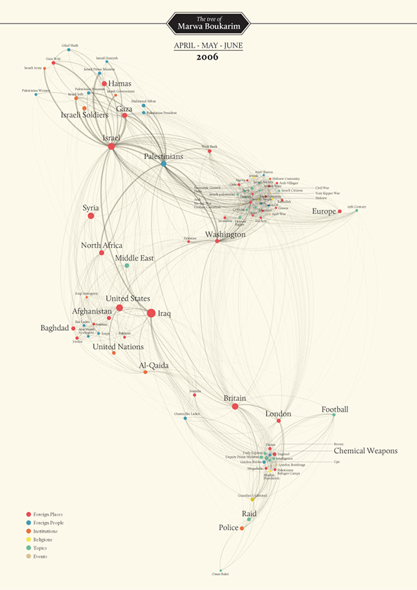
Because I come from the field of literary studies, I am interested in the relationship between words and “A Semantic Network Graph on Lebanon” seemed to be a promising exploration of those relationships. This visualization bears similarities with those examined previously insofar as its manipulation of proximity, use of colour and relative size (of the nodes) are used to communicate meaning. This work is quite literally about new perceptions, and it also visualizes many perspectives: “The goal was to understand how Lebanon was perceived abroad by understanding the main actors, relations, and most relevant topics.” Furthermore, there are multiple iterations of the network graph that move from the ‘raw’ sketch to increasing detail that populates the network with nodes and labels, showing the progression. It uses the architecture of decentralization. With the focus on Lebanon, parallels may be drawn with Lima’s discussion of flaws in city planning, and understands “the city as a living organism in constant mutation, a highly complex network involving a vast number of variables” (Lima 48). This concept is echoed in the visual project pursued by students in a digital lab. The ‘finished’ product, however, is presented on a physical page, deeming it a static visualization. But one difference between this visualization and the former is the inclusion of images of ‘zoomed in’ clusters. Their technique is similar to a particular digital strategy outlined by Meirelles: “Other effective strategies involve enabling the user to change the camera view or zoom into the graph, for example. So-called focus + context techniques involve operations that keep the contextual view of the whole graph while enabling a selected area to be represented in detail” (58). This effort may blur the lines between what we understand to be static and dynamic visualizations.
From the DH Sample Book:
American Panorama: An Atlas of American History
This digital project can be clearly situated in the field of dynamic visualizations. An interactive map, it allows the user to navigate the clusters of data and has an effective filtering system. It facilitates an effective transmission of information that does not suffer from disorder or an overwhelming amount of data, like the treemap it is a“space-efficient display of large structured datasets” (Meirelles 30). For example, in the Renewing Inequality project on family displacements from 1950-1960 allows one to view the same space through the lens of demographics and incomes or from the perspective of redlining.
Mapping Metaphor
This project uses the Historical Thesaurus of English as its primary source, and furnishes us with a dynamic way of interacting with that text. While it uses a circular network layout, the ideology motivating the visualization is a hierarchical one. One of the first bullet point on the homepage reads: “This circle represents all of knowledge in English: every word in every sense in the English language for over a millennium.” This statement embodies the centralism and finalism that Lima critiques, and stands in direct opposition with the idea of the rhizome. While the data can be viewed through different perspectives, these seem to function to reinforce the idea of absolute understanding.
