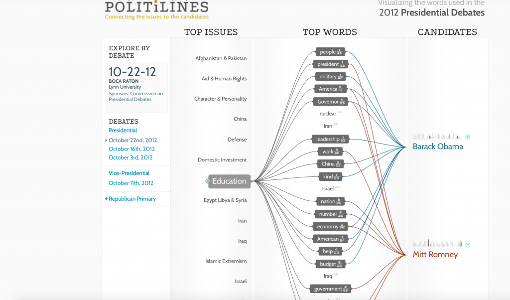
Periscopic, the creator of the top visualization, analyzed the top words spoken during speeches given by presidential candidates to see what were the major issues they focused on were. I feel that the unique way in which the data was presented allowed me to develop takeaways that I would not have found if I was just listening to the speeches. I believe that I would lose sight of some of the trends that were made obvious by this particular visualization. As Friendly argued in his piece, A Brief History of Data Visualization, the dynamic visualization of the data allowed me “to see phenomena and relationships in new [and] different ways” (Friendly 30). Furthermore, I was able to interact with this visualization and look at specific things that interested me and the impact of those things on society. Like Du Bois argues in his book, Visualizing Black America, Periscopic utilized the “cross-fertilization of visual art and social science” to offer “alternative visions” of the speeches made by presidential candidates (Du Bois 13). This is significant because it allows individuals to become more educated on the issues being discussed and provides the opportunity for viewers to come up with their own interpretations. As D’Ignazio and Klein argued, “embracing multiple perspectives can lead to a more detailed picture of the problem at hand” (D’Ignazio and Klein). The tree-like, web structure of these visualizations allows viewers to “browse, filter, and organize” their understanding of the material “in a nested hierarchy” (Lima 41). I was attracted to this picture due to the bright colors and shapes utilized. I believe that this is because of the preattentive properties this visualization possess. As Meirelles discussed in his book, Design for Information, “studies in psychology have shown that our visual systems favor certain visual features over others. In this case, I was drawn to the colors and shapes Periscopic used.
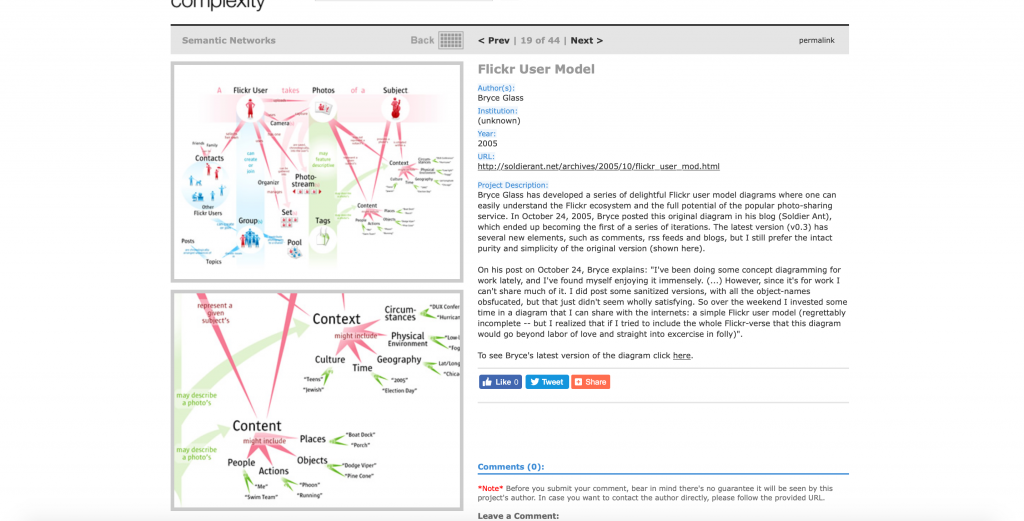
The second visualization demonstrates “the Flickr ecosystem and the full potential of the popular photo-sharing service” (Glass). As DuBois argued in his book, Data Portraits, I was originally attracted to this diagram because it was visually pleasing and made me want to immediately learn more. Furthermore, the creator utilizes the elements of design that Meirelles discussed in order to help portray the data in an intriguing manner. I particularly took notice of the red-green color scheme and the spatial distance between various elements of the infographic. The creator of this visualization utilized the tree concept that Manuel Lima discussed in his work, Visual Complexity: Mapping Patterns of Information. The tree-like structure of this work allows me to see the fundamental make-up of Flickr because I am able to see the hierarchal structure of the uses of the platform. However, I feel this visualization is limited as it is not dynamic. It is particularly hard to try to look at the material from multiple perspectives because it is merely a reflection of results. As a viewer, I wish I had the ability to interact with the data and find conclusions embedded in the data set.
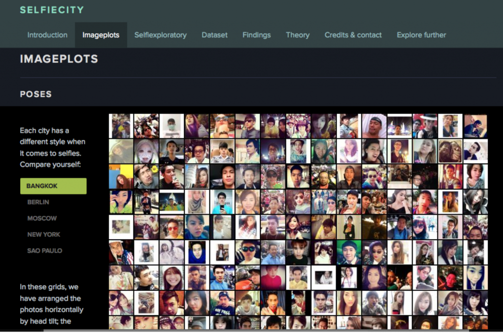
The visualization, “selficity,” illustrates themes and trends in selfies people take. It uses imageplots to display the thousands of pictures to reveal the results of the findings. The study categorizes the pictures into what types of people take selfies, what their poses are, and what their expressions are. It compared people taking selfies in numerous cities worldwide and then further compared gender and age. It allows viewers to see the set of data used to draw conclusions in an unbiased fashion. It utilizes both quantitative and qualitative metrics to allow for multiple perspectives/measures to be taken into account. I believe that the use of dynamic data allows for users to interact with the data and allows them to know “the sources of data, and it relies upon them to make decisions about data” (D’Ignazio and Klein). However, this raises the ethical problem with this particular visualization. The author/creator did not ask permission to use the photographs so there is a privacy issue. There also could be bodies that are not accounted for in the data sample. Populations of people could be completely unrepresented in the data set, but due to biases and preconceived notions, it could go completely undetected. As Joni Seager argued in Bring Back the Bodies, “‘if data are not available on a topic, no informed policy will be formulated; if a topic is not evident in standardized databases, then, in a self-fulfilling cycle, it is assumed to be unimportant’” (D’Ignazio and Klein). In the case of “selfiecity,” there could be groups of people who are not even on social media or who have public accounts so they are not represented in the data set.
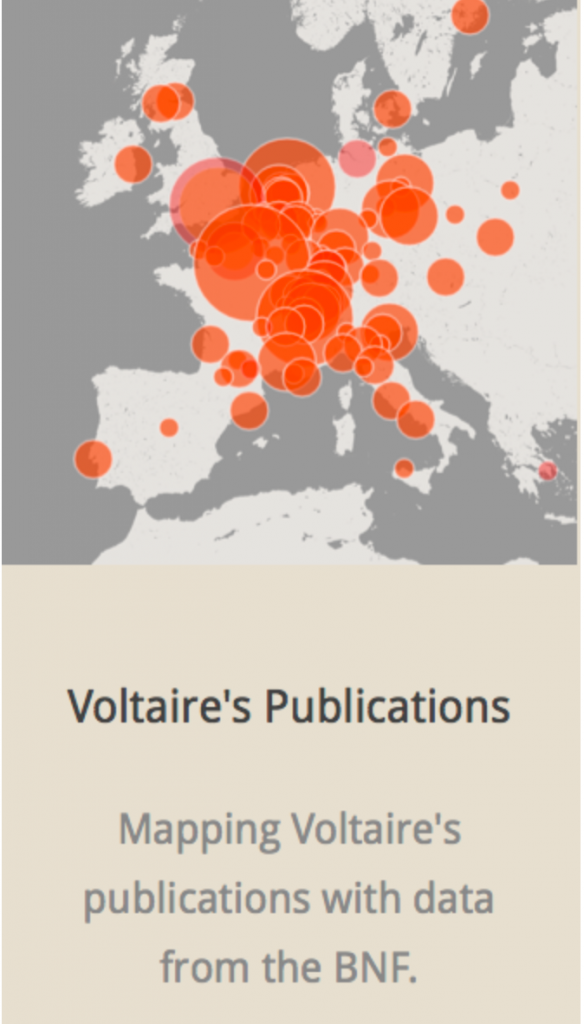
The Mapping of the Republic of Letters uses data visualization to understand the correspondence of networks. The manner in which the data is presented allows viewers to see Voltaire’s correspondence and understand his connections to certain people and places. I feel the creator did a great job of making an interactive, dynamic visualization. I believe that the method used to present the data allows for viewers to come up with their own interpretations and draw their own conclusions. The features of the visualization allow for viewers to see a multi-dimensional perspective of the findings. As discussed in the Friendly reading, the use of dynamic graphic methods, allows for “instantaneous and direct manipulation of graphical objects and related statistical properties” (Friendly 25). I feel that this is an important characteristic because it eliminates the possibility of the author/creator potentially inserting biases that could get passed down to the viewer. Furthermore, I feel the interactive component of this visualization allows viewers to see things that they would not have previously seen without having the ability to play with and manipulate the data on their own.
