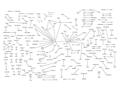
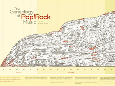
I chose these two visualizations because the information they contain is interesting to me – the first visualization is about trends in using the phrase “is the new” from various sources in 2005, and the second visualization is a chart that chronicles the growth of pop/rock music and its top selling artists from 1955 to 1978.
Both of these visualizations are static because they are predetermined for a specific year or a set period of time and will not change with new data. At the same time, although it isn’t dynamic in the sense that clicking an icon will bring its viewer to a new page, it is still interactive in the sense that it contains interesting content to hook the viewer in and make them want to look at the data. In the first visualization, it is similar to what DuBois describes as “sociological content,” the major difference being the level of importance in the topic (clearly, sentence patterns in 2005 are not nearly as important as the experiences of the Black American in the 1900s).
In the visualization about music, the creator uses a technique that reminds me of Meirelles’ description of node-link diagrams, which “use symbolic elements to stand for nodes, and lines to represent the connections between them” (55). In the case of this visualization, an arrow extending from a performers name shows the length of time that he/she remained a major hit maker. One issue surrounding this visualization is that it inherently comes with bias, as discussed in the reading by D’lanzio & Klein. They write, “If data are not available on a topic, no informed policy will be formulated; if a topic is not evident in standardized databases, then, in a self-fulfilling cycle, it is assumed to be unimportant.” Are there other visualizations surrounding the progression of music? Are the “major players” in this visualization key figures in other visualizations that might be similar to it? This goes back to Lima’s point in Visual Complexity, in which trees are associated with the “notion of centralism, or centralization, which expresses either an unequivocal concentration of power and authority in a central person or group of people,” in this case, the artists (43). Despite this, I believe that both of these visualizations capture interesting data and present their findings in a way that is aesthetically appealing. Though these visualizations may be static, they remain engaging by having creative topics.
With the Digital Humanities Sample Book, I chose to analyze “American Panorama” and “Mapping Metaphors.” “American Panorama” was created by the Digital Scholarship Lab at the University of Richmond and was funded by the Andrew W. Mellon Foundation. They pursued this project digitally because it is an interactive map that is grouped by collection on its homepage. Its sources are published on a separate webpage, where the Lab also cites its methods used to collect the data. The writing for the project is clear and interesting, clearly written as though it is intended for mass audiences rather than small groups of highly educated individuals. This project differentiates itself from a traditional or analogue research project by allowing the viewer to search by city or state using its interactive capabilities, rather than containing a ton of information that might be overwhelming to a viewer. The authors likely decided to make this interactive because it’s an effective way to give people a lot of information in a way that is engaging, and people can actually learn about the locations they want to learn about. It has additional familiarity in the sense that it uses Google Maps as its mapping host. With regards to strengths, this project excels with its ability to engage the viewer using interactive tools and interesting colors as well as the ability to search by city. One drawback is that it didn’t have every city, which poses the question: why did the creators choose the cities they chose? Unfortunately, the data they used is for a specific date range, so there isn’t much that the creators can do about it. Overall, though, the project is interesting and has come a long way since its website was created four years ago; it began with four projects, and it currently has eight.
“Mapping Metaphors” was slightly less impressive than “American Panorama.” The authors came from a team at the University of Glasgow who wanted to discover metaphorical connections within the English language, and they were funded by the Arts and Humanities Research Council. This visualization’s description is slightly more difficult to find than that of “Mapping Metaphors,” as it requires the viewer to navigate to another tab to find the purpose and central thesis. Generally speaking, though, the website’s navigation is creative in the sense that it has a giant spinning circle in the middle of the site to use for navigation. This navigation tool is both a strength and a weakness, as it looks interesting but it is challenging to actually use. Meirelles broke things down into how people see things; dominant colors included red-green and yellow-blue, yet this project uses red, green, and blue, which isn’t very aesthetically pleasing. The project’s source materials come from the thesaurus, but it’s unclear how they chose their categories, which may lead to some false assumptions within the data. Although it has potential to be a really interesting project, its execution falls short in a few ways, namely confusion with how to use the project’s main tool as well as the visual design and structure of the website.
