A skill that is becoming more and more essential to daily life in contemporary time is data literacy. Especially, when one considers our world’s increasing shift towards digitalization along with the seemingly endless technological advances made daily. Much of the data that is being presented to the public eye comes in the form of digital charts, maps, tables, graphs, along with other visual displays. The days of folks reading long, drawn-out abstracts that present data in a rather bland and verbose manner are a distant memory due to the increasingly fast-paced tempo of our society. The everyday person does not want to spend a lengthy period of time trying to make sense of data, rather they want to be able to quickly look at something, process it, then get on with their day. This is why the basic skill of data literacy is important because people need to know what exactly they are looking at, and if there is something not quite right possess the know-how to identify it in a timely manner. Below are two examples of data sets that are in every sense of the word “inaccurate” and poorly presented.

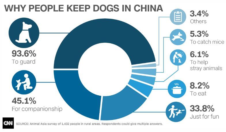
The first graph illustrates the MLB’s salaries for the top homerun earners in the 2017 season. However, the issue with this graph is that the salary of Aaron Judge is not at all proportionate with the salaries of the other players presented. An individual with basic data literacy would be able to immediately realize this and draw the conclusion that this graph is poorly done. The second data set lists the percentages of why people keep dogs in China. Almost immediately one can observe that the percentages total over 100% which from a mathematical standpoint is impossible. What can be drawn from both examples is that data literacy is crucial to prevent the circulation of false information.
