Knowing how to use and read data is critical in many disciplines, particularly those in which individuals need to make well-informed decisions. In order for data visualizations to be effective, there needs to be an understanding between both the person who created the visualization as well as the person who is deciphering the data. More specifically, it needs to be clear what the visualization is attempting to communicate.

This visualization is an example of a failed attempt to communicate what the creator deemed to be important information. The 60% on the left of the visualization is the same size as the combination of the 10% and the 20% on the right side of the visualization, when in reality it should be twice the size in order to accurately capture its true discrepancy in terms of percentages. An individual viewing this visualization might misinterpret the graphics, and as a result come to false conclusions.
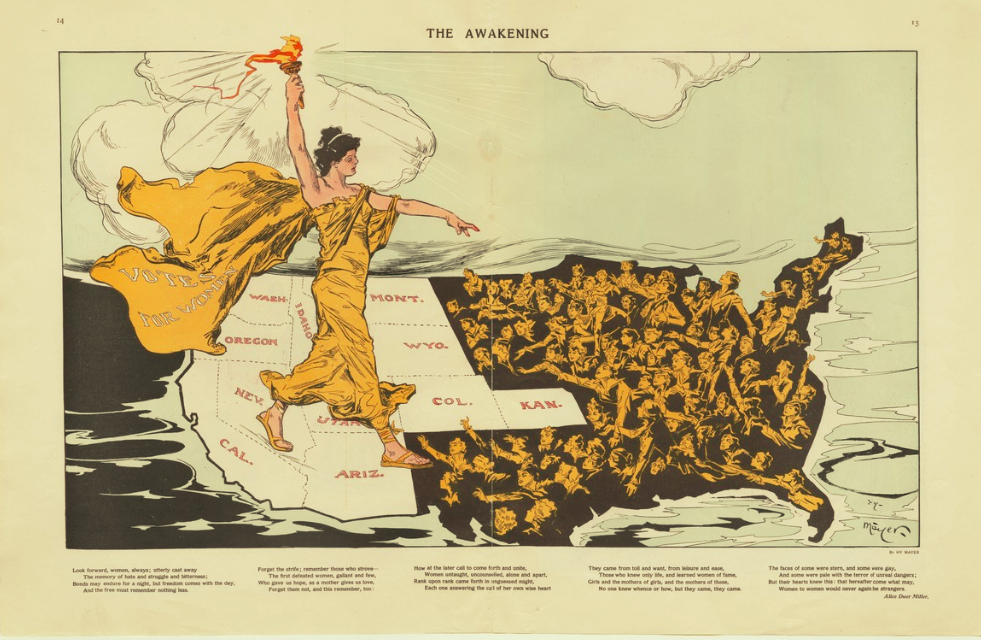
This visualization was created in 1915, around the time of the fight for women’s suffrage. Using tools like colors, words, and facial expressions, the creator was able to encapsulate not only context surrounding the events at the time, but also insight into where the fight for women’s suffrage was headed. As Lady Liberty moves from the light states (those which already maintain women’s suffrage), she holds her torch in her hand as she pushes towards the states that are in the darkness (i.e. those states that did not yet have women’s suffrage). Even without knowledge regarding specifics of the time, a person who is analyzing this visualization is likely able to piece together what they are looking at.
