Based on the readings that I have done this week and the discussions on data that we have had in class, I believe data literacy is extremely important. As mentioned in chapter one of Data Feminism, I strongly feel that “working with communities and embracing multiple perspectives can lead to a more detailed picture of the problem at hand” (D’Ignazio & Klein). Data can help us solve fundamental issues that arise, but in order to learn and grow from the past, it is necessary that we as a society learn more about the data we use to draw conclusions. We need to know where the data comes from and how it is being analyzed in order to extract the information we need. Data visualization is used to help display information in a manner that is easy to understand and interpret. When used correctly, it helps support an argument and prove a point. It allows for a more concrete way to display qualitative data and things that are hard to measure. However, misuse of data can skew the results and/or portray the wrong information.
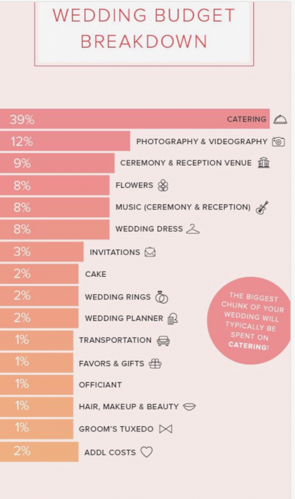
As seen in this image from viz.wtf, the bars of the graph are not proportional at all. They also do not go in order of percentages so the viewer of this information is not getting an accurate representation of the breakdown of costs.
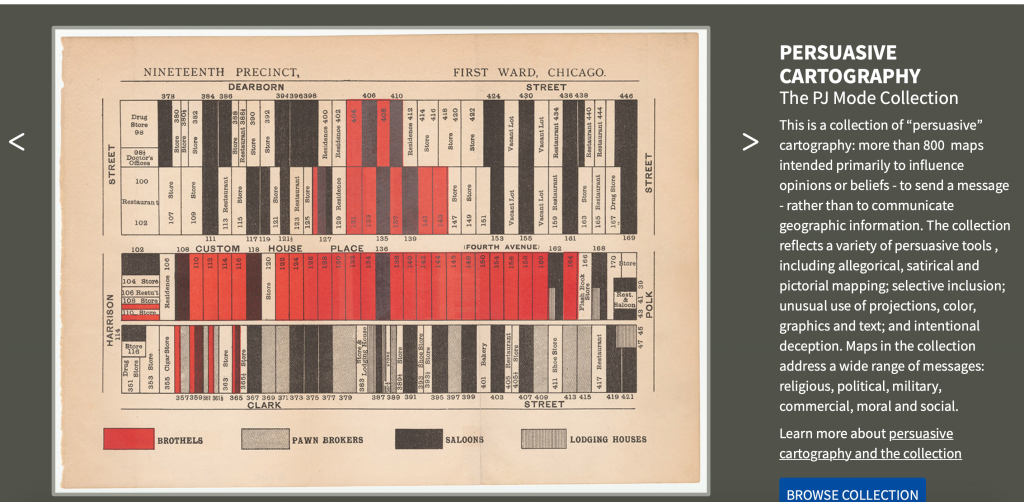
In this image from Persuasive Cartography, the greater of this visualization is trying to argue that there is a concentration of vice in a particular area in Chicago. However, the manner in which the data is represented makes the problem seem worse or more apparent than it actually is. The creator strategically rotated the map so north was not facing up in order for it to appear that there was a bigger concentration of “bad areas.” This is an example of how problems can arise when there are biases and a lack of data literacy.
