I chose to analyze a dataset of diseases and genes and how they are interconnected. I think the visualization method employed was very effective for this particular data set — I really appreciated the structure of network diagrams. Networks work really well for data in which there are many nodes with multiple, complex connections. Lima articulates the beauty of networks: “Cities, the brain, the World Wide Web, social groups, knowledge classification and the genetic association between species all refer to the complex systems defined by a large number of interconnected elements, normally taking the shape of a network. This ubiquitous topology, prevalent in a wide range of domains, is at the forefront of a new scientific awareness of complexity…” (Lima 69). The relationships of different diseases to each other would be hard to visualize in any other way. The complexity and multiple layers of this data were the most interesting part to me, which is why I chose to focus my analysis on how the most connected disease (colon cancer) is connected to other diseases within the set.
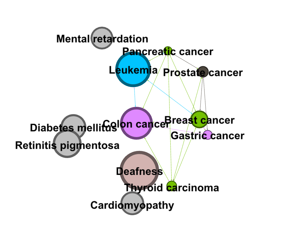
With this set of data on diseases, I was initially interested in visualizing how many of the nodes in this network were cancer, and how these nodes were connected to each other. To find this out, I first used the inter edges filter to filter for just cancers (6.2% of the data).
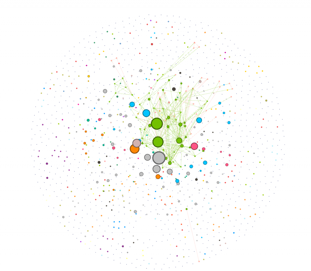
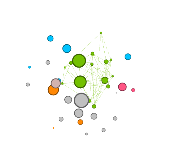
I was curious about which cancers were the most connected to other cancers. I dragged the degree filter under the inter edges filter, as a sub filter, and gradually eliminated cancers that had a low degree number from my visualization. I added labels in as the visualization shrank to show which cancers were the most connected. I have screenshotted the steps I took and included them below.
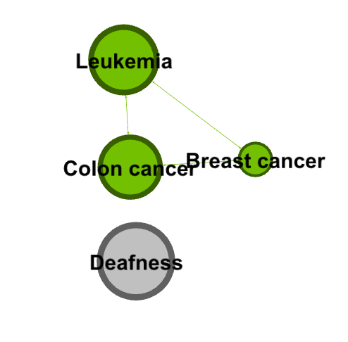
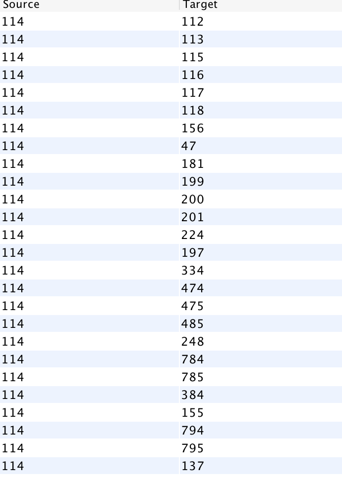
Next, I went to the Data Laboratory to see a complete list of all the cancer that colon cancer was connected to. I filtered for Colon cancer (114), and waited for targets to show up. I was presented with a long list of ID numbers. One challenge I had with gephi was that I had to go back to the main data set and cross reference the filtered IDs to find the names of the cancers (I wish the edges tab, where I filtered this data, had a column for name as well!).
I then filtered my visualization by modularity to detect communities. I filtered it further by degree to make communities and their relation to colon cancer more clear.
I found that learning gephi was slightly easier than the other platforms. I mainly learned through experimentation, and trying different filters and settings until I learned how to filter towards the specific part of the data I was looking at (cancers). I enjoyed this process of learning gephi and exploring the data. I created my visualization and my analysis through exploratory network analysis, which Graham defines as being based around the idea that: “ the network is important, but in as-yet unknown ways”. Researchers “ explore that dataset in order to find whatever interesting information may arise from it” (Graham 236). I took a very large data set and focused in on one area that I found interesting, and then through exploring the gephi software and the data set, I was able to pull some interesting analysis.
