For this project, I decided to work with my own dataset, one on the demographics of the people involved in International Orientation 2019. The dataset included their names, where they came from, why they were participating (first year, teaching assistant, transfer, or staff), the team they were put into for the program, their class year, and other special tags (athlete, etc.) The goal that I had with my dataset would be to try to figure out if the connections made during International Orientation fostered friendships within certain ‘small worlds’ and to see if Gephi could, as Lima puts it, “translate structural complexity to perceptible visual insights aimed at a clearer understanding.” (Lima, 79)
Executing the dataset, however, was a process. I first went with connecting every node to each other to see what information might come up, but a visualization of that dataset did not yield very much information. All of the nodes had the same weight and while the different categories that I had assigned them made for pretty colors, any useful information could not be determined.
Continuing to work with the data, I had to redefine what an edge meant in this dataset, and I decided that they were connected if they had matching entries in the categories mentioned above. The weight would be increased as the similarities increased. This would represent the opportunities given for them to create connections with each other, following Graham’s example of phone call networks “A network of people connected by whom they call on the phone can be weighted by total number or length of phone call.” (Graham, 207)
I went about this by using the excel spreadsheet method, filtering the data and creating edges for all the nodes in the same categories. By making sure that every one of the nodes was connected in some way, I was able to make a dataset where all the nodes were connected to one other node.
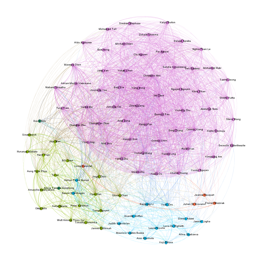
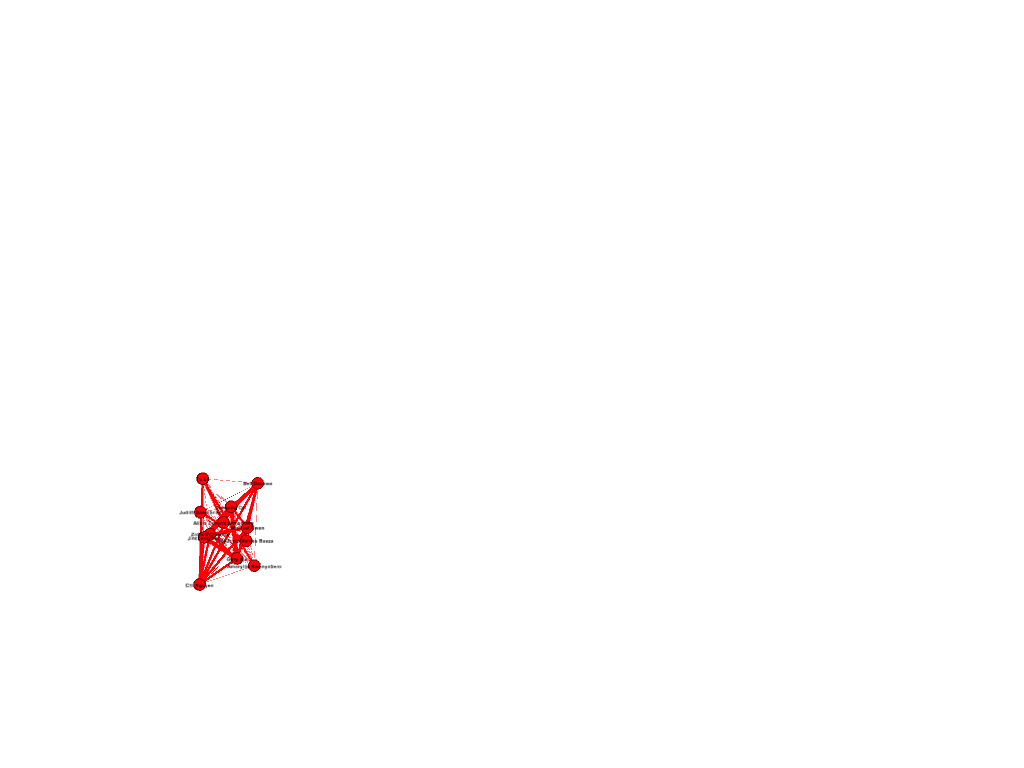
For my first visualization with the dataset, I decided to try the ForceAtlas 2 layout, and from there, try to figure out how where there were clusters and to see if I could find where the connections were the most central. The results were not that surprising, as a large cluster formed around the nodes with the two attributes of Chinese citizenship and the class of 2023. In the following image, the pink nodes that dominate the screen are under the category of first year, while the other large categories, the teaching assistants and the orientation staff, grouped in small worlds away from the first years.
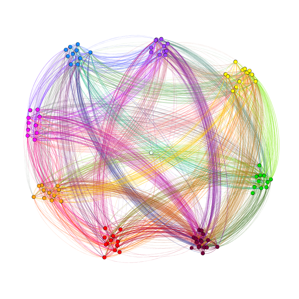
With the second visualization that I produced, I wanted to see if team colors played a part in connecting people together and see if how strong the connection was across teams. To achieve this, used the palette table to assign each color team their own color and used the dragging tool to group the nodes together. In the resulting visualization, I saw that there was a strong link between members of teams brown and purple. To double-check this, I unscaled the weights to see if the link was still strong. The result wasn’t too apparent, but I think that that might have happened due to the manual node placement.
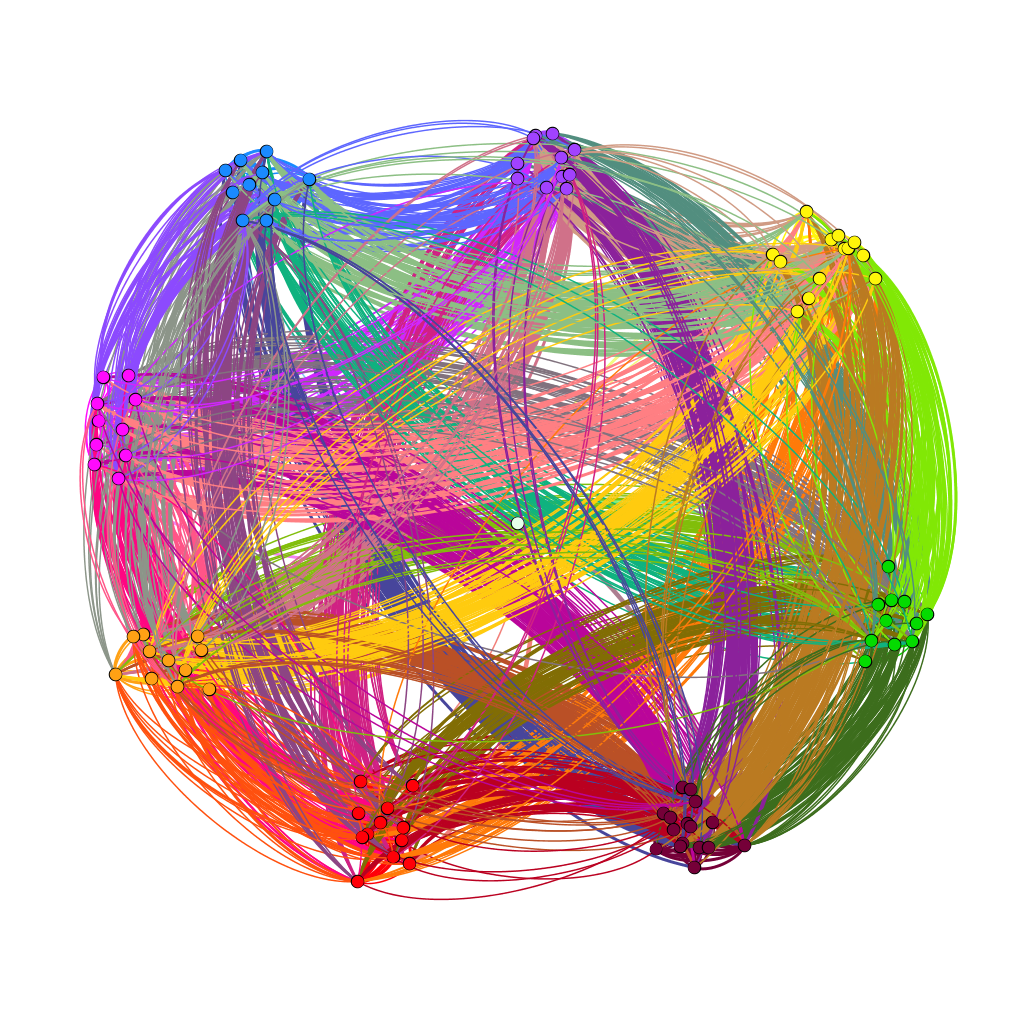
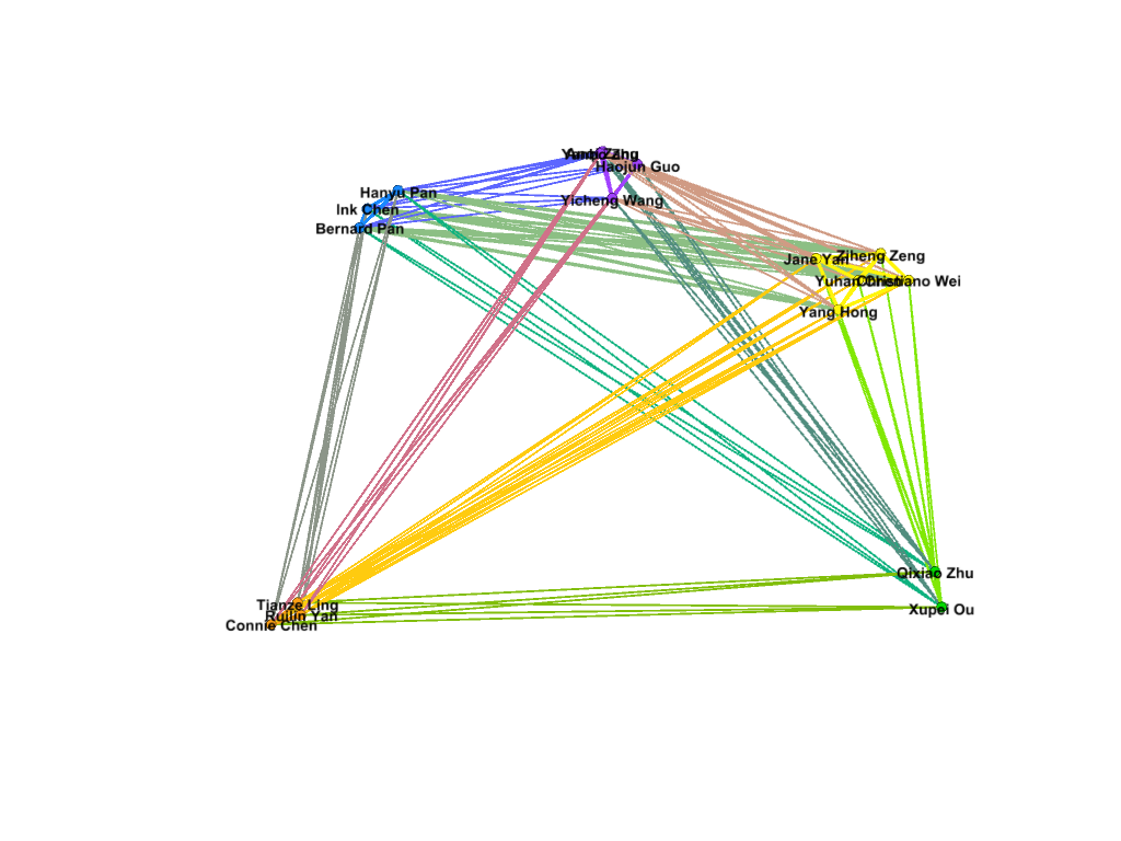
In the third visualization, I wanted to use the modularity class to see where the connections were more complex. The average modularity was 0.059, which signaled that the dataset was not very complex. Graham states that “Modularity is successful when there’s a high ratio of edges connecting nodes within any given community compared to edges linking out to other communities.” (Gram, 229) With the dataset being small and most of the first years having connections with each other through their class year and a country of origin, it seems that a high modularity score was not likely. For the visualization, I used the filter to separate out nodes with different modularity classes. As shown below in the visualizations, different modularity classes correspond to different color teams for some reason that I don’t really understand.
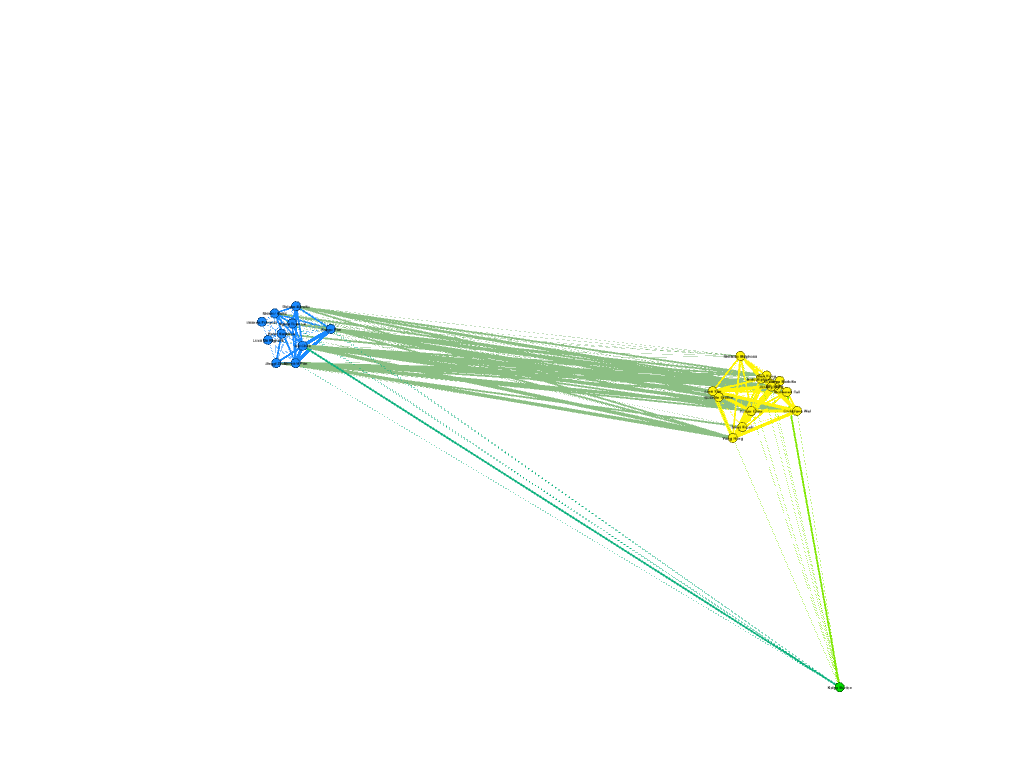

I also wanted to see which nodes had the most degree of connections in my network. On average, each node was connected to fifty other nodes. This data is probably skewed by the amount of first years connected to each other through class year. The following visualization shows the highest degree of connected nodes, from a score of 65 and above. It is primarily composed of Chinese first-years. Again, this data is most likely skewed by the demographics of the program.
Going through the process of creating the dataset, I learned two things well. Gephi is amazing at creating visuals, and it is terrible at being user friendly when it comes to data. To start with, it is capable of taking in an enormous amount of connection data, and on the Overview page, it is very easy to drill down the connections and find new patterns in the data that might not have been seen before. Lima notes that systems such as Gephi “expose causality in patterns in relationships, contributing decisively to the holistic understanding of the depicted topology” (Lima, 83) and I believe that I have been able to look at some interesting connections and clusters that I did not expect. However, I realize that my network is not a natural network, but rather, a network constructed to be relatively diverse in participant categories by a single person, and this limitation should be acknowledged when working with datasets that do not occur naturally.
While Gephi could take in a lot of information that I provided, it could not create edges on its own, and it was very user-unfriendly when it came to data. As such, I would say that Gephi is much like Tableau in this regard. While it is a powerful tool to show the connections between the data, the underlying information must be carefully curated in order to produce accurate visualizations. Overall, Gephi is a very powerful visual tool to use, being able to manipulate parts of the data through filtering, coloring and positioning. However, these tools, however powerful, are useless without the knowledge of the underlying dataset.
