Categories
Assignment 5

Assignment 5

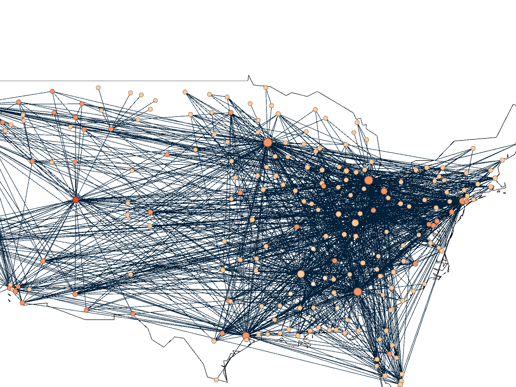
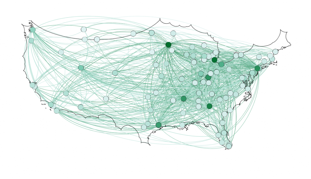
For my 5th assignment, I decided to use Gephi to graph my own dataset, flights in the US. The data originated from the index of complex networks from the University of Colorado. A list of airports and flight information, to the naked eye, is overwhelming. With thousands of lines of information about millions of flights, making sense of the information in that form is challenging. This is why Lima says that network visualizations can be a “visual decoder of complexity” (Lima 80). It allows you to immediately distinguish some “central players”(Graham 234) in the network, or in this case some of the busiest airports.

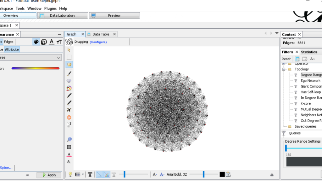
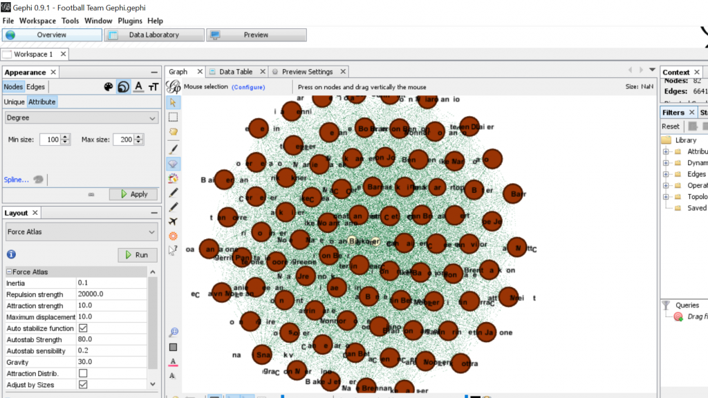
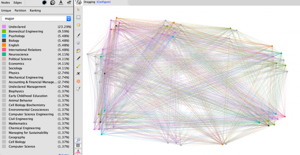
Initially, I put all the airports in the database on the map and decided that provided a visualization that was far too hairball-ish for my tastes, so I revised it.

Gephi map with all airports plotted

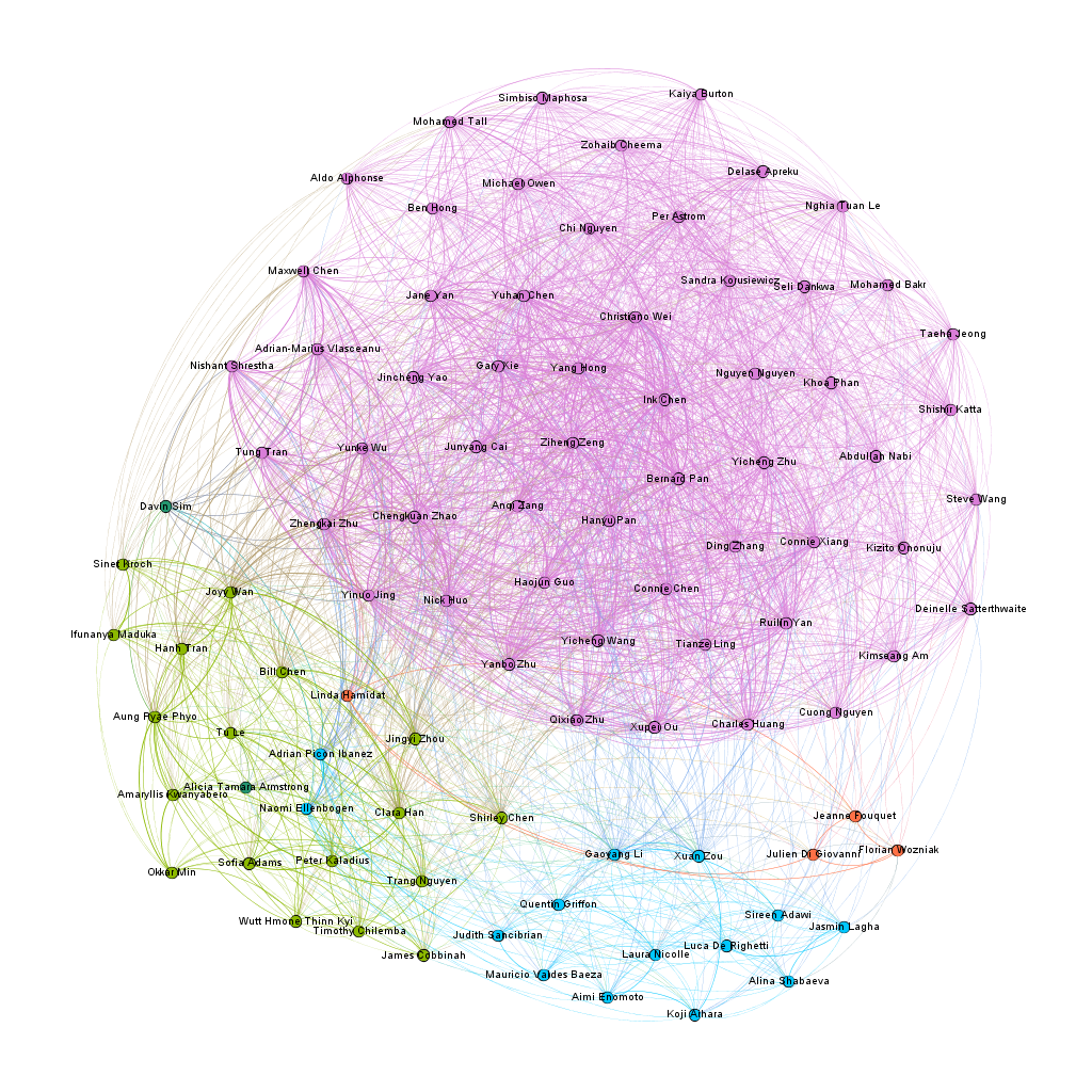
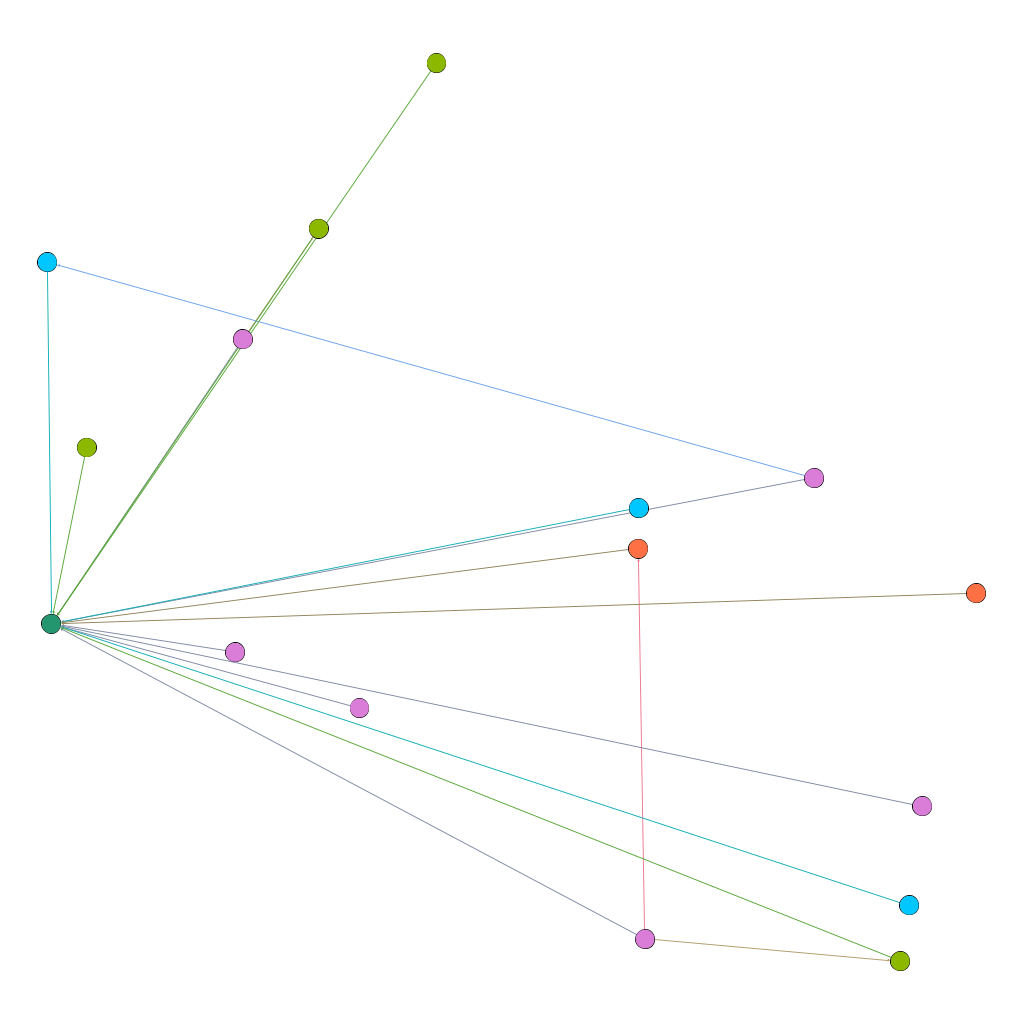
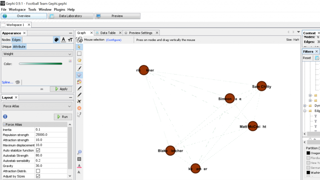
I needed some form of what Lima would call “classification” which “applies the hierarchical model to show our desire for order symmetry and regularity.”(Lima 25) I decided to filter to the five busiest airports and plot all the flights coming out of those airports, and their final destinations, or in other words, classify by degree. I did this in Excel, because I wanted to be able to render the final image in the preview window rather than taking screenshots. After doing this, I discovered little to no improvement by cutting down to five airports, as can be seen below. To determine which airports I should include, I used a counting function in excel to determine how many connections each node had, and then cut out all the nodes that did not connect to those five.
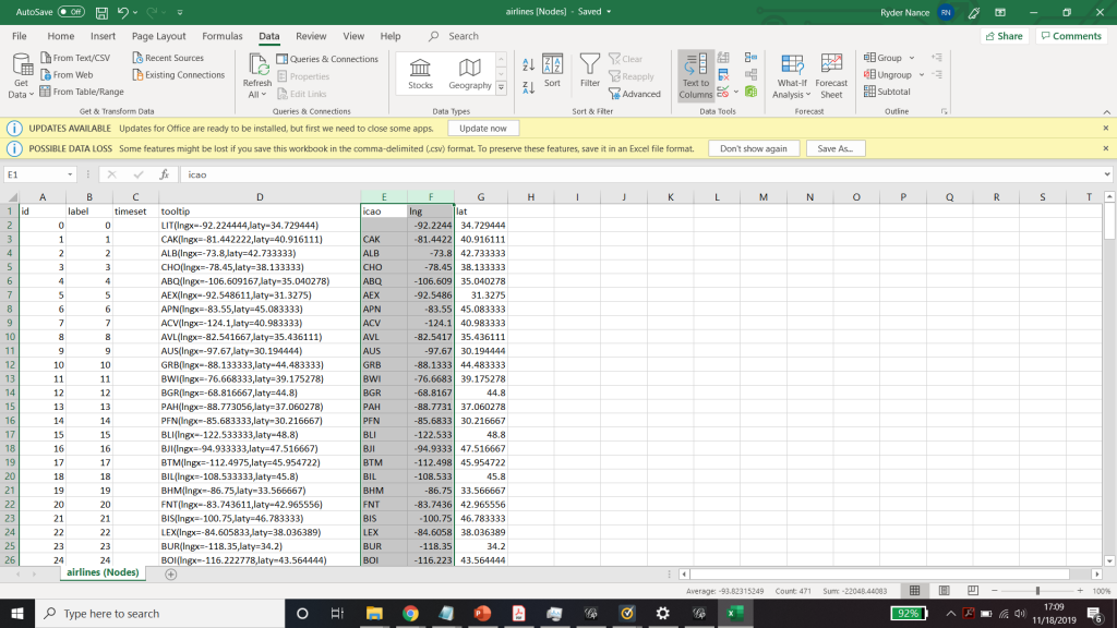
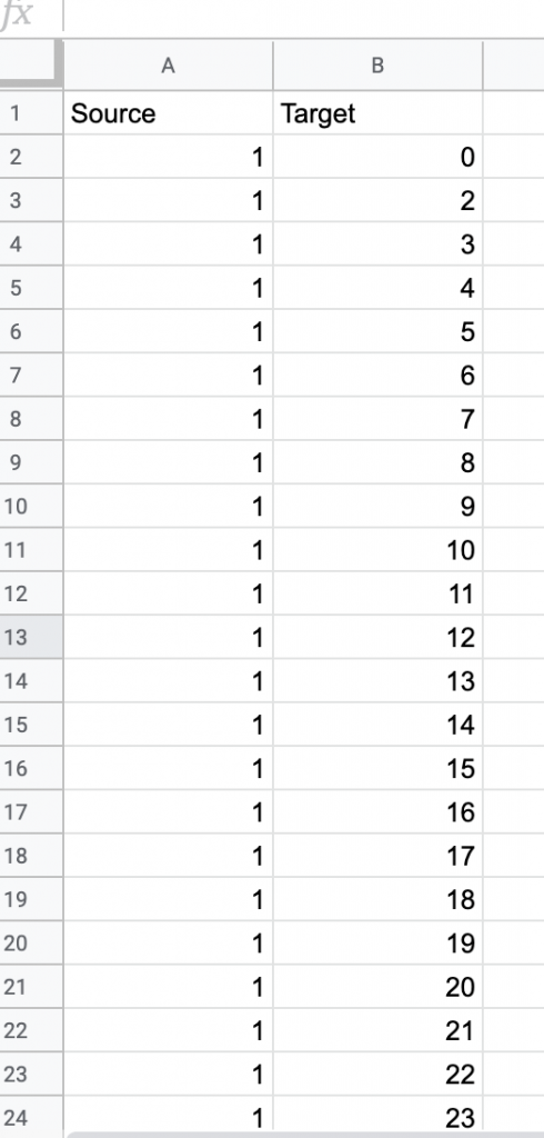
Figure 1. First render of US Flights

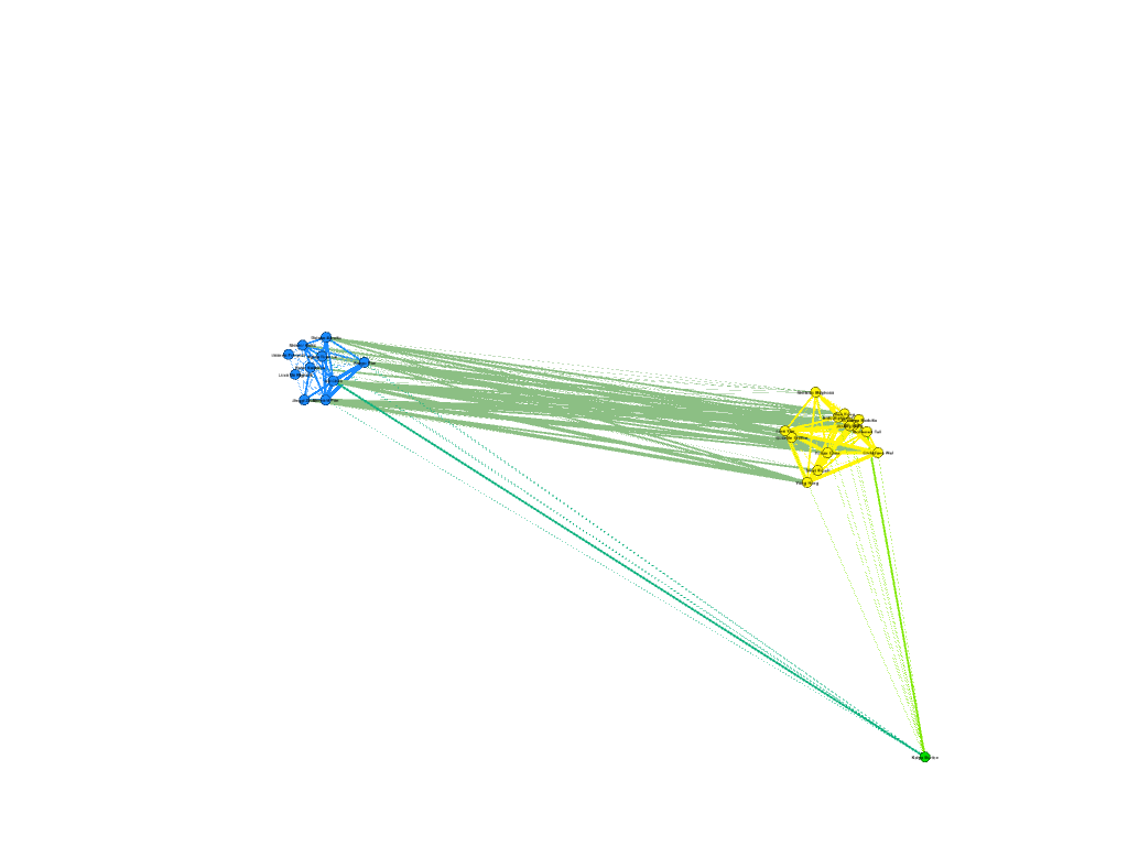
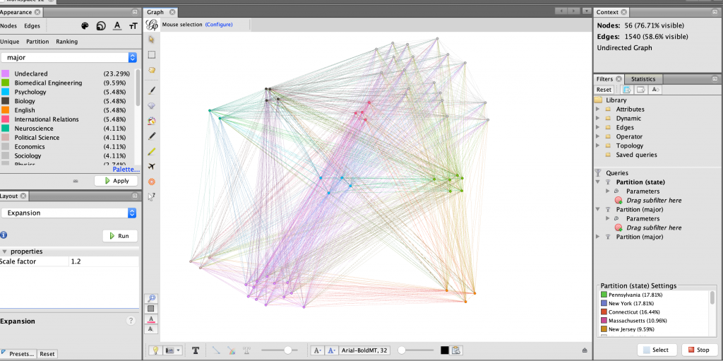
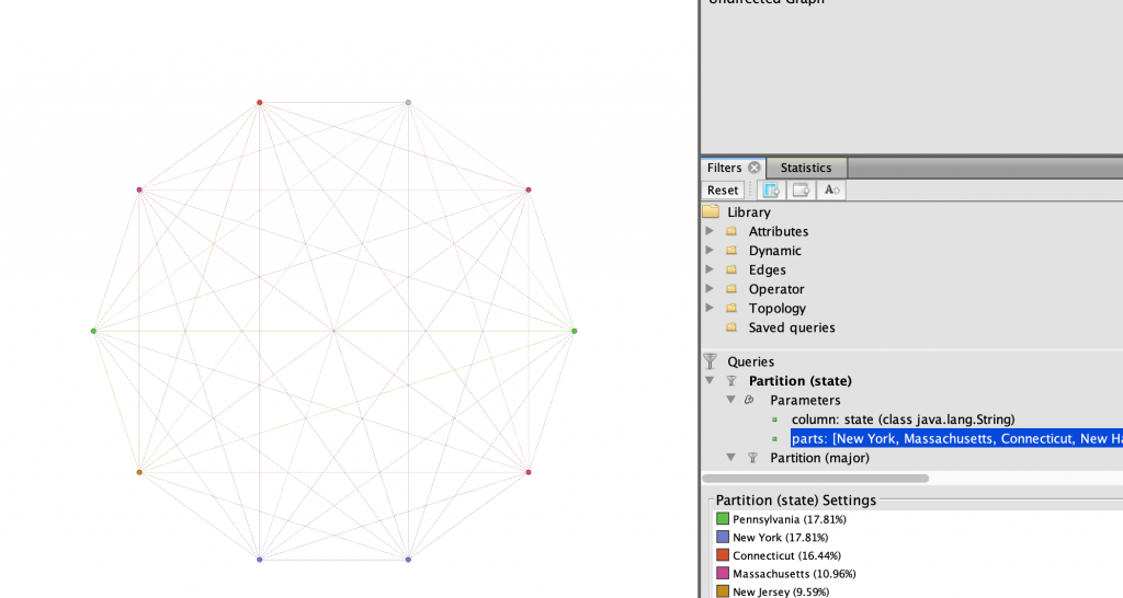
Because 5 was still too broad, I decided to filter down to 3, and I also had to condense some of the large airports that I wanted to show in order to be able to display them all. For example, I condensed the 3 DC airports (DCA, BWI, and IDW) into one location, to avoid clutter. These airports are so close together anyway, that they fall under the same ATC system (the DC SFRA to be exact) and require the same clearance. The same is true of the major 3 airports around New York City. I again utilized Excel to do this, as its text processing commands are powerful and relatively easy to use. Also, I again had issues getting the filters to work in Gephi. Additionally, the filters did not seem to be compatible with the mapping plugin for Gephi. If you used any kind of filter, the map disappeared.

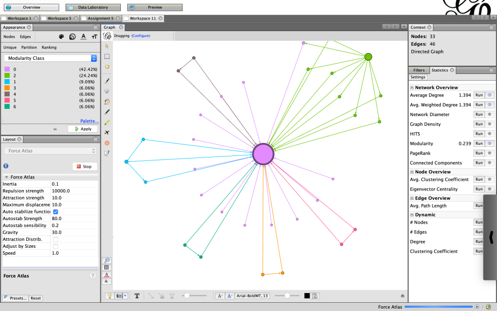
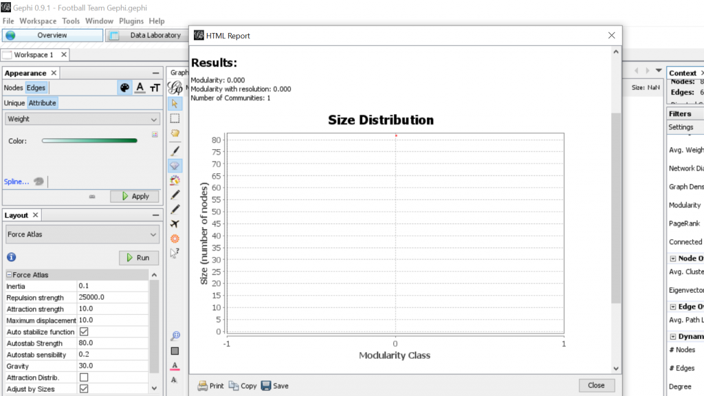
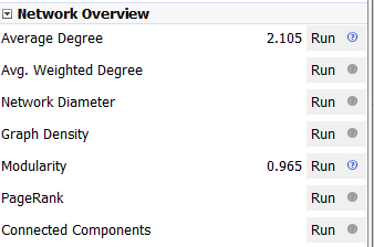
Next I calculated the modularity and degree for the network. I used the built-in statistical tool in Gephi to make these calculations, and determined that the average degree was 2.05, and the modularity was 0.965. The modularity has a relatively medium value because, although there are many connections between the high-degree nodes, there are also many nodes with a degree of one. As Graham says “Modularity is successful when there’s a high ratio of edges connecting nodes within any given community compared to edges linking out to other communities.”(Graham 229) In this case, the edges linking to other communities are flights to smaller airports, while the links within the community are to the high-degree airports, Chicago, New York, Florida, Seattle, and Dallas.

Gephi statistical calculations

To display the map, I used the “map of countries” plugin for Gephi. In order to make it functional, I went through and provided the latitude and longitude of each airport in question.

One of the most interesting realizations from this data, for me, was the placement of the routes vs the Victor Airway map. In the US, commercial and general aviation traffic follow what are called Victor airways (which are essentially highways in the sky). They are directed between airports and radio navigation fixes. The map that I created very closely resembles this. For reference, I have included a screenshot of a small portion of the Victor Airway map, just the portion centered around Chicago Midway airport (KMDW). The full map is far too complex to be visible in a screenshot. The black lines are the airways and the blue circles are the class B and C airspaces around the airports.

Victor airway map centered around KMDW ( http://vfrmap.com )

Finally, as for my opinion of Gephi, it was not my favorite tool to work with. As with many of the other open source tools that we used, frequent bugs and issues with a distinct lack of documentation were frustrating. Additionally, I found the included coulour pallet used was lacking, and was not as easy as tableau to change. However, when it worked, Gephi was easy to interact with in order to arrange the nodes in a way that looked good. I was never able to get the Data Laboratory panel to work, so I was unable to assess its helpfulness. However, despite the Data Lab not working, it was easy to import new spreadsheets so when I needed to make a change I would just change it in Excel and then re-import it. Gephi was not as easy for the coordinate driven data, as it was not originally designed to work with map data. The plugin worked, but required a great deal of “data plumbing” behind the scenes to get it functional.

Final map render

Unfortunately, after many hours of toying, I was unable to get the preview tool to work properly and had to revert to using the snipping tool to get screenshots of the visualization in the overview tab which can be seen above.

Categories
Assignment 5

Assignment 5 – APP

For this project, I decided to work with my own dataset, one on the demographics of the people involved in International Orientation 2019. The dataset included their names, where they came from, why they were participating (first year, teaching assistant, transfer, or staff), the team they were put into for the program, their class year, and other special tags (athlete, etc.) The goal that I had with my dataset would be to try to figure out if the connections made during International Orientation fostered friendships within certain ‘small worlds’ and to see if Gephi could, as Lima puts it, “translate structural complexity to perceptible visual insights aimed at a clearer understanding.” (Lima, 79)

Executing the dataset, however, was a process. I first went with connecting every node to each other to see what information might come up, but a visualization of that dataset did not yield very much information. All of the nodes had the same weight and while the different categories that I had assigned them made for pretty colors, any useful information could not be determined.

Continuing to work with the data, I had to redefine what an edge meant in this dataset, and I decided that they were connected if they had matching entries in the categories mentioned above. The weight would be increased as the similarities increased. This would represent the opportunities given for them to create connections with each other, following Graham’s example of phone call networks “A network of people connected by whom they call on the phone can be weighted by total number or length of phone call.” (Graham, 207)

 I went about this by using the excel spreadsheet method, filtering the data and creating edges for all the nodes in the same categories. By making sure that every one of the nodes was connected in some way, I was able to make a dataset where all the nodes were connected to one other node.

For my first visualization with the dataset, I decided to try the ForceAtlas 2 layout, and from there, try to figure out how where there were clusters and to see if I could find where the connections were the most central. The results were not that surprising, as a large cluster formed around the nodes with the two attributes of Chinese citizenship and the class of 2023. In the following image, the pink nodes that dominate the screen are under the category of first year, while the other large categories, the teaching assistants and the orientation staff, grouped in small worlds away from the first years.

With the second visualization that I produced, I wanted to see if team colors played a part in connecting people together and see if how strong the connection was across teams. To achieve this, used the palette table to assign each color team their own color and used the dragging tool to group the nodes together. In the resulting visualization, I saw that there was a strong link between members of teams brown and purple. To double-check this, I unscaled the weights to see if the link was still strong. The result wasn’t too apparent, but I think that that might have happened due to the manual node placement.

In the third visualization, I wanted to use the modularity class to see where the connections were more complex. The average modularity was 0.059, which signaled that the dataset was not very complex. Graham states that “Modularity is successful when there’s a high ratio of edges connecting nodes within any given community compared to edges linking out to other communities.” (Gram, 229) With the dataset being small and most of the first years having connections with each other through their class year and a country of origin, it seems that a high modularity score was not likely. For the visualization, I used the filter to separate out nodes with different modularity classes. As shown below in the visualizations, different modularity classes correspond to different color teams for some reason that I don’t really understand.

I also wanted to see which nodes had the most degree of connections in my network. On average, each node was connected to fifty other nodes. This data is probably skewed by the amount of first years connected to each other through class year. The following visualization shows the highest degree of connected nodes, from a score of 65 and above. It is primarily composed of Chinese first-years. Again, this data is most likely skewed by the demographics of the program.

Going through the process of creating the dataset, I learned two things well. Gephi is amazing at creating visuals, and it is terrible at being user friendly when it comes to data. To start with, it is capable of taking in an enormous amount of connection data, and on the Overview page, it is very easy to drill down the connections and find new patterns in the data that might not have been seen before. Lima notes that systems such as Gephi “expose causality in patterns in relationships, contributing decisively to the holistic understanding of the depicted topology” (Lima, 83) and I believe that I have been able to look at some interesting connections and clusters that I did not expect. However, I realize that my network is not a natural network, but rather, a network constructed to be relatively diverse in participant categories by a single person, and this limitation should be acknowledged when working with datasets that do not occur naturally.

While Gephi could take in a lot of information that I provided, it could not create edges on its own, and it was very user-unfriendly when it came to data. As such, I would say that Gephi is much like Tableau in this regard. While it is a powerful tool to show the connections between the data, the underlying information must be carefully curated in order to produce accurate visualizations. Overall, Gephi is a very powerful visual tool to use, being able to manipulate parts of the data through filtering, coloring and positioning. However, these tools, however powerful, are useless without the knowledge of the underlying dataset.

Categories
Assignment 5 Uncategorized

Assignment 5

The process of transforming my research question to suit the concerns of network analysis taught me a great deal about Gephi. I quickly learned that the approach I took to my general research interest in mapping the relationship between the cartographer and the rastaman through place in Kei Miller’s The Cartographer Tries to Map a Way to Zion was not so much concerned with relations within the text as simply visualizing geography. Instead of attempting “to portray a new unfamiliar territory” I only considered portraying a familiar one (Lima 80). With some more thought about relationships between words that may be fruitful to my research I came to was: How are words that signify systems of measure used beyond “Quashie’s Verse” — the poem in the collection I am most familiar with. This included rereading the collection and looking out for words that are related to measurement of some kind. For additional efficiency I searched for keywords in an electronic copy when I identified them in order to see if the word was repeated elsewhere in the poetry collection. Though I considered using Voyant to do a differential reading I decided against it because I was focused more on specific word choice than on word frequency for example, so it was necessary to do a close reading. Examples of the words I found are “measure”, “arc”, “distance”, “miles” and “length” — each appearing at different frequencies. The process of creating the nodes and edges table prompted me to read around the words I found, for some words surprised me, and I discovered language of measurement is almost only used by the rastaman and not the cartographer. What was not so surprising was that he uses these words to demonstrate the indeterminacy of European systems of measure, or the “immappancy of dis world” (Miller 21). With this in mind I was more prepared to delve into the cartography of networks.

This is the first visualization I created with a smaller data set for testing, the spatial quality of this visualization produced randomly by Gephi inspired my interest in creating a network that aesthetically mirrored the mathematical, even angular imagery invoked by cartography.

Creating the visualization allowed me to map the relationships between words related to metric in Kei Miller’s The Cartographer Tries to Map a Way to Zion. This was particularly fruitful considering the cartographic concerns of the text. The nodes are words signifying systems of measure, and the edges represent occurrence in the collection, which each word is attributed to a particular poem in the collection.

This is an ego network, where the words the rastaman uses concerning measurement are linked to him, and each node is partitioned according to degree, the colors of the nodes and edges representing the poems that have the most connections in the network. However, I did not find this method of visualization particularly illuminating.

This visualization was created using Force Atlas, with an increased repulsion strength

I was fascinated by the shape proceeded so I did not change the layout. Instead I partitioned by modularity class and found the results eyeopening. Seeing the communities of poems grouped according to the linguistic connections between them gave me more insight on Miller’s project with his collection. It reaffirmed Lima’s statement that “network visualization is also the cartography of the indiscernible, depicting intangible structures that are invisible and undetected by the human eye” (Lima 80).

Here, I changed the partition to modularity class, which added clarity and generated new ideas

I felt more confident about my choices knowing that “The best community detection approach is the one that works best for your network and your question; there is no right or wrong, only more or less relevant” especially since I am not mapping a community of people, but rather a community of words (Graham 229). Reading Graham’s work was particularly helpful to understand the elements of networks in general and each of the functions on Gephi in particular. Moreover, the approaches to creating a network in practice were useful. Instead of sticking to what I thought was the only “correct” way to proceed – a Hypothesis-driven network analysis – I felt free to be more exploratory, knowing “that the network is important, but in as-yet unknown ways” (Graham 236).

My Final Visualization

For my final visualization I chose to use a black background to highlight not only the color but also the unique shapes produced by the network. The shape at the top right corner was of particular interest because it resembles a spider. The spider, specifically Anancy, is a figure mentioned in the collection who plays with and plays on language, governing the process of interpretation. Seeing a version of Anancy appear in this new map prompts me to think more about how maps can be visible or invisible, and ways that lines, measurements and algorithms may be humanistic. “You cyaa climb / into Zion on Anancy’s web – or get there by boat or plane or car” (Miller 62). This web invoked by the visualization does not arrive at Zion, in the same way the cartographer discovers there is no one way to map a place that is not quite a place.

Categories
Assignment 5

Assignment #5

The platform Gephi took home the first place trophy with being one of the most frustrating and difficult data visualization programs that I have ever worked with. It began with the Gephi 9.2 download not working on my computer and took nearly a week for me to figure out what I needed to do. This task involved the download of Gephi 9.1 along with the installation of Java. Also, due to the fact that Gephi 9.1 is different than Gephi 9.2, the quick tutorial was most certainly not quick resulting in the frequent urge to defenestrate the computer out the window, however, I must note that this did not happen. Upon Gephi beginning to function properly, I began to use the pre-made data sheets so that I could become somewhat familiar with the operations such as the Les Miserables and the Southern Ladies sheets. These data samples served as good practice, to say the least, and from there I thought I would try the challenge of creating my own. This was certainly for me was a challenge due to the fact that I am not super handy with Microsoft Excel and Gephi 9.1 is a tad quirkier than Gephi 9.2.

This was when I had just used the Layout tool at the beginning
It was starting to take more of a legible form
Some Modularity Calculation…
Some calculation of degree and how it pertains to teammates from the West Coast…

For my Gephi work, I thought it would be appropriate to make my own data sheets in Excel and then import the sheets into Gephi. This creating of the sheets was quite tedious. However, once the data was entered into Gephi the work could begin. I began with the Layout tab and implemented the force-directed layout. According to Graham the force-directed layout, “…attempt to reduce the number of edges that cross one another while simultaneously bringing more directly-connected nodes closer together” (Graham 249). This is visible from the initial visualization to the next visualization illustrated in my screenshot. It greatly reduced the number of edges that were present. Also, some of the key nodes are greatly made more visible which in this case is the members of the football team. This closely coincides with another point that Graham makes when speaking of another analysis when stating, “…noticing immediately some central players in the art world: a few famous dealers, some museums, and so forth” (Graham 252). When looking at this visualization in Gephi it can also be quite complex in nature especially when considering the amount of interconnectedness among the football team. However, according to Manuel Lima when examining these complex visualizations that possess this unity, “…the unaccountable interacting variables and inherent complexity that makes us gaze in awe when contemplating such a landscape…” (Lima 231). And, in the case of the football team visualization in Gephi with the many edges connecting the numerous nodes as in the second screenshot, “…the dense layering of lines and interconnections might enthrall us at a deeper level, leaving us to marvel at the feeling of wholeness from disparate multiplicity” (Lima 231). Which most certainly applies to the visualization of the football team created in Gephi. It is also important to note that Lima later speaks of the notion of diversity in unity this phenomena certainly applies to the visualization that I have created using the Gephi platform.

Categories
Assignment 5

Assignment 5

Networks show relationships between everything and everyone. Lima believes that “network visualization can be a remarkable discovery tool, able to translate, structural complexity into perceptible visual insights aimed at a clearer understanding. It is through its pictorial representation and interactive analysis that modern network visualization gives life to many structures hidden from human perception” (Lima 79). Using Gephi to analyze a dataset, one is able to take a group of people, and highlight the connections within the group through their common attributes. The goal of using Gephi in this way is to create a network visualization that clarifies the group and bring new information to light, that is difficult to find on a spreadsheet.

For this assignment, I wanted to see the relationship between major and home state of my teammates on the rowing team. I was curious if there was some sort or relationship between these attributes, but also if any particular members were more connected than others. I started by creating a node table of every member of the Bucknell Women’s Rowing team from the graduating years 2019-2023. Unlike other visualization platforms, I had to sort through my data and organize it to show the nodes in the simplest way. I then created the edge table which connects every person on the team, each node, with each other on the common connection that they are or have been all on the rowing team. This process was particularly difficult for that I had to go back between the Google spreadsheet and Gephi to make sure all of the nodes were connected correctly, and there was not any extra connections. As I found out by doing this, “it is easy to become hypnotized by the complexity of a network, to succumb to the desire of connecting everything and, in so doing, learning nothing” (Graham 201). By not analyzing and sorting out the network, my visualization was crowded and nearly impossible to read.

Figure 1: All nodes connected to one another.

As Graham mentioned, by having every node connected, it is very difficult to learn anything about the dataset. I wanted to look at degree for that “in fairly small networks, up to a few hundred nodes, degree centrality will be a fairly good proxy for the importance of a node in relation to a network” (Graham 217). However, because each node is connected to every node only once, every node at the degree of 72, so every edge have the same weight of zero. And for this same reason when I ran the statistics test for modularity, it also came up with zero for that each node is connected in the exact same ways. This made analyzing the information a little bit more difficult.

Lima states, network visualization is “a potential visual decoder of complexity, the practice is commonly driven by five key functions: document, clarify, reveal, expand, and abstract” (Lima 80). I wanted to document the potential relationships within my rowing team on the attributes of Name, Graduation Year, Home State, Major, and Sport Team. To clarify the data I played with the different attribute filters and partition coloring. By doing this, I revealed that there is a very strong relationship between Winter, Martinez, and Keating, which could be potentially be expanded in a larger, more focussed project, and possibly use it as an abstract representation for some larger connection.

I started analyzing the data by partitioning the data by home state and generally grouped the nodes accordingly using the dragging tool, as seen in Figure 2. This proved to show that much of my team is from the North-East United States. I then partitioned the every member’s major, keeping the grouping as home state to see what they most common majors were within the team, and possibly within certain states. As seen in Figure 3, the partitioning in this way did not show very much. I then filtered the data in Figure 4 to display only the nodes with states within the north-east.

Figure 2: All nodes partitioned by home state
Figure 3: All nodes partitioned by major
Figure 4: Only nodes within the North-East, partitioned by major

After seeing only the nodes in the north-east, I further filtered the data to show only the top two STEM majors on the team, Biomedical engineering and Biology. I thought that there might be a relation between those living in the north-east and their likelihood of being a science, technology, engineering, or mathematics majors. In Figure 5, I showed this relationship using the Circular layout. I then became curious what states these women were from, so I used the same layout and filters, and in Figure 6 I changed the partition color to states in the north-east instead of major.

Figure 5: Biomedical and Biology majors from the North-East, partitioned by major
Figure 6: Biomedical and Biology majors from the North-East, partitioned by state

I wanted to further expand which of my teammates had the strongest connections in terms of what region they were from and their majors. I filtered the state parameter even further to only include the tri-state region of New York, New Jersey, and Connecticut. This revealed to me in Figure 7 that three of the four women who were from this particular region are Biology majors. Thus allowing me to find that there is a very strong relationship between Winter, Martinez, and Keating.

Figure 7: Biomedical and Biology majors from the tri-state area

Through learning Gephi I have found it to be extremely useful in displaying relationships between nodes. The filtering, color and size partitions, and layouts were ideal in customizing the network in a way that is visually appealing and highlights the important information being shown. However, one thing that Gephi does not do unlike other platforms we have used this semester is the ability to change the edge relationships easily. At times I wanted to have the edges connect nodes with the same state attribute, or major, but I found it to be more difficult that worth. How I created my edges was simple, however still took close to an hour to create the edge table for it in a spreadsheet. Interacting with the dataset at the spreadsheet phase was new and quite a learning experience in comparison to the other visualization platforms we have used, which were given to us in the way that worked with the software. Overall, Gephi is fussy to work with, although in the end it is all worth the beautiful networks that can be created.