Categories
Uncategorized

Assignment 3

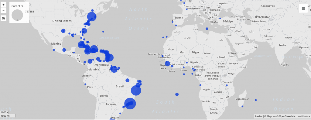
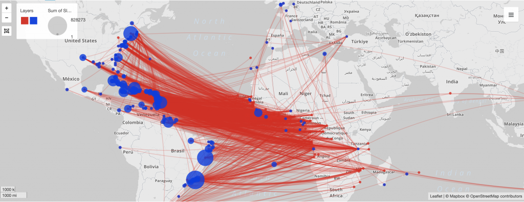
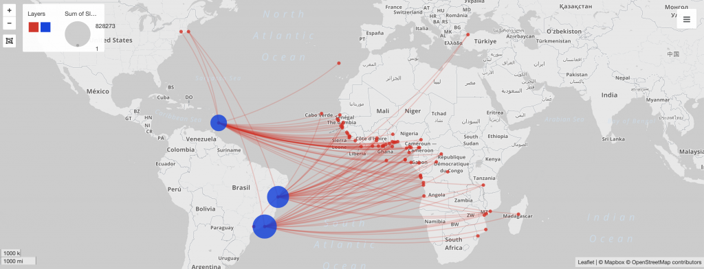
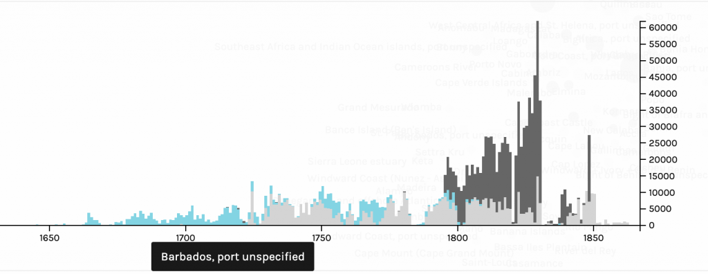
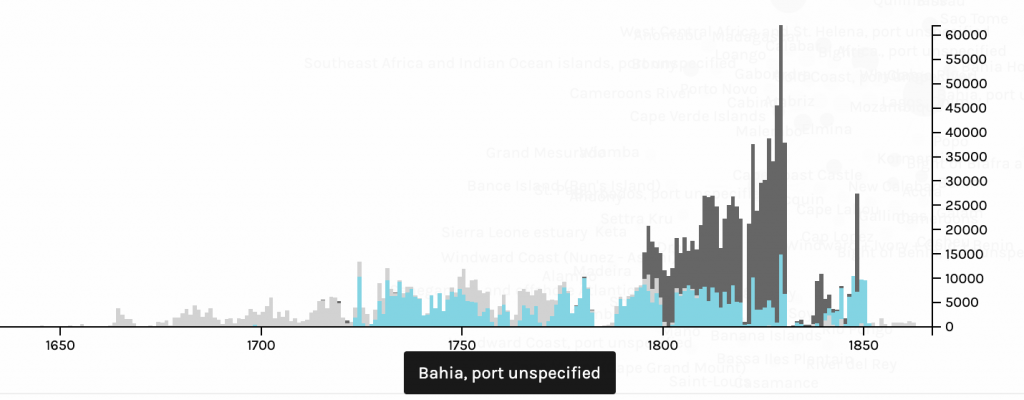
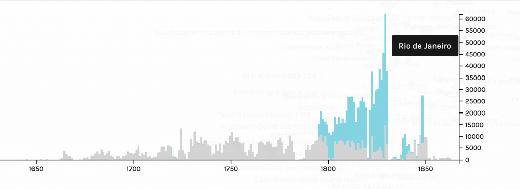
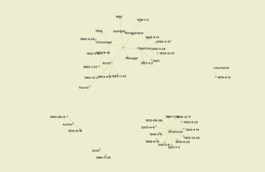
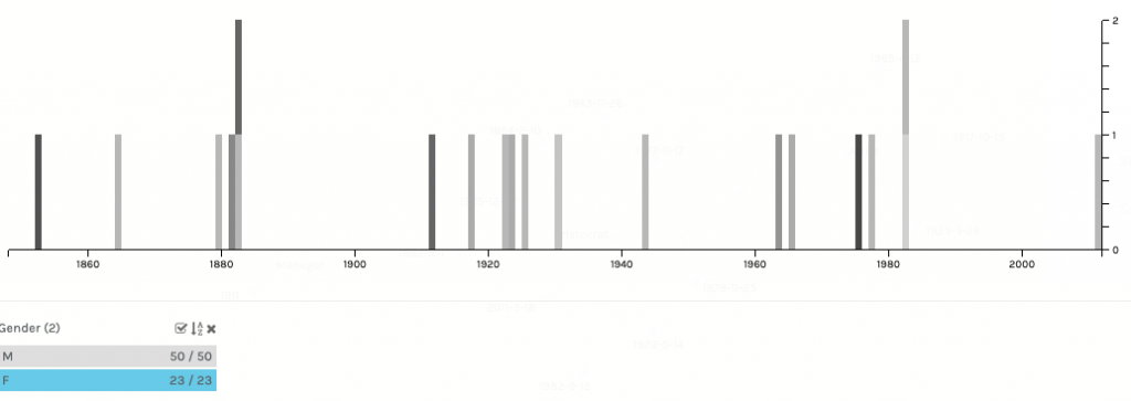
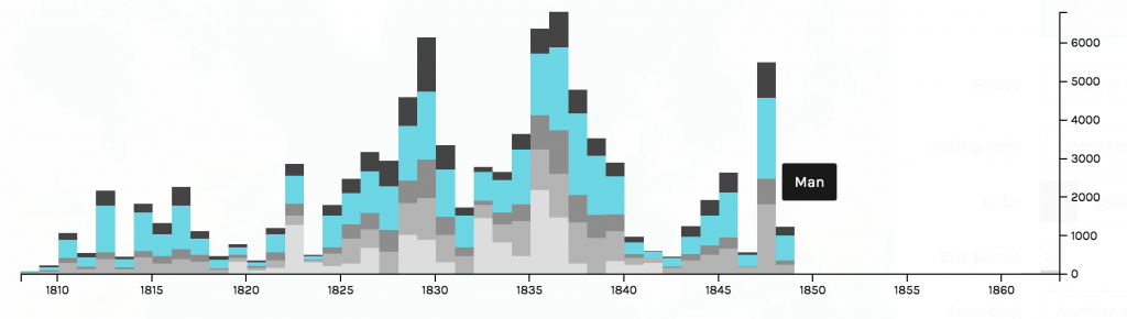
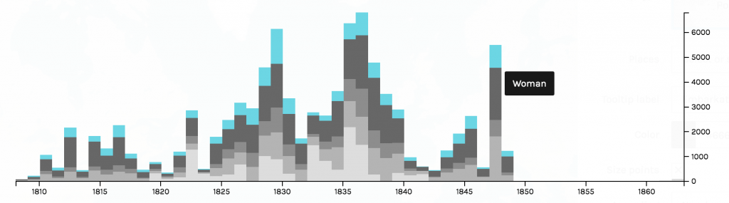
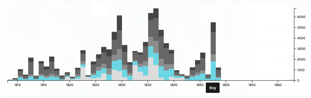
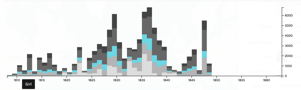
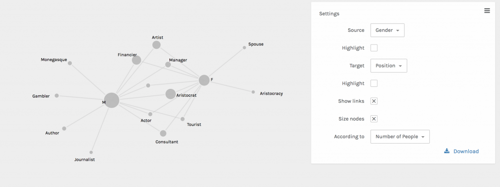
In creating this visualization, I first charted the country of origin and the date of arrival. Then, I further filtered the map by looking at a chart of gender, and which years numbers of different genders came. The graph compares the amount of men and women arriving in the 1800s. Specifically, I am looking at the years 1820,1830, and 1848. 

First graph of arrival and country of origin
Filtered graph of male and female slave arrival

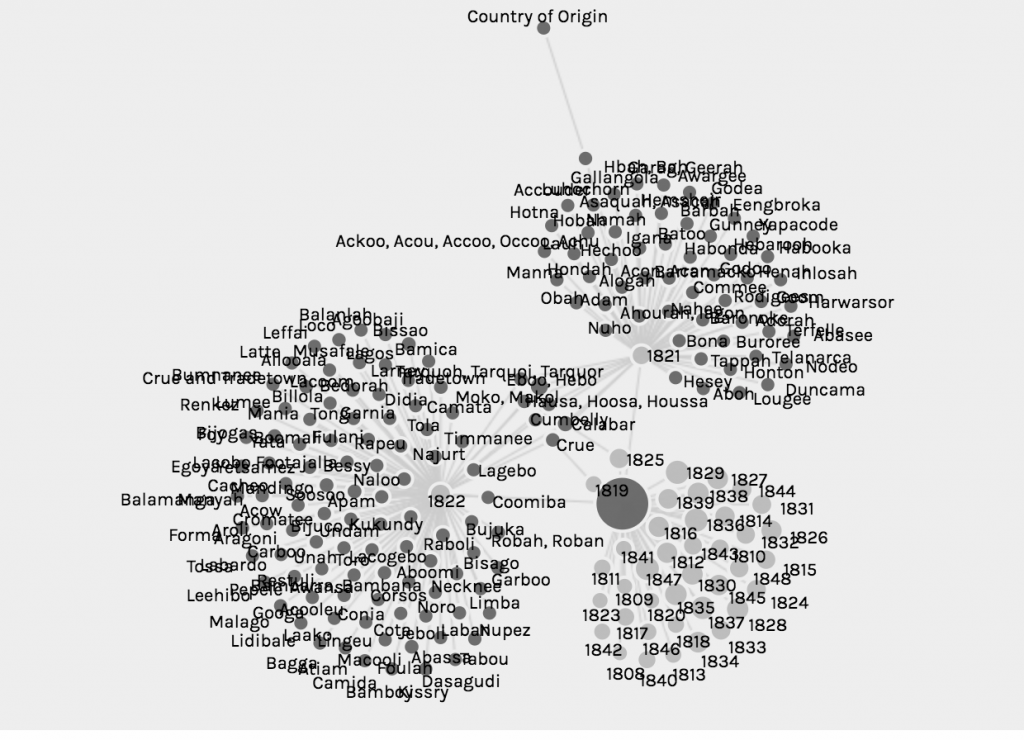
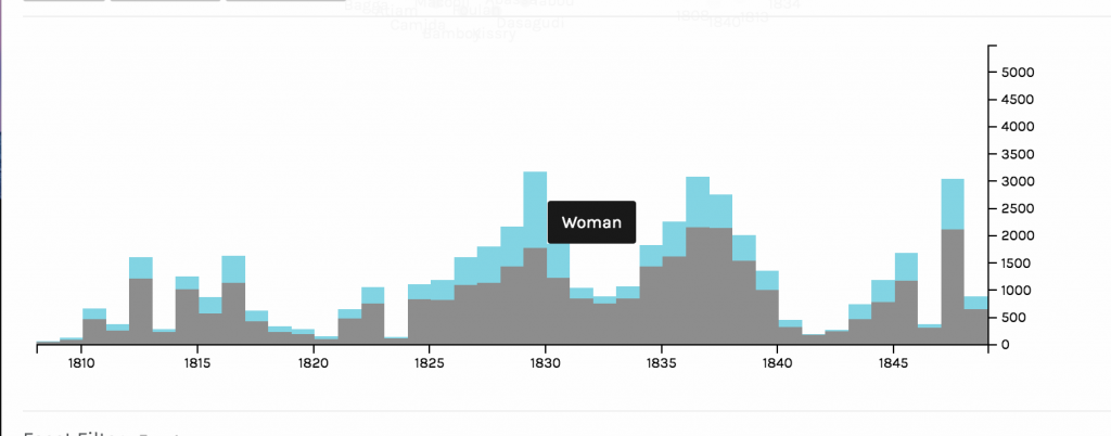
In the year 1820, the amount of slaves arriving dropped dramatically. 1820 is one of the lowest points on the graph in terms of both men and women arriving. The spatialization of data on the graph allowed for me to very easily see at which points the numbers were the lowest. Based on this dip in numbers, I did some research on why this might be. In 1819, a bill was passed that allowed armed cruisers to patrol the coasts of the United States and Africa to supress the slave trade. Another act in 1820 ensured that the slave trade was came under piracy laws, which was punishable by death. Ships were despatched to defeat slave traders and pirates. So laws and policies in and around 1820 provide some explanation for the drop in slave arrival.

In 1830, there was a spike in the arrival of slaves. This spike is one of the highest on the chart. Something I found interesting about this year was the ratio of men to women slaves was closer to equal than at any other year on the graph. The var graph as a mode of visualizing allowed me to see this phenomenon very clearly. As Drucker discusses, visualizing data in the most fitting form is essential in preventing distortion or misinterpretation, and in allowing the viewer to gain the most knowledge from the visualization. The bar graph allowed for me to understand both the overall amount of slaves arriving at certain dates, and to compare the amount of each gender arriving. In terms of why so many women arrived in 1830, I did not find a lot of historical explanation. One theory I had was that the spike in slaves arriving in and around 1830 made Nat’s Rebellion, which occurred in 1831, more possible. The increase in slave numbers could have increased confidence and a “strength in numbers” mentality that fueled the rebellion.

In 1848, there was another big spike. This spike was interesting because again, it is one of the largest spikes on the graph, and it is surrounded by very low numbers in slave arrival. One possible explanation for this drastic increase in arrival is the Mexican-American War, in which the United States gained control of the Mexican territory. With this new area, there was bound to be some expansion and demand for more slaves, despite general anti-slavery sentiment that was growing in the country. Additionally, reports from this time showed that American ships were not pursuing slave traders. 

I think the visualization of how many male and female slaves came in the span of years is a generation of knowledge, not merely a representation. I created the gender visualization by filtering a larger visualization. From the gender graph, I then identified interesting time periods in which the arrival of both or one of the genders charted was significant. This data is generated knowledge because it is filtering knowledge that was already graphed, and displaying it new ways that lead to new conclusions. Although, as Drucker states, all visualizations are representations, or substitutions of data that pass themselves off as presentations of the information itself, focusing in on specific data points does generate more knowledge about the data set, regardless of whether that knowledge is wholly accurate or not. Charting specific parts of a larger data set, and then narrowing in on even more specific dates reveals insight that could not have been generated otherwise.

Categories
Assignment 3

Assignment 3

Using the Trans-Atlantic Slave Voyages dataset, I decided to look at the relationship between the European colonial powers, the largest ports for slave disembarkation, and the years in which the most slaves landed at them. After first looking at the dataset, I saw that Bahia and Rio de Janeiro both had the largest number of slaves land at them, and I hypothesized that there must be a reason for Brazil to need such a large number of slaves, more than any other region. 

In Palladio, I used the dataset to not only map, but put a timeline to the connections between Portuguese colonies and the number of slaves entering into them. Figure 1 displays the relative number of slaves that arrived at each port, and where those ports are. I then mapped in Figure 2 the connections between these landing places with the place of purchase for each slave, which produced a map that proves that the majority of the slaves in the Americas were bought from African colonies. I then narrowed in to looking at the largest landing ports, those of which were in Portuguese colonies, and took a closer look at where exactly those slaves were being purchased in Figure 3.

Figure 1: Landing sites of slaves sized to number arrived at port
Figure 2: Place of slave purchase to landing sized to number arrived at port
Figure 3: Place of slave purchase to major landing ports in largest Portuguese colonies

After looking at what ports received the most amount of slaves, and finding out that many of them indeed come from the Western coast of Africa, I wanted to put a timeline to the Atlantic slave trade between Portugal and Africa. In Figures 4, 5 and 6, I highlighted the number of slaves that each landing port had between the years 1650 and roughly 1880. In both the ports in Brazil, Bahia and Rio de Janeiro, there was a significant spike in the number of slaves arriving in the late 18th and early 19th century. I wanted to find the reason for this, and after looking in to it I found out that not only did Portugal have a colony in Angola, a major slave trading colony, that there was a boom of gold fields that were discovered in Brazil in the 18th-early 19th century. More slaves were needed to work in the fields, which resulted more slaves being imported to Brazil through its two major ports, Bahia and Rio de Janeiro. As seen on the timeline, there is a sharp decline in slave trade in the mid 1800s, which can be further explained through Brazil abolishing slave trade in 1851 and then Portugal closing the last Trans- Atlantic slave trading route in the late 1800s.

Figure 4: Number of slaves landed in Barbados per year
Figure 5: Number of slaves landed in Bahia per year
Figure 6: Number of slaves landed in Rio de Janeiro per year

Visualizations are able to explain datasets and bring out patterns in them in a way that an excel spreadsheet is unable. The type of visualization greatly affects what information will be extracted from data and how it will be perceived by viewers. As Drucker states, “the means by which a graphic produces meaning is an integral part of the meaning it produces” (Drucker, 239). This idea is essential in making visualizations from datasets. I was able to display the pattern between Portuguese colonies and their large influx of slaves imported in the 18th and 19th century by using mapping and timelines to visually make the key patterns pop out to the viewer. Without mapping and the use of a timeline, the connection between Brazil, a Portuguese colony, Portugal, Angola, and the boom of gold fields would not have been made.

Categories
Assignment 3

Assignment #3

In working with the Cushman Collection data, I was curious about the relationship between an individual’s gender and their position in the workforce. I theorized that – especially during the earlier years of the dataset – men would hold positions that were considered more prestigious when compared to positions held by women.

Positions Held by Women and Men

In using Palladio, I first wanted to look at all of the data; in this context, all of the positions held by both men and women for the provided dates. In this sense, this data is representational because the data must be understood within the context of its time. The arrangement of this visualization is important because it shows not only what positions are exclusive to men or women, but also which positions overlap in the two groups. Women’s positions that are exclusively for women are positions that embrace hegemonic femininity, or the traditional view of a woman’s place in society. The positions that are exclusively made up of women are ‘spouse’ and ‘aristocracy,’ positions that derive worth from some sort of outside source, whether it be a woman’s husband or a woman’s wealthy family. In contrast, the positions that are exclusively made up of men include positions such as author and journalist, positions that are often well-respected and viewed as legitimate. Positions that were shared between men and women range in how they are viewed by society, with the high-level shared positions being consultants, managers, and financiers. In first looking at the data, my hypothesis was that these higher-level positions would not be held by women until after the 20th century.

After getting an overview of positions held by both men and women in this dataset, I wanted to explore how these positions would be impacted with the passing of time. I did this by filtering the data by gender, then by date of the individual’s death (thus determining the time period in which they lived). Many of women’s positions shown on Palladio were post-1920s, whereas men’s positions were fairly evenly distributed throughout the available dates. In an effort to explore these relationships further, I moved onto Timeline JS to determine what was happening in the United States around this date range. I chose only a few key events and turning points to include in the timeline, because there are truly so many important events that have occurred surrounding the topic of women’s rights.

This information is valuable because, as Drucker notes, “almost all information visualizations are reifications of mis-information.” Being able to analyze the data for women’s positions in the United States both literally with regards to their careers as well as socially with regards to legislation allows viewers to gain context and understanding for the different positions that women have held over the years.

Categories
Uncategorized

Assignment 3

As Johanna Drucker described, “graphical expression is premised on assumptions about data, knowledge design, content models, and file formats that need explicit attention if they are going to be understood from humanistic perspectives and reworked for humanities projects”. Given that the data being expressed in this visualization is slave data, it is more than important to provide “explicit attention” to the model at hand. Further, as Drucker later explains, one must be aware that “data visualizations are representations”, and an observer must do their best to not pass these representations off as “presentations” (Drucker, 245). Using the African Names Dataset, I created a representation using the variables “Arrival” and “Sex”. While Palladio is often associated as the platform to be used to create an overview of knowledge, the layered timeline I was created revealed a significant amount of information that trigged me to to explore further. The graphs below are crucial in locating and understanding trends that appeared in the time of slavery. Figure 1 displays the number of men that arrived year to year, Figure 2 depicts the number of boys, Figure 3 shows the arrival of women, and Figure 4 illustrates the total amount of girls. From these series of graphs, we see a consistent trend that the total number of men arriving year to year dominate the total number of other sexes. Another prevalent trend from the timeline indicate that that there were a spike in arrivals around 1829, 1837, and 1848. In order to gain further insight on what was the political climate surrounding slavery was during these years, I decided to narrow my lens and analyze these years in Timeline JS. I want to better understand the political climate, the well-being of the economy, and the societal factors that drove a desire for more slaves. As an observer of the following timeline slides, one should note that I look specifically into the United States during the years of 1829, 1837, and 1848. While the data provided does not give light to the activity occurring within America (as the slave trade ended in 1808), I found it to be insightful to dive deeper into a world power country and their position regarding slavery. Countries around the world were looking at the United States as if it were on a pedestal, so the question I asked myself was, what kind of example were we setting for slavery to still be so prevalent around the world? 

I continued to explore other components of Palladio, including the graph tab. I created a graphical expression as indicated in Figure 5 using the variables “Disembarkation” and “Arrival”. In an Excel spreadsheet, it is quite difficult which islands were sending the largest influx of African Americans. Using Palladio to organize this specific criteria enabled me to see that Freetown sent the greatest number of slaves out for disembarkation and is the oldest port. Havana follows in later years sending a significant number of slaves out, and then the Bahamas is the smallest port of disembarkation. A follow up question this visualization led me to is why did the Bahamas only sent slaves over in 1836?

The final visualization I created using Palladio’s platform is shown in Figure 6. The graphical expression filters the variables “Sex” and “Age”. I proceeded to size the nodes to uncover what the most common age was of the arriving African Americans. It appears as though the most prevalent age of the enslaved individuals was between 20-30 years of age. While the ability to arrange the nodes and highlight them in order to get a better understanding of the knowledge being depicted, I do think the spatialization of Palladio is unimpressive. There is, as Drucker would argue, a fault in the graphical form in that there is too much information, it is hard to read. 

Figure 1
Figure 2
Figure 3
Figure 4
Figure 5
Figure 6

https://cdn.knightlab.com/libs/timeline3/latest/embed/index.html?source=1SIkS_rTR2bXGEzi-G69x9bov-7Jk4aqvwTfeq07TbQw&font=Default&lang=en&initial_zoom=2&height=650

Categories
Assignment 3

Lippincott Assignment 3

Palladio Visualizations

Palladio: Sex-Segregated Workforce

When utilizing sample data on Palladio I became interested in the connections between gender and positions (occupations) in the workforce during the era this data was pulled from. When looking at the graph above I was fascinated by the amount of women who seemed to have jobs in what I assumed to be predominately male industries during the time period. As one analyzes this visualization it appears that, from the data provided, most women and men shared the same occupations. I was particularly interested in the female financier as even now the industry is predominantly male, although it is changing as we speak.

Palladio Time Span: Years Women Were Alive

When analyzing this further I took at look at the years these women were alive. The range of the years the women were alive spans from 1800 to 2011, showcasing that most of them were alive during the women’s suffrage movement. This made me believe that this movement lead to these women being some of the first females in their field. This parallels with the Palladio graph because after doing outside research on the women’s suffrage movement I understood how the visualizations were connected.

Palladio Map: Place of Death for Women

In order to conduct more research for my visualizations I created a map showcasing where the women died, assuming that they died in or around where they worked. The cities highlighted in the visualization are still leaders in the business world so I was not surprised to see Paris, London, and New York had women in the workforce. In order to tell a story with this data, and understand my findings more, I took what I had concluded and conducted my own outside research to visualize on a timeline in Timeline JS.

Timeline JS

Timeline JS: Sex-Segregated Workforce

In this timeline I utilized the insight I gained from my visualizations on Palladio to understand the time period of these events.

Timeline JS: Education of Women

When looking at the map of where women died I decided to dive deeper and see what was going on in those cities during the 1800/1900s. I came across the movement to educate women and was fascinated by it. I presume that the women included in the data I used were more involved in the workforce because they were educated. As I say on the slide: “Women saw their first chance for change in 1830. They fought for centries to be recognized as potential univeristy students. The first form of education for women was teacher training. This lead to public school being introduced across the US. In the 1940s women’s rate of literacy raised and women started to enroll in colleges and univerities. The first US women graduated with a bachelor’s degree on July 16th of 1840. This was followed by Elizabeth Blackwell being the first US woman to graduate from medical school, a prodominatly male practice. It took more than 100 years for women to account for 50% of college students. The availiblity of education contiues to grow every year.” Elizabeth Blackwell graduated from an institution in New York, leading me to assume that women could attend college there, leading to them finding jobs in the city. I think that this time period was very crucial for society and the women’s suffrage movement as it allowed women to enter the workforce with the same education men had.

Timeline JS: Woman in Finance 1877

I also wanted to conduct more research on the woman who was in finance. By doing research on her I learned that: “Marie Charlotte Blanc was born in Fance. At the age of fourteen she entered the workforce as a maid. After the death of her husband in 1877 she operated the Monte Carlo Casino. As a finiancer she redifined the sex-segregated workforce. Blanc continued to run the casino and worked with Charles Garnier to build the Opéra de Monte-Carlo until she died in 1881.” Marie Blanc was one of the earliest women I have learned of that worked in such a male driven industry so early in the movement for women’s suffrage. Although she did not necessarily ‘apply’ for the job she took over graciously and was able to build another profitable building, the opera house, from her experience with the casino.

Timeline JS: Women’s Suffrage Movement

In order to tie together my three visualizations on Palladio and my other two slides on Timeline JS I conducted research on the US Women’s Suffrage Movement. The important dates I found include: “In 1848 Cady Stanton writes ‘The Declaration of Sentiments’ sparking women’s activism for decades to come. 1919 The senate finally passes the Nineteenth Amendment and the ratification begins. August 26th of 1920 American women win full voting rights.” I expected the suffrage movement to have impacted the events I addressed. I was surprised to learn that the movement started after the other events, causing me to believe that the development in the education of women as well as women starting to enter the predominantly male work force were leading factors in to the start of the Women’s Suffrage movement. Below I have included a link to my Timeline JS work.

Learning from Drunker, Meirelles, and Lima

Drucker emphasizes the importance of reading visualizations as graphical expression accurately is crucial. The data used to create these visualizations was taken from a spreadsheet organized by columns and rows, a form of graphical information. This form allows users to document a system of relations thus creating meaning from numbers. I feel as though when utilizing Palladio to showcase data is creates visualizations that are representations not necessarily data sets. Drunker shares that information visualizations can frequently showcase “mis-information” and through my experience I understand why. Without using Timeline JS and outside research to aid your visualization, data is sometimes hard to analyze and understand, and as I learned on Assignment 2 you cannot always trust your data!

Meirelles argues in chapter three that our concepts and corresponding visuals are organized around linear and cyclical times. Linear times can be visualized with timelines, like I used for the years women in my data were alive. These timelines are chronological and sequential narratives of historical events, which help readers of visualizations understand what they are looking at.

Lima discusses in chapter two the importance of network visualization. The graph I created showcasing the connection between gender and jobs is an example of a network as it is a connection of nodes (the job or gender) and the links that connect a person to a position showcasing a connection.