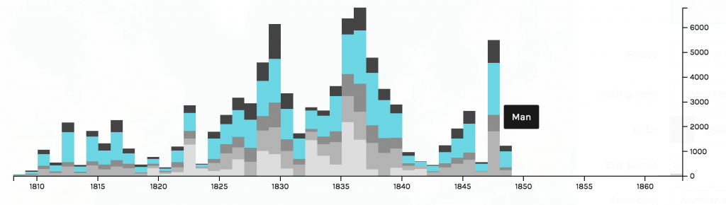
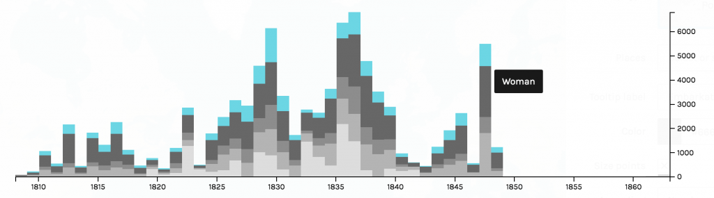
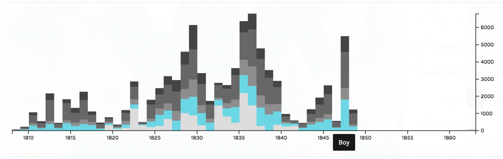
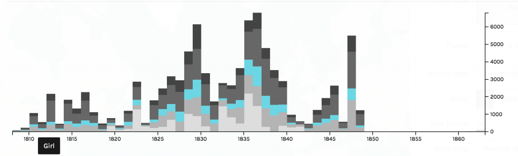
As Johanna Drucker described, “graphical expression is premised on assumptions about data, knowledge design, content models, and file formats that need explicit attention if they are going to be understood from humanistic perspectives and reworked for humanities projects”. Given that the data being expressed in this visualization is slave data, it is more than important to provide “explicit attention” to the model at hand. Further, as Drucker later explains, one must be aware that “data visualizations are representations”, and an observer must do their best to not pass these representations off as “presentations” (Drucker, 245). Using the African Names Dataset, I created a representation using the variables “Arrival” and “Sex”. While Palladio is often associated as the platform to be used to create an overview of knowledge, the layered timeline I was created revealed a significant amount of information that trigged me to to explore further. The graphs below are crucial in locating and understanding trends that appeared in the time of slavery. Figure 1 displays the number of men that arrived year to year, Figure 2 depicts the number of boys, Figure 3 shows the arrival of women, and Figure 4 illustrates the total amount of girls. From these series of graphs, we see a consistent trend that the total number of men arriving year to year dominate the total number of other sexes. Another prevalent trend from the timeline indicate that that there were a spike in arrivals around 1829, 1837, and 1848. In order to gain further insight on what was the political climate surrounding slavery was during these years, I decided to narrow my lens and analyze these years in Timeline JS. I want to better understand the political climate, the well-being of the economy, and the societal factors that drove a desire for more slaves. As an observer of the following timeline slides, one should note that I look specifically into the United States during the years of 1829, 1837, and 1848. While the data provided does not give light to the activity occurring within America (as the slave trade ended in 1808), I found it to be insightful to dive deeper into a world power country and their position regarding slavery. Countries around the world were looking at the United States as if it were on a pedestal, so the question I asked myself was, what kind of example were we setting for slavery to still be so prevalent around the world?
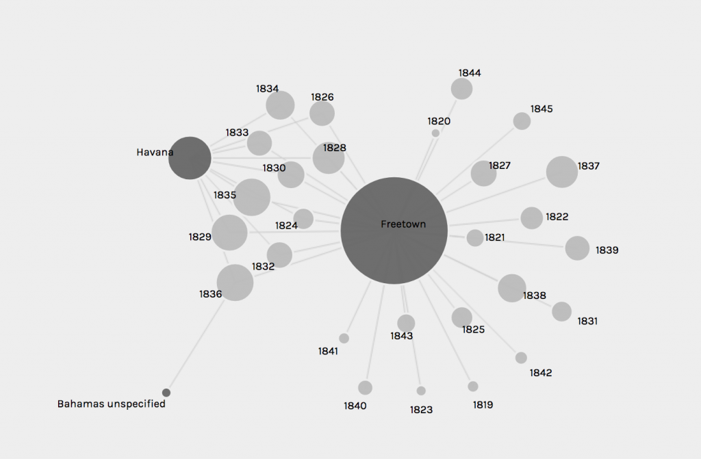
I continued to explore other components of Palladio, including the graph tab. I created a graphical expression as indicated in Figure 5 using the variables “Disembarkation” and “Arrival”. In an Excel spreadsheet, it is quite difficult which islands were sending the largest influx of African Americans. Using Palladio to organize this specific criteria enabled me to see that Freetown sent the greatest number of slaves out for disembarkation and is the oldest port. Havana follows in later years sending a significant number of slaves out, and then the Bahamas is the smallest port of disembarkation. A follow up question this visualization led me to is why did the Bahamas only sent slaves over in 1836?
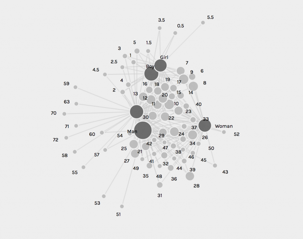
The final visualization I created using Palladio’s platform is shown in Figure 6. The graphical expression filters the variables “Sex” and “Age”. I proceeded to size the nodes to uncover what the most common age was of the arriving African Americans. It appears as though the most prevalent age of the enslaved individuals was between 20-30 years of age. While the ability to arrange the nodes and highlight them in order to get a better understanding of the knowledge being depicted, I do think the spatialization of Palladio is unimpressive. There is, as Drucker would argue, a fault in the graphical form in that there is too much information, it is hard to read.