Categories
Practice

Journal 1

Data visualization is the vehicle for crucial data to be presented to the public. The “Bring Back the Bodies” reading points to how good data visualization can uncover injustices and inform the public. The article uncovered how little data there was on women’s childbirth and rates of death, and also how black mothers were at higher risk during childbirth than white mothers. Data literacy is essential for public understanding of such issues. The Dubois chapter touches on how data visualization can be specific for specific cultural topics, like how current day data visualization of the Harlem Renaissance refers back to visualizations in 19th century that connect to slavery. He also discusses how good design can be used to communicate beyond cultural barriers, specifically in how he conveyed American racial data to a European audience. Data literacy facilitates understanding connections between issues, importance of new data, and provides a method of universal communication through design with people different from you.

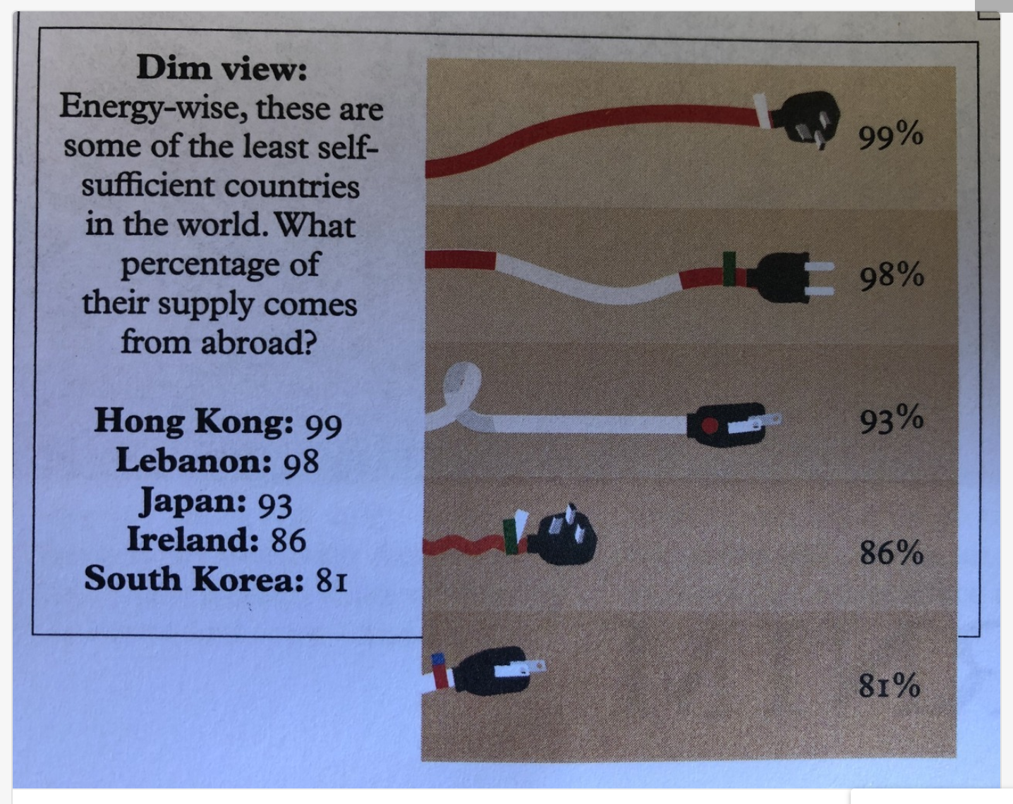
Even if one has good data literacy skills, sometimes a poorly created graphic can make data impossible to understand. For example, this visualization attempts to compare what percentage of these countries’ energy comes from abroad. Poor size representation skews the information – – the 81% chord is a fraction of the size of the 99% chord. 

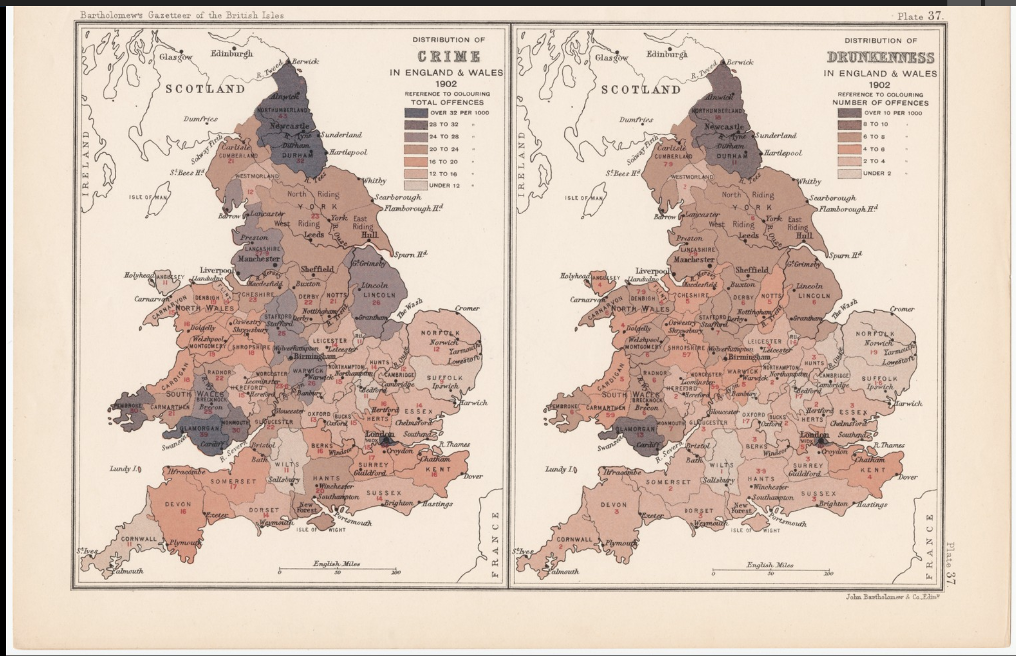
On the other hand, here is an example of data visualization done well. This graphic compares the total offenses (per 1000) of drunkenness versus crime in England and Wales. It has a clear key that explains which colors correlate to the amount of offenses and the presentation of the maps side by side conveys the comparison well. 

Categories
Practice

Journal #1

Knowing how to use and read data is critical in many disciplines, particularly those in which individuals need to make well-informed decisions. In order for data visualizations to be effective, there needs to be an understanding between both the person who created the visualization as well as the person who is deciphering the data. More specifically, it needs to be clear what the visualization is attempting to communicate.

Increase in the cost of healthcare

This visualization is an example of a failed attempt to communicate what the creator deemed to be important information. The 60% on the left of the visualization is the same size as the combination of the 10% and the 20% on the right side of the visualization, when in reality it should be twice the size in order to accurately capture its true discrepancy in terms of percentages. An individual viewing this visualization might misinterpret the graphics, and as a result come to false conclusions.

This visualization was created in 1915, around the time of the fight for women’s suffrage. Using tools like colors, words, and facial expressions, the creator was able to encapsulate not only context surrounding the events at the time, but also insight into where the fight for women’s suffrage was headed. As Lady Liberty moves from the light states (those which already maintain women’s suffrage), she holds her torch in her hand as she pushes towards the states that are in the darkness (i.e. those states that did not yet have women’s suffrage). Even without knowledge regarding specifics of the time, a person who is analyzing this visualization is likely able to piece together what they are looking at.

Categories
Practice

Practice

Data literacy is something that is becoming ever more important in the information filled world we live in. Solving problems and improving human life is all dependent on data literacy. Being able to interpret, analyze and visualize data are skills that will not only help one benefit society but also help one make decisions and trust information. Everyone is surrounded by data so it is very important to be able to distinguish between good data and biased or illegitimate data. Data can be manipulated or collected unethically and it is the responsibility of the reader to distinguish the credibility of the data they are trying to interpret.  As well as better understanding information, data literacy also allows people to get their information across more accurately. Sharing information and knowledge is vital part to the expansion of our society but, in doing so the risk is run that information will not be represented accurately. This leads to confusion and misinterpretations of data.

In my first example from viz.wtf, it can be clearly seen the producer of the visualization wanted to represent something other than the findings of their data. In this visualization, the smaller percentage of data is in the larger section of the pie chart therefore the visualization is not directly proportional to the numerical quantities represented. Making the reader at first glance think it is more common for companies to have less than fifty employees. Also all of the data does not add up to one hundred. This can all lead to a misinterpretation of the data.

The next example from Persuasive Cartography entitled The Awakening is a good portrayal of data. Lady Liberty is stepping across a map of the states wearing a cap that says votes for women. The message that this visual is trying to portray is easily understood because there is enough direction and information leading the viewer to the meaning.

Categories
Practice

Practice Blog

Based on the readings that I have done this week and the discussions on data that we have had in class, I believe data literacy is extremely important. As mentioned in chapter one of Data Feminism, I strongly feel that “working with communities and embracing multiple perspectives can lead to a more detailed picture of the problem at hand” (D’Ignazio & Klein). Data can help us solve fundamental issues that arise, but in order to learn and grow from the past, it is necessary that we as a society learn more about the data we use to draw conclusions. We need to know where the data comes from and how it is being analyzed in order to extract the information we need. Data visualization is used to help display information in a manner that is easy to understand and interpret. When used correctly, it helps support an argument and prove a point. It allows for a more concrete way to display qualitative data and things that are hard to measure. However, misuse of data can skew the results and/or portray the wrong information.

As seen in this image from viz.wtf, the bars of the graph are not proportional at all. They also do not go in order of percentages so the viewer of this information is not getting an accurate representation of the breakdown of costs.

In this image from Persuasive Cartography, the greater of this visualization is trying to argue that there is a concentration of vice in a particular area in Chicago. However, the manner in which the data is represented makes the problem seem worse or more apparent than it actually is. The creator strategically rotated the map so north was not facing up in order for it to appear that there was a bigger concentration of “bad areas.” This is an example of how problems can arise when there are biases and a lack of data literacy.