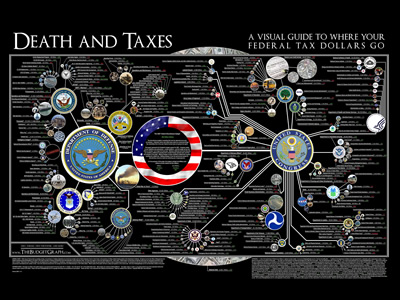
Categories
Assignment 1

Assignment 1

Visual Complexity

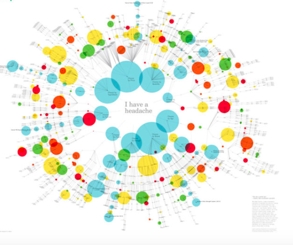
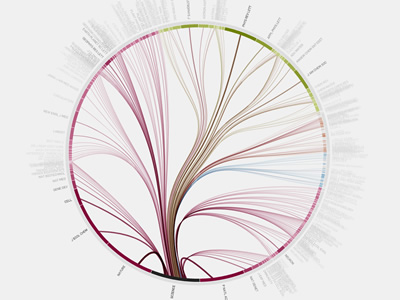
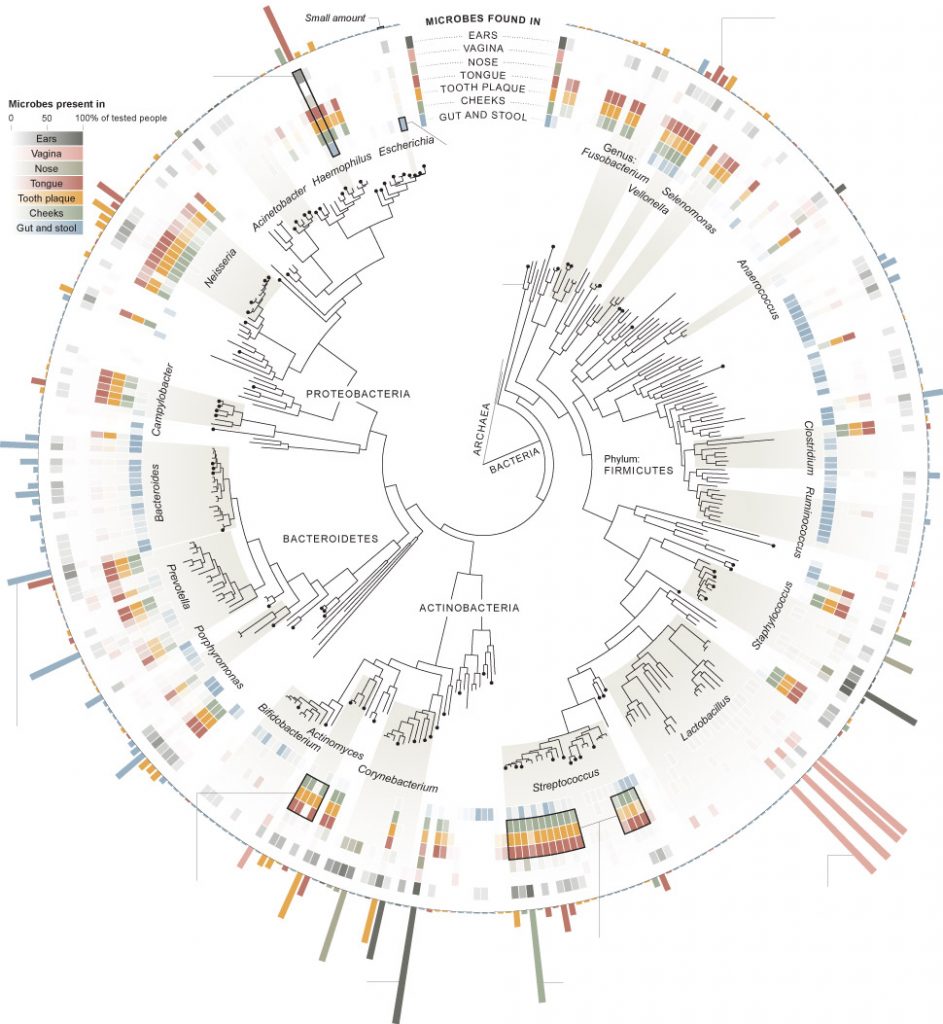
My first visualization, from the New York Times,  analyzes the “invisible population” or the bacteria that live in different bodily sites on the 242 people tested. I chose this one initially because it visually appealed to me and I generally tend to like the graphics produced by the New York Times. In Design for Information, Meirelles discusses studies that show that different people are drawn to different “visual features.” I was drawn to the radial coloring and the inner ring resembling a gauge from afar. Though I may not have been initially interested in the precise breakdown of bacteria on a human body, the graphic caught my attention and caused me to take a closer look. Using compelling graphics to gather the attention of a reader is a technique that would be familiar to W.E.B DuBois, who “ produce[d] modern graphs, charts, maps, photographs, and other items that appeared to sparkle” in order to grab people’s attention because “an array of dry displays at the exhibit would have been ineffective in subverting the social Darwinist paradigm.”(DuBois 34) DuBois was trying to grab the attention of the masses (not just “a small circle of academics”) in order to “Chronicle the African American experience”(DuBois 34), while the New York Times is simply trying to get readers to turn to section D1 of the June 19th edition of the Times. Similar tactics, just different audiences.
Though represented radially, the hierarchical structure of the diagram resembles the “classification” type tree diagram as described by in Visual Complexity Mapping Patterns of Information:  “Classification(a systematic taxonomy of values) …applies the hierarchical model to show our desire for order symmetry and regularity.”(Lima 25)

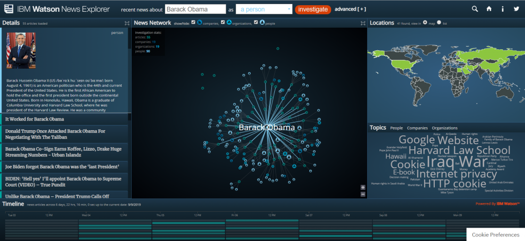
My second visualization is the IBM Watson News explorer which indexes thousands of news articles per day and analyzes them for content in order to link them together by topic, location, and people involved. This visualization appealed to me because of the location map on the right side. The news explorer uses color as a “preattentive feature” (Meirelles 22) to draw the eye to geographic locations where the searched item is tied to. You can search for a specific term or you can use the topic wordmap to find popular topics. When you select a topic, ( I have selected Obama in the above screenshot) it then uses the same wordmap to show you the most used words in articles about the topic (Obama here) as well as a map of the usage locations, and what Meirelles described in Design for Information as a node-link diagram(Meirelles 55) to detail the interconnections between your selected topic and another, as well as a list of the actual source articles where all of the information is pulled from. 

The IBM visualization is clearly dynamic, as it pulls live data for recent news articles, while the New York Times article is static, it relies on the data taken from the study of 242 people, it never changes. 

While analyzing these two visualizations, I thought about the influences of bias that are discussed in Data Feminism. Invisible Populations is based on scientific data, so the largest source of bias there would likely be in how the information is actually communicated to the reader. However, with the IBM visualization is a little less clear. Going to the information section of the website reveals that the system indexes 250K articles per day from 70K sources. While one might believe that this eliminates bias, I am not sure. The source articles are arranged in a manner that is less than transparent, with articles from sites like “spin.com” and “truepundit.com” showing up with the same frequency as more verified articles from sites like “nytimes.com” and “CNN”. Because of this scheme, extremely biased opinion pieces can show up in the results categorized as news. Because the system is automated, there is no moderation. Additionally, you can search for individuals, and it will show you articles and information linked to the person. However as Data Feminism implies, what’s important in this analysis isn’t who’s in the system, but “who” is missing. The system can only display information on people that the media is reporting on. If there are no articles about the person online, then to system, they effectively do not exist. You can only see the stories of the people who get in front of the news. As Data Feminism says, “Who any particular system is designed for, and who that system is designed by, are both issues that matter deeply. “(D’Ignazio and Klein)

This visualization, as compared to the last one, does allow the consumer to interact with the data in multiple ways. You can click on almost any of the visualizations to display more information or to use that as a search criterion for a new search. The New York Times visualization only provides a single means of interaction. However, considering the fact that one was designed for print media and the other was designed for the internet, this is not surprising, and also not a downside of the New York Times piece. I believe both visualizations allow for new understanding of the material. The IBM visualization allows you to see the connections between different articles and stories that are happening, that you would not have been able to easily detect before. The New York Times visualization provides less new understanding, but it does neatly sum up all of the information about the human biome.

DH Sample Book

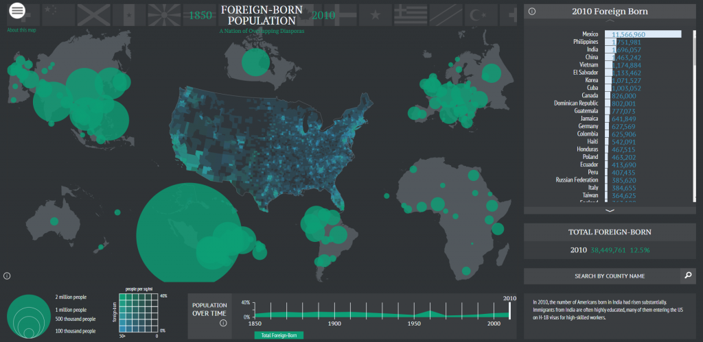
In the digital humanities sample book, I chose American Panorama, and the Six Degrees of Francis Bacon. American Panorama was compiled by the Digital Scholarship Lab at the University of Richmond. The project is a compilation of maps displaying information about the United States. The project is navigated by selecting a particular map and changing the parameters of it (each one is slightly different). The visualization allows the user to select from various criteria to change what the map displays. In the screenshot, I have the map of foreign born population. It allows the year to be adjusted at the bottom and then it shows where foreigners are from. You can even search by country on the right hand side. Information that this shows that a research paper would be unable to is the time element of the foreign population change. A paper would be able to discuss trends, and maybe even show a few years, but it would be unable to display the change over time in the same way that this can. The lab has a separate page that clearly lists the sources for the information. In terms of shortcomings, this project is pretty good. I think the main page could provide more information about the maps before you clicked on then, to give the reader more information about what they are about to open. The project was first created in 2015 (according to Wayback Machine) and has added maps since then. They currently have 8 maps. 

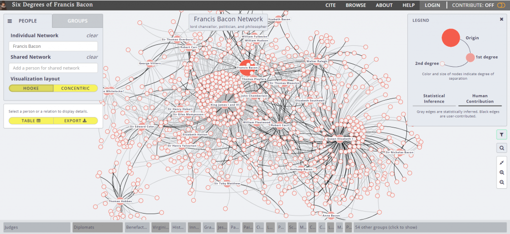
The second visualization is Six Degrees of Francis Bacon. The project is hosted by Carnegie Mellon University, with Christopher Warren as the project leader. The purpose is to recreate the “early modern social network”. The project is entirely open source, meaning that anyone can contribute to it. This is both good and bad. Like Wikipedia, this type of system means that data is generally correct and updated frequently, but it is often unverified. It is good for basic reference, but not for citing. This is also one of the shortcomings of the project, is the unverified nature of the data it uses. Over a traditional research paper, this project offers a dynamic dataset that is always expanding, and a level of broadness that can’t be discussed in a paper. One simply cannot communicate that volume of information in a traditional paper, however with this project it is easy due to the ability to navigate and view details on specific connections. I believe that this project does offer new ways of viewing this data. I had no idea the vast social network that existed in the days of Francis Bacon, and this project allows you to easily follow a trail of connections to new information. One other shortcoming of the project is the linking of people together. The legend indicates that a grey line means that the connection has been statistically inferred. This means that some of these could be incorrect due to shortcomings of the algorithm. Design-wise, I thought the project was very easy to navigate and was visually appealing, using  different sized dots to indicate the degree of the connection, a technique discussed by Meirelles for pattern recognition. 

Categories
Assignment 1

Assignment 1

“Art in Odd Places”

David Bunde created this visualization so that artists of the Lower East Side in Manhattan may have the chance to explore the role public space plays in society in terms of authors displaying their projects. I was drawn to this visualization because i live in close proximity to the location-at-hand. Viewers, specifically artists, can interact with the visualization in a way that allows them to examine and understand the relationships between creators, locations, and projects through three corresponding columns. The method the author used to connect each aspect of the visualization to one another enables the viewer to see the information they want very easily. The visualization exemplifies the concept of a dynamic visualization in many ways. Firstly, one can interact by hovering over any listed artists’ name, any location, or any project and see its connection to the other nodes. Lima described the world wide web as a “Tangled network of nodes and links, embodying an enormous volume of data” (Lima 56). Bunde uses artists names, locations in the East Village, and project names as nodes and links them together through the interactive visualization. In these ways, we can interact with and grasp an understanding of the material.

“I have a headache”

The unknown author created this visualization to illustrate an array of over-the-counter drugs available for headaches. What drew me to this piece were the bright colors used for nodes as well as the branches from a central foundation. Being a network, it displays the many decision making processes one may go through to choose a brand of medication. It uses branches, similar to those of a tree graph discussed in class, to radiate from the central headache and “branch off” into a chain of decisions. In chapter one, when discussing tree graphs, Meirelles writes that “In a nutshell, hierarchical systems are ordered sets where elements and/or subsets are organized in a given relationship to one another, both among themselves and within the whole” (Merielles 17). Suggested medications in the visual are related to factors like age, brand, dosage, etc. Although this work is not interactive, it still provides the viewer with a chart packed with hypothetical choices one may face. I feel that if the author made this visual interactive and available to be viewed from different perspectives, it would be much more useful for the people interested. Furthermore, it would contribute to new ways of understanding the material.

“SELFIECITY”

“Selfiecity” is an interactive visualization that illustrates different themes and trend in the selfies people from all around the world take. I chose to examine it because in today’s world, social media as well as selfies are a very prominent part of society. Du Bois describes data visualization in his Visualizing Black America as, “the rendering of information in a visual format to help communicate data while also generating new patterns and knowledge through the act of visualization itself” (DuBois 8). The visualization is definitely very organized, allowing for the viewer to easily explore and find patterns in data sets. The use of image plots helps display and categorize the pictures. Categories of the images include types of selfies and different poses. It even includes and compares selfies from different cities, ages, and genders. Viewers can easily access and see the data without drawing bias from it. Additionally, it builds on our understanding of the subject with easy-to-read graphs and theoretical essays.

The visualization utilizes both quantitative and qualitative metrics to allow for multiple perspective to be taken into account. This use of dynamic data gives viewers the opportunity to interact with and know the data.

Although it is a very well-constructed visualization, I did find a privacy issue in that the authors didn’t ask permission to use the pictures in their study. This is a common ethical problem in research and case findings. In addition, the authors may not have accounted for all selfies. Most times, there are populations of people who fail to be represented in data samples due to biases or simply not being on social media.

“Mapping the Republic of Letters”

The Mapping of the Republic of Letters uses visualization to display Voltaire’s correspondence of networks across continents and further the understanding of his connections to certain people and places. Networks included were social networks created by scientific academies and physical networks created by travel. I feel this is a well- developed, interactive work that answers questions people may have regarding these networks. The method used to present the data allows for viewers to interpret and draw their own conclusions from a multi-dimensional perspective. This dynamic method eliminates any possibility of bias from the author in the visualization due to direct manipulation of the graphical objects and statistical properties.

Categories
Assignment 1

Assignment 1

I chose these two visualizations because the visuals were easy to read and navigate and they both covered issues that I think are worthy of analysis. The information flow in science graphic is a dynamic visualization, as it lets users interact and choose specific topics to view more information/ additional visualizations. The US tax graphic is static, as it is not interactive. In the US tax graphic, preattentive features (size, color, and line weight) are utilized to draw the viewer’s attention to most important symbols: “…the objective (of preattentive features) is to support perceptual inference and to enhance detection and recognition” (Meirelles 22). The information flow in science graphic provides interactive ways for the viewer click around the graphic and view different perspectives and journals. All these visualizations are beautiful, but not in such a way that distracts from the information, which was something Dubois stressed in his American Negro Exhibit: “However, the art did not distract from science; it served to reinforce the comprehensive scientific data chronicling the African American journey” (Dubois 34). There is a purposeful organization to this graphic as well – it is in the form of a tree graph, which illustrates the hierarchies in the citation network and the division of journals into four categories and then into subcategories. This method is effective in how it “applies the hierarchical model to show our desire for order, symmetry, and regularity (Lima 25). Additionally, the graphic on US taxes presents new information and a new perspective to the public, who often do not know where their tax money is going. When a large governmental organization holds all the power, data visualization is an important tool that can be used to inform. D’Ignazio and Klein emphasize this point in their discussion of feminism and power: “Feminism is about power–about who has it, and who doesn’t. In a world in which data is power, and that power is wielded unequally, feminism can help us better understand how it operates and how it can be challenged”.

The first visualization I chose from the DH Sample Book is the graph on “Lesbian and Gay Liberatio in Canada”. This graphic is a dynamic visualization that allows the viewer to click through the graph and view specific points in history and further information. It gives the viewer a strong historical perspective to this movement that might otherwise get lost in modern times. Another progressive and interesting part about this graphic is how it includes biographical information on every person involved in the database, which adds validity and depth to the information. This graphic is eye opening and provocative as it prompts questions about the global momentum of this movement. One weak point of this graphic is although it is very organized and clear, the visual aspect is not very exciting or eye catching. 

Another visualization I analyzed from the DH Sample Book is “American Panorama”. This visualization looks at the displacement of American families in “slum” neighborhoods of cities in 1955-66. The way the information was presented was very interactive and dynamic, and also very user friendly. The website gave an overview of what the graphic would discuss, provided a key. It then lets you move your mouse over different cities to view statistics on urban displacement. This graphic brings new information to light and highlights specific issues within this larger issue, like race, poverty, and redlining in cities. For example, there is a graph for each city that chats the displacement of families based on race, showing the disparity between how many white families were displaced and how many families of color were displaced. It allows the viewer to understand the situation from the perspective that is different from that taught in textbooks. 

Categories
Assignment 1

Assignment #1

Periscopic, the creator of the top visualization, analyzed the top words spoken during speeches given by presidential candidates to see what were the major issues they focused on were. I feel that the unique way in which the data was presented allowed me to develop takeaways that I would not have found if I was just listening to the speeches. I believe that I would lose sight of some of the trends that were made obvious by this particular visualization. As Friendly argued in his piece, A Brief History of Data Visualization, the dynamic visualization of the data allowed me “to see phenomena and relationships in new [and] different ways” (Friendly 30). Furthermore, I was able to interact with this visualization and look at specific things that interested me and the impact of those things on society. Like Du Bois argues in his book, Visualizing Black America, Periscopic utilized the “cross-fertilization of visual art and social science” to offer “alternative visions” of the speeches made by presidential candidates (Du Bois 13). This is significant because it allows individuals to become more educated on the issues being discussed and provides the opportunity for viewers to come up with their own interpretations. As D’Ignazio and Klein argued, “embracing multiple perspectives can lead to a more detailed picture of the problem at hand” (D’Ignazio and Klein). The tree-like, web structure of these visualizations allows viewers to “browse, filter, and organize” their understanding of the material “in a nested hierarchy” (Lima 41). I was attracted to this picture due to the bright colors and shapes utilized. I believe that this is because of the preattentive properties this visualization possess. As Meirelles discussed in his book, Design for Information, “studies in psychology have shown that our visual systems favor certain visual features over others. In this case, I was drawn to the colors and shapes Periscopic used.

The second visualization demonstrates “the Flickr ecosystem and the full potential of the popular photo-sharing service” (Glass). As DuBois argued in his book, Data Portraits, I was originally attracted to this diagram because it was visually pleasing and made me want to immediately learn more. Furthermore, the creator utilizes the elements of design that Meirelles discussed in order to help portray the data in an intriguing manner. I particularly took notice of the red-green color scheme and the spatial distance between various elements of the infographic. The creator of this visualization utilized the tree concept that Manuel Lima discussed in his work, Visual Complexity: Mapping Patterns of Information. The tree-like structure of this work allows me to see the fundamental make-up of Flickr because I am able to see the hierarchal structure of the uses of the platform. However, I feel this visualization is limited as it is not dynamic. It is particularly hard to try to look at the material from multiple perspectives because it is merely a reflection of results. As a viewer, I wish I had the ability to interact with the data and find conclusions embedded in the data set.

The visualization, “selficity,” illustrates themes and trends in selfies people take. It uses imageplots to display the thousands of pictures to reveal the results of the findings. The study categorizes the pictures into what types of people take selfies, what their poses are, and what their expressions are. It compared people taking selfies in numerous cities worldwide and then further compared gender and age. It allows viewers to see the set of data used to draw conclusions in an unbiased fashion. It utilizes both quantitative and qualitative metrics to allow for multiple perspectives/measures to be taken into account. I believe that the use of dynamic data allows for users to interact with the data and allows them to know “the sources of data, and it relies upon them to make decisions about data” (D’Ignazio and Klein). However, this raises the ethical problem with this particular visualization. The author/creator did not ask permission to use the photographs so there is a privacy issue. There also could be bodies that are not accounted for in the data sample. Populations of people could be completely unrepresented in the data set, but due to biases and preconceived notions, it could go completely undetected. As Joni Seager argued in Bring Back the Bodies, “‘if data are not available on a topic, no informed policy will be formulated; if a topic is not evident in standardized databases, then, in a self-fulfilling cycle, it is assumed to be unimportant’” (D’Ignazio and Klein). In the case of “selfiecity,” there could be groups of people who are not even on social media or who have public accounts so they are not represented in the data set.

The Mapping of the Republic of Letters uses data visualization to understand the correspondence of networks. The manner in which the data is presented allows viewers to see Voltaire’s correspondence and understand his connections to certain people and places. I feel the creator did a great job of making an interactive, dynamic visualization. I believe that the method used to present the data allows for viewers to come up with their own interpretations and draw their own conclusions. The features of the visualization allow for viewers to see a multi-dimensional perspective of the findings. As discussed in the Friendly reading, the use of dynamic graphic methods, allows for  “instantaneous and direct manipulation of graphical objects and related statistical properties” (Friendly 25). I feel that this is an important characteristic because it eliminates the possibility of the author/creator potentially inserting biases that could get passed down to the viewer. Furthermore, I feel the interactive component of this visualization allows viewers to see things that they would not have previously seen without having the ability to play with and manipulate the data on their own.

Categories
Assignment 1

Assignment #1

I chose these two visualizations because the information they contain is interesting to me – the first visualization is about trends in using the phrase “is the new” from various sources in 2005, and the second visualization is a chart that chronicles the growth of pop/rock music and its top selling artists from 1955 to 1978.

Both of these visualizations are static because they are predetermined for a specific year or a set period of time and will not change with new data. At the same time, although it isn’t dynamic in the sense that clicking an icon will bring its viewer to a new page, it is still interactive in the sense that it contains interesting content to hook the viewer in and make them want to look at the data. In the first visualization, it is similar to what DuBois describes as “sociological content,” the major difference being the level of importance in the topic (clearly, sentence patterns in 2005 are not nearly as important as the experiences of the Black American in the 1900s).

In the visualization about music, the creator uses a technique that reminds me of Meirelles’ description of node-link diagrams, which “use symbolic elements to stand for nodes, and lines to represent the connections between them” (55). In the case of this visualization, an arrow extending from a performers name shows the length of time that he/she remained a major hit maker. One issue surrounding this visualization is that it inherently comes with bias, as discussed in the reading by D’lanzio & Klein. They write, “If data are not available on a topic, no informed policy will be formulated; if a topic is not evident in standardized databases, then, in a self-fulfilling cycle, it is assumed to be unimportant.” Are there other visualizations surrounding the progression of music? Are the “major players” in this visualization key figures in other visualizations that might be similar to it? This goes back to Lima’s point in Visual Complexity, in which trees are associated with the “notion of centralism, or centralization, which expresses either an unequivocal concentration of power and authority in a central person or group of people,” in this case, the artists (43). Despite this, I believe that both of these visualizations capture interesting data and present their findings in a way that is aesthetically appealing. Though these visualizations may be static, they remain engaging by having creative topics.

With the Digital Humanities Sample Book, I chose to analyze “American Panorama” and “Mapping Metaphors.” “American Panorama” was created by the Digital Scholarship Lab at the University of Richmond and was funded by the Andrew W. Mellon Foundation. They pursued this project digitally because it is an interactive map that is grouped by collection on its homepage. Its sources are published on a separate webpage, where the Lab also cites its methods used to collect the data. The writing for the project is clear and interesting, clearly written as though it is intended for mass audiences rather than small groups of highly educated individuals. This project differentiates itself from a traditional or analogue research project by allowing the viewer to search by city or state using its interactive capabilities, rather than containing a ton of information that might be overwhelming to a viewer. The authors likely decided to make this interactive because it’s an effective way to give people a lot of information in a way that is engaging, and people can actually learn about the locations they want to learn about. It has additional familiarity in the sense that it uses Google Maps as its mapping host. With regards to strengths, this project excels with its ability to engage the viewer using interactive tools and interesting colors as well as the ability to search by city. One drawback is that it didn’t have every city, which poses the question: why did the creators choose the cities they chose? Unfortunately, the data they used is for a specific date range, so there isn’t much that the creators can do about it. Overall, though, the project is interesting and has come a long way since its website was created four years ago; it began with four projects, and it currently has eight.

“Mapping Metaphors” was slightly less impressive than “American Panorama.” The authors came from a team at the University of Glasgow who wanted to discover metaphorical connections within the English language, and they were funded by the Arts and Humanities Research Council. This visualization’s description is slightly more difficult to find than that of “Mapping Metaphors,” as it requires the viewer to navigate to another tab to find the purpose and central thesis. Generally speaking, though, the website’s navigation is creative in the sense that it has a giant spinning circle in the middle of the site to use for navigation. This navigation tool is both a strength and a weakness, as it looks interesting but it is challenging to actually use. Meirelles broke things down into how people see things; dominant colors included red-green and yellow-blue, yet this project uses red, green, and blue, which isn’t very aesthetically pleasing. The project’s source materials come from the thesaurus, but it’s unclear how they chose their categories, which may lead to some false assumptions within the data. Although it has potential to be a really interesting project, its execution falls short in a few ways, namely confusion with how to use the project’s main tool as well as the visual design and structure of the website.