Categories
Assignment 1

Assignment 1

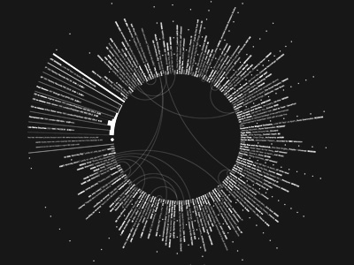
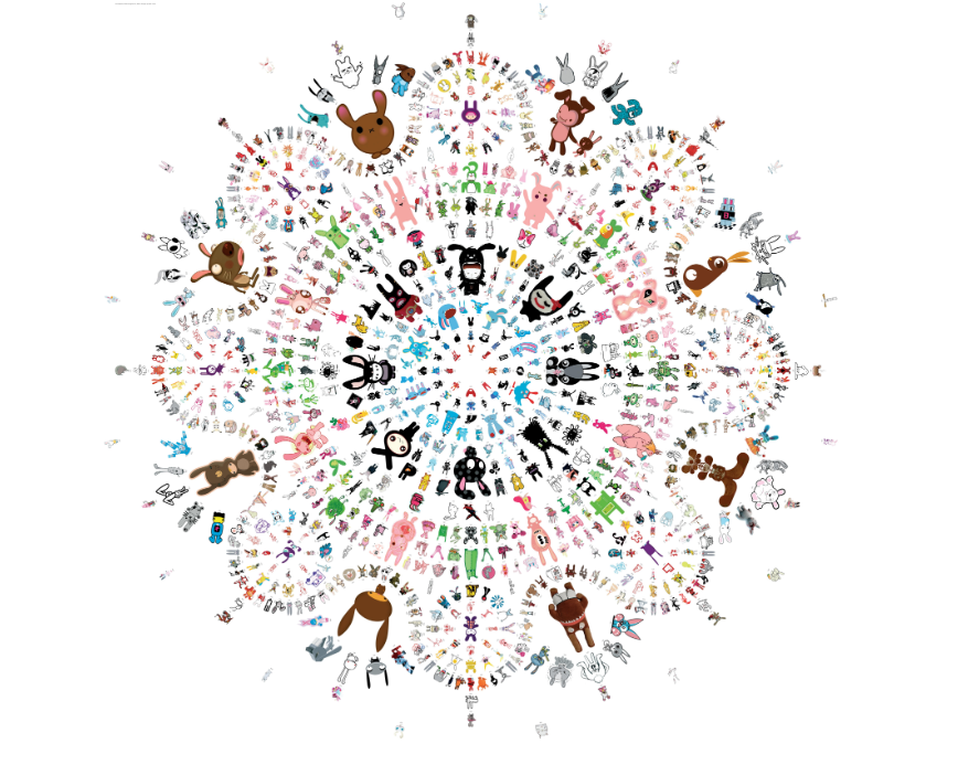
The first visualization I chose was “The Essence of Rabbit” compiled by the design firm Pictoplasma. It explores the art of around 600 artists on the topic of rabbits, their interpretations of the animal and showcases them in a what is effectively summed up as “a bunny mandala,” putting them in a color-coded formation that requires you to zoom in to view the art clearly. Looking back on my decision to view this following the three-stage model of perception in Meirelles’ book, I think that I was attracted to this during Stage 2: “Slow serial processing for extraction of patterns and structures.” It was the only one that had cartoons on it.

t is effectively summed up as “a bunny mandala,” putting them in a color-coded formation that requires you to zoom in to view the art clearly. Looking back on my decision to view this following the three-stage model of perception in Meirelles’ book, I think that I was attracted to this during Stage 2: “Slow serial processing for extraction of patterns and structures.” It was the only one that had cartoons on it.

This visualization showcases the differences in how a rabbit can appear in people’s heads and through the hands of artists, explored in different visual features. In essence, this also explores data feminism in the sense that this design firm is the one organizing the data and thus has a lot of power in choosing what designs fit into their aesthetic. The description of the project says that Pictoplasma asked the artists, however, there is not much more explanation to the process other than this. This opens up the question: “Was there anyone left behind?”

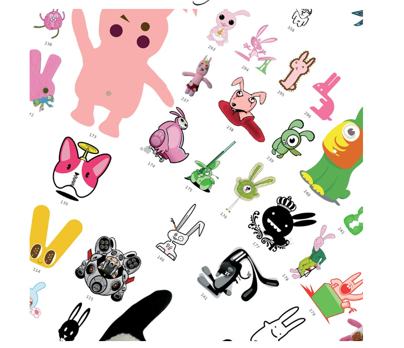
Although this visualization is all static data, the complexity of it that requires you to look only at one portion of the time creates a pseudo-dynamism, allowing you to choose what part of the mandala you want to see. However, the data is still static, and once you are done with the visualization, there is no way to compare parts of the dataset you want, an example of which could be only looking into the brown rabbits of the mandala. This visualization, while interesting, was no more than what they promised: “a bunny overdose.” 

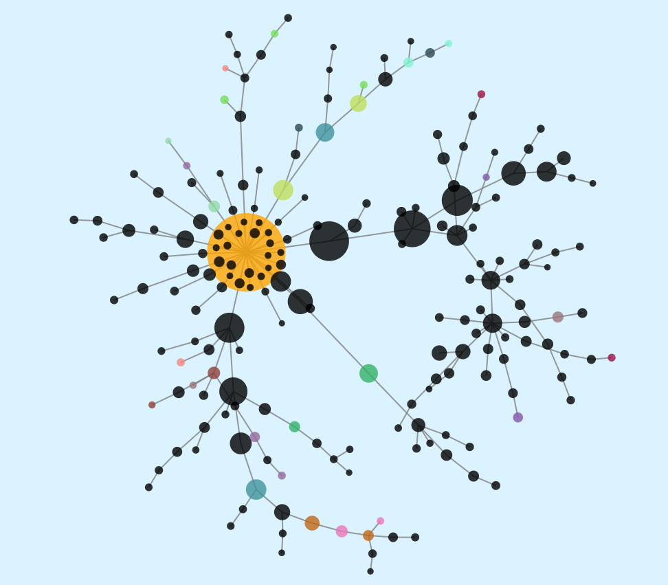
The second visualization I chose was “Visualizing Reddit Discussions.” It visualizes the comments and reactions of reddit threads from the front page, and is an interesting tool to see how discussions flow from topic to topic. The sizes of the bubbles note the engagement, while the colors other than black note the same author. This visualization is interesting as different conversations have different flows to them. Some stay anchored in the same main thread, whereas others start sub-discussions in a popular comment subthread.

This visualization is dynamic, changing from post to post and in real-time. The visualizations pull data from the main page, and it is possible to look into the threads you are interested in by pasting the link in the search bar. However, since the data is real-time, tracking it requires saving the post’s link to be able to see it later as it might not come up on its own again.

This tool, I think, serves to open up data interpretation a bit more. Complied over time, a single post’s growth could be an interesting thing to see, but in the current state of non-tracked change, this clearly dynamic visualization becomes static, in a way. These visualizations do create a new understanding of how people interact online, and having the choice of data set puts the power in the users’ hands. This does, however, bring up the question of pre-set algorithms as many of the users might not be familiar with coding, and the data that they end up with, therefore, might be biased after all.

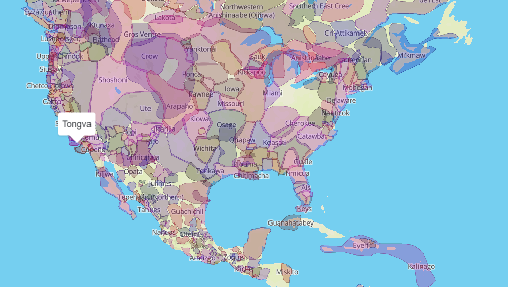
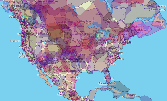
From the DH Sample book, I first chose Native Land, which visualizes the territories, languages, and treaties of native people. By looking at this data and being able to filter through the selected categories, you could find more data about a specific language or topic, and isolate it for better representation of your topic. It does allow for data to be viewed in different, but skewed perspectives, possibly, due to the data not being complete, Nonetheless, the project definitely provides ways to interact with the data and draw new conclusions.

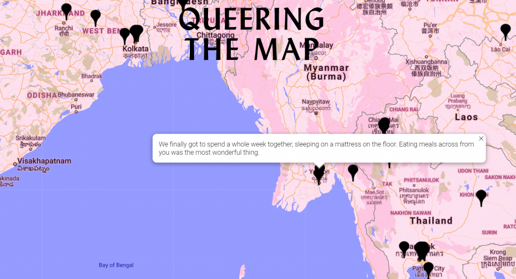
The second example I chose from the DH Book was “Queering the Map.” This allows people to share their own stories about queerness and contribute to a dataset the way that they see fit. It puts a lot of power into the hands of the visitor, which results in strange locations, but interesting stories nonetheless. This representation of data is simple, but the ease of being able to put your own narrative there and effectively changing the dataset might lead to new personal understandings about how and why people share their data.

Categories
Assignment 1

Assignment #1

Mapping 31 days in Iraq
Programming Languages Influence Network

I chose these two visualizations various reasons. The top visualization shows a map of Iraq showing deaths from January 2006. The bottom one is a visualization of different programming languages and their influences. The first visualization is a static visualization, where you can look through the image but cannot interact with it. Although it is static, it does present the data in a new perspective. It shows the deaths over a month, where most of the people who died are civilians. This visualization attempts to show the humans who died rather than just giving a number. As D’Ignazio and Klein stated, “the perspective of only one group of bodies becomes invisibly embedded in a larger system”; in this case the perspective of the American media is the only perspective we see. This perspective usually fails to show the innocent lives lost in Iraq due to war. Much like how Du Bois had “the politics of visuality, and the very question of black visibility” in the back of his mind, the visualization attempts to make visible the invisible innocent lives lost during the war (15). It shows the human cost of war.

The second visualization is dynamic and interactive. The visualization shows a hierarchical system where languages are connected to their influencers and languages they influenced. This visualization can be seen as a genealogy tree, which “incorporates the tree to illustrate growth and subdivision over time” (Lima 25). The interactive aspect of the second visualization allows user to click on any specific language to focus and center it. The shape represents the numbers of languages influenced by it. The color represents the type of language. As Meirelles states, “we process spatial properties separately from object properties” (19). Here it is apparent that one type of language can influence another type. These visualizations allow users to explore, understand and discover new ways of understanding the data.

The two visualizations from the Digital Humanities Sample Book I chose are the Native Land and the Spread of U.S. Slavery. I chose these two maps because they help visualize information in different ways. The Native Land is an Indigenous-led project created by Victor Temprano. The map is dynamic meaning users can click through and see what native tribe lived in specific area. Users can look by territory, language and treaties. It provides users multiple ways to look through the data.

The Spread of U.S. Slavery is a map created by Lincoln Mullen. The dynamic map can be used to look at the number of slaves from 1790-1860. It also shows the number of free African Americans in particular place in the US. The timeline on the map can be used to see how the spread of slavery moves down to the south while the number of free African Americans starts increasing in the north. Both of these visualizations allow users to look at the data through different perspective as well as learn and discover information.

Categories
Assignment 1

Assignment 1

“Grand Taxonomy of Rap Names” was not only striking due to the eye-catching colours, the subject matter was also a significant point of interest. I was curious about the connections, and wanted to investigate the grand claim the title makes. Taxonomy is a biological term, which recalls arguments made by Lima regarding classification, particularly those concerning the ordering of nature. This visualization, while concerned with classification does not use a hierarchical model (tree structure) but instead uses a network – as it better fits the data. The title, then, becomes rather ironic, for placing value on rap names – a field dominated by black bodies – subverts what Linnaeus accomplished by his own ordering system which fueled scientific racism. DuBois makes a similar move with his infographics using “the map depicting routes of the African slave trade… which served as the lead image for the Georgia study” and “situates Georgia (represented by a star) at the center of the map’s diasporic cartography” (11). The producers of “Grand Taxonomy” visualize rap names in a way that demonstrates new ways of understanding “how various name origins, from physical attributes to audacious misspelling, are all interconnected” the way that DuBois draws lines between countries and continents. “Grand Taxonomy” also bears similarities to D’Ignazio and Klein’s goal in creating Data Feminisms. Their document an annotated one, making connections outside itself, and it accomplishes the task of social collaboration that both Lima and Meirelles discuss in their networking chapters. Network thinking is also integrated in the process of creating the visualization, but because it originates from a poster there are not multiple ways to interact with the data. Though it may be described as a static visualization, the links between the nodes are dynamic for they are built on multiple relations.

A relationship between “Grand Taxonomy” and “The Guardian: A Semantic Network Graph on Lebanon” is formed through the concept of the rhizome. Lima quotes Deleuze and Guattari who argue, “the rhizome is an acentered, nonhierarchical, nonsignifying system without a General and without an organizing memory or central automaton, defined solely by a circulation of states.” Both of these visualizations depart from the arboreal structure and adopt a network structure, which allow them to convey information in a way that represents those dynamic relationships.

Because I come from the field of literary studies, I am interested in the relationship between words and “A Semantic Network Graph on Lebanon” seemed to be a promising exploration of those relationships. This visualization bears similarities with those examined previously insofar as its manipulation of proximity, use of colour and relative size (of the nodes) are used to communicate meaning. This work is quite literally about new perceptions, and it also visualizes many perspectives: “The goal was to understand how Lebanon was perceived abroad by understanding the main actors, relations, and most relevant topics.” Furthermore, there are multiple iterations of the network graph that move from the ‘raw’ sketch to increasing detail that populates the network with nodes and labels, showing the progression. It uses the architecture of decentralization. With the focus on Lebanon, parallels may be drawn with Lima’s discussion of flaws in city planning, and understands “the city as a living organism in constant mutation, a highly complex network involving a vast number of variables” (Lima 48). This concept is echoed in the visual project pursued by students in a digital lab. The ‘finished’ product, however, is presented on a physical page, deeming it a static visualization. But one difference between this visualization and the former is the inclusion of images of ‘zoomed in’ clusters. Their technique is similar to a particular digital strategy outlined by Meirelles: “Other effective strategies involve enabling the user to change the camera view or zoom into the graph, for example. So-called focus + context techniques involve operations that keep the contextual view of the whole graph while enabling a selected area to be represented in detail” (58). This effort may blur the lines between what we understand to be static and dynamic visualizations.

From the DH Sample Book:

American Panorama: An Atlas of American History

This digital project can be clearly situated in the field of dynamic visualizations. An interactive map, it allows the user to navigate the clusters of data and has an effective filtering system. It facilitates an effective transmission of information that does not suffer from disorder or an overwhelming amount of data, like the treemap it is a“space-efficient display of large structured datasets” (Meirelles 30). For example, in the Renewing Inequality project on family displacements from 1950-1960 allows one to view the same space through the lens of demographics and incomes or from the perspective of redlining. 

Mapping Metaphor

This project uses the Historical Thesaurus of English as its primary source, and furnishes us with a dynamic way of interacting with that text. While it uses a circular network layout, the ideology motivating the visualization is a hierarchical one. One of the first bullet point on the homepage reads: “This circle represents all of knowledge in English: every word in every sense in the English language for over a millennium.” This statement embodies the centralism and finalism that Lima critiques, and stands in direct opposition with the idea of the rhizome. While the data can be viewed through different perspectives, these seem to function to reinforce the idea of absolute understanding. 

Categories
Assignment 1

Assignment 1

I chose this first visualization for its combination of cartography and knowledge. It is a system of representation of space, which communicates complex contexts through overlapping texts and diagrams.

Image 2

This visualization of the patterns between Oscar winning actors, directors, and other actors that they work with. I chose this visualization to analyze for that it displays information that is accessible to the public, however difficult to display into one visualization due to its complexity of rings and spokes.

The first image of the history of visualizations using knowledge cartography is a dynamic visualization for that once you click on the different texts it further information pops up. The second visualization is static, and is one large visualization that displays all of the Oscar information in a single graphic. Static visualizations, many being “infographics are worthy of reflection and study on their our term”, due to the multiple aesthetic dimensions (DuBois 15). Data in both examples can be interacted with and viewed in different perspectives depending on what parts of the image is being highlighted, and information being focussed on. The network thinking that both visualizations use “are giving way to new ideas that are able to address the inherent complexities of modern society” (Lima 69). Material is better understood and learned through visualization, and these networking and mapping strategies contribute to more complicated information being shown.

Digital Humanities Sample Book

Image 3

This visualization from the Digital Humanities Sample book called The Six Degrees of Francis Bacon. I chose this for its obvious use of tree hierarchy to display the important information and have leaves and branches off of the main points. This is a dynamic visualization for that is moves with the viewer and forms to what information is being analyzed. As” Newman describes trees as a connected, undirected network that contains no closed loops… a tree is considered a connected network because every node can access any other node by following a path” (Meirelles 57). This is important in being able to interact with the data in different ways by scanning over and clicking on different points. This dynamic and interactive visualization allows viewers to interpret the information differently and understand material in ways that others may not, and only focus on what material deems to be important.

Image 4

Navigating the Green Book is an interactive site that allows its viewers to visualize the 1900s Green Book. I chose this for that it was unique in that one could enter any addresses and find where an African American could stop to eat or sleep. This is a highly dynamic visualization for that one must enter in locations to find out more information. Different locations brings different results and new material. This display not only allows viewers to bring up their own location, but they can also click and get information on the icons or look at a particular city and all of the friendly places in it, not just on route. Because “many of the problems that individual people face are often the result of larger systems of power, but they remain invisible until those people bring them to light”, this site brings these problems to light by creating room for different viewpoints and using cartography (Klein). By having a mapping service that is easy to use and similar to other navigating apps, people are introduced to the data in a familiar fashion, instead of in a visualization that people do not know how to use.

Categories
Assignment 1

Assignment 1

The rationale behind me choosing these two visualizations is relatively straightforward. First off, they caught my eye when exploring the different sections, and second, these visualizations display their data in a creative and interesting manner. The first visualization uses Joy Division’s original recording of “Love Will Tear Us Apart” and maps the lyrics of the song in relation to the 85 plus covers of the song done by various bands over time. It is a static visualization meaning it is not interactive, what one sees is what one gets, so to speak. Using the shades of black and white to make the various bands and recordings stand out to the human eye, thus making it easy for the viewer to process the relationships being presented. Which correlates when Meirelles states that, “The hierarchy depends on other features present in the visualization, such as color saturation and the degree of distinctness from surrounding marks” (Meirelles 22). In the case of this visualization the color saturation of black and white play a key role in illustrating the structure of how the various cover songs relate back to the original recording of the song. There is also something to be said for the shape of this visualization, that being it is visually appealing to the eye which DuBois pioneered when he was touring with his exhibits. Until then, “The use of charts and graphs was rare, especially those that were aesthetically pleasing to the eye and the intellect” (DuBois 32). This visualization takes a set of raw data that is not only aesthetically appealing but creative in nature. This brings the discussion to the next visualization “Politilines” which is of the 2012 presidential candidates Barack Obama and Mitt Romney and the top issues that both candidates bring up in various speeches during the presidential race. This visualization differs from the first one mentioned because it is a dynamic visualization meaning that the viewer can physically interact with the visualization by clicking on the various issue topics to see how often and how each candidate touches on upon them. The creator of this visualization uses bright, colored, bold lines and shapes to construct a chart that displays the data in a visually interesting and gripping manner to draw the viewer in. The structure of how this visualization is constructed relates to when Lima mentions, ” We can once more perceive the tree metaphor, not only to express the various relations between topics, but also as a unifying element, connecting all areas of knowledge under the same foundation” (Lima 36). Also, this visualization brings into perspective the topics being discussed by both presidential candidates which when one is elected office will possess a significant amount of power over the direction of the U.S. D’Ignazio and Klein touch upon this idea of power when they write that “In a world in which data is power, and that power is wielded unequally, feminism can help us better understand how it operated and how it can be challenged” (D’Ignazio and Klein). From this excerpt, one can deduce that this visualization and the data it presents how the candidates view the importance of the various topics.

From the DH Sample Book, I chose the visualization “Native Lands” which is a dynamic visualization of where different indigenous tribe’s territory they inhabited is displayed on a large map of the world. It predominately shows the tribes of North America and Australia. The viewer can click on the different areas which are brightly colored to get more in-depth information about the tribe like languages spoken, how they interacted with other nearby tribes and the treaties that affected them. It really is an interesting visualization because of the sheer scale and size along with the information it provides on each indigenous group.

The second visualization I selected from the DH Sample Book is the “Old Weather” visualization. This particular one was very interesting to me on many different levels, the most significant one being that for me personally, the maritime history is something that I enjoy learning about. What this project is an archive of the ship logs from voyages to the Arctic and old whaling ship logs. One can view various ship logs that are presented on the site which are static, however dynamic at the same time because the viewer can scroll through to view the different ship logs. What really stood out to me was how information-packed some of these ship logs were and it can act as a window to a time period that there was a lot going on in the world.