Categories
Assignment 2

Assignment 2- Slavery Data Visualizations

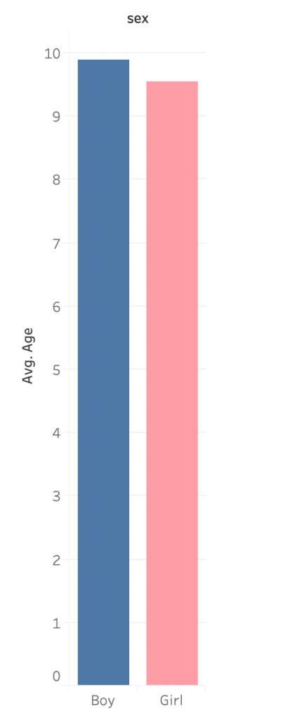
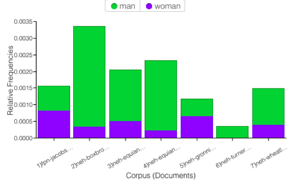
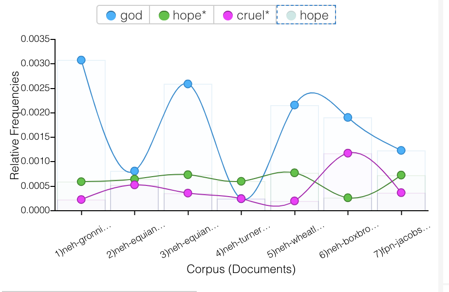
Using the Slave Names database, US Slavery in the 1860s and Slave Narratives, I created six visualizations that are meant to display the journey many slaves took to the new world. I did this through looking at words that are associated with traveling and the hopes and also the realities it embodied for these people.

Voyant Visualizations

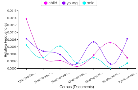
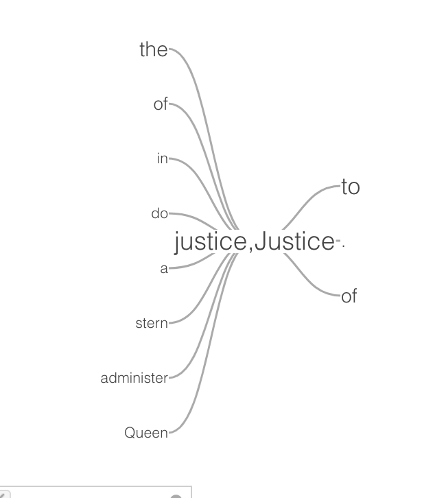
This wordtree with ship as the root word shows that the words most commonly associated with ship include those such as, merchant, gun, slave, and large. These word associations allow us to draw conclusions what the text was about and what might the person writing it was experiencing.

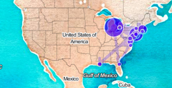
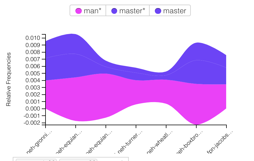
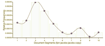
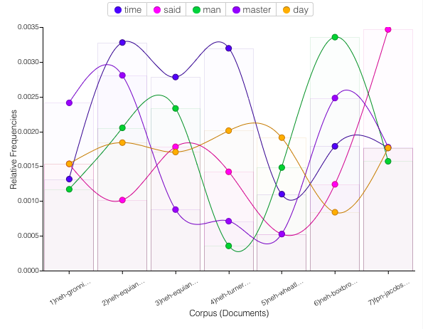
This bubbleline displays where in the seven texts are the words ship, captain, and freedom are located and the occurrence of them. As seen, a few of the texts barely mention these words, however in Olaudah Equiano’s writing it is shown that there is a chronological connection between talking about a ship, a captain and freedom.

A link visualization, similar to that of the word tree displays a network of words that are of higher frequency and words that are in high proximity to one another. In this case, the words in blue, the root words, are connected to words that are commonly associated which we can look at to determine what freedom meant to the author, or that time was a large aspect of being on a ship and gaining freedom.

Tableau Visualizations

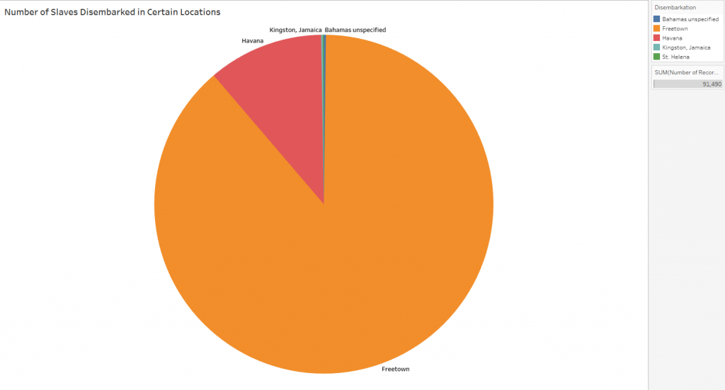
The slaves that were accounted for in the dataset disembarked in one of five places, and this pie chart visually displays the large number of slaves that disembarked in Freetown and Havana. The stark differences in numbers allows readers to draw conclusions that many more slaves must have been present in Freetown, or that there was a mistake or bias in the data.

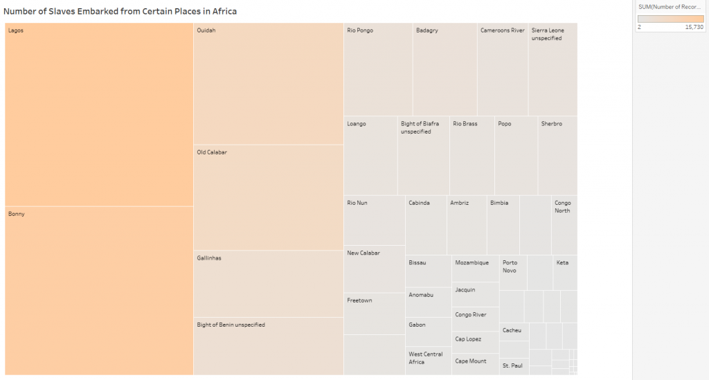
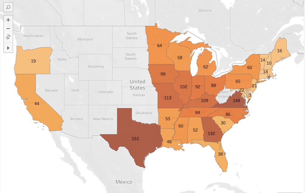
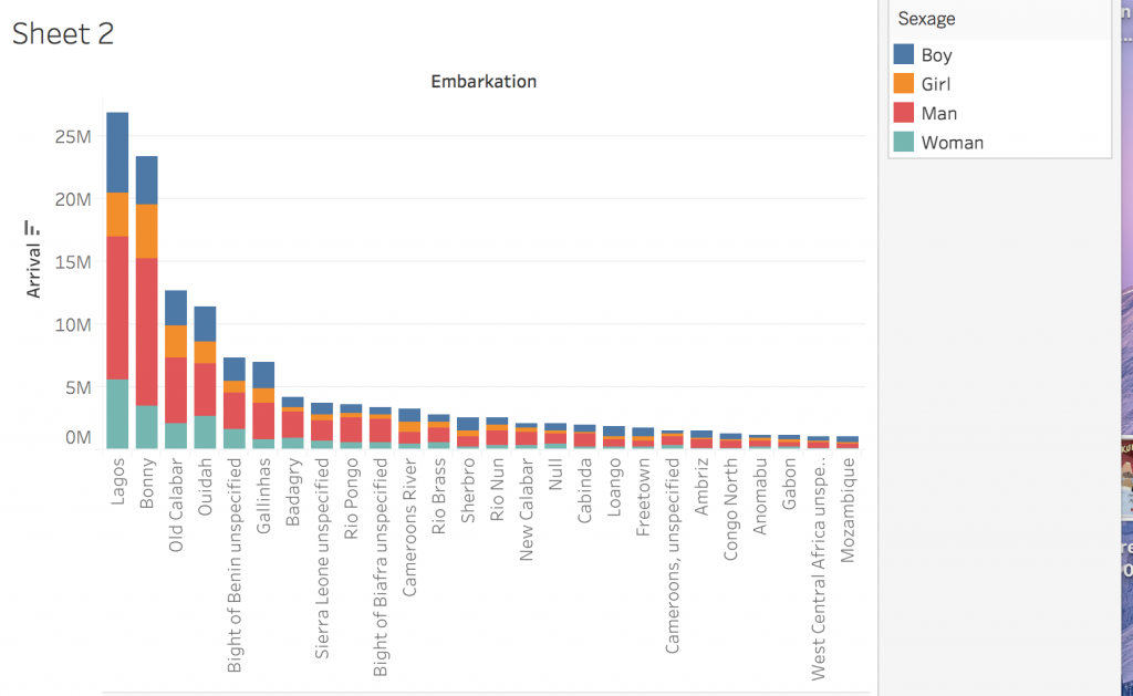
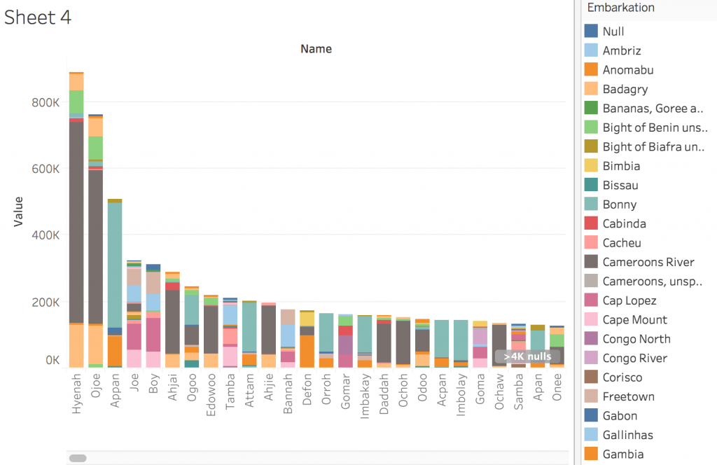
This tree map displays the places that slaves embarked from, and the concentration of slaves from that place. The color and the size of the rectangle display the concentration, showing that some of the areas of Africa were affected more than others.

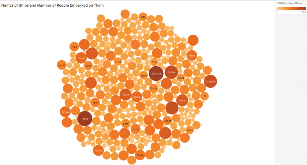
Similar to the tree map, this packed bubble chart shows the concentration of slaves who embarked on certain ships. Seeing the data in this way it is easier to see that many of the slaves who were accounted for were on a few major boats, or that those ships were much larger than others.

Comparison

Voyant is a platform that analyses qualitative data and creates visualizations based on them. Tableau is similar in that it creates visualizations of data to make it easier to view and understand, however it looks specifically at quantitative datasets. Voyant is able to look deeper into the written words of authors and analyze biases and backgrounds and how they might affect the writing and content of texts, where tableau is able to look at numbers and make assumptions based off of looking at relationships of numbers.

Visualization Practices

The creation of interactive visualizations and construction of text corpuses has verified Tanya Clement’s observation that visual platforms allow for greater insight, vantage points, and authenticity of data because they bring new light to datasets that cannot be seen by looking at numbers of texts in a spreadsheet. They can highlight relationships between variables that seemingly are not related prior, but indeed draw interesting conclusions. Defamiliarizing and deconstructing texts is helpful in creating a multidimensional viewpoint, looking at more than just the words on a page, but what they mean and why they are used. Digital visualizations do not simplify the data, it makes it easier to understand and analyze, showing immutable truths.

Categories
Assignment 2

Assignment 2

Slave Location

Voyant: Slave Narratives
Tableau: Slave Population in U.S.

I used Voyant to analyze the seven slave narratives, those of which named locations in the U.S., by creating a dreamscape visualization that resembles a map. The map focuses in on the states mentioned throughout the narratives with circles representing each state. The bigger the circle location, the more frequently it is mentioned in the narratives. Voyant also has the ability to visualize links between states that are mentioned together in the texts. The visualization clearly shows the circles to be located on the East Coast and in the general Northeast area. This is due to the authors mentioning these areas in their narratives. Bigger, darker circles represent more popular areas in the texts. Links between states that the author mentioned together in the texts are represented by the arrows on the map. I used Tableau to create the second visualization. The program used data from the US Slavery 1860 data base to display the number of slaves of the United States on a map. A higher population of slaves is represented by darker hues of orange, as shown in the legend that I included. Although Voyant and Tableau visualize two different kinds of data, textual and quantitative, both programs seemed to display the same takeaway from the data. I thought it was interesting to notice the similarity between the two maps in the sense that the slave narratives and the slavery database focused in on similar areas of the country. 

Creating two different visualizations with different programs and data to portray a central idea takes some thought. I knew to use Voyant for the slave narratives as it is a tool for textual analysis, allowing for me to sort through the words in all seven texts. At the same time, it was able to pick out which words were states, helping to create the map visualization. Tableau, being more of a tool for quantitative data, allowed for the creation of visualizations from databases. The program darkens the color of shaded states based on density. The more number of records accounted for in the data, the darker the shade of the state on the map.

However, I think that the different abilities of Voyant and Tableau did not well together to present the data I wanted, being the location and population of slaves in the United States during that specific period. Tableau created a better representation of the slave representation in the United States, spanning all the way from the North East to the South, and even over to the West. Anyone with a general idea of slavery in the U.S. would look at the visualization with an understanding of why certain states were shaded the way they are. On the other hand, Voyant’s visualization of states mentioned in the slave narratives is a misrepresentation of the slave population. The map’s nodes mainly focus on the Northeastern states, with few connections to the Southern states, which were a prominent part of slavery during the time period. This could be due to a focus on northern states throughout the slave narratives, but in regards to reasoning, I can’t seem to figure out why. Therefore, I think that using the slave narratives to create visualizations regarding slave population in the States is misleading and inaccurate. Rather, using the US Slavery 1860 data base gives a better representation of slavery overall during this time period in history.


Children

Voyant: Line Graph
Tableau: Bar Graph (Child’s age and gender)
tooltip: boy
tooltip: girl

Once again, I used Voyant to portray a similar correlation between three terms throughout the seven slave narratives; child, young and sold. One could assume that “sold” is referring to being sold as a slave, so I thought it would be interesting to take notice of how often young children are related to the world “sold” throughout the texts. From the line graph I created with Voyant, an association can be made between the three terms, as their lines tend to follow the same trend throughout the narratives. Although it is sad to think about, the strong correlation displayed by the visualization makes it clear that children being sold into slavery was a prominent topic of discussion throughout the texts.

Using age and sexage data from the African Names Database, I then used Tableau to create a bar graph which displays the average age of children in slavery. The bar graph focuses on children by only pulling data from the “boy” and “girl” sexages. I utilized the tool tip again by adding the number of records in order to show just how many young children were apart of slavery during the time. This visualization furthers my point regarding young children being sold into slavery. If the average age of children in slavery was around nine/ ten years old, there were definitley children much younger involved. Data visualization tools like Voyant and Tableau allow for the analyzation of data in ways that people may not have considered before. For example, you may have never known just how young slaves were if it were not for Tableau!

Gender

Voyant: Bar Graph
Tableau Pie Chart

I used Voyant to showcase how much more dominant men were than women in the narratives. The bar graph displays the relative frequencies of the words “man” and “woman” throughout the texts. It is very clear that, for the most part, men are discussed much more than women are. We can see that in Turner’s text, women were actually completely left out. Without Voyant’s easy-to-use program, it would be a lot harder to make this assumption about a set of texts without reading them. This tool allows for a general analyzation of something in a simple, time-sufficient way.

Using Tableau and the African Names Database, I was able to create a pie chart portraying the genders and ages of slaves in the data set. I thought it was interesting to compare to my Voyant visualization to, once again, display how insignificant females were in comparison to men at this point in time. Males (man and boy) are represented by green and blue colors while females (woman and girl) are represented by red and pink colors. The chart shows that men are the most dominant group of slaves, followed by boys, women, and girls. The tooltip in Tableau allows for the viewer to more clearly see the order of most common gender and age group.  

After working with Voyant and Tableau, I now understand what each does and for what kind of data visualization they fit best. Voyant allows us to present qualitative data in an interactive, visually appealing way. Similarly, Tableau allows us to work with quantitative data sets to present information. Voyant is extremely useful for finding keywords in a corpus. Additionally, one can compare one work to another without having to read either piece, which can be very useful when considering long narratives. I found Tableau to be a little more complicated than Voyant, but after exploring its possibilities more, it became more familiar. To me, Tableau is much more impressive than Voyant in the sense that it compares such specific elements of each data set. In addition, it creates previews of what your visualizations may look like with the “show me” tab, which is something that I really liked about it. After becoming more familiar with the program, I was able to illustrate very interesting concepts.

Tanya Clement

The process of corpus construction and the creation of visualizations using Voyant and Tableau has verified Tanya Clement’s concept of “differential reading.” She observed that the use of visualization platforms “combines the video streams from these cameras, and the resulting images duplicate a multidimensional viewpoint. That we are aware it is a virtual reality keeps us mindful of the processes we use to produce it, but the experience of this encompassing vantage point allows for a feeling of justice or authenticity that is based on plausible complexities, not simplified and immutable truths.” These processes allowed me to see features that I might not have seen with other platforms. While creating visualizations and using different data to display similar concepts, I was given the chance to see data from different perspectives, creating the multidimensional viewpoint she discusses in her observation of visualization platform. This viewpoint is important so that the viewer can experience multiple viewpoints and grasp a thorough understanding of the subject at hand. This can lead to a feeling of authenticity of the created visualizations.

Categories
Assignment 2

Assignment 2

In my visualizations, I was mainly interested in how slaves were dehumanized, how society reinforced this cruelty, and in what ways enslaved people persevered. In my visualizations through Voyant, I was focused on the relationships different words throughout the texts have to one another. I was interested in which words often coincide with other words, and if there is a relationship between them, even if they are seemingly contradictory words. The first graph I created analyzed how often the words “God”, “hope”, and “cruel” were used throughout all 7 of the texts. I chose these words because I wanted to see if there was a connection between “God” and “hope”, in the sense that slaves found hope through religion. I noticed that “God” was either used a lot, or hardly at all in the texts, and when it was used, it did not overlap much with “hope”. One observation I made about this graphic was how the words “cruel” and “hope” aligned in many of the texts. In the first 4 texts, and the 7th text, “hope” and “cruel” are used a similar amount, which I found interesting because they are such contrasting words. Specifically in the context of slavery, the fact that these two words were used together so often is a little shocking – when there is cruelty, there is also hope. It is almost to say that in spite of the cruelty, there was hope.

The next graph I created analyzes the use of “man” and “master” throughout the texts. Similar to my first graph, I was surprised by how often these words overlapped. “Man” and “master” specifically seem to be used together a lot, which is logical as the slaves would refer to white men as “master”, and slave owners might refer to their slaves simply by gender (which is furthered referenced in the Tableau graphs). The correlation between “man” and “master” speak to the clear roles established in this time period.

 The last graph I made using Voyant was a word tree centered around the word “justice”. There were some expected small words, like “the”, “do”, etc, but some of the other words shocked me. I found “queen” and “stern” in particular interesting. The idea of justice being associated with the queen is telling of the time period being written about. It also makes me question how just “justice” was. Using “stern” in reference to justice supports this doubt – stern justice sounds like cruelty being disguised as doing what is right. This association of words with justice says a lot about what was considered right and wrong at the time, and how this contributed to the cruelty touched on in the first two graphs. This idea of stern justice, being endorsed by the most powerful dictator of justice, provides some insight into how this dehumanizing and cruelty to the slaves occurred.

In Tableau, the first graph I created analyzed the genders of people coming from different embarkation locations. It breaks down the total number of people from each location into categories of man, woman, boy, and girl. I found it interesting how consistently the populations were male heavy – it lead me to question whether people were being gendered correctly. Based on my observations in Voyant, I was interested in which ways slaves were being dehumanized, and denied justice, and treating them as genderless, nameless, animals was one of them.

Next, I graphed how many men, women, boys, and girls had the same name. For example, the name Hyenah was used very frequently for all of the four categories. Another interesting categorization that confirmed my suspicion on lack of correct gendering, the name “boy” was used mostly for girls, and often for women, and very little for actual boys and men. This completely inaccurate gendering just goes to show how little the capturers were concerned with the slaves’ identity. Calling many people by simply “boy” reduces their identity to a hugely broad gender that, in most cases, was not even accurate.

Lastly, I created a graph that showed which names were coming from which embarkation location. For example, people named Hyenah were coming mostly from the Cameroons River. This visualization made me curious about how people were being assigned names. Was the name Hyenah very common in places like the Cameroons River, or did the white capturers just clump people together under the same name for convenience sake?

Tableau and Voyant were very useful for visualizing two totally different sets of data. Tableau creates graphs using numbers, which was perfect for visualizing the huge amount of slaves being transported, and their genders, names, and places of origin. I think Tableau was particularly good at combining different aspects of the same data set (for example, name, number of people, and embarkation location all in one graph). I also think Tableau provided many user friendly ways to customize graphs and make them more complex – for example, I found the tool tip feature very useful and effective in adding layers to visualizations. Also the ability to change colors and labels was useful and allowed for more creativity. Voyant, on the other hand, was able to visualize a huge amount of literary information in fascinating ways. The ability of this program to draw connections between even the smallest elements of literature, like individual words, is amazing and shockingly helpful for drawing larger conclusions about the text. Voyant was able to compare 7 different lengthy texts, while keeping the visualizations clean and easy to read. When using these two platforms in combination, I was able to draw connections between how slaves were being dehumanized, through a removal of their identity by calling them by gender or incorrect names, and in what ways society continued to enforce it, like through the skewing of the word “justice”.

To address Clement’s observation about visualizations creating multidimensional viewpoints, I think both Tableau and Voyant allow one to synthesize multiple different sources, and thus, multiple different viewpoints, to draw some larger conclusions. Through Voyant, it is possible to analyze 7 different texts at the same time, and find commonalities between all of them in terms of word usage and more. This kind of analysis yields more holistic conclusions and connections. For example, the correlation between the use of words “cruel” and “hope” over multiple texts is much more telling than if that connection were to be observed over just one text. Additionally, the ability to combine multiple aspects of the same data set through Tableau allows for connections to be made across categories that might not have ever been compared, like the relationship between certain names and embarkation locations. In a more broad sense, one aspect of both of these visualization platforms that I found created “a feeling of justice or authenticity”, was the ability to experiment with so many different combinations of data, sources, categories, and forms of visualization. This process made me feel like I had seen the data from many different perspectives, and thus, was able to create accurate and effective visualizations.

Categories
Assignment 2

Assignment #2

In order to construct my data, I met with Professor Faull to get a grasp on what it was that I wanted to look at. I hadn’t worked with Voyant nor Tableau before, so I felt overwhelmed with possibilities on what it was I could do. Professor Faull helped me to decide to look at “who are the enslaved people?” and to put this within the context of the 1860s texts.

Use of the word “slave” in Harriet A. Jacobs’ novel, Incidents in the Life of a Slave Girl
Most popular words throughout the corpus

Using Voyant, I analyzed both the corpus as a whole and the Jacobs reading. I chose the Jacobs reading specifically because it was the one document that was published in the 1860s, the time period of our data for the Tableau work. With Voyant, I studied the frequency of the word “slaves” as it appears in the Jacobs writing, which is meant to be a persuasive tool for the general public surrounding the idea that the ownership of slaves is wrong. I found it interesting that after the use of the word peaks around section 3 of the document, it has a sharp drop and doesn’t really rise back up.

Another idea I looked at with Voyant was the most popular words used throughout the corpus and how often each document used the most popular words. The main takeaway I gathered from this is how much more the Jacobs document uses the word “said” compared to the other documents in the corpus, indicating that this document is likely very different stylistically from the other documents; perhaps in its structure or point of view. Further, some consider higher use of the word “said” to indicate text that is less reliable than works that have less reported text.


Where did the enslaved people come from?
Which counties in the U.S. had the most enslaved people relative to their total population?

With Tableau, I was interested in mapping the geographical locations of slaves, both before they were enslaved and as they were enslaved people. It was challenging to find coherent information for the data surrounding the enslaved people’s country of origin, because there were many slight differences in some spellings of countries, e.g. “the Democratic Republic of Congo” vs “Congo.” Nonetheless, the data that was available for the number of enslaved people living in the United States was slightly more readily accessible, and I mapped it on Tableau by percentage of the county population that was enslaved.

In doing my own research, I wanted to know what other sources had to say about where enslaved people typically came from. I went to history.com, which noted that “of those Africans who arrived in the United States, nearly half came from two regions: Senegambia, the area comprising the Senegal and Gambia Rivers and the land between them, or today’s Senegal, Gambia, Guinea-Bissau and Mali; and west-central Africa, including what is now Angola, Congo, the Democratic Republic of Congo and Gabon.” Comparing this information to the maps I created makes sense for both the maps and the website, as the concentrated areas on my map primarily represent Senegambia and west-central Africa.

One thing I found interesting about the data set I was working with is how it left out some interesting and important details about the individuals who were taken from Africa to the Americas: some did not make it (source: gilderlehrman). In fact, about twelve percent of those who embarked did not survive the voyage to the Americas, but no one would know that by simply looking at the visualizations I created. A more effective visualization would be able to take this into consideration, as well as the number of individuals from/to each location.

Using Tableau and Voyant together is beneficial to an individual’s broader understanding of a topic. Tableau allows people to visually map data and quite literally see where people had been to where they were sent as enslaved people, which is quite powerful. Voyant allows people to gauge patterns and apply those to specific dates or time periods. Using the two pieces of software together makes for a powerful tool. Tanya Clement observed that the use of a visualization platform “combines the video streams from these cameras, and the resulting images duplicate a multidimensional viewpoint” and went on to discuss the encompassing vantage point, which is relevant through the use of Tableau and Voyant because the programs provide what Lima introduced in Chapter 2 as organicism. Organicism states that reality is best understood as an organic whole; in this context, Tableau and Voyant not only provide geographical locations, they also provide patterns of speech and text.

These tools allow us to perform what Clement describes as “differential reading,” which means to be both close and distant; subjective and objective. We do this through looking at human elements and analyzing things like vocabulary to deconstruct and then reconstruct data and text. As Professor Faull says in her essay, “The earliest ventures into thinking about visualization and literature are not at all digital, but rather focused on both the graphical rendering of plot and character and also the extraction of metadata from collections of documents.”

Categories
Assignment 2

Assignment #2

I used Tableau to analyze the African Slave Names database and the US Slavery in the 1860s data and Voyant to analyze the Slave Narratives. When initially interacting with the data sets to get a better sense of what the information was about and to better understand the two platforms, I became very interested in the differences between men and women. Specifically, I wanted to get a sense of what it was like to be a woman during the 1800s. I began looking into trends and finding patterns which helped me focus my development of the data.

What caught my eye when looking at the raw Slave Narratives was that both Nat Turner and Phillis Wheatley had their narratives published within three years of each other. I felt that focusing on these two particular narratives would be beneficial in evaluating the differences between men and women because Phillis Wheatley was a woman and Nat Turner was a man and they would be easily comparable given how close the publication dates were to each other.

The above Cirrus reflects the most common words in Phillis Wheatley’s Narrative.

The below Cirrus illustrates the most frequently used words in Nat Turner’s Narrative.

The below illustration depicts the most frequently used words in both narratives as well as the most unique words in each individual narrative.

In Voyant, I first created two wordclouds and put them side by side to one another with the bottom one reflecting Nat Turner’s narrative and the top one illustrating Phillis Wheatley’s narrative. I learned right away that in the wordcloud, size matters. The size of the text is a proportional representation of number of words in the corpus. By looking at the cirruses alongside the summary of frequent and distinctive words, I was able to see that the word “death” appeared frequently in both narratives. Given the state of the country at the time and the terrible conditions both Wheatley and Turner faced, I am not surprised to see how prevalent the word “death” was. On the other hand, it was interesting to me that the word “blood” was used often in Turner’s narrative, but not in Wheatley’s. I continued to question how gender roles played into this result and thought about how Wheatley, as a woman, could have had more of a passive role in the fight against slavery. I kept this in the back of my mind as I continued to explore the data set.

However, what was most interesting to me was when I looked at the most distinctive words in each corpus because I feel that it provided me with insight into the gender differences that occurred. In the Wheatley narrative, the words “heavenly” and “skies” were most unique. After looking at other narratives from other female slaves which were published around the same time period, such as Bethany Veney, I noticed that the female slaves, in particular, relied heavily on religion to get them through the difficult times. They spent a lot of time hoping and praying for freedom and for better days in the future. The women seemed to have more of a positive outlook on the situation than their male counterparts. The comparison of Wheatley’s narrative to Turner’s narrative further affirms this theory as the distinct words in his narrative were “party” and “southampton.” These words are also significant because Turner took a very active role in the fight against slavery. He led a gory rebellion against white people which took place in southampton. He took a much more active role than Wheatley in the fight against slavery which made me consider the stereotype that women are supposed to be more passive and take a more submissive role.

I further investigated my theory of the prevalence of hope in the women’s narrative by comparing the usage of the words “god,” “hope,” and “love” in Wheatley’s narrative to Turner’s narrative. The above visualization reveals my findings. Like I previously suspected, these positive words that I selected are found in Wheatley’s narrative 101 times compared to Turner’s 8 times. This difference is significant and really makes me wonder how much gender stereotypes have played into this.

I continued to look at the trends involving gender when I analyzed the African Slave Names Database and US Slavery in the 1860s data using Tableau. I decided to plot the number of women slaves who arrived in the US by the year in which they arrived. I noticed that 1829 was the year when the most number of women were brought over. To get a historical context for this, I researched significant events that occurred during 1829 in US history. I discovered that this was the year when “David Walker of Boston publishes his fiery denunciation of slavery and racism, Walker’s Appeal in Four ArticlesWalker’s Appeal, arguably the most radical of all anti-slavery documents” (US History). Immediately following 1829, the number of women slaves coming to the US started rapidly declining, which makes me believe that Walker’s work had a strong impact on society. This event is also significant because Walker is from Boston, which is where Wheatley lived after being brought to the US. Around thirty-five years after her death, a movement against slavery began close to where she lived. How come Wheatley was unable to have the same success as Walker? Could it be because more time had passed or is it because Wheatley, as a women, was not taken seriously by society? This process of working with the data sets and analyzing them from different perspectives allowed me to consider these reasonings that I would never had even considered if I was just presented with the raw data.

I wanted to find the country where the most women came from using the African Names Database. I sorted the data so that only the records of women showed and I was surprised at how much of an imbalance I found in the result and how much of a lack of information there was. I found that 163 women came from the country Eboo, Hebo, but I could not find anything about this online. In fact, nothing came up when I searched it. This process of analyzing the data exposed biases in data collection and how populations of people are just unaccounted for. The next country to have the largest amount of women was Calabar. 43 of the women in the database came from there. This is interesting to me that such a large percentage of the recorded women came from one country.

I then decided to pivot a little bit and look into the state of Virginia, where Nat Turner lived after being brought to the US. As illustrated in the visualization below, almost thirty years after his death, slavery was still extremely prevalent in the state of Virginia. The visualization depicts the state of Virginia and the darker colors represent the counties with the largest amount of slaves in the population. Despite Turner’s anti-slavery efforts, the issue remained very apparent even years later.

After working with both Voyant and Tableau, I believe that I got a better sense of what each platform is like and when it is most beneficial to use. Tableau allows me to work with quantitative data sets and present the findings in visually appealing ways. Voyant, allows me to do the same thing, but with qualitative data instead. As discussed in the Faull reading, Voyant “allows for the ‘algorithmic’ reading of literary language, and serves as an entry point into the field of computational and corpus-based linguistic analysis of literary texts” (Faull 4). To me, the most beneficial thing about Voyant is that it provides keywords and contexts in the corpus. It allowed me to take the large narratives filled with huge volumes of text and figure out the main themes and concepts of them without having to read every word. Furthermore, it allowed me to compare the narratives with one another and find similarities and differences in a matter of seconds. Specifically, this was most beneficial when I compared Wheatley’s narrative to Turner’s. I was able to see what the differences in life of Wheatley and Turner were and was able to compare their specific narratives to historical trends to draw conclusions. Tableau was helpful to me because I was able to interact with the two large data files and compare specific elements of each in a creative, aesthetically pleasing way. I found the “show me” tab to be really helpful in getting started with the creation of my visualizations. However, I encountered problems when I tried to put certain dimensions/measurements into a specific column or row and it would not let me. As I began to use the platform more, I became more familiar with it, but still had some difficulty. Tableau helped me illustrate the distribution of slaves in the US on a map, which makes it much easier to the viewer. Instead of having to go through a large excel file, I was able to manipulate the data to produce the outcome I wanted. Both platforms are similar in that they allowed me to go through large sets of data (whether that was qualitative or quantitative) and discover the answers to my questions without having to analyze every single word/number.

Both Tableau and Voyant allowed me to practice the concept of “differential reading” discussed by Tanya Clement. This process of corpus construction and creation of iterative visualizations allowed me to identify features I might not have seen, “make hypotheses, generate research questions, and figure out prevalent patterns and how to read them” (Clements). Voyant, in particular, allowed me to realize how texts differed from one another and how they related. I was able to find patterns and relationships among the data sets. Furthermore, like we discussed in class, this process has allowed me to see the complexities of gender and race. I was able to see the big picture of the data in front of me and get additional “data points” that I would not have seen or have collected without embarking on this process. I was able to get a more holistic representation of society and breakdown any previous misconceptions I had. Utilizing Voyant and Tableau allowed me to synthesize things to make a multi-dimensional, authentic viewpoint.