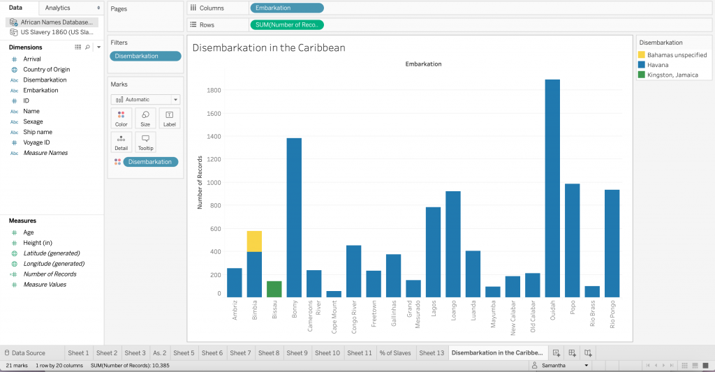
Using Tableau and Voyant to engage with quantitative and qualitative data presented different questions and varying solutions. In Tableau I tried to allow the available data to inform my choices, with the goal of creating some sort of story from the data. I created two visualizations using the African names database, the first of which is an examination of slave disembarkation in Caribbean. This bar chart illuminates the most prevalent location (Cuba) in this dataset. I began thinking about this data with the Caribbean in mind, and initially with disembarkation as a column and embarkation as a color, but after experimenting with the axis and the colors I found a more interesting way of illustrating the data. Those who embarked in Bimbia disembarked in both Cuba and the Bahamas (despite differing ships) – a detail that could have been easily overlooked without this method of visualization.
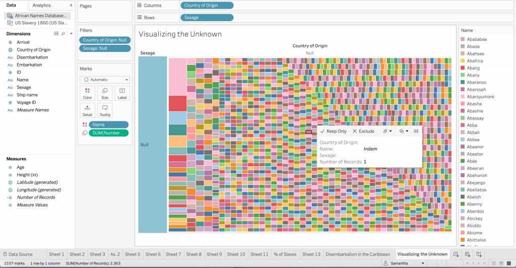
For the second visualization I considered what it would look like to see the “null” or unknown data. I think the lack of documentation can tell us something. So instead of simply excluding the “null” data I created a tree map only consisting of this information. The diversity of colors represent stories that are not told through data or otherwise. To draw from D’Ignazio and Klein’s idea of bringing the bodies back into the conversation, I do not believe that the absence of ‘country of origin’ and ‘sexage’ make these records, or rather these people invalid. All of these people have an untold story, I think this visualization demonstrates the diversity of possibilities.
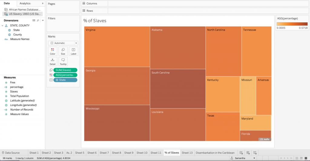
The third visualization comes from the US Slavery 1860 dataset. After creating the map in class and thinking about the usefulness of picturing geographic data in a medium other than a map I created a tree map to visualize the percentage of slaves in each state. This was helpful for me because seeing how the size of the sector correlated with the number of slaves while the color showed the states with the highest percentage of enslaved people was important so as not to get confused by the physical size of the state. The darkness of the orange in Florida makes a statement despite its small sector, or perhaps because of it.
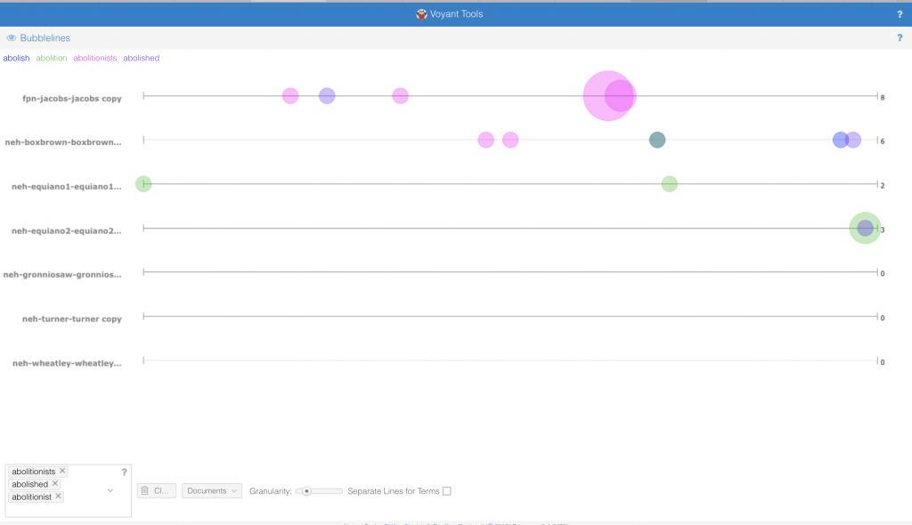
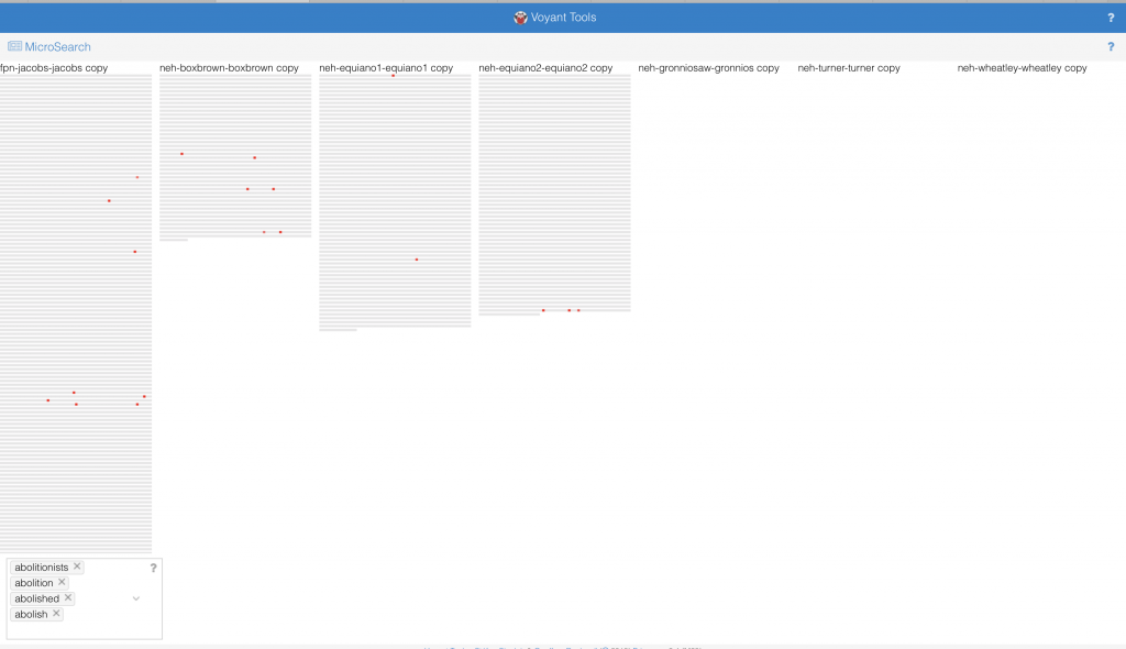
On reflecting upon the complex publication history of slave narratives and their function in the abolitionist movement I thought about how frequent abolition came up in the course of each narrative. The contexts tool in Voyant not only allowed me to see the appearance of iterations of ‘abolish’, including ‘abolition’ and ‘abolitionist’, but also their relative location in the texts. The narratives of Henry Box Brown, Harriet Jacobs and Olaudah Equiano each have some version of abolish/abolition in their texts while the others do not. Bubblelines show the frequency and temporal distribution in the narrative using colored bubbles instead of text. The temporalities of these texts may allow us to understand the diction. The word frequency in Equiano’s narratives (1789), Box Brown’s (1851) and finally Jacobs’ (1861) increases with time. However, there is a substantial gap between Equiano’s two part narrative and the second two. I began to question how the abolitionist movement featured in this trend. After conducting the distant reading I attempted to do a close reading with the goal of a differential reading in mind. I discovered that Equiano had many abolitionist friends and was a pioneer of the movement, which explains such early uses of words like abolition and abolished in this kind of text. In the mid to late nineteenth century the movement was most charged, and Brown and Jacob’s narrative were likely used directly for this purpose whereas Nat Turner’s (1831) for example could not be so explicit in that way. Having already read Turner’s narrative I was able to understand how that text fits in with the corpus, and how forces outside the usual publication history would account for lack of abolitionist discourse. Voyant’s tool allowed me to trace in incline of words like abolish and abolitionist, and how this incline mirrors the timing and momentum of the abolitionist movement.
The Microsearch tool provides a different way of seeing the same data, simulating a paragraph that signifies the length of each narrative. The placement of the dots indicates the relative frequency of the words among the texts. Instead of using multiple colors to represent multiple words, the red operates like a density graph or chart – where darker areas signify greater word frequency. Something I found interesting, however, is that if a word did not appear in a text that representative paragraph was erased instead of being left empty. The absence of the paragraph like structure does not allow for a direct comparison between the length of all narratives and the frequency of the word. It also has problematic implications: if a writer/narrator does not use particular vocabulary, is his or her narrative unimportant to the conversation?
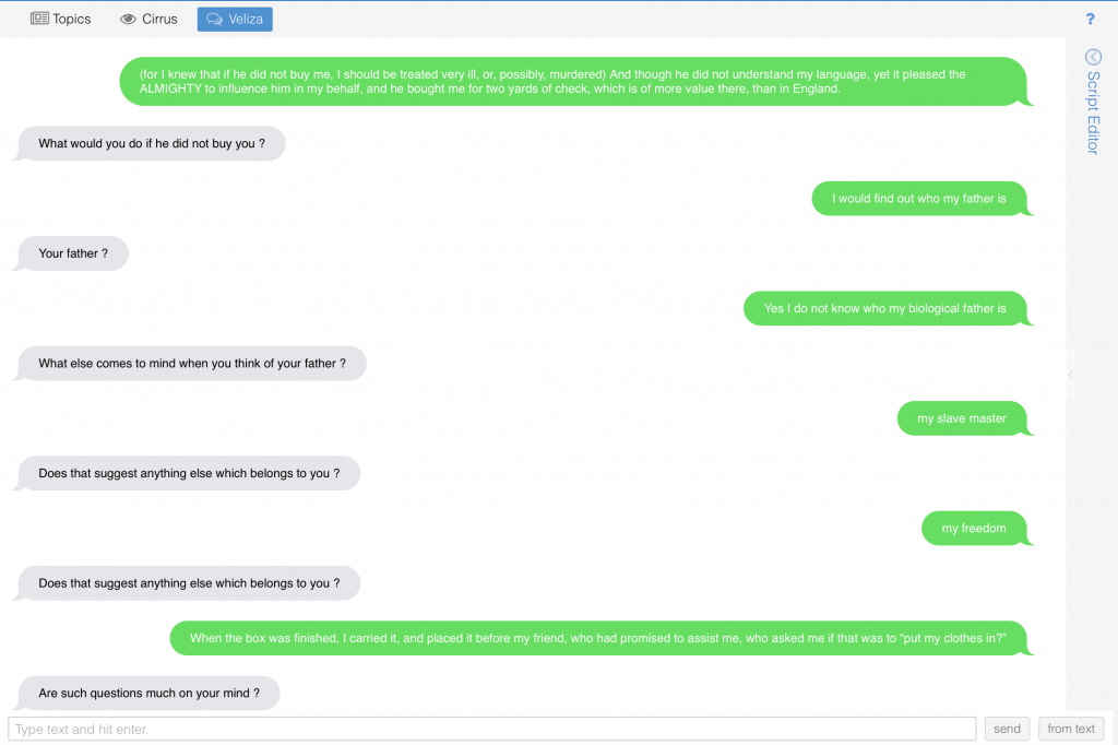
Veliza, an experimental tool is a way of visualizing how texts may literally talk to each other. This simulation is eerily similar to an iMessage conversation from an aesthetic standpoint. Voyant Tools Help states that “the original Eliza was designed as a (parody of a) Rogerian psychotherapist, so the more you write content that sounds like it could be expressed to a psychologist, the more satisfying your results are likely to seem.” In this instance the user is encouraged (by the programmers and the program itself) to focus on feeling and puts the user in the shoes (for lack of a better term) of the enslaved person. The interaction with the visualization is like conversing with the enslaved, and psychoanalyzing their experience of slavery feels inappropriate. Also on the user is put in the odd position of the slave by using this interface. This does not seem to give the one who is enslaved agency, but functions in a similar way to the storyteller/transcriber structure that characterizes the slave narrative. It almost reads as abolitionist propaganda. While very interesting, this tool does not seem tailored to this sort of material. This brings back to mind how blackness is often not considered by those with the power to program, and the ways these programs function to reinforce racist ideologies.
I believe that the etymology of the words Tableau and Voyant, illustrate the differences in each visualization tool. The former, from the 17th century demotes a picture, representing a scene from a story or quite literally a small table. Alternatively, the latter comes from Old French voiage, meaning ‘provisions for a journey’. In my experience of both platforms Tableau indeed operates like a picture using quantitative data to create a static visual, while Voyant’s tools foster a more dynamic interaction with the qualitative data by showcasing the movement of data. So, while Tableau is able to ‘picture’ data, Voyant actually supports some measure of dialogue, exemplified in my last visualization. This prompted me to think about the interface and agency, along with its limitations. The question of who creates these data visualizations resurfaces. Who are these platforms made for? Can the text speak for itself, or does the reader/user speak for it? Overall more control in Tableau to manipulate data while Voyant has specific built-in methods to accomplish a similar end. The approaches, however, seem to stand for opposing ideologies of piercing a text versus ranging over a text. A logbook for example would hold data used to create the African Names database and the various slave narratives are the sources for the corpus used in Voyant. While there is likely to have been more than the clean categories of the dataset in the logbook, it is ‘pierced’ in order to locate value or meaning. Alternatively, in Voyant we are invited to range over the entirety of the text, seeing how each part informs the whole.
Despite these differences I think both platforms allow the user to see data from multiple angles and how each way of handling the data is informed by a particular goal. Furthermore, the opportunity to play with the data emphasizes that without a goal in mind one can freely observe how the dataset interacts with itself. With an understanding of how Tableau and Voyant operate as users we can choose either to take a snapshot or to embark on a journey. While Voyant prompted me to do a close reading, Tableau encouraged me to find a way to see information that could not be close read.
