I started my visualizations with Voyant Tools, to visualize the narratives of enslaved people. First, I prepared the corpus by arranging the text them based on the date written and filtered out more stopwords from the text off the most frequent 25 words, taking out the following: day, told, soon, people, men, man, thought, soon, said, saw, mr, heard, went, come, came, knew, know, like.
Out of the remaining words, I was interested to see that the word ‘children’ was mentioned many times, so I tried to focus on it to see if there were any meaningful connections. Looking at the trendline, Harriet Jacobs was the only one who wrote significantly about this, and by examining the bubblelines visualization, she used the word ‘children’ quite often throughout her narrative. Referring to the title of the memoir, “Incidents in the Life of a Slave Girl. Written by Herself,” it could refer to her own childhood.
Interested in exploring this further, I looked into different visualizations and found that a wordtree yielded the most information about what Jacobs was writing about. In the following visualization, we can see that a lot of the connections made with the word children are varied, and we can through most of the connections that she was talking about the children that she has encountered in her life, e.g. connections such as “master’s, grandmother’s, mother’s.”
Aiming to deconstruct the text further, I shifted to a more analytical collocate view of the word. Reading through the list, I discovered that some terms that had more negative connotations, such as suspicious, jail, or unhappy, had significantly less mentions. For me, this visualization raised up the question of how much editing was done for a white audience back then, and hence, how true are the narratives to the author’s real feelings?
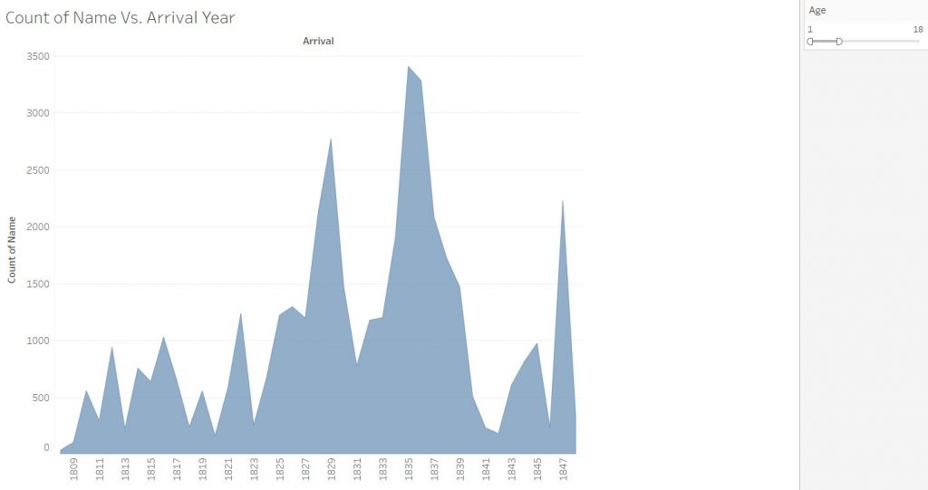
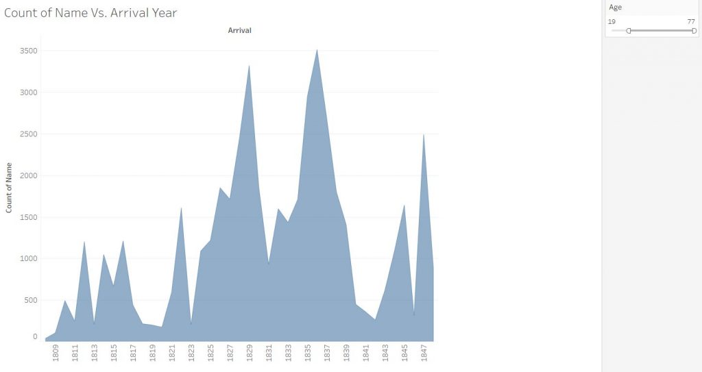
Shifting to Tableau, I used the African Names Database to construct some visualizations. Preparing the data involved correcting the categories, such as setting the arrival year as a date rather than a number value. The first thing I wanted to find out about was if there were any connections in the data for enslaved children. For this dataset, I set up a time versus count of names to visualize the enslaved people over the years, and added an age attribute filter to see how much the data would change based on two age ranges, 1-18 and 19-77. The data that came out, however, showed that the graphs between the two stayed relatively similar, leading to my hypothesis that children under 19 made up half the dataset.
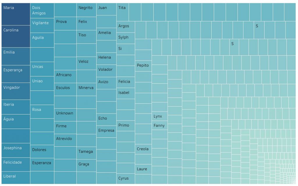
The next topic I wanted to explore was the ships themselves and how many people were usually on them. For this, I looked into making a tree map and successfully a visualization of how many people ships might have carried. The answer ranged from the most populous from 1116 enslaved people on the Maria to as few as just one on board. The tree map shows a very large number of ships which reveals a little bit of how many people had been taken from their homeland then.
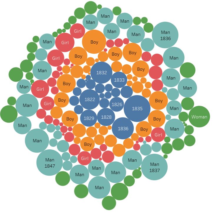
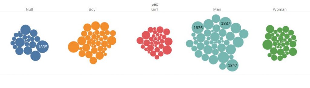
The final topic I looked into was the distribution of gender. Playing around with the data, I managed to put it into a packed bubble visualization, and then categorized them by sex. The data shows some clear information. Men were the most enslaved compared to other sexes, and there are a surprising number of non-records.
Using both Voyant and Tableau, I found a stark difference between the two. Voyant, being more capable of qualitative analysis, gave me visualization upon visualization, no matter what I wanted to focus on, or if there was no specific focus at all. The avenues of exploration really let the user find more possible connections. However, Voyant’s results are mostly connections that need to be built on with other, different views that rely on the user making these assumptions. However, when it came to using Tableau, I needed to be very specific on what I wanted from the data. Unless I was able to supply the data types that Tableau needed for the visualizations, there would be no meaningful visualizations. This brings a bit of frustration in setting up the data for success, but the results are, therefore, more concrete than Voyant. A commonality between these two tools, however, is that they show connections that we might not have seen before by looking at the data without them. These tools either save time as well, either by pulling out metadata to analyze or building correlations with numerical data.
From this assignment, it was using Voyant that strongly verified Tanya Clement’s observation of a visualization platform combining multiple views and creating a multidimensional standpoint. Using a single view of the Voyant tools did not give a meaningful view into the slave narratives, but using them together with the viewpoint focused on the word ‘children’ helped layer more meaning onto the visualizations, resulting in a stronger argument that is based on ‘plausible complexities’ as Clement states. For quantitative information, it is harder to not end up with simple answers, due to the defined fields that we must put the data in to get the desired visualizations. However, as with the Voyant visualizations, putting together more data in Tableau allows for a more complete picture, as we pick and select what data to highlight in each of our visualizations, potentially leaving some data unexplored.
