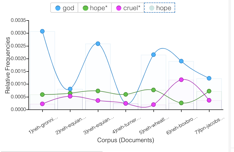
In my visualizations, I was mainly interested in how slaves were dehumanized, how society reinforced this cruelty, and in what ways enslaved people persevered. In my visualizations through Voyant, I was focused on the relationships different words throughout the texts have to one another. I was interested in which words often coincide with other words, and if there is a relationship between them, even if they are seemingly contradictory words. The first graph I created analyzed how often the words “God”, “hope”, and “cruel” were used throughout all 7 of the texts. I chose these words because I wanted to see if there was a connection between “God” and “hope”, in the sense that slaves found hope through religion. I noticed that “God” was either used a lot, or hardly at all in the texts, and when it was used, it did not overlap much with “hope”. One observation I made about this graphic was how the words “cruel” and “hope” aligned in many of the texts. In the first 4 texts, and the 7th text, “hope” and “cruel” are used a similar amount, which I found interesting because they are such contrasting words. Specifically in the context of slavery, the fact that these two words were used together so often is a little shocking – when there is cruelty, there is also hope. It is almost to say that in spite of the cruelty, there was hope.
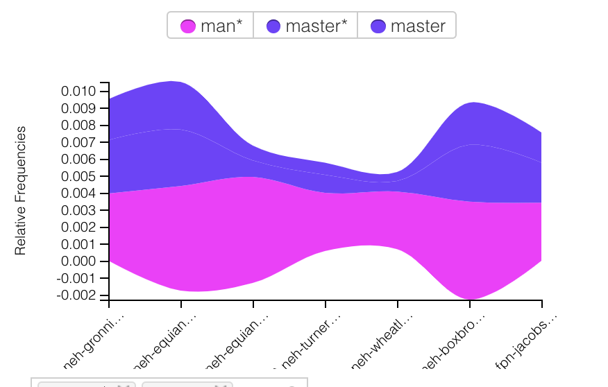
The next graph I created analyzes the use of “man” and “master” throughout the texts. Similar to my first graph, I was surprised by how often these words overlapped. “Man” and “master” specifically seem to be used together a lot, which is logical as the slaves would refer to white men as “master”, and slave owners might refer to their slaves simply by gender (which is furthered referenced in the Tableau graphs). The correlation between “man” and “master” speak to the clear roles established in this time period.
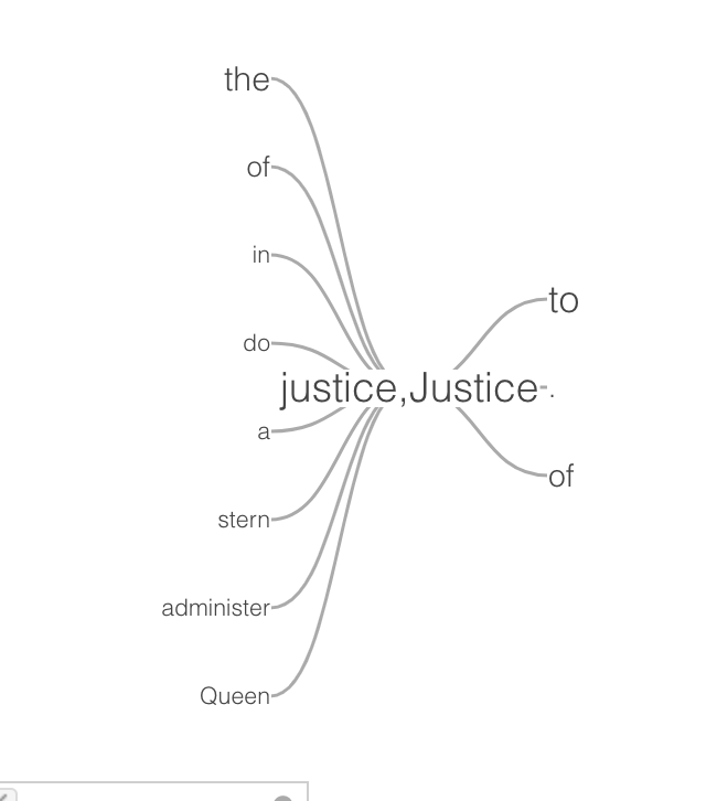
The last graph I made using Voyant was a word tree centered around the word “justice”. There were some expected small words, like “the”, “do”, etc, but some of the other words shocked me. I found “queen” and “stern” in particular interesting. The idea of justice being associated with the queen is telling of the time period being written about. It also makes me question how just “justice” was. Using “stern” in reference to justice supports this doubt – stern justice sounds like cruelty being disguised as doing what is right. This association of words with justice says a lot about what was considered right and wrong at the time, and how this contributed to the cruelty touched on in the first two graphs. This idea of stern justice, being endorsed by the most powerful dictator of justice, provides some insight into how this dehumanizing and cruelty to the slaves occurred.
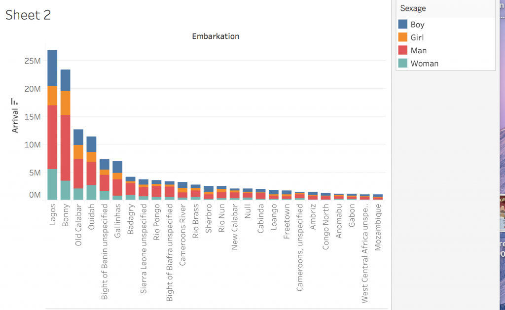
In Tableau, the first graph I created analyzed the genders of people coming from different embarkation locations. It breaks down the total number of people from each location into categories of man, woman, boy, and girl. I found it interesting how consistently the populations were male heavy – it lead me to question whether people were being gendered correctly. Based on my observations in Voyant, I was interested in which ways slaves were being dehumanized, and denied justice, and treating them as genderless, nameless, animals was one of them.
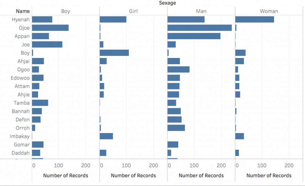
Next, I graphed how many men, women, boys, and girls had the same name. For example, the name Hyenah was used very frequently for all of the four categories. Another interesting categorization that confirmed my suspicion on lack of correct gendering, the name “boy” was used mostly for girls, and often for women, and very little for actual boys and men. This completely inaccurate gendering just goes to show how little the capturers were concerned with the slaves’ identity. Calling many people by simply “boy” reduces their identity to a hugely broad gender that, in most cases, was not even accurate.
Lastly, I created a graph that showed which names were coming from which embarkation location. For example, people named Hyenah were coming mostly from the Cameroons River. This visualization made me curious about how people were being assigned names. Was the name Hyenah very common in places like the Cameroons River, or did the white capturers just clump people together under the same name for convenience sake?
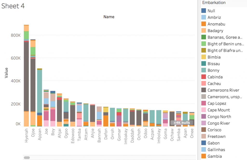
Tableau and Voyant were very useful for visualizing two totally different sets of data. Tableau creates graphs using numbers, which was perfect for visualizing the huge amount of slaves being transported, and their genders, names, and places of origin. I think Tableau was particularly good at combining different aspects of the same data set (for example, name, number of people, and embarkation location all in one graph). I also think Tableau provided many user friendly ways to customize graphs and make them more complex – for example, I found the tool tip feature very useful and effective in adding layers to visualizations. Also the ability to change colors and labels was useful and allowed for more creativity. Voyant, on the other hand, was able to visualize a huge amount of literary information in fascinating ways. The ability of this program to draw connections between even the smallest elements of literature, like individual words, is amazing and shockingly helpful for drawing larger conclusions about the text. Voyant was able to compare 7 different lengthy texts, while keeping the visualizations clean and easy to read. When using these two platforms in combination, I was able to draw connections between how slaves were being dehumanized, through a removal of their identity by calling them by gender or incorrect names, and in what ways society continued to enforce it, like through the skewing of the word “justice”.
To address Clement’s observation about visualizations creating multidimensional viewpoints, I think both Tableau and Voyant allow one to synthesize multiple different sources, and thus, multiple different viewpoints, to draw some larger conclusions. Through Voyant, it is possible to analyze 7 different texts at the same time, and find commonalities between all of them in terms of word usage and more. This kind of analysis yields more holistic conclusions and connections. For example, the correlation between the use of words “cruel” and “hope” over multiple texts is much more telling than if that connection were to be observed over just one text. Additionally, the ability to combine multiple aspects of the same data set through Tableau allows for connections to be made across categories that might not have ever been compared, like the relationship between certain names and embarkation locations. In a more broad sense, one aspect of both of these visualization platforms that I found created “a feeling of justice or authenticity”, was the ability to experiment with so many different combinations of data, sources, categories, and forms of visualization. This process made me feel like I had seen the data from many different perspectives, and thus, was able to create accurate and effective visualizations.
