Image 1
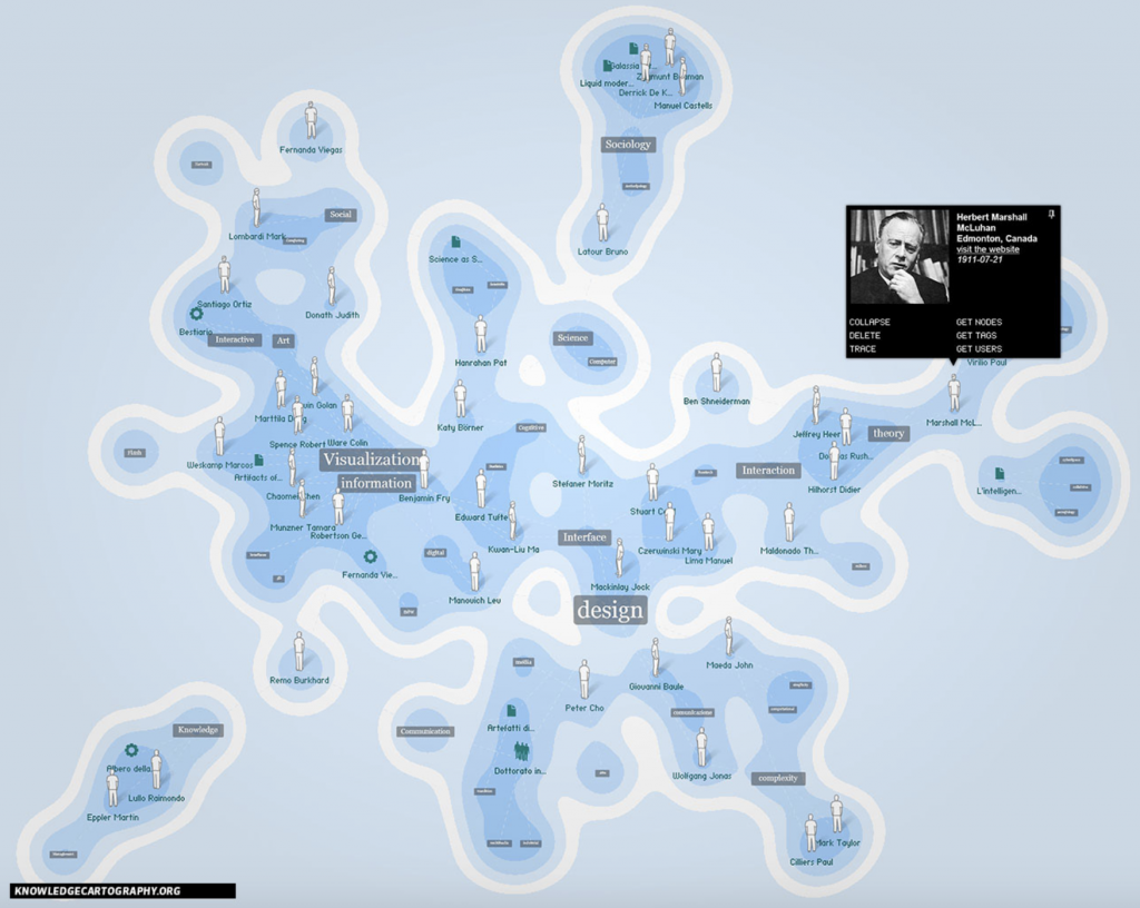
I chose this first visualization for its combination of cartography and knowledge. It is a system of representation of space, which communicates complex contexts through overlapping texts and diagrams.
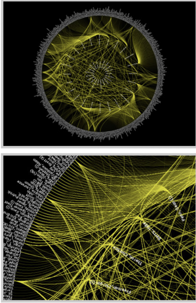
This visualization of the patterns between Oscar winning actors, directors, and other actors that they work with. I chose this visualization to analyze for that it displays information that is accessible to the public, however difficult to display into one visualization due to its complexity of rings and spokes.
The first image of the history of visualizations using knowledge cartography is a dynamic visualization for that once you click on the different texts it further information pops up. The second visualization is static, and is one large visualization that displays all of the Oscar information in a single graphic. Static visualizations, many being “infographics are worthy of reflection and study on their our term”, due to the multiple aesthetic dimensions (DuBois 15). Data in both examples can be interacted with and viewed in different perspectives depending on what parts of the image is being highlighted, and information being focussed on. The network thinking that both visualizations use “are giving way to new ideas that are able to address the inherent complexities of modern society” (Lima 69). Material is better understood and learned through visualization, and these networking and mapping strategies contribute to more complicated information being shown.
Digital Humanities Sample Book
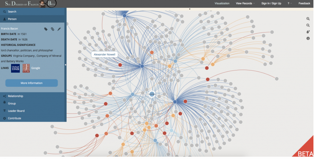
This visualization from the Digital Humanities Sample book called The Six Degrees of Francis Bacon. I chose this for its obvious use of tree hierarchy to display the important information and have leaves and branches off of the main points. This is a dynamic visualization for that is moves with the viewer and forms to what information is being analyzed. As” Newman describes trees as a connected, undirected network that contains no closed loops… a tree is considered a connected network because every node can access any other node by following a path” (Meirelles 57). This is important in being able to interact with the data in different ways by scanning over and clicking on different points. This dynamic and interactive visualization allows viewers to interpret the information differently and understand material in ways that others may not, and only focus on what material deems to be important.
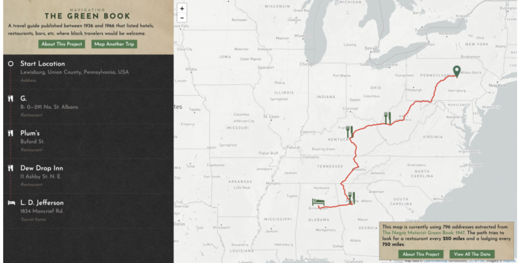
Navigating the Green Book is an interactive site that allows its viewers to visualize the 1900s Green Book. I chose this for that it was unique in that one could enter any addresses and find where an African American could stop to eat or sleep. This is a highly dynamic visualization for that one must enter in locations to find out more information. Different locations brings different results and new material. This display not only allows viewers to bring up their own location, but they can also click and get information on the icons or look at a particular city and all of the friendly places in it, not just on route. Because “many of the problems that individual people face are often the result of larger systems of power, but they remain invisible until those people bring them to light”, this site brings these problems to light by creating room for different viewpoints and using cartography (Klein). By having a mapping service that is easy to use and similar to other navigating apps, people are introduced to the data in a familiar fashion, instead of in a visualization that people do not know how to use.
