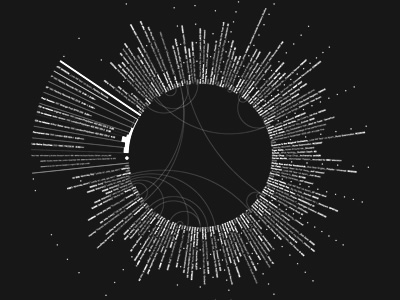
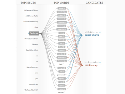
The rationale behind me choosing these two visualizations is relatively straightforward. First off, they caught my eye when exploring the different sections, and second, these visualizations display their data in a creative and interesting manner. The first visualization uses Joy Division’s original recording of “Love Will Tear Us Apart” and maps the lyrics of the song in relation to the 85 plus covers of the song done by various bands over time. It is a static visualization meaning it is not interactive, what one sees is what one gets, so to speak. Using the shades of black and white to make the various bands and recordings stand out to the human eye, thus making it easy for the viewer to process the relationships being presented. Which correlates when Meirelles states that, “The hierarchy depends on other features present in the visualization, such as color saturation and the degree of distinctness from surrounding marks” (Meirelles 22). In the case of this visualization the color saturation of black and white play a key role in illustrating the structure of how the various cover songs relate back to the original recording of the song. There is also something to be said for the shape of this visualization, that being it is visually appealing to the eye which DuBois pioneered when he was touring with his exhibits. Until then, “The use of charts and graphs was rare, especially those that were aesthetically pleasing to the eye and the intellect” (DuBois 32). This visualization takes a set of raw data that is not only aesthetically appealing but creative in nature. This brings the discussion to the next visualization “Politilines” which is of the 2012 presidential candidates Barack Obama and Mitt Romney and the top issues that both candidates bring up in various speeches during the presidential race. This visualization differs from the first one mentioned because it is a dynamic visualization meaning that the viewer can physically interact with the visualization by clicking on the various issue topics to see how often and how each candidate touches on upon them. The creator of this visualization uses bright, colored, bold lines and shapes to construct a chart that displays the data in a visually interesting and gripping manner to draw the viewer in. The structure of how this visualization is constructed relates to when Lima mentions, ” We can once more perceive the tree metaphor, not only to express the various relations between topics, but also as a unifying element, connecting all areas of knowledge under the same foundation” (Lima 36). Also, this visualization brings into perspective the topics being discussed by both presidential candidates which when one is elected office will possess a significant amount of power over the direction of the U.S. D’Ignazio and Klein touch upon this idea of power when they write that “In a world in which data is power, and that power is wielded unequally, feminism can help us better understand how it operated and how it can be challenged” (D’Ignazio and Klein). From this excerpt, one can deduce that this visualization and the data it presents how the candidates view the importance of the various topics.
From the DH Sample Book, I chose the visualization “Native Lands” which is a dynamic visualization of where different indigenous tribe’s territory they inhabited is displayed on a large map of the world. It predominately shows the tribes of North America and Australia. The viewer can click on the different areas which are brightly colored to get more in-depth information about the tribe like languages spoken, how they interacted with other nearby tribes and the treaties that affected them. It really is an interesting visualization because of the sheer scale and size along with the information it provides on each indigenous group.
The second visualization I selected from the DH Sample Book is the “Old Weather” visualization. This particular one was very interesting to me on many different levels, the most significant one being that for me personally, the maritime history is something that I enjoy learning about. What this project is an archive of the ship logs from voyages to the Arctic and old whaling ship logs. One can view various ship logs that are presented on the site which are static, however dynamic at the same time because the viewer can scroll through to view the different ship logs. What really stood out to me was how information-packed some of these ship logs were and it can act as a window to a time period that there was a lot going on in the world.
