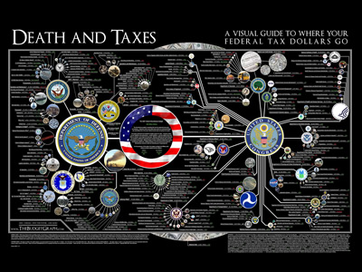
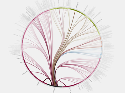
I chose these two visualizations because the visuals were easy to read and navigate and they both covered issues that I think are worthy of analysis. The information flow in science graphic is a dynamic visualization, as it lets users interact and choose specific topics to view more information/ additional visualizations. The US tax graphic is static, as it is not interactive. In the US tax graphic, preattentive features (size, color, and line weight) are utilized to draw the viewer’s attention to most important symbols: “…the objective (of preattentive features) is to support perceptual inference and to enhance detection and recognition” (Meirelles 22). The information flow in science graphic provides interactive ways for the viewer click around the graphic and view different perspectives and journals. All these visualizations are beautiful, but not in such a way that distracts from the information, which was something Dubois stressed in his American Negro Exhibit: “However, the art did not distract from science; it served to reinforce the comprehensive scientific data chronicling the African American journey” (Dubois 34). There is a purposeful organization to this graphic as well – it is in the form of a tree graph, which illustrates the hierarchies in the citation network and the division of journals into four categories and then into subcategories. This method is effective in how it “applies the hierarchical model to show our desire for order, symmetry, and regularity (Lima 25). Additionally, the graphic on US taxes presents new information and a new perspective to the public, who often do not know where their tax money is going. When a large governmental organization holds all the power, data visualization is an important tool that can be used to inform. D’Ignazio and Klein emphasize this point in their discussion of feminism and power: “Feminism is about power–about who has it, and who doesn’t. In a world in which data is power, and that power is wielded unequally, feminism can help us better understand how it operates and how it can be challenged”.
The first visualization I chose from the DH Sample Book is the graph on “Lesbian and Gay Liberatio in Canada”. This graphic is a dynamic visualization that allows the viewer to click through the graph and view specific points in history and further information. It gives the viewer a strong historical perspective to this movement that might otherwise get lost in modern times. Another progressive and interesting part about this graphic is how it includes biographical information on every person involved in the database, which adds validity and depth to the information. This graphic is eye opening and provocative as it prompts questions about the global momentum of this movement. One weak point of this graphic is although it is very organized and clear, the visual aspect is not very exciting or eye catching.
Another visualization I analyzed from the DH Sample Book is “American Panorama”. This visualization looks at the displacement of American families in “slum” neighborhoods of cities in 1955-66. The way the information was presented was very interactive and dynamic, and also very user friendly. The website gave an overview of what the graphic would discuss, provided a key. It then lets you move your mouse over different cities to view statistics on urban displacement. This graphic brings new information to light and highlights specific issues within this larger issue, like race, poverty, and redlining in cities. For example, there is a graph for each city that chats the displacement of families based on race, showing the disparity between how many white families were displaced and how many families of color were displaced. It allows the viewer to understand the situation from the perspective that is different from that taught in textbooks.
