Being able to read, interpret, and manipulate data is an essential skill in being able to create data visualizations. Dubois discusses in his chapter that a good visualization design can be used to communicate across cultural boundaries to display information. Data literacy is also necessary for understanding digital visualizations that are made from data sets. Without basic data literacy people would not be able to gather and understand information on public issues. A well designed data visualization, along with data literacy, the understanding of new information on issues can be expressed more easily between people and cultures.
There has to be data literacy on both sides of visualizations, the people who are making them, in addition to the people who are reading them. If one party is unable to accurately read a data set, then the information on a visual can be misinterpreted by the reader, creating false news.
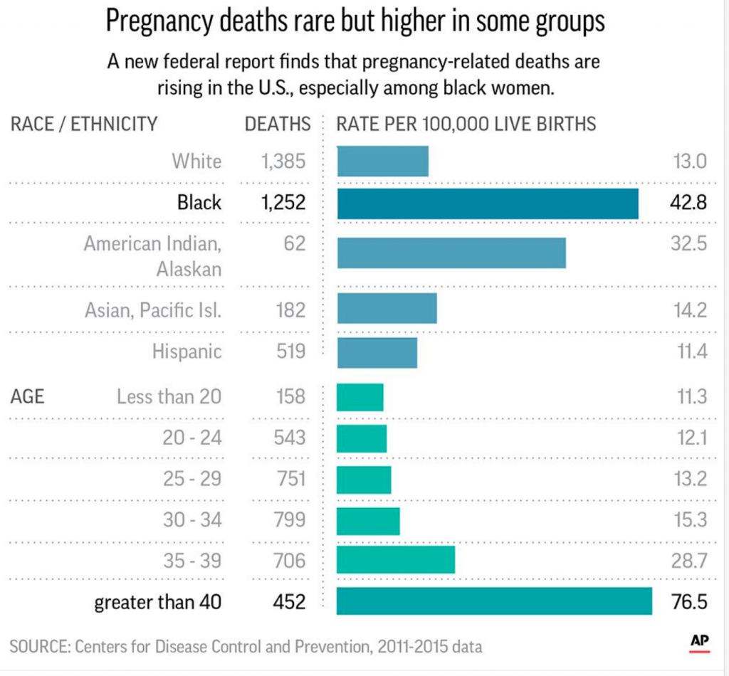
Below is an example of how someone who has done a poor job displaying data can ultimately enhance the odds of a reader misinterpret a federal report on a public issue. The Center of Disease Control and Prevention released this bar chart on pregnancy deaths rates between different groups of women to show that deaths related to pregnancy in black women is rising. However, due to how it scaled the bars, it makes readers believe that there are just as many deaths for black women as there are for women giving birth over the age of forty, which is simply not true. Data literacy in this case would be able to stop this confusion and creation of false information.
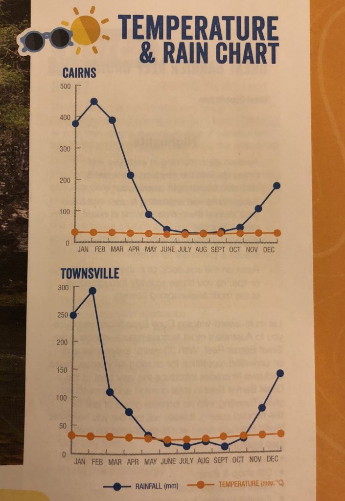
The Temperature and Rain Chart below from https://viz.wtf/ also displays how data literacy is absolutely necessary in creating visuals to display basic information in a simple manner. Having two set of information being shown on a single y-axis is confusing for readers to interpret. As seen below, it looks as if the temperature never changes throughout the year, but the amount of rainfall drastically does- this is not the case though. The scale does not fit both variables. If the person who made this chart had a stronger knowledge on data literacy, then the trend that the data showed between temperature and rainfall could have been displayed and gathered by readers.