Data literacy is something that is becoming ever more important in the information filled world we live in. Solving problems and improving human life is all dependent on data literacy. Being able to interpret, analyze and visualize data are skills that will not only help one benefit society but also help one make decisions and trust information. Everyone is surrounded by data so it is very important to be able to distinguish between good data and biased or illegitimate data. Data can be manipulated or collected unethically and it is the responsibility of the reader to distinguish the credibility of the data they are trying to interpret. As well as better understanding information, data literacy also allows people to get their information across more accurately. Sharing information and knowledge is vital part to the expansion of our society but, in doing so the risk is run that information will not be represented accurately. This leads to confusion and misinterpretations of data.
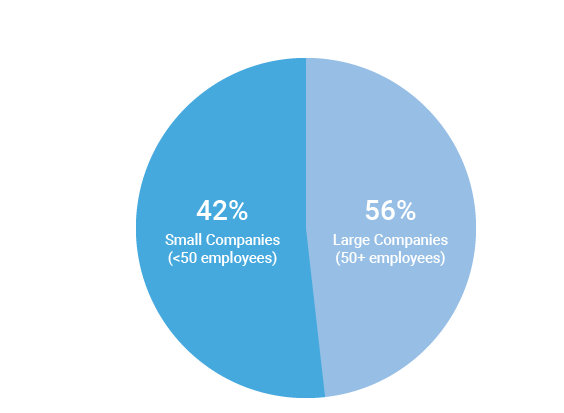
In my first example from viz.wtf, it can be clearly seen the producer of the visualization wanted to represent something other than the findings of their data. In this visualization, the smaller percentage of data is in the larger section of the pie chart therefore the visualization is not directly proportional to the numerical quantities represented. Making the reader at first glance think it is more common for companies to have less than fifty employees. Also all of the data does not add up to one hundred. This can all lead to a misinterpretation of the data.
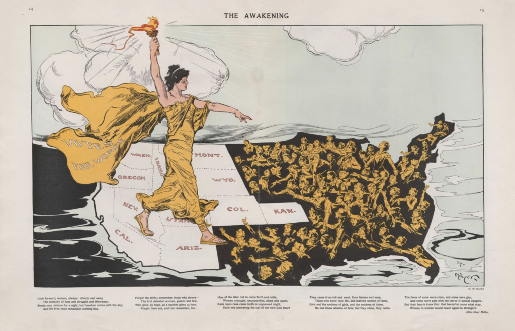
The next example from Persuasive Cartography entitled The Awakening is a good portrayal of data. Lady Liberty is stepping across a map of the states wearing a cap that says votes for women. The message that this visual is trying to portray is easily understood because there is enough direction and information leading the viewer to the meaning.