Being able to read and work with data is becoming increasingly important in today’s society. Data literacy is essential as more and more data are collected, used and misused. As more data is collected and used, it can result in more bias and could be misused. As a computer science major, I understand how biased many datasets are and how these biases can influence the world. A biased data leads to biased algorithms and biased people, causing more bias in the world. As expressed in their article, Catherine D’Ignazio and Lauren Klein, most data does not equally represent everyone thus it is inherently biased. This is where data literacy is important as that skill can be used to account for the biases in the data.
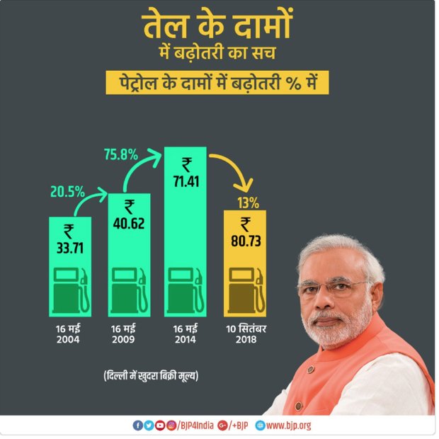
When used correctly, data visualization can provide a quick and simple method of reading a complex dataset. However, when misused, data visualization can misinform or even harm society. An example of a harmful data visualization is when politicians misrepresent their influence. The image below misrepresents data by visualizing an increase in petrol price as a decrease.
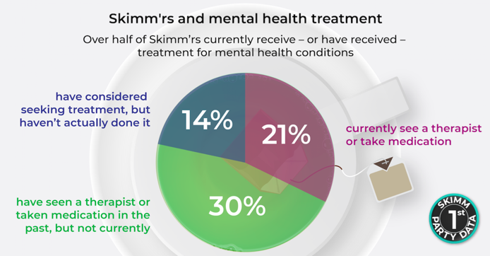
The image below shows another example of a bad or misleading data visualization. The data is represented by a pie chart, where the whole does not add up to 100%. The pie chart leaves out the remaining 35% of the people.
The biases in data and the misrepresentation of data in a visualization are two of the many reasons why data literacy is an important skill in the modern society.